
A richness map is a map of sampling effort
On this page
Problem statement
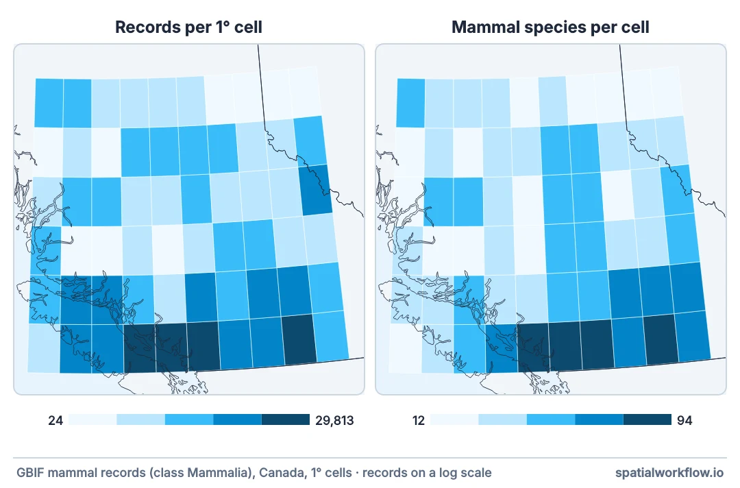
The species richness map shows a hotspot around the city, a band along the highway and a blank in the mountains. It is a plausible-looking map, and the pattern is recording effort. Across 60 one-degree cells of southern British Columbia, the rank correlation between log record count and species richness is 0.91; over the whole province, in How to build a species richness grid, it is 0.93.
That correlation does not make the data useless. It makes the raw map uninterpretable, and there are three things to do about it: correct the richness, map the effort beside it, or change the question.
Quick answer
Measure the correlation first, then decide:
import time
import numpy as np, pandas as pd, requests
from scipy import stats
from scipy.special import gammaln

API = "https://api.gbif.org/v1/occurrence/search"

def cell(west, south, east, north, **params):
    wkt = (f"POLYGON(({west} {south},{east} {south},{east} {north},"
           f"{west} {north},{west} {south}))")
    for attempt in range(6):
        r = requests.get(API, params={**params, "geometry": wkt, "hasCoordinate": "true",
                                      "facet": "speciesKey", "facetLimit": 1000,
                                      "limit": 0}, timeout=180)
        if r.status_code == 429:
            time.sleep(2 ** attempt)
            continue
        r.raise_for_status()
        time.sleep(0.2)
        body = r.json()
        return body["count"], np.array(
            [c["count"] for c in body["facets"][0]["counts"]], dtype=float)
    raise RuntimeError("rate limited")

rows = []
for west in np.arange(-128.0, -118.0, 1.0):
    for south in np.arange(49.0, 55.0, 1.0):
        n, counts = cell(round(west, 3), round(south, 3),
                         round(west + 1, 3), round(south + 1, 3),
                         taxonKey=359, country="CA")
        if n:
            rows.append({"west": west, "south": south, "records": n,
                         "richness": len(counts), "counts": counts})
grid = pd.DataFrame(rows)

r = stats.spearmanr(np.log10(grid.records), grid.richness)
print(f"{len(grid)} occupied cells, {grid.records.sum():,} records")
print(f"Spearman(log records, richness) = {r.statistic:.2f}")
print(f"richest cell: {grid.richness.max()} species in "
      f"{grid.loc[grid.richness.idxmax(), 'records']:,} records")
print(f"poorest occupied cell: {grid.richness.min()} species in "
      f"{grid.loc[grid.richness.idxmin(), 'records']:,} records")
60 occupied cells, 110,092 records
Spearman(log records, richness) = 0.91
richest cell: 94 species in 29,813 records
poorest occupied cell: 12 species in 24 records
A correlation of 0.9 or more is normal for this kind of data, and it is the number to print before any interpretation of the map.
Correlate with effort, rarefy, map both, coarsen
1. Compute the correlation with effort
Rank correlation between richness and log record count. Print it in the caption of any richness map.
2. Rarefy to a common sample size
The standard correction. It works, it drops the cells below the threshold, and it should be reported with both numbers.
3. Map the effort next to the richness
Two maps side by side let a reader see which features of one appear in the other. It is the cheapest honest presentation.
4. Coarsen the grain
Bigger cells accumulate enough records to be comparable. The map gets blockier and more defensible.
5. Use a ratio only if the denominator is meaningful
Species per record is not a rate anybody wants; rarefied richness is the principled version of the same instinct.
6. Change the question where the data will not support it
"Where are the most species" may be unanswerable with these records. "Where are the records" and "which cells have enough data to say" are answerable.
Three remedies measured
The data used on this page
Every number below comes from GBIF's API. GBIF adds and revises records daily, so the setup answers each GBIF request this page makes from the reply it got on 9 October 2026, and lets any other request through live.
import hashlib, io, zipfile

import requests

# GBIF adds and revises records daily. So that the numbers below reproduce, every GBIF request on
# this page is answered from the reply it got on 9 October 2026 (one file per request, named by a
# SHA-1 of its URL); any other request, or all of them once these lines are deleted, goes live.
SAVED = zipfile.ZipFile(io.BytesIO(requests.get(
    "https://data.spatialworkflow.io/gbif-api-2026-10-09.zip", timeout=300).content))
live_get = requests.get


def saved_get(url, params=None, **kwargs):
    prepared = requests.Request("GET", url, params=params).prepare()
    try:
        body = SAVED.read(hashlib.sha1(prepared.url.encode()).hexdigest()[:16] + ".json")
    except KeyError:
        return live_get(url, params=params, **kwargs)
    reply = requests.models.Response()
    reply.status_code, reply._content, reply.url = 200, body, prepared.url
    reply.headers["Content-Type"] = "application/json"
    return reply


requests.get = saved_get
Example 1 — the three remedies, measured
def rarefy(counts, m):
    n = counts.sum()
    if m > n:
        return np.nan
    log_missing = (gammaln(n - counts + 1) - gammaln(n - counts - m + 1)
                   - gammaln(n + 1) + gammaln(n - m + 1))
    return float(len(counts) - np.exp(log_missing).sum())

grid["rarefied"] = [rarefy(c, 200) for c in grid.counts]
usable = grid[grid.rarefied.notna()]

print(f"{'approach':<28}{'cells':>7}{'correlation with effort':>26}")
print(f"{'raw richness':<28}{len(grid):>7}"
      f"{stats.spearmanr(np.log10(grid.records), grid.richness).statistic:>26.2f}")
print(f"{'rarefied to 200 records':<28}{len(usable):>7}"
      f"{stats.spearmanr(np.log10(usable.records), usable.rarefied).statistic:>26.2f}")
ratio = grid.richness / grid.records
print(f"{'species per record':<28}{len(grid):>7}"
      f"{stats.spearmanr(np.log10(grid.records), ratio).statistic:>26.2f}")
approach cells correlation with effort
raw richness 60 0.91
rarefied to 200 records 46 0.05
species per record 60 -0.98
Species per record is worse than useless: it correlates with effort as strongly as the raw richness does, in the opposite direction. Dividing by the denominator does not remove the dependence; it inverts it.
Example 2 — coarsening the grain
for step in (1.0, 2.0, 3.0):
    rows = []
    for west in np.arange(-128.0, -118.0, step):
        for south in np.arange(49.0, 55.0, step):
            n, counts = cell(round(west, 3), round(south, 3),
                             round(west + step, 3), round(south + step, 3),
                             taxonKey=359, country="CA")
            if n:
                rows.append({"records": n, "richness": len(counts)})
    g = pd.DataFrame(rows)
    rho = stats.spearmanr(np.log10(g.records), g.richness).statistic
    print(f"{step}° cells: {len(g):>3} occupied, median {g.records.median():>7,.0f} records, "
          f"correlation {rho:.2f}")
1.0° cells: 60 occupied, median 442 records, correlation 0.91
2.0° cells: 15 occupied, median 2,183 records, correlation 0.86
3.0° cells: 8 occupied, median 11,180 records, correlation 0.90
Coarsening helps less than it should. The correlation falls from 0.91 to 0.86 at two degrees and comes back to 0.90 at three, because with eight cells left the statistic is measuring almost nothing. Coarsening trades the effort problem for a sample-size problem, and on this grid it runs out of cells before it runs out of effort.
Example 3 — what a reader should be shown
pivot_r = grid.pivot_table(index="south", columns="west", values="records").fillna(0)
pivot_s = grid.pivot_table(index="south", columns="west", values="richness").fillna(0)

def sparkline(frame, fmt="{:>6.0f}"):
    lines = []
    for south in sorted(frame.index, reverse=True):
        lines.append(f"{south:>5.0f}N  " +
                     "".join(fmt.format(v) for v in frame.loc[south]))
    return "\n".join(lines)

print("records per cell")
print(sparkline(pivot_r))
print("\nspecies per cell")
print(sparkline(pivot_s))
print("\nthe two maps have the same shape, which is the point")
records per cell
54N 467 416 150 285 102 331 60 37 59 74
53N 24 230 55 416 735 1041 1067 209 232 551
52N 218 678 850 367 105 884 276 122 261 3958
51N 536 64 95 403 76 398 1359 563 270 359
50N 1113 2262 2768 547 383 2056 859 2391 3711 867
49N 106 1976 4208 7301 29813 12393 4534 4146 9101 1174
species per cell
54N 45 40 33 34 26 38 16 14 17 20
53N 12 35 21 43 32 54 46 31 32 36
52N 26 45 48 42 27 61 50 26 35 54
51N 34 21 24 40 20 47 52 39 31 45
50N 44 43 48 37 37 60 55 64 71 64
49N 13 44 57 65 94 83 83 72 87 71
the two maps have the same shape, which is the point
Why effort and richness move together
Why the correlation is so high
Species accumulation curves rise steeply at first: the first hundred records in a cell find most of its common species, and every hundred after that adds a few more. Because record counts vary between cells by three or four orders of magnitude, the cells sit at wildly different points on that curve, and richness therefore tracks effort almost perfectly.
Why species-per-record is the wrong fix
The instinct to divide by effort assumes richness is proportional to records. It is not — it is a saturating function of them, so the ratio falls as effort rises and the corrected map is an upside-down effort map. Rarefaction is the same instinct done correctly: it compares cells at a fixed point on the accumulation curve instead of assuming the curve is a line.
Why the honest answer is sometimes "no map"
With a median of 102 records per occupied cell, most of this grid cannot support a richness comparison at all. Publishing the effort map and the handful of cells that pass a threshold is a smaller, true result; publishing the raw richness map is a larger, false one.
Effort proxies, estimators and blank cells
- Effort proxies — checklists, survey hours, camera nights — are far better than record counts where the data has them.
- Target-group richness (species of one group per cell, relative to another) partly cancels shared effort.
- Estimators (Chao1, ACE) extrapolate to total richness and are optimistic on presence-only data.
- Occupancy models handle detection explicitly, and need repeat visits the data rarely has.
- A blank cell is not a zero-richness cell; map it as no data.
- Colour scales: a sequential ramp over a raw richness map implies a comparability the data does not have.
Internal links
- How to build a species richness grid — the map in question
- How to correct richness for sampling effort — the correction in full
- Sampling bias in occurrence data explained — where the effort pattern comes from
- Biodiversity metrics explained — metrics that are less effort-sensitive
- Species occurrence data explained — what a record is
- Choropleth classification explained — how the class breaks change the story
FAQ
Why does my richness map look like a population map?
Because it largely is one: records come from people, and richness rises with records.
Can I divide richness by the number of records?
No. Richness saturates with effort, so the ratio is an inverted effort map.
What correlation is acceptable?
There is no threshold. Report it, correct what you can, and let a reader judge.
Does rarefaction fix it?
It removes the sample-size component and drops the cells with too few records. It does not fix where people looked.
Should I coarsen the grid?
It helps: bigger cells have more records and are more comparable, at the cost of resolution.
What if no cell has enough records?
Then map effort and say so. That is a result too.