
Choropleth Classification Explained: Quantiles, Equal Interval and Natural Breaks
On this page
Problem statement
The same data, two lines of code, two completely different maps. Here are Delaware's census tracts coloured by people per square kilometre of land, from the 2020 Census (the setup is under The data used on this page):
import matplotlib
matplotlib.use("Agg")

tracts.plot(column="density", scheme="quantiles", k=5, cmap="YlOrRd", legend=True)
tracts.plot(column="density", scheme="equal_interval", k=5, cmap="YlOrRd", legend=True)
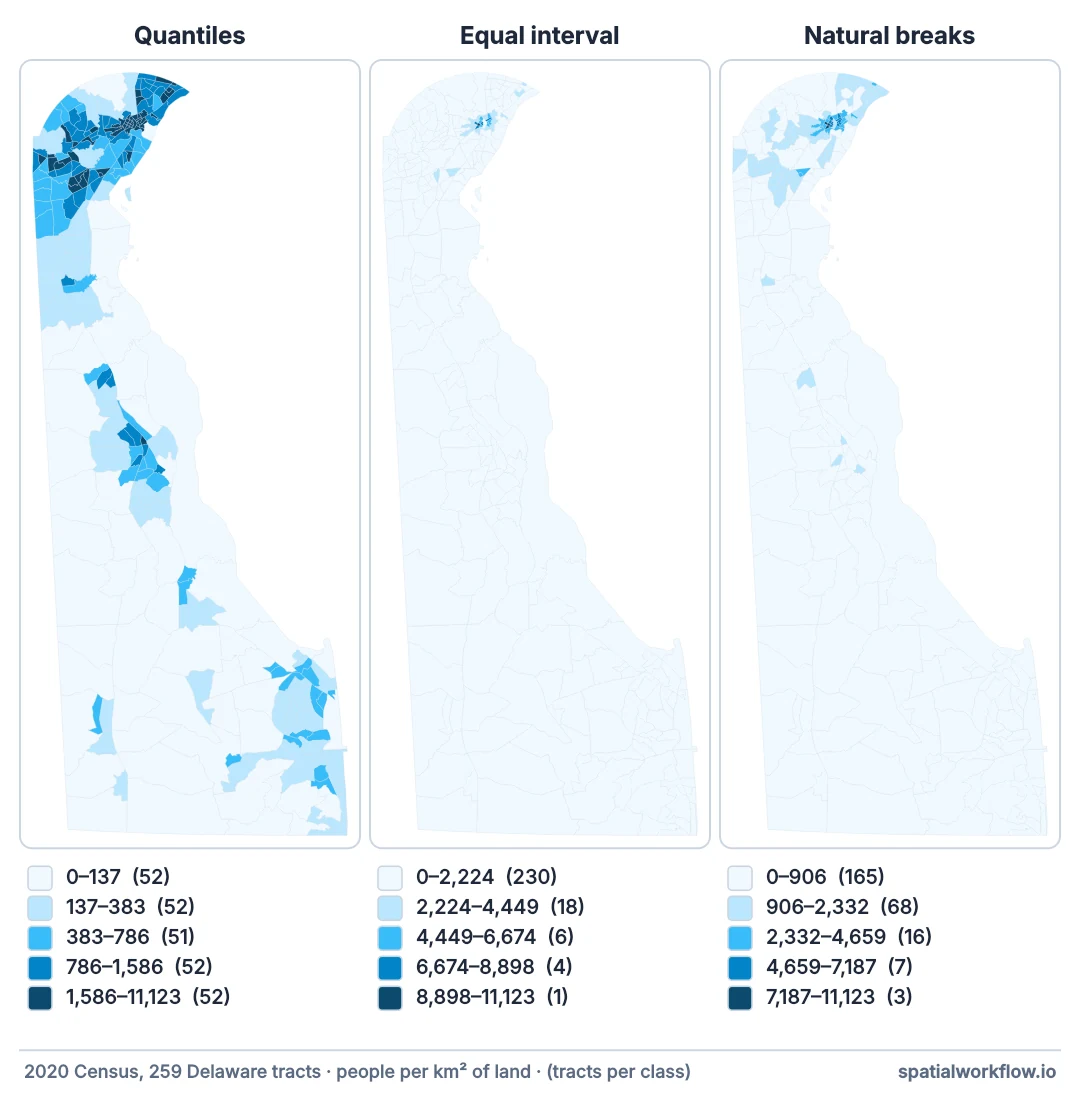
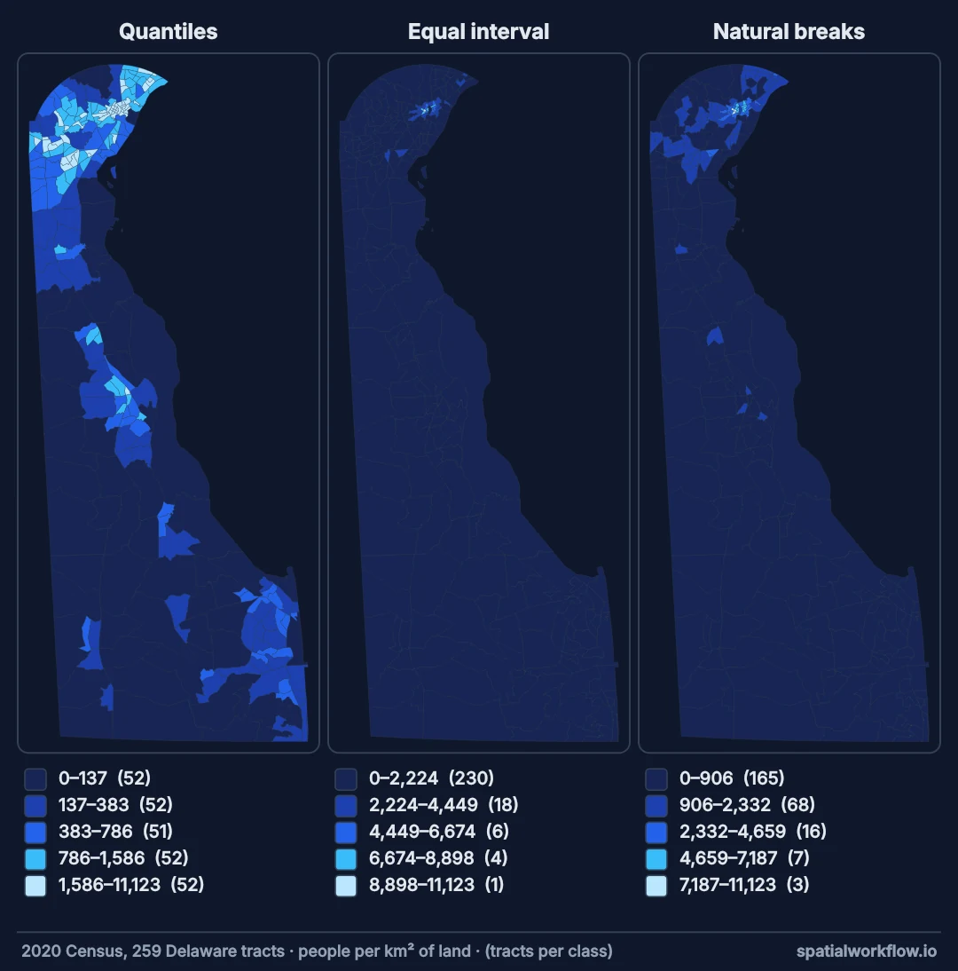
The first shows a patchwork with roughly equal numbers of tracts in each colour. The second is almost entirely pale yellow with a handful of dark tracts around Wilmington. Nothing about the data changed. Neither map is wrong. They are answers to different questions, and a reader shown one of them will not know the other exists.
Worse is the default:
tracts.plot(column="density", cmap="YlOrRd", legend=True)No classification at all — a continuous colour ramp stretched linearly from minimum to maximum. One outlier compresses everything else into a narrow band of indistinguishable colour, and the map shows little but where the outlier is.
Classification is the step that turns numbers into colours, and it is where a choropleth acquires most of its editorial content.
Quick answer
tracts.plot(column="density", scheme="quantiles", k=5,
cmap="YlOrRd", legend=True, edgecolor="white", linewidth=0.3)| Scheme | What each class contains | Use for |
|---|---|---|
quantiles |
equal counts of features | ranking, comparing places |
equal_interval |
equal value ranges | evenly spread data, absolute thresholds |
natural_breaks (Jenks) |
groups the data suggests | finding real clusters |
std_mean |
standard deviations from the mean | showing deviation, diverging data |
fisher_jenks |
optimal, exact version of Jenks | the same breaks on every run |
user_defined |
your thresholds | policy bands, established categories |
| none (default) | a linear stretch | almost never — outliers destroy it |
Always pass a scheme. The default continuous ramp is the one option that reliably hides the data.
A rate, the distribution, the scheme, k, the colours
1. Map a rate, not a count
Before choosing any scheme: a choropleth colours areas, so a large area gets a lot of ink whatever its value. Colouring a raw count means the map mostly shows how the areas were drawn.
by_count = tracts["pop"].rank(pct=True)
by_rate = tracts["density"].rank(pct=True)
print(f"tract population: {tracts['pop'].min():,} to {tracts['pop'].max():,}")
print(f"rank correlation between count and density: {by_count.corr(by_rate):.2f}")
largest = tracts.loc[tracts["aland_km2"].idxmax()]
print(f"the largest tract: {largest['aland_km2']:,.0f} km², {largest['pop']:,} people — "
      f"population percentile {by_count[largest.name]:.0%}, density percentile {by_rate[largest.name]:.0%}")
tract population: 0 to 8,360
rank correlation between count and density: -0.05
the largest tract: 293 km², 3,722 people — population percentile 50%, density percentile 2%
Census tracts are drawn to hold broadly similar numbers of people, so a count choropleth of them says little — and the biggest, emptiest tract is coloured like an ordinary one. Anything divided by an appropriate denominator works: per capita, per square kilometre, per household, as a percentage. This single change fixes more misleading choropleths than every classification decision combined.
2. Look at the distribution before choosing
The right scheme follows from the shape of the data:
def profile(gdf, column):
    v = gdf[column].dropna()
    print(f"{column}: n={len(v):,}  missing={gdf[column].isna().sum():,}")
    print(f"  min {v.min():,.1f}  median {v.median():,.1f}  max {v.max():,.1f}")
    print(f"  mean {v.mean():,.1f}  skew {v.skew():+.2f}")
    for q in [0.01, 0.25, 0.5, 0.75, 0.95, 0.99]:
        print(f"  p{int(q * 100):<3} {v.quantile(q):>12,.1f}")


profile(tracts, "density")
density: n=259 missing=0
min 0.0 median 567.8 max 11,122.6
mean 1,085.2 skew +3.18
p1 10.9
p25 197.0
p50 567.8
p75 1,388.3
p95 3,885.7
p99 7,562.6
A strong positive skew, and a mean well above the median, say this data is right-tailed: a few dense urban tracts, a long run of suburban and rural ones. equal_interval on it will put most tracts in the first class. quantiles will spread them out. That is the decision made, before drawing anything.
3. Understand what each scheme does
import mapclassify as mc

v = tracts["density"]
for name, c in [("quantiles", mc.Quantiles(v, k=5)),
                ("equal_interval", mc.EqualInterval(v, k=5)),
                ("fisher_jenks", mc.FisherJenks(v, k=5)),
                ("std_mean", mc.StdMean(v))]:
    print(f"{name:<15} breaks {[f'{b:,.0f}' for b in c.bins]}")
    print(f"{'':<15} counts {[int(n) for n in c.counts]}")
quantiles breaks ['137', '383', '786', '1,586', '11,123']
counts [52, 52, 51, 52, 52]
equal_interval breaks ['2,225', '4,449', '6,674', '8,898', '11,123']
counts [230, 18, 6, 4, 1]
fisher_jenks breaks ['906', '2,332', '4,659', '7,187', '11,123']
counts [165, 68, 16, 7, 3]
std_mean breaks ['-2,004', '-459', '2,630', '4,174', '11,123']
counts [0, 0, 236, 10, 13]
Read the counts, not the breaks. equal_interval puts most of the tracts in one class — the map will be one colour. quantiles splits them evenly by construction. Fisher-Jenks finds a middle position that follows the data's own structure. (natural_breaks in mapclassify is a k-means approximation with random starts and can give different breaks on each run; fisher_jenks is the exact, repeatable version.)
Quantiles guarantee equal counts, so every class is visible and the map is about rank. The cost: two tracts on either side of a break can be nearly identical in value, and a class can span a huge range at the tail. A quantile map always looks varied, even when the underlying differences are trivial.
Equal interval divides the value range into equal parts, so the legend is intuitive and comparable across maps. It only works when the data is reasonably evenly spread. On skewed data it produces a map of one colour.
Natural breaks (Jenks) minimises within-class variance, putting boundaries where the data has genuine gaps. It follows the data's structure, and it is data-dependent — two maps of different years get different breaks and cannot be compared.
Standard deviations classify by distance from the mean, which is the right frame for a diverging colour scheme showing above and below average. It assumes something roughly normal; on skewed data like this the classes below the mean are empty or nearly so, because a mean dragged up by the dense tracts is barely more than a standard deviation above zero.
4. Choose the number of classes
for k in [3, 5, 7, 9]:
    c = mc.Quantiles(v, k=k)
    print(f"k={k}  ADCM {c.adcm:>12,.0f}")
k=3 ADCM 121,291
k=5 ADCM 96,685
k=7 ADCM 78,074
k=9 ADCM 65,897
Five to seven is the usual range. Below four the map loses detail; above about eight, readers cannot reliably match a polygon's colour to a legend swatch — a limit of perception rather than of the data. ADCM — absolute deviation about class medians — always falls as k rises, so it cannot choose k for you; it is a tiebreaker between schemes at the same k, and not a substitute for the question of what the map is for.
5. Match the colour scheme to the data type
Classification decides the breaks; the colour ramp decides whether they read correctly.
| Data | Colour scheme | Examples |
|---|---|---|
| sequential (low → high) | single-hue or multi-hue ramp | YlOrRd, Blues, viridis |
| diverging (below/above a midpoint) | two hues meeting at neutral | RdBu, PiYG, BrBG |
| categorical | distinct hues, no order | tab10, Set2 |
# diverging data must have its midpoint at the meaningful zero
gdf["change_pct"] = (gdf["pop_2020"] - gdf["pop_2010"]) / gdf["pop_2010"] * 100
lim = np.abs(gdf["change_pct"]).quantile(0.98)
gdf.plot(column="change_pct", cmap="RdBu", vmin=-lim, vmax=lim, legend=True)
The symmetric vmin/vmax is what makes a diverging map honest. Without it, matplotlib centres the ramp on the midpoint of the data range rather than on zero, so "no change" gets a colour from one side and growth and decline are not visually comparable.
Every scheme compared on Delaware's census tracts
The data used on this page
Delaware's census tracts from the Census Bureau's TIGER/Line files, with each tract's population summed from its census blocks: 2020 for most of the page, and 2010 for the comparison in example 2. Tracts with no land area are dropped, and density is people per square kilometre of land (ALAND), not of total area, so tracts that are mostly water are not diluted.
import geopandas as gpd
import numpy as np

TIGER = "https://www2.census.gov/geo/tiger"
blocks = gpd.read_file(f"{TIGER}/TIGER2020/TABBLOCK20/tl_2020_10_tabblock20.zip",
                       columns=["GEOID20", "POP20", "ALAND20"], ignore_geometry=True)
per_tract = (blocks.assign(tract=blocks["GEOID20"].str[:11])
                   .groupby("tract").agg(pop=("POP20", "sum"), aland=("ALAND20", "sum")))
tracts = gpd.read_file(f"{TIGER}/TIGER2020/TRACT/tl_2020_10_tract.zip", columns=["GEOID"])
tracts = tracts.merge(per_tract, left_on="GEOID", right_index=True)
tracts = tracts[tracts["aland"] > 0].to_crs(26918).reset_index(drop=True)      # UTM 18N, metres
tracts["aland_km2"] = tracts["aland"] / 1e6
tracts["density"] = tracts["pop"] / tracts["aland_km2"]                          # people per km² of land

blocks10 = gpd.read_file(f"{TIGER}/TIGER2010BLKPOPHU/tabblock2010_10_pophu.zip", ignore_geometry=True)
pop10 = (blocks10.assign(GEOID10=blocks10["STATEFP10"] + blocks10["COUNTYFP10"] + blocks10["TRACTCE10"])
                 .groupby("GEOID10")["POP10"].sum())
tracts10 = gpd.read_file(f"{TIGER}/TIGER2010/TRACT/2010/tl_2010_10_tract10.zip", columns=["GEOID10", "ALAND10"])
tracts10 = tracts10.merge(pop10, left_on="GEOID10", right_index=True)
tracts10 = tracts10[tracts10["ALAND10"] > 0].to_crs(26918).reset_index(drop=True)
tracts10["density"] = tracts10["POP10"] / (tracts10["ALAND10"] / 1e6)

print(f"2020: {len(tracts)} tracts, {tracts['pop'].sum():,} people; "
      f"2010: {len(tracts10)} tracts, {tracts10['POP10'].sum():,} people")
2020: 259 tracts, 989,948 people; 2010: 215 tracts, 897,934 people
Example 1: comparing every scheme at once
Before publishing, look at the alternatives:
import matplotlib.pyplot as plt

SCHEMES = ["quantiles", "equal_interval", "natural_breaks", "std_mean",
           "fisher_jenks", "boxplot"]


def compare_schemes(gdf, column, k=5, cmap="YlOrRd"):
    fig, axes = plt.subplots(2, 3, figsize=(18, 11))
    v = gdf[column].dropna()
    for ax, scheme in zip(axes.ravel(), SCHEMES):
        gdf.plot(column=column, scheme=scheme, k=k, cmap=cmap, ax=ax,
                 edgecolor="white", linewidth=0.2,
                 missing_kwds={"color": "#e2e8f0", "hatch": "///"})
        counts = [int(n) for n in mc.classify(v, scheme, k=k).counts]
        biggest = 100 * max(counts) / sum(counts)
        ax.set_title(f"{scheme}\ncounts {counts} · largest class {biggest:.0f}%", fontsize=9)
        print(f"{scheme:15} counts {str(counts):28} largest class {biggest:3.0f}%")
        ax.set_axis_off()
    plt.tight_layout()
    return fig


fig = compare_schemes(tracts, "density")
fig.savefig("schemes.png", dpi=80)
quantiles counts [52, 52, 51, 52, 52] largest class 20%
equal_interval counts [230, 18, 6, 4, 1] largest class 89%
natural_breaks counts [165, 68, 16, 7, 3] largest class 64%
std_mean counts [0, 0, 236, 10, 13] largest class 91%
fisher_jenks counts [165, 68, 16, 7, 3] largest class 64%
boxplot counts [0, 65, 65, 64, 48, 17] largest class 25%
The "largest class %" is the number to scan. Anything above about 60% means most of the map is one colour and the scheme is not separating the data — equal_interval and std_mean can be dismissed on that number alone, and the Jenks schemes, at just over 60%, are borderline. (natural_breaks may print slightly different counts on another run; that is the random start mentioned in step 3.)
missing_kwds is worth keeping as a habit: without it, features with a null value are simply not drawn, leaving holes a reader will interpret as zero rather than unknown. See how to handle missing and null values.
Example 2: fixed breaks so maps compare across years
Data-driven schemes recompute their breaks per dataset, so a 2010 map and a 2020 map classified separately are not comparable — the same colour means different values.
import pandas as pd

print("each year's own quintile breaks:")
for year, layer in [(2010, tracts10), (2020, tracts)]:
    print(f"  {year}: {[f'{b:,.0f}' for b in mc.Quantiles(layer['density'], k=5).bins]}")

pooled = pd.concat([tracts10["density"], tracts["density"]])
breaks = list(mc.Quantiles(pooled, k=5).bins)
print("shared breaks:", [f"{b:,.0f}" for b in breaks])

fig, axes = plt.subplots(1, 2, figsize=(12, 7))
for ax, (year, layer) in zip(axes, [(2010, tracts10), (2020, tracts)]):
    layer.plot(column="density", scheme="user_defined", classification_kwds={"bins": breaks},
               cmap="YlOrRd", ax=ax, edgecolor="white", linewidth=0.2, legend=(year == 2020))
    print(f"  {year} tracts per shared class: {[int(n) for n in mc.UserDefined(layer['density'], bins=breaks).counts]}")
    ax.set_title(str(year))
    ax.set_axis_off()
fig.savefig("years.png", dpi=80)
each year's own quintile breaks:
2010: ['124', '397', '868', '1,683', '12,659']
2020: ['137', '383', '786', '1,586', '11,123']
shared breaks: ['130', '384', '798', '1,645', '12,659']
2010 tracts per shared class: [45, 40, 41, 45, 44]
2020 tracts per shared class: [50, 55, 53, 50, 51]
With each year's own breaks, the same colour means a different density in each map. With the shared breaks the class counts move between years, which is the change you are trying to show. scheme="user_defined" with explicit bins is what makes a series of maps a series rather than unrelated pictures. Deriving those bins from the pooled data means the breaks suit the whole period rather than any one year — and because the classification is by value, it works even though the tract boundaries were redrawn between the two censuses.
A legend on only the last panel avoids repeating the same key twice.
Example 3: an honest choropleth, end to end
def choropleth(gdf, column, *, denominator=None, per=100_000, scheme="quantiles",
               k=5, cmap="YlOrRd", crs=None, title=None, note=None):
    gdf = gdf.copy()

    if denominator:
        col = f"{column}_per_{denominator}"
        gdf[col] = gdf[column] / gdf[denominator].replace(0, np.nan) * per
    else:
        col = column

    if crs:
        gdf = gdf.to_crs(crs)
    elif gdf.crs and gdf.crs.is_geographic:
        raise ValueError("geographic CRS — pass an equal-area crs= for a choropleth")

    missing = gdf[col].isna().sum()
    fig, ax = plt.subplots(figsize=(10, 11))
    gdf.plot(column=col, scheme=scheme, k=k, cmap=cmap, ax=ax,
             edgecolor="white", linewidth=0.25,
             legend=True, legend_kwds={"loc": "lower right", "fontsize": 9,
                                       "title": col.replace("_", " ")},
             missing_kwds={"color": "#e2e8f0", "hatch": "///",
                           "label": f"no data ({missing})"})

    classifier = mc.classify(gdf[col].dropna(), scheme, k=k)
    counts = [int(n) for n in classifier.counts]
    ax.set_title(title or col, fontsize=14, loc="left")
    ax.set_axis_off()
    ax.annotate(
        (note or "") + f"\n{scheme}, k={k} · class counts {counts}"
        f" · {len(gdf) - missing:,} of {len(gdf):,} areas mapped",
        xy=(0.01, 0.01), xycoords="axes fraction", fontsize=7.5, color="#64748b")
    return fig, classifier


try:
    choropleth(tracts.to_crs(4326), "pop", denominator="aland_km2", per=1)
except ValueError as err:
    print(f"ValueError: {err}")

fig, cls = choropleth(
    tracts.to_crs(4326), "pop", denominator="aland_km2", per=1,
    scheme="quantiles", k=5, crs=5070,
    title="Delaware: people per km² of land, 2020",
    note="Source: US Census Bureau, 2020 Census via TIGER/Line blocks. A rate, not a count.",
)
fig.savefig("delaware_density.png", dpi=80)
print(f"class counts: {[int(n) for n in cls.counts]}")
ValueError: geographic CRS — pass an equal-area crs= for a choropleth
class counts: [52, 52, 51, 52, 52]
Four things this function refuses to let you get wrong. It computes a rate when given a denominator, rather than trusting you to remember. It raises on a geographic CRS instead of silently drawing a distorted map — the reasoning is in choosing a map projection for display — and reprojects when given one, here to EPSG:5070, the Census Bureau's equal-area Albers projection for the United States. It draws missing values in a distinct hatched grey with a count, so absent data cannot be mistaken for low data. And it prints the scheme, k and class counts on the figure itself, so a reader can see how the colours were assigned rather than having to trust them.
The replace(0, np.nan) on the denominator turns a division by zero into a missing value, which is honest, rather than into an infinity, which plots as the maximum class.
A choropleth's two mappings
A choropleth performs two mappings: from a value to a class, and from a class to a colour. The second is a design decision. The first is an analytical one, and it determines what the map is capable of showing.
The reason schemes differ so much is that they optimise different things. Quantiles optimise for visual balance — equal counts per class guarantee every colour appears, which makes a map that looks informative regardless of whether the underlying differences are meaningful. Equal interval optimises for legend legibility — even, round-ish ranges that a reader can hold in their head and compare with another map. Natural breaks optimise for within-class homogeneity, placing boundaries where the data has genuine gaps.
These goals conflict. On skewed data — which is most real spatial data, since income, population density, house prices and disease counts are all right-tailed — the conflict is stark. Equal interval collapses to one colour. Quantiles produce a balanced map whose top class, on Delaware's tracts, runs from about 1,600 to 11,100 people per km², so places a sevenfold difference apart share a shade. Neither is dishonest, and both need to be labelled.
This is why the class counts belong on the map, and why a published choropleth should state its scheme. A reader looking at a quantile map is looking at ranks; a reader looking at an equal-interval map is looking at magnitudes. Without the label they cannot tell which, and the two support different conclusions from identical data.
The count-versus-rate error dominates everything else. A choropleth encodes value as colour over an area, and the reader integrates colour across area whether or not you intend it. So a raw count mapped this way produces a picture of where the denominator is large — usually population. This is not a subtle bias; it is the map showing a different variable from the one in the legend. Dividing by an appropriate denominator is the single highest-value correction available.
And the classification interacts with the projection. Both are ways the map's visual weight can diverge from the data's actual weight: an unequal-area projection makes northern regions look larger, and a poor classification makes them look more extreme. Together they compound. An equal-area projection and a scheme suited to the distribution are the two halves of a choropleth that says what its legend claims.
Finally, note the limit of the form. A choropleth cannot show within-area variation, and it inherits whatever the areal units impose — the modifiable areal unit problem means the same underlying data aggregated to different boundaries can produce opposite patterns. When that matters, a dot density map, a cartogram, or mapping the underlying points is more honest than a better classification of the aggregate.
Ties, missing values, Jenks speed and diverging ramps
-
scheme=requiresmapclassify.pip install mapclassify, or GeoPandas raises when you pass one. -
Ties break quantiles. If many features share a value, quantile classes cannot have equal counts and
mapclassifywarns. -
missing_kwdsis essential. Without it, null-valued features are not drawn at all and read as zero. -
kabove about 8 exceeds what readers can match to a legend, however much detail the data has. -
Jenks is slow on large datasets.
fisher_jenksis exact and O(n²);natural_breaksis a k-means approximation (with random starts, so it can change between runs);FisherJenksSampledcomputes the exact breaks on a random sample. -
Diverging ramps need symmetric
vmin/vmax, or the neutral colour lands somewhere other than zero. -
std_meanassumes an approximately normal distribution. On skewed data its first class is often empty. -
user_definedbins are upper bounds, and the last one must be at least the data maximum. -
Colour-blind readers cannot separate red from green;
viridis,cividisand ColorBrewer's colour-blind-safe ramps can. -
legend_kwds={"fmt": "{:,.0f}"}stops a legend showing eight decimal places.
Internal links
- How to create a choropleth map in Python with GeoPandas — the practical build
- Choosing a map projection for display — the other half of an honest choropleth
- My GeoPandas choropleth colours look wrong — when the map does not match the data
- How to plot maps in Python with GeoPandas and Matplotlib — plotting fundamentals
- How to handle missing and null values in spatial datasets — what
missing_kwdsis for - How to aggregate spatial data by region in GeoPandas — producing the values you classify
- How to add legends, labels and a scale bar to a GeoPandas map — making the classes readable
- Spatial data quality: the six dimensions that matter — what the numbers are worth before you map them
- Counts, rates and densities — deciding what value to classify
- Return periods and annual exceedance probability explained — classing a probability without misleading a reader
- Dynamic segmentation explained — classing a route instead of an area
FAQ
Which classification scheme should I use?
quantiles for showing rank and guaranteeing every class is visible; equal_interval when the data is evenly spread and the legend must be intuitive; natural_breaks to find real groupings. Always pass one — the default continuous ramp hides everything behind outliers.
Why is my whole map one colour?
Almost certainly equal_interval on skewed data, where the top few values stretch the range so far that nearly every feature falls in the first class. Check the class counts and switch to quantiles or natural_breaks.
Should I map counts or rates?
Rates, essentially always. A choropleth colours areas, so a raw count produces a map of where the denominator is large — usually population — regardless of what the legend says.
How many classes?
Five to seven. Fewer loses detail; more exceeds what a reader can reliably match between a polygon and a legend swatch.
Why do my maps for different years look inconsistent?
Data-driven schemes recompute breaks per dataset. Derive one set of breaks from the pooled data and pass them with scheme="user_defined".
What is Jenks natural breaks actually doing?
Minimising variance within classes and maximising it between them, so boundaries land where the data has genuine gaps. It is data-dependent, which is why it does not compare across datasets.
How should I show missing data?
With missing_kwds — a distinct grey, ideally hatched, and a count in the legend. Undrawn polygons read as zero, which is a different claim from unknown.