
How to Map Flight Delays by Airport in Python
On this page
Problem statement
"Which airports have the worst delays?" sounds like a groupby and a map. The groupby is easy. The trouble is everything around it: which delay — departure or arrival, mean, median or on-time share; which airports — a field with three flights a year will top any ranking; and which map — the US in latitude and longitude makes the north look twice its size, and Alaska and Hawaii fall off the edge.
This page maps 2025 departure delays at the 352 airports in the BTS on-time file, decides each of those questions explicitly, and shows how much the ranking moves when the small airports are handled properly.
Quick answer
Group flown flights by origin, compute the share departing less than 15 minutes late alongside the median and mean delay, and rank only airports with enough flights:
flown = flights[(flights.Cancelled == 0) & (flights.Diverted == 0)]
by = flown.groupby("Origin").agg(flights=("DepDelay", "size"), on_time=("DepDelay", lambda d: (d < 15).mean()),
                                 median_delay=("DepDelay", "median"), mean_delay=("DepDelay", "mean"))
big = by[by.flights >= 10_000].join(airports)
print(f"{len(by)} airports; {len(big)} with 10,000+ departures")
print(big.sort_values("on_time")[["flights", "on_time", "median_delay", "mean_delay"]].round(3).head(5).to_string())
print(big.sort_values("on_time")[["flights", "on_time", "median_delay", "mean_delay"]].round(3).tail(3).to_string())
352 airports; 102 with 10,000+ departures
flights on_time median_delay mean_delay
Origin
SFB 10420 0.713 -2.0 18.386
DFW 306185 0.714 -1.0 19.120
DAL 70145 0.729 1.0 14.798
PBI 30181 0.737 -2.0 18.995
BWI 94610 0.743 0.0 15.242
flights on_time median_delay mean_delay
Origin
OGG 25245 0.873 -3.0 5.361
LIH 15493 0.880 -3.0 3.715
KOA 15621 0.887 -3.0 5.075
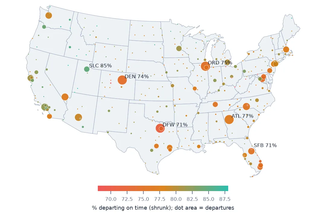
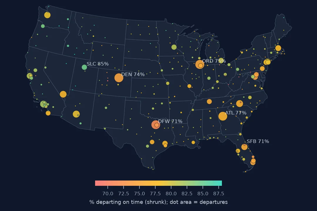
Among the 102 airports with 10,000 or more departures, Orlando Sanford (71.3% on time) and Dallas–Fort Worth (71.4%) did worst in 2025, and the three Hawaiian neighbour-island airports best, at 87–89%. The median delay barely separates them: it is a few minutes early almost everywhere. The mean delay, pulled up by the long tail, is three to five times higher at the worst airports.
From a groupby to an honest map
1. Decide which delay you are mapping
print(f"departure delay of 15+ min: {(flown.DepDelay >= 15).mean():.1%}   arrival delay of 15+ min: {(flown.ArrDelay >= 15).mean():.1%}")
print(f"left early: {(flown.DepDelay < 0).mean():.1%}   arrived early: {(flown.ArrDelay < 0).mean():.1%}")
departure delay of 15+ min: 21.7% arrival delay of 15+ min: 22.3%
left early: 58.3% arrived early: 60.7%
The Department of Transportation calls a flight on time if it arrives within 15 minutes of schedule; for an airport map, departures are the airport's own performance, while arrivals carry the origin's delays with them. Most flights leave early by the clock — 58.3% have a negative departure delay — which is why means and medians behave so differently (see average flight delay comes out negative).
2. Small airports make the extremes
print(by.flights.describe(percentiles=[0.25, 0.5, 0.75]).round(0).to_string())
for lo, hi in [(0, 1000), (1000, 10_000), (10_000, 1e9)]:
    part = by[(by.flights >= lo) & (by.flights < hi)]
    print(f"{lo:>6,.0f}+ flights: {len(part):3d} airports, on-time from {part.on_time.min():.1%} to {part.on_time.max():.1%}")
count 352.0
mean 19544.0
std 46304.0
min 3.0
25% 710.0
50% 2726.0
75% 13000.0
max 320418.0
0+ flights: 117 airports, on-time from 46.3% to 100.0%
1,000+ flights: 133 airports, on-time from 66.6% to 90.3%
10,000+ flights: 102 airports, on-time from 71.3% to 88.7%
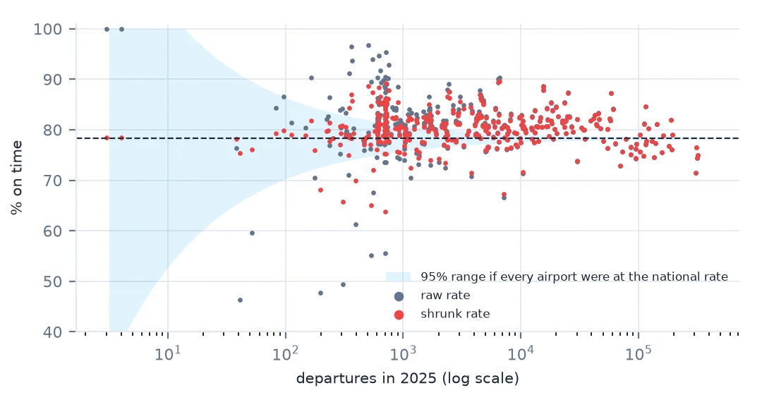
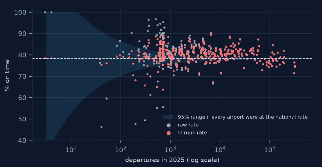
Half the airports have fewer than 2,726 departures a year, and their on-time rates spread from 46.3% to 100%. Above 10,000 flights the spread is 71.3% to 88.7%. The extremes of an unweighted ranking are mostly small samples.
3. Pull small airports towards the national rate
A standard fix is to shrink each airport's rate towards the national one, by an amount that depends on how many flights it has. Adding a fixed number k of imaginary flights at the national rate barely moves an airport with hundreds of thousands of departures and moves one with forty most of the way:
k = 400                                                         # pseudo-flights of prior weight
p0 = (flown.DepDelay < 15).mean()
by["on_time_shrunk"] = (by.on_time * by.flights + p0 * k) / (by.flights + k)
by["rank_raw"] = by.on_time.rank(ascending=False)
by["rank_shrunk"] = by.on_time_shrunk.rank(ascending=False)
print(f"national on-time rate {p0:.1%}")
print(by.sort_values("on_time").head(5)[["flights", "on_time", "on_time_shrunk", "rank_raw", "rank_shrunk"]].round(3).to_string())
national on-time rate 78.3%
flights on_time on_time_shrunk rank_raw rank_shrunk
Origin
VRB 41 0.463 0.753 352.0 325.0
CKB 199 0.477 0.682 351.0 348.0
HGR 308 0.494 0.657 350.0 350.0
HTS 531 0.552 0.651 349.0 351.0
USA 703 0.556 0.638 348.0 352.0
Vero Beach, last of 352 with 41 departures, moves to 325th; small airports with a few hundred flights and genuinely poor records (CKB, HGR, HTS, USA) stay at the bottom. Shrinkage does not hide bad performance; it stops 41 flights from counting as much as DFW's 306,185.
4. Project before you draw
import geopandas as gpd

pts = gpd.GeoDataFrame(by.join(airports), geometry=gpd.points_from_xy(airports.lon.reindex(by.index), airports.lat.reindex(by.index)), crs=4326)
lower48 = pts[pts.lat.between(24, 50) & pts.lon.between(-125, -66)].to_crs(5070)    # Conus Albers, equal area
print(f"{len(lower48)} airports in the lower 48; {len(pts) - len(lower48)} in Alaska, Hawaii and the territories")
320 airports in the lower 48; 32 in Alaska, Hawaii and the territories
A map of the lower 48 states belongs in an equal-area projection, here Conus Albers (EPSG:5070); in plain longitude and latitude the northern tier is stretched east–west. The 32 airports outside it — Alaska, Hawaii, Puerto Rico and the Pacific territories — need insets or their own maps.
Time of day and arrivals
The data used on this page
The Bureau of Transportation Statistics Reporting Carrier On-Time Performance files for 2025, and airport coordinates from OurAirports in a copy saved on 15 October 2026. State outlines for the map are the Census Bureau's 2023 cartographic boundary file.
from pathlib import Path
import zipfile

import numpy as np
import pandas as pd
import requests

Path("data").mkdir(exist_ok=True)
BTS = "https://transtats.bts.gov/PREZIP/On_Time_Reporting_Carrier_On_Time_Performance_1987_present_2025_{}.zip"
COLS = ["FlightDate", "Reporting_Airline", "Tail_Number", "Flight_Number_Reporting_Airline", "Origin", "Dest",
        "CRSDepTime", "DepTime", "DepDelay", "TaxiOut", "WheelsOff", "WheelsOn", "TaxiIn", "CRSArrTime", "ArrTime",
        "ArrDelay", "Cancelled", "CancellationCode", "Diverted", "CRSElapsedTime", "ActualElapsedTime", "AirTime",
        "Distance", "CarrierDelay", "WeatherDelay", "NASDelay", "SecurityDelay", "LateAircraftDelay"]
TEXT = {c: str for c in ["CRSDepTime", "DepTime", "WheelsOff", "WheelsOn", "CRSArrTime", "ArrTime", "CancellationCode",
                         "Tail_Number"]}


def read_month(m):
    f = Path(f"data/On_Time_Reporting_Carrier_On_Time_Performance_1987_present_2025_{m}.zip")
    if not f.exists():
        f.write_bytes(requests.get(BTS.format(m), timeout=900).content)
    with zipfile.ZipFile(f) as z:
        name = next(n for n in z.namelist() if n.endswith(".csv"))
        return pd.read_csv(z.open(name), usecols=COLS, dtype=TEXT, parse_dates=["FlightDate"], low_memory=False)


flights = pd.concat([read_month(m) for m in range(1, 13)], ignore_index=True)

# OurAirports is edited daily; this is the copy of 15 October 2026
# (live: https://davidmegginson.github.io/ourairports-data/airports.csv).
AIRPORTS = "ourairports-airports-2026-10-15.csv"
if not Path(f"data/{AIRPORTS}").exists():
    Path(f"data/{AIRPORTS}").write_bytes(requests.get(f"https://data.spatialworkflow.io/{AIRPORTS}", timeout=300).content)
ap = pd.read_csv(f"data/{AIRPORTS}", usecols=["ident", "iata_code", "name", "latitude_deg", "longitude_deg"])
by_iata = ap.dropna(subset=["iata_code"]).drop_duplicates("iata_code").set_index("iata_code")
by_ident = ap.set_index("ident")
codes = pd.Index(sorted(set(flights.Origin) | set(flights.Dest)))
KEEP = ["name", "latitude_deg", "longitude_deg"]
airports = by_iata.reindex(codes)[KEEP]
gap = airports.latitude_deg.isna().values
airports.loc[gap, KEEP] = by_ident.reindex("K" + codes[gap])[KEEP].values      # fall back to the US ident, K + code
airports = airports.rename(columns={"latitude_deg": "lat", "longitude_deg": "lon"})
print(f"{len(flights):,} flights, {len(codes)} airports, {airports.lat.isna().sum()} without coordinates")
7,001,619 flights, 352 airports, 0 without coordinates
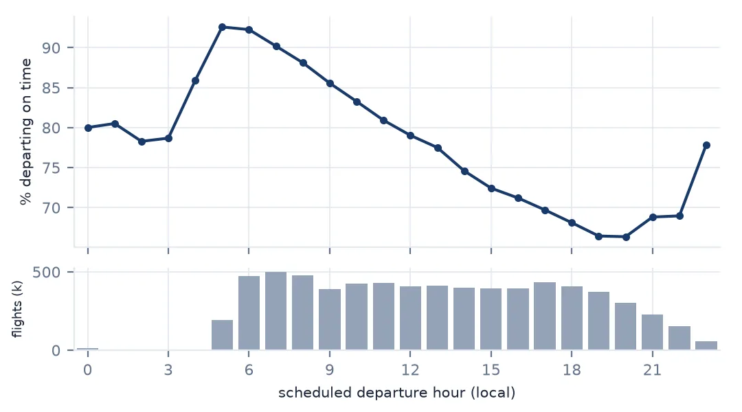
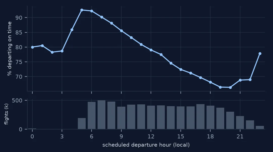
Example 1: delays build through the day
hour = flown.CRSDepTime.str[:2].astype(int).clip(upper=23)
by_hour = flown.groupby(hour).DepDelay.agg(on_time=lambda d: (d < 15).mean(), mean="mean", flights="size")
print(by_hour.loc[[5, 7, 10, 13, 16, 19, 21]].round(3).to_string())
on_time mean flights
CRSDepTime
5 0.926 4.330 194931
7 0.902 4.372 501217
10 0.833 8.604 427414
13 0.775 13.431 410959
16 0.712 19.115 394921
19 0.665 23.407 373468
21 0.688 21.298 229222
Delay is a function of the clock as much as of the airport. 92.6% of 5 a.m. departures leave on time, 66.5% of 7 p.m. departures; the mean delay grows more than fivefold from early morning to evening, as delays accumulate on aircraft through the day (following an aircraft through its day). An airport with a busy evening bank will rank worse than one with the same performance spread across the day.
Example 2: departures and arrivals at the same airport
arr = flown.groupby("Dest").ArrDelay.apply(lambda d: (d < 15).mean()).rename("arr_on_time")
both = big.join(arr)
print(f"correlation of departure and arrival on-time rates over {len(both)} large airports: "
      f"{both.on_time.corr(both.arr_on_time):.2f}")
print(both.assign(gap=both.on_time - both.arr_on_time).sort_values("gap")[["on_time", "arr_on_time"]].round(3).iloc[[0, 1, -2, -1]].to_string())
correlation of departure and arrival on-time rates over 102 large airports: 0.57
on_time arr_on_time
Origin
DAL 0.729 0.795
BWI 0.743 0.802
MSN 0.827 0.751
SFB 0.713 0.637
Departure and arrival on-time rates at the same airport are correlated (0.57), but not the same thing. Dallas Love Field and Baltimore, both Southwest strongholds, depart worse than they arrive, while Sanford's arrivals are even worse than its departures. A map should say which it shows.
What an airport delay map is a map of
A delay rate per airport mixes three things: the airport's own capacity and weather, the airlines that use it, and the time of day those airlines schedule their flights. The map cannot separate them, and should not pretend to. What it can do is avoid adding a fourth, which is noise from small samples, and a fifth, which is distortion from the projection.
For the noise, a minimum-flights threshold throws away information; shrinkage keeps every airport and reports how sure the estimate is. For the projection, an equal-area CRS keeps symbol positions fair. For the measure, the on-time share is the most robust single number, because a few multi-hour delays cannot move it — but it says nothing about how bad the late flights were, which the mean does. The maps in this cluster use the on-time share and report the mean beside it.
Mistakes this map invites
- Ranking small airports. Shrink towards the national rate, or show the sample size.
- Mixing departures and arrivals. Say which; they correlate at only 0.57.
- Comparing airports with different schedules. Evening-heavy airports look worse; compare by hour if it matters.
- Mapping in degrees. Project the lower 48 to an equal-area CRS and inset Alaska and Hawaii.
- Using the mean alone. A handful of long delays moves it; give the on-time share too.
Internal links
- How to load and clean a year of US flight data — the table this page maps
- Average flight delay comes out negative — on-time rate, mean or median
- How to measure where and when weather delays flights — one cause of the pattern
- How to measure airport congestion from taxi-out times — delay on the ground
FAQ
Which large US airport had the worst on-time departures in 2025?
Among airports with 10,000+ departures in the BTS file, Orlando Sanford (71.3% within 15 minutes) and Dallas–Fort Worth (71.4%); the national rate was 78.3%.
Why shrink on-time rates for small airports?
Because a rate from 41 flights is far noisier than one from 300,000. Pulling each rate towards the national one by an amount set by its sample size keeps small airports from dominating the extremes of a ranking.