
Interpolated Pollution Map Shows Bullseyes
On this page
Problem statement
The interpolated NO2 map has a red disc around every kerbside monitor, fading into orange rings and a pale background between them. It looks like a map of pollution hotspots. It is a map of where the monitors are. Each disc is centred on a station that measures one street, and the interpolation has spread that street's value over a circle several kilometres wide — while the equally busy streets with no monitor are drawn as clean.
Bullseyes are the visible symptom of three separate problems: mixing station types, interpolating a field that is not smooth, and a weighting power that makes each point dominate its neighbourhood.
Quick answer
Test whether the surface's peaks sit on stations. If they do, the map is showing the network, not the air:
import io, requests, numpy as np, pandas as pd, geopandas as gpd

API = "https://eeadmz1-downloads-api-appservice.azurewebsites.net/ParquetFile/urls"
META = "https://discomap.eea.europa.eu/map/fme/metadata/PanEuropean_metadata.csv"
r = requests.post(API, json={"countries": ["DE"], "cities": ["Berlin"], "pollutants": ["NO2"],
                             "dataset": 2, "dateTimeStart": "2023-01-01T00:00:00Z",
                             "dateTimeEnd": "2023-12-31T23:00:00Z", "aggregationType": "hour"},
                  timeout=120)
rows = []
for url in [u.strip() for u in r.text.splitlines()[1:] if u.strip()]:
    d = pd.read_parquet(io.BytesIO(requests.get(url, timeout=120).content))
    d["Value"] = pd.to_numeric(d.Value, errors="coerce")
    y = d[(d.Start >= "2023-01-01") & (d.Start < "2024-01-01") & (d.Validity > 0)]
    if len(y) >= 0.9 * 8760:
        rows.append((d.Samplingpoint.iloc[0].split("/")[1], y.Value.mean()))
meta = pd.read_csv(META, sep="\t", low_memory=False,
                   storage_options={"User-Agent": "spatialworkflow-examples/1.0"}).drop_duplicates("SamplingPoint")   # EEA refuses Python's default agent
st = pd.DataFrame(rows, columns=["SamplingPoint", "no2"]).merge(meta, on="SamplingPoint")
st = gpd.GeoDataFrame(st, geometry=gpd.points_from_xy(st.Longitude, st.Latitude), crs=4326).to_crs(25833)
xy, z = np.c_[st.geometry.x, st.geometry.y], st.no2.to_numpy()
traffic = (st.AirQualityStationType == "traffic").to_numpy()

def idw(xk, zk, xq, power=2):
    d = np.hypot(*(xq[:, None, :] - xk[None, :, :]).transpose(2, 0, 1))
    w = 1 / np.maximum(d, 1.0) ** power
    return (w * zk).sum(1) / w.sum(1)

x0, y0, x1, y1 = st.total_bounds
gx, gy = np.meshgrid(np.arange(x0, x1, 250), np.arange(y0, y1, 250))
grid = np.c_[gx.ravel(), gy.ravel()]

def peaks_on_stations(surface, threshold):
    hot = grid[surface > threshold]
    d = np.hypot(*(hot[:, None, :] - xy[None, traffic, :]).transpose(2, 0, 1)).min(1)
    return len(hot), (d < 1500).mean() if len(hot) else np.nan

surf = idw(xy, z, grid)
n, share = peaks_on_stations(surf, 22)
print(f"all 17 stations, power 2: {n} cells above 22 µg/m³, "
      f"{share:.0%} of them within 1.5 km of a traffic station")
all 17 stations, power 2: 800 cells above 22 µg/m³, 54% of them within 1.5 km of a traffic station
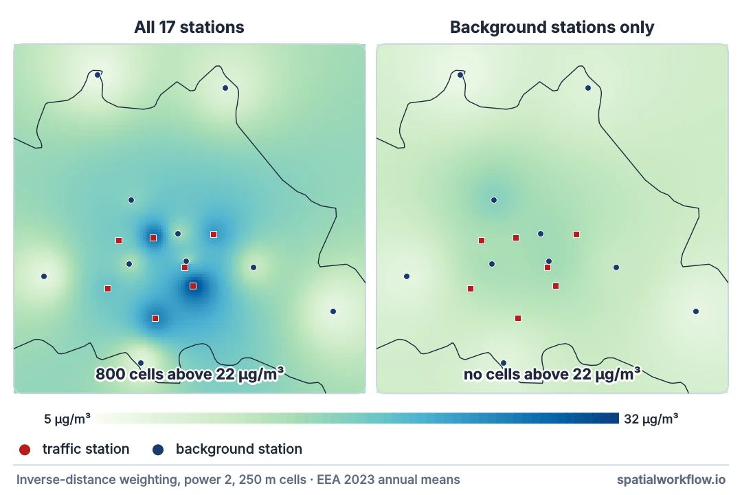
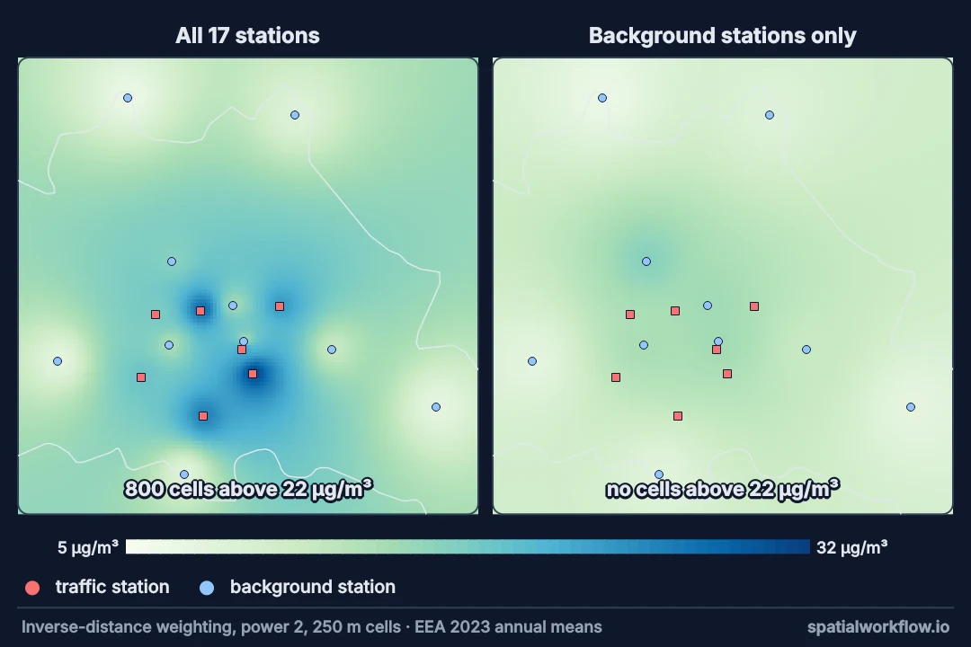
The 800 hot cells — 50 km² — exist only because of the seven kerbside stations; the background-only surface below has none. Half lie within 1.5 km of a kerbside monitor and the rest fill the gaps between neighbouring monitors in the centre. Streets with the same traffic and no monitor get the background value.
Split station types, check maxima, validate the power
1. Split the stations by type
Traffic stations measure their own street. Interpolate background stations only; treat traffic stations as samples of a different quantity — the roadside increment.
2. Check the surface's maxima against station locations
If the highest values sit exactly on stations and fall off in circles, the interpolation is extrapolating point values, not revealing structure.
3. Choose the IDW power by validation, not by look
Low powers average everything towards the network mean; high powers paint each station's value over its whole neighbourhood. Pick the power by leave-one-out error on the background stations — and expect it not to fix the problem.
4. Model the roadside part explicitly
Roadside concentrations follow roads, not circles. A land-use regression — NO2 as a function of traffic and road length near each site — or a dispersion model puts the increment where the roads are.
5. Show the station network on the map
Station symbols let readers see where the surface is supported. A bullseye with a monitor in the middle is recognisable as one.
Power parameters and removing traffic stations
Example 1 — the power parameter
bg = ~traffic
for power in (1, 2, 3, 4):
    surf_p = idw(xy, z, grid, power)
    n, share = peaks_on_stations(surf_p, 22)
    errs = [idw(np.delete(xy, i, 0)[np.delete(bg, i)], np.delete(z, i)[np.delete(bg, i)],
                xy[[i]], power)[0] - z[i] for i in np.where(bg)[0]]
    print(f"power {power}: {n:>5} hot cells, {share:>4.0%} on traffic stations; "
          f"background-only LOO RMSE {np.sqrt(np.mean(np.square(errs))):.2f}")
power 1: 91 hot cells, 100% on traffic stations; background-only LOO RMSE 4.05
power 2: 800 hot cells, 54% on traffic stations; background-only LOO RMSE 4.01
power 3: 1230 hot cells, 39% on traffic stations; background-only LOO RMSE 4.08
power 4: 1474 hot cells, 32% on traffic stations; background-only LOO RMSE 4.13
Low powers pull every cell towards the network average and the hot area shrinks to 91 cells hugging the monitors; high powers turn the map into patches, each painted with its nearest station's value, and the hot area grows to 1,474 cells — 92 km². Meanwhile the validation error barely moves (4.01–4.13), so it cannot choose between them. The problem is what is being interpolated, not how.
Example 2 — remove the traffic stations
surf_bg = idw(xy[~traffic], z[~traffic], grid)
n_bg, _ = peaks_on_stations(surf_bg, 22)
print(f"background-only surface: {n_bg} cells above 22 µg/m³, "
      f"range {surf_bg.min():.1f}–{surf_bg.max():.1f}")
increment = z[traffic] - idw(xy[~traffic], z[~traffic], xy[traffic])
print(f"traffic increment at the 7 kerbside stations: "
      f"{increment.min():.1f}–{increment.max():.1f} µg/m³, mean {increment.mean():.1f}")
background-only surface: 0 cells above 22 µg/m³, range 6.7–17.5
traffic increment at the 7 kerbside stations: 3.7–17.2 µg/m³, mean 10.3
The background surface is a smooth gradient with no hotspots; the kerbside information survives as an increment — a number that belongs to a road, and that a road-based model can apply to every comparable street.
Example 3 — where a bullseye lands
roads_like = st[traffic][["SamplingPoint", "no2"]].copy()
roads_like["background there"] = idw(xy[~traffic], z[~traffic], xy[traffic]).round(1)
roads_like["hot area within 3 km, as a radius (m)"] = [
    int(np.sqrt((np.hypot(*(grid - p).T) < 3000)[surf > 22].sum() * 250 ** 2 / np.pi))
    for p in xy[traffic]]
print(roads_like.sort_values("SamplingPoint").round(1).to_string(index=False))   # the download's row order varies
SamplingPoint no2 background there hot area within 3 km, as a radius (m)
SPO.DE_DEBE061_NO2_dataGroup1 19.6 13.4 0
SPO.DE_DEBE063_NO2_dataGroup1 31.8 14.6 2650
SPO.DE_DEBE065_NO2_dataGroup1 23.8 14.5 1229
SPO.DE_DEBE067_NO2_dataGroup1 18.5 14.8 822
SPO.DE_DEBE069_NO2_dataGroup1 26.1 12.2 2243
SPO.DE_DEBE125_NO2_dataGroup1 28.4 15.2 1472
SPO.DE_DEBE126_NO2_dataGroup1 23.9 15.5 1918
Each kerbside value, measured within two metres of the kerb, is drawn as a hot area equivalent to a disc 0.8 to 2.7 km in radius; only DEBE061, at 19.6 µg/m³, stays below the threshold. That is the size of the error the map makes about the space around each monitor.
Why interpolation draws circles
Why interpolation draws circles
IDW and kriging both predict a location from nearby stations weighted by distance. Near a station its own value dominates; the prediction falls towards the neighbours' values with distance, equally in every direction. An isolated high value therefore becomes a round peak. That is correct behaviour for a smooth field and wrong for one whose peaks are lines.
Why roadside NO2 is not a smooth field
NO2 near a busy road can halve within 50–100 m of the kerb. The field is a background surface with sharp ridges along every major road. Seventeen points cannot sample that; no interpolation of them can reconstruct it.
Why the fix is a change of model
Once the roadside part is recognised as a function of roads, the natural model uses road data: distance to the nearest major road, road length within a buffer, traffic counts. That is what land-use regression does, and it produces ridges along roads rather than discs around monitors.
Industrial stations, kriging and sensor networks
- Industrial stations produce the same artefact around a plant; treat them like traffic stations.
- Kriging with a nugget smooths bullseyes but does not move the peaks off the monitors.
- Log-transforming concentrations reduces the dominance of a few high values but not the geometry.
- Low-cost sensor networks are denser but mixed in siting; the same split by environment applies.
- Annual vs hourly maps: hourly bullseyes are worse, because the kerbside increment varies with traffic hour by hour.
Internal links
- How to interpolate air quality station data — the background-only method
- Air quality monitoring networks explained — what each station type represents
- How to build a land-use regression model for NO2 — the roadside part, along roads
- How to cross-validate an interpolation — choosing parameters honestly
- How to krige in Python — the model-based alternative to IDW
- Rate map dominated by small areas — another map that shows its sampling, not its subject
FAQ
Why does my interpolated pollution map have circles around the monitors?
Kerbside stations are being interpolated as if they represented the space around them. Each one's high value becomes a round peak.
Should I lower the IDW power?
It changes their size and shape — lower powers shrink the hot area, higher ones grow it — not the fact that they are there. Remove or model the traffic stations instead.
How do I map roadside pollution then?
With a land-use regression or dispersion model that uses road data, so the increment follows roads.
Is kriging better at avoiding bullseyes?
Not fundamentally. It is still a distance-weighted average around each station.
How can I tell a real hotspot from a bullseye?
Check whether the peak sits on a monitor and falls off in a circle. Real hotspots follow roads, junctions or sources.
What should the map show besides the surface?
The station locations and types, and where the surface is far from any background station.