
How to Make a Choropleth Map With Plotly in Python
On this page
Problem statement
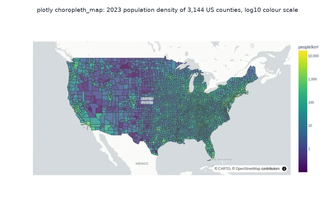
A choropleth colours areas by a value: population density by county, unemployment by state, sales by region. Plotly Express makes an interactive one in a single call, with a basemap, hover labels and zoom, and saves it as a standalone HTML file anyone can open. Getting a good one takes three things the one-liner hides: matching each row to its shape through the right GeoJSON property, keeping the GeoJSON small enough that the page loads, and choosing a colour scale that does not paint most areas the same colour.
This page maps the 2023 population density of every US county with plotly.express.choropleth_map, using the Census Bureau's county boundaries and population estimates, measures how much simplifying the geometry shrinks the HTML file, compares a linear and a logarithmic colour scale, and builds a version without a basemap.
Quick answer
Pass the GeoJSON, the column that identifies each row, and the property in the GeoJSON that holds the same identifier:
import plotly.express as px
fig = px.choropleth_map(D, geojson=GJ, locations="GEOID", featureidkey="properties.GEOID", color="log10_density",
                        color_continuous_scale="Viridis", map_style="carto-positron", zoom=3, center={"lat": 38, "lon": -96},
                        hover_name="NAME", hover_data={"density_km2": ":.1f", "pop2023": ":,", "log10_density": False}, opacity=0.8)
fig.write_html("data/county_density.html", include_plotlyjs="cdn")
print(f"counties: {len(D):,}; HTML file: {Path('data/county_density.html').stat().st_size / 1e6:.2f} MB")
print(f"density per km²: median {D.density_km2.median():.1f}, highest {D.density_km2.max():,.0f} ({D.loc[D.density_km2.idxmax(), 'NAME']})")
counties: 3,144; HTML file: 1.98 MB
density per km²: median 16.9, highest 17,227 (New York County, New York)
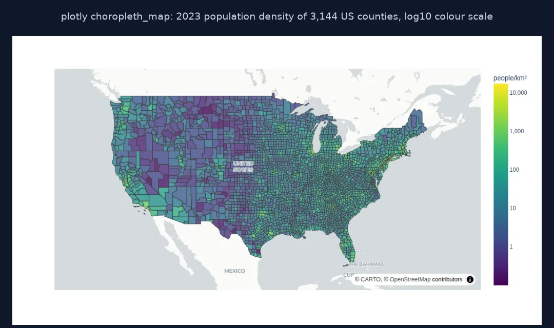
The finished map is a 1.98 MB HTML file. The median county has 16.9 people per km²; the densest is New York County, Manhattan, with 17,227.
Shrink the GeoJSON, choose linear or log colours, readable hovers
1. Shrink the GeoJSON
The boundaries are embedded in the HTML, so their size is the page's size. Simplify the geometry and compare:
def html_size(gj, path):
    f = px.choropleth_map(D, geojson=gj, locations="GEOID", featureidkey="properties.GEOID", color="log10_density", map_style="carto-positron")
    f.write_html(path, include_plotlyjs="cdn")
    return Path(path).stat().st_size / 1e6
for tol in (0, 0.005, 0.02):
    g = C if tol == 0 else C.assign(geometry=C.geometry.simplify(tol, preserve_topology=True))
    verts = g.geometry.count_coordinates().sum()
    print(f"simplify {tol:<5}: {verts:>7,} vertices, HTML {html_size(json.loads(g[['GEOID', 'geometry']].to_json()), f'data/t_{tol}.html'):.2f} MB")
simplify 0 : 55,527 vertices, HTML 1.77 MB
simplify 0.005: 45,121 vertices, HTML 1.51 MB
simplify 0.02 : 36,295 vertices, HTML 1.30 MB
The 1:20 million boundaries are already generalised: 55,527 vertices and a 1.77 MB file. Simplifying with a tolerance of 0.005° drops 19% of the vertices and the file to 1.51 MB; 0.02° to 1.30 MB, a quarter smaller, with no visible change at national scale.
2. Linear or logarithmic colours
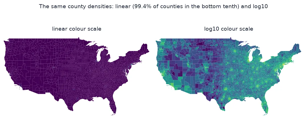
Densities span from under one person per km² to tens of thousands. On a linear scale nearly every county falls in the bottom of the colour range:
lin = (D.density_km2 - D.density_km2.min()) / (D.density_km2.max() - D.density_km2.min())
log = (D.log10_density - D.log10_density.min()) / (D.log10_density.max() - D.log10_density.min())
print(f"counties in the bottom 10% of the colour range: linear {(lin < 0.1).mean():.1%}, log10 {(log < 0.1).mean():.1%}")
print(f"counties in the top half: linear {(lin > 0.5).sum()}, log10 {(log > 0.5).sum()}")
counties in the bottom 10% of the colour range: linear 99.4%, log10 1.9%
counties in the top half: linear 3, log10 839
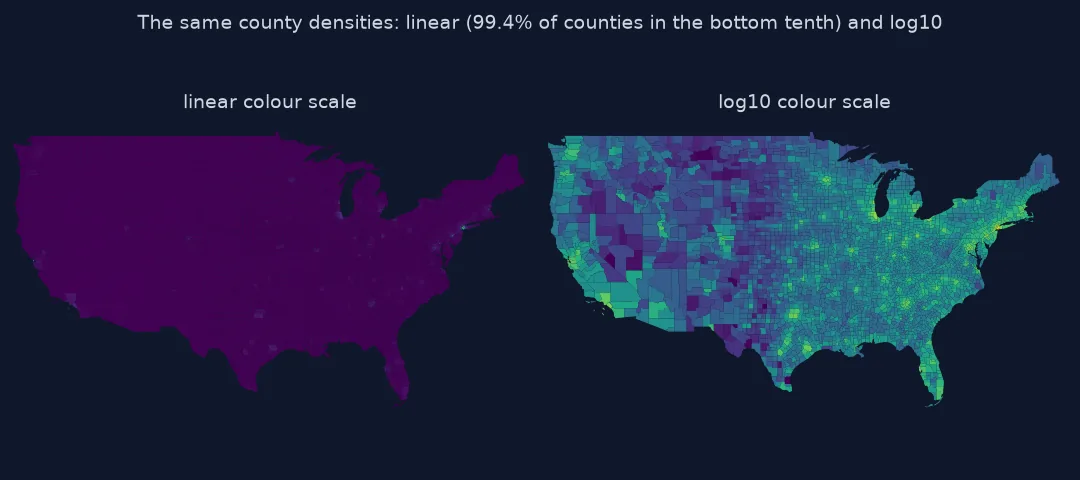
On a linear colour scale 99.4% of counties fall in the bottom tenth of the range and only 3 in the top half: Manhattan and a few other boroughs set the scale and the rest of the country is one colour. On a log10 scale 1.9% are in the bottom tenth and 839 in the top half.
3. Hover labels people can read
Show the name and real values on hover, formatted, and hide the transformed column:
fig.update_traces(hovertemplate="<b>%{hovertext}</b><br>%{customdata[0]:.1f} people per km²<br>population %{customdata[1]:,}<extra></extra>")
fig.update_layout(coloraxis_colorbar=dict(title="people/km²", tickvals=[0, 1, 2, 3, 4], ticktext=["1", "10", "100", "1,000", "10,000"]))
fig.write_html("data/county_density.html", include_plotlyjs="cdn")
print(f"traces: {len(fig.data)}; hover fields: {fig.data[0].customdata.shape[1]}; first row: {D.NAME.iloc[0]}, {fig.data[0].customdata[0].tolist()}")
traces: 1; hover fields: 3; first row: Brooks County, Georgia, [12.823392234258126, 16245.0, 1.1080029264107456]
The hover template uses the three customdata fields Plotly Express attached: density, population and the hidden log value. Brooks County, Georgia, the first row, has 12.8 people per km² and 16,245 people.
A choropleth without a basemap
The data used on this page
The US Census Bureau's 2023 county cartographic boundaries (1:20 million) and Vintage 2023 county population estimates. Areas come from the boundaries in the US Albers equal-area projection (EPSG:5070), so density is people per km² of the generalised outline, including water.
import json
from pathlib import Path

import geopandas as gpd
import numpy as np
import pandas as pd
import requests

Path("data").mkdir(exist_ok=True)
def cached(path, url):
    p = Path(path)
    if not p.exists():
        r = requests.get(url, timeout=600)
        r.raise_for_status()
        p.write_bytes(r.content)
    return p
C = gpd.read_file(cached("data/cb_2023_us_county_20m.zip", "https://www2.census.gov/geo/tiger/GENZ2023/shp/cb_2023_us_county_20m.zip")).to_crs(4326)
est = pd.read_csv(cached("data/co-est2023-alldata.csv", "https://www2.census.gov/programs-surveys/popest/datasets/2020-2023/counties/totals/co-est2023-alldata.csv"),
                  encoding="latin-1", dtype={"STATE": str, "COUNTY": str})
est = est[est.SUMLEV == 50].assign(GEOID=lambda d: d.STATE + d.COUNTY)[["GEOID", "STNAME", "CTYNAME", "POPESTIMATE2023"]]
C = C[~C.STATEFP.isin(["72"])].merge(est, on="GEOID")
C["area_km2"] = C.to_crs(5070).area / 1e6
D = pd.DataFrame({"GEOID": C.GEOID, "NAME": C.CTYNAME + ", " + C.STNAME, "pop2023": C.POPESTIMATE2023,
                  "density_km2": C.POPESTIMATE2023 / C.area_km2})
D["log10_density"] = np.log10(D.density_km2.clip(lower=0.1))
GJ = json.loads(C[["GEOID", "geometry"]].to_json())
print(f"{len(C):,} counties with population; GeoJSON features: {len(GJ['features']):,}; first id {GJ['features'][0]['properties']['GEOID']!r}")
3,144 counties with population; GeoJSON features: 3,144; first id '13027'
3,144 counties and county equivalents have both a boundary and a 2023 estimate. Each GeoJSON feature carries its five-character GEOID as a string, '13027' for the first: that is the property featureidkey points to.
Example 1: a choropleth without a basemap
For print or a self-contained figure, use px.choropleth with the GeoJSON and fit the view to the data; no tiles are needed:
f2 = px.choropleth(D, geojson=GJ, locations="GEOID", featureidkey="properties.GEOID", color="log10_density",
                   color_continuous_scale="Viridis", scope="usa", hover_name="NAME")
f2.update_traces(marker_line_width=0)
f2.update_layout(margin=dict(l=0, r=0, t=0, b=0), coloraxis_colorbar=dict(title="people/km²", tickvals=[0, 1, 2, 3, 4], ticktext=["1", "10", "100", "1,000", "10,000"]))
f2.write_html("data/county_density_noTiles.html", include_plotlyjs="cdn")
print(f"geo scope 'usa' uses an Albers USA projection with Alaska and Hawaii inset; HTML {Path('data/county_density_noTiles.html').stat().st_size / 1e6:.2f} MB")
f2.write_html("data/county_density_embedded.html")                     # default: Plotly.js inside the file
print(f"same map with Plotly.js embedded: {Path('data/county_density_embedded.html').stat().st_size / 1e6:.2f} MB")
geo scope 'usa' uses an Albers USA projection with Alaska and Hawaii inset; HTML 1.86 MB
same map with Plotly.js embedded: 6.67 MB
The basemap-free version, on Plotly's own geo axes with the Albers USA projection and Alaska and Hawaii as insets, is 1.86 MB with Plotly.js loaded from a CDN. Embedding Plotly.js makes the same file 6.67 MB: the library alone is about 4.8 MB.
How Plotly matches values to features
Plotly draws a choropleth by matching each value in locations to a feature in the GeoJSON. By default it looks for the feature's top-level id; featureidkey points it to a property instead, such as properties.GEOID. The match is exact and by string: a county code read as the integer 1001 will not match the string "01001", which is the most common reason for a blank map. choropleth_map draws on a MapLibre basemap whose styles, such as carto-positron or open-street-map, need no token; choropleth draws on Plotly's own geographic axes with projections and no tiles.
The output is a standalone HTML file containing the data and the full geometry, so its size grows with the number of vertices. Simplifying boundaries for a national map loses nothing visible at that scale and can cut the file several times over. The colour scale is the other decision that changes what readers see: densities, incomes and counts are usually skewed, and a linear scale gives almost every area the same colour; a logarithmic transform, quantile classes or a capped range show the variation.
String ids, embedded Plotly.js and projection
- IDs as strings: read codes with
dtype=strso leading zeros survive; see the blank map fix. - Embedding Plotly.js:
include_plotlyjs="cdn"keeps files small but needs internet to open; the default embeds the library, which the example measures. - Simplify with topology: simplifying polygons independently opens gaps between neighbours;
preserve_topology=Truekeeps each shape valid but not shared edges; use a topology-aware tool for exact edges. - Projection:
choropleth_mapuses Web Mercator; areas far from the equator look larger than they are.
Internal links
- Fixing a Plotly choropleth that shows a blank map — when nothing appears
- How to make a choropleth map with GeoPandas — the static alternative
- Colour on maps explained — choosing the scale
FAQ
How do I make a choropleth map in Plotly?
Use px.choropleth_map(df, geojson=gj, locations="id_column", featureidkey="properties.id_field", color="value"), then fig.show() or fig.write_html().
What is featureidkey in Plotly?
The path to the property in each GeoJSON feature that matches the values in locations, for example properties.GEOID.
Does Plotly need a Mapbox token?
Not for the *_map functions, which use MapLibre and free basemap styles; the older *_mapbox functions needed one for Mapbox styles.
Why is my Plotly map HTML file so big?
It embeds the full GeoJSON and, by default, Plotly.js; simplify the geometry and use include_plotlyjs="cdn".