
Election Maps Explained: What a Results Map Can and Cannot Say
On this page
Problem statement
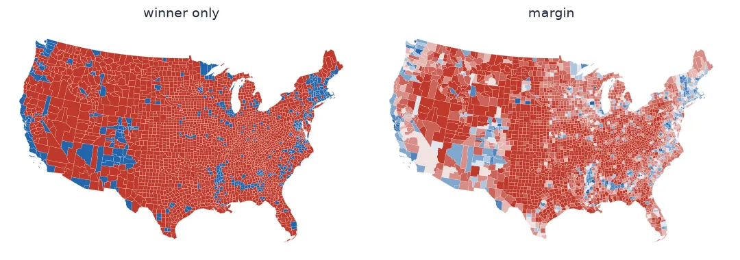
An election map looks like a statement of fact, and every one of them is a set of choices. Which quantity is shown: the winner, the margin, the change, the turnout? Over which units: states, counties, precincts, constituencies? On which base: land, people, or equal tiles? In which colours, and with what breaks? Each choice makes some things visible and others invisible, and the defaults — a winner-takes-all colour on a land map — make the most misleading combination the easiest to draw.
This page uses the 2024 US presidential results by county to measure what the common choices hide. It then lays out the alternatives covered in the rest of this topic.
Quick answer
Before drawing, decide the quantity, the unit and the base, and check what each hides:
r = c.margin > 0
print(f"winner map: {r.sum():,} red and {(~r).sum():,} blue counties; "
      f"{(c.margin.abs() < 0.10).sum():,} of them decided by under 10 points look identical to landslides")
print(f"land map: Republican-won counties are {c.km2[r].sum() / c.km2.sum():.0%} of the area, "
      f"{c.total_votes[r].sum() / c.total_votes.sum():.0%} of the votes")
print(f"inside the colours: {c.votes_dem[r].sum() / c.votes_dem.sum():.0%} of Democratic votes were cast in Republican-won counties, "
      f"{c.votes_gop[~r].sum() / c.votes_gop.sum():.0%} of Republican votes in Democratic-won ones")
winner map: 2,661 red and 448 blue counties; 303 of them decided by under 10 points look identical to landslides
land map: Republican-won counties are 86% of the area, 51% of the votes
inside the colours: 38% of Democratic votes were cast in Republican-won counties, 36% of Republican votes in Democratic-won ones
The quantity, the unit, the base, and what no map shows
1. Choose the quantity
The winner is a single bit per area; the margin carries magnitude; the change between elections carries direction; the vote count carries weight:
bands = pd.cut(c.margin, [-1, -0.5, -0.1, 0, 0.1, 0.5, 1], labels=["D+50", "D+10–50", "D<10", "R<10", "R+10–50", "R+50"])
print(bands.value_counts().reindex(["D+50", "D+10–50", "D<10", "R<10", "R+10–50", "R+50"]).to_dict())
{'D+50': 41, 'D+10–50': 279, 'D<10': 128, 'R<10': 175, 'R+10–50': 1270, 'R+50': 1216}
A winner map colours every one of these bands with one of two colours. A margin map keeps them apart. Neither shows how many people are behind each colour.
2. Choose the unit
The same election looks different at different units, because aggregation hides variation. A state is one colour, though its counties range widely:
st = c.groupby("STUSPS").agg(votes_gop=("votes_gop", "sum"), votes_dem=("votes_dem", "sum"), total=("total_votes", "sum"),
                             county_min=("margin", "min"), county_max=("margin", "max"))
st["margin"] = (st.votes_gop - st.votes_dem) / st.total
for s in ("GA", "PA", "TX"):
    print(f"{s}: statewide {st.margin[s]:+.1%}; counties from {st.county_min[s]:+.0%} to {st.county_max[s]:+.0%}")
GA: statewide +2.2%; counties from -69% to +84%
PA: statewide +1.7%; counties from -59% to +73%
TX: statewide +13.7%; counties from -39% to +92%
3. Choose the base
On a land base, the map's visual weight follows area. The alternatives re-weight it: cartograms make area follow votes, dot-density maps draw votes as dots, value-by-alpha fades sparse areas, and tile maps give every unit the same area.
4. Remember what no map shows
A county map shows totals for places, not individuals. That a county voted 60–40 says nothing about any particular voter in it. Large shares of each party's voters live in places the other party won:
print(f"Democratic votes in counties the Republican won by 30+ points: {c.votes_dem[c.margin > 0.3].sum():,}")
print(f"Republican votes in counties the Democrat won by 30+ points: {c.votes_gop[c.margin < -0.3].sum():,}")
Democratic votes in counties the Republican won by 30+ points: 8,165,573
Republican votes in counties the Democrat won by 30+ points: 6,836,135
The same data, three headlines
The data used on this page
2024 presidential results by county from tonmcg/US_County_Level_Election_Results_08-24; county boundaries from the US Census Bureau cartographic boundary files, 2023, 1:20 million. Lower 48 states and DC.
from pathlib import Path

import geopandas as gpd
import numpy as np
import pandas as pd
import requests

Path("data").mkdir(exist_ok=True)
for name, url in {"2024_US_County_Level_Presidential_Results.csv": "https://raw.githubusercontent.com/tonmcg/US_County_Level_Election_Results_08-24/master/2024_US_County_Level_Presidential_Results.csv",
                  "cb_2023_us_county_20m.zip": "https://www2.census.gov/geo/tiger/GENZ2023/shp/cb_2023_us_county_20m.zip"}.items():
    if not Path("data", name).exists():
        Path("data", name).write_bytes(requests.get(url, timeout=300).content)
res = pd.read_csv("data/2024_US_County_Level_Presidential_Results.csv", dtype={"county_fips": str})
res["fips"] = np.where(res.state_name == "District of Columbia", "11001", res.county_fips)
res = res.groupby("fips")[["votes_gop", "votes_dem", "total_votes"]].sum()
c = gpd.read_file("data/cb_2023_us_county_20m.zip")
c = c[~c.STATEFP.isin(["02", "15", "60", "66", "69", "72", "78"])].join(res, on="GEOID", how="inner").to_crs(5070)
c["km2"] = c.area / 1e6
c["margin"] = (c.votes_gop - c.votes_dem) / c.total_votes
print(f"{len(c):,} counties, {c.total_votes.sum():,} votes")
3,109 counties, 154,022,941 votes
Example 1: the same data, three headlines
r = c.margin > 0
print(f"'Republicans won {r.mean():.0%} of counties'")
print(f"'Republicans won {c.km2[r].sum() / c.km2.sum():.0%} of the land'")
print(f"'Republicans won {c.votes_gop.sum() / c.total_votes.sum():.1%} of the vote, Democrats {c.votes_dem.sum() / c.total_votes.sum():.1%}'")
'Republicans won 86% of counties'
'Republicans won 86% of the land'
'Republicans won 49.9% of the vote, Democrats 48.4%'
Each headline is true. Only one is about voters.
Counts attached to places
Election results are counts attached to places. A map can show the counts, ratios derived from them (shares, margins, swing), or the place's winner. It draws them on a base that gives each place some visual weight. The trouble is that the most familiar combination — a winner colour on land — maximises the weight of sparsely populated places and minimises the information in the colour. It is not wrong. It answers the question "where did each side win?", and that question is rarely the one readers think it answers.
The other pages in this topic work through the alternatives with the same data. Map the margin rather than the winner. Use cartograms or dots to give weight to votes rather than land. Use tiles where units are equal. Use swing to show change. Join the data carefully, because results and boundaries come from different sources. And whichever map you draw, put a number beside it: the national vote shares, so the picture can be checked against the count.
Third parties, turnout and electoral systems
- Third parties take votes from both sides; margins of the top two do not add to the total.
- Turnout is invisible on a results map; mapping it needs the eligible population.
- Precinct-level maps show far more variation than counties and need far more careful joining.
- Uncontested races (common in some legislatures) have no meaningful margin; mark them.
- Electoral systems differ: a seat map, a vote map and a proportional result can tell three stories.
- Results change until certification; date the data.
Internal links
- How to make a US county election map
- Cartograms explained
- How to make a dot-density election map
- Election map colours explained
- How to make an election swing map
FAQ
Why are election maps misleading?
Most draw a winner colour on a land map, which gives the most space to the emptiest places and hides how close each result was.
What should an election map show instead of the winner?
The margin, at least; and to show where the votes are, a cartogram, a dot-density map or a value-by-alpha map.
Does a red county mean everyone there voted Republican?
No. Maps show totals for places; a large share of each party's voters live in places the other party won.
What unit should I map election results at?
The smallest unit with reliable results and boundaries that your readers can interpret — usually counties or constituencies — and be aware that each level of aggregation hides variation within it.