
Vector Field Maps Explained
On this page
Problem statement
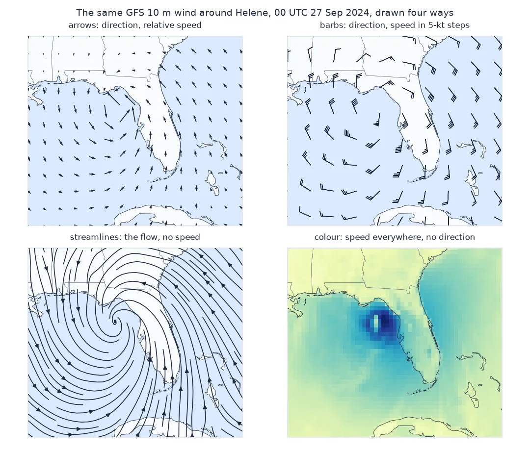
A wind field is two numbers at every point, and a map has one colour at every point. Every way of drawing wind is a compromise between showing direction, showing speed, and keeping the map readable: arrows, barbs, streamlines and colour each make a different trade. Choosing among them is a design decision with consequences, because each method hides something the others show: arrows hide the flow between them, barbs hide the pattern, streamlines hide the speed, colour hides the direction.
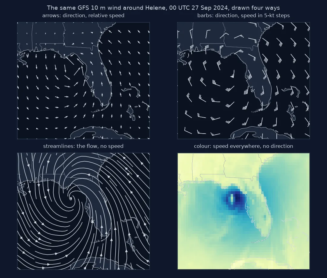
This page draws the same field, the GFS 10-metre wind around Hurricane Helene at 00 UTC on 27 September 2024, four ways, and measures what each one puts on the map.
Quick answer
Draw the same field with each method and count what reaches the reader:
fig, axs = plt.subplots(2, 2, figsize=(10, 8))
n_arrows = axs[0, 0].quiver(LON[::4], LAT[::4], U[::4, ::4], V[::4, ::4], scale=400, scale_units="width").N
n_barbs = len(axs[0, 1].barbs(LON[::6], LAT[::6], U[::6, ::6] * 1.94384, V[::6, ::6] * 1.94384, length=5).get_offsets())
sp = axs[1, 0].streamplot(LON_UP, LAT_UP, U_DEG, V_UP, density=1.6, color="k")
n_lines = len(sp.lines.get_segments())
axs[1, 1].pcolormesh(LON, LAT, SPEED, shading="nearest")
fig.savefig("four_ways.png", dpi=120)
print(f"grid points: {SPEED.size:,}; arrows: {n_arrows}; barbs: {n_barbs}; streamlines: {n_lines}; coloured cells: {SPEED.size:,}")
grid points: 6,497; arrows: 437; barbs: 195; streamlines: 131; coloured cells: 6,497
What arrows, barbs and streamlines encode and lose
1. What each method encodes
Direction and speed, and how precisely:
methods = pd.DataFrame({
    "direction": ["yes", "yes", "yes", "no"],
    "speed": ["length (relative)", "feathers, 5 kt steps", "only if coloured", "colour classes"],
    "marks": [n_arrows, n_barbs, n_lines, SPEED.size]}, index=["arrows", "barbs", "streamlines", "colour"])
print(methods.to_string())
direction speed marks
arrows yes length (relative) 437
barbs yes feathers, 5 kt steps 195
streamlines yes only if coloured 131
colour no colour classes 6497
2. What each loses: the strongest wind
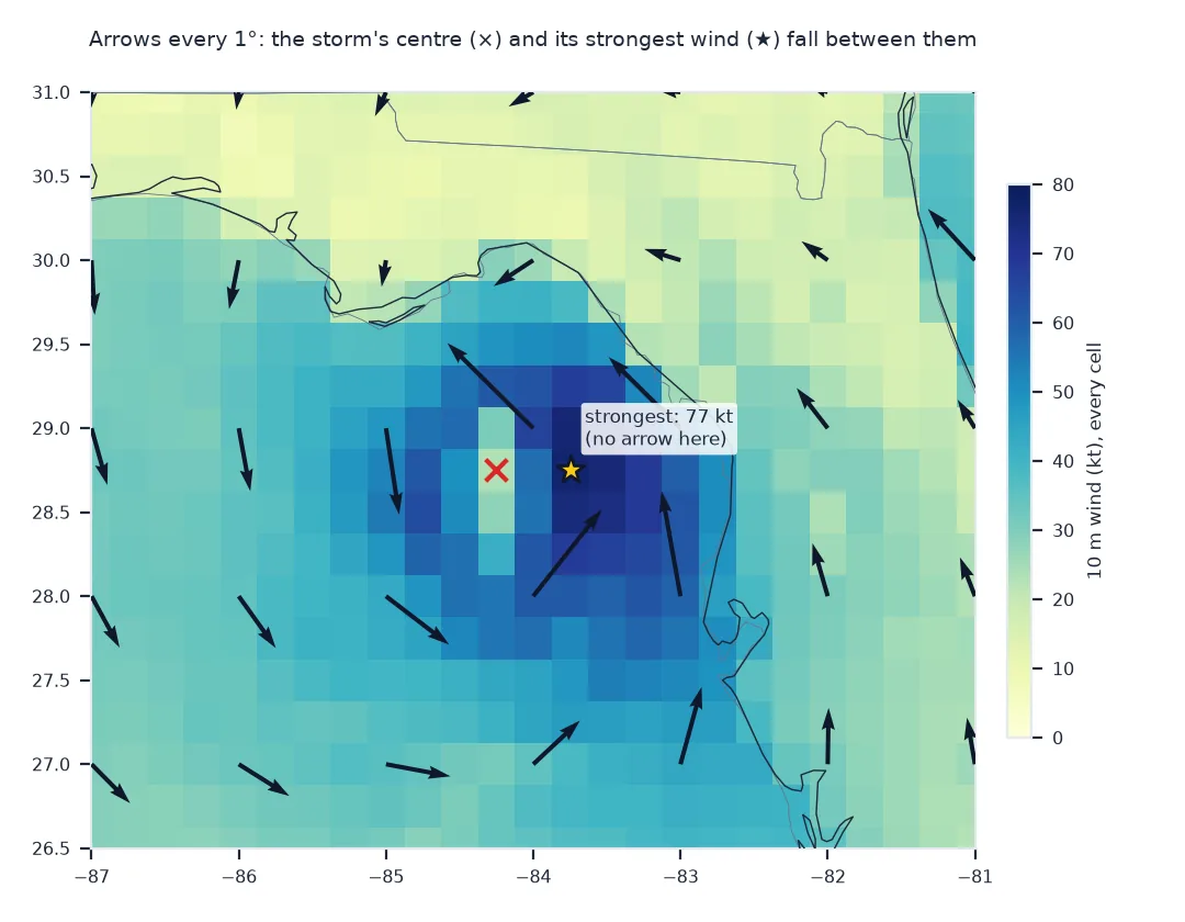
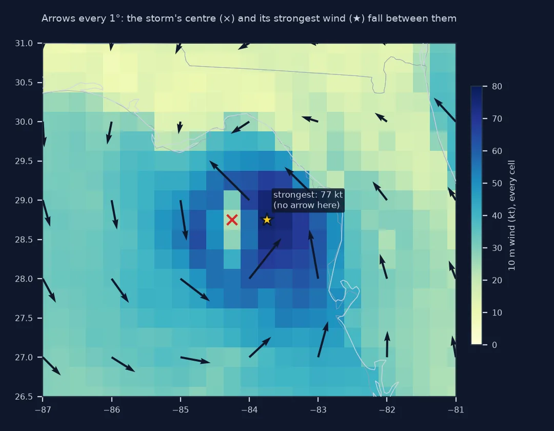
Thinning for arrows and barbs samples the field; the colour field shows every cell. Compare the strongest wind each one can show:
kt = SPEED * 1.94384
print(f"full field: {kt.max():.0f} kt; on the arrow grid (every 4th): {kt[::4, ::4].max():.0f} kt; "
      f"on the barb grid (every 6th): {kt[::6, ::6].max():.0f} kt, drawn as {np.round(kt[::6, ::6].max() / 5) * 5:.0f}")
full field: 77 kt; on the arrow grid (every 4th): 67 kt; on the barb grid (every 6th): 56 kt, drawn as 55
3. What each loses: the flow between marks
Streamlines are continuous. On the arrow grid, the circulation's centre falls between marks; measure how far the nearest arrow is from Helene's centre in the GFS:
cy, cx = 28.75, -84.25                                                  # the GFS low, from its sea-level pressure
arrow_lat, arrow_lon = LAT[::4], LON[::4]
d = np.hypot((arrow_lat[:, None] - cy) * 111, (arrow_lon[None, :] - cx) * 111 * np.cos(np.radians(cy)))
print(f"Helene's centre in the GFS: {cy}°N {abs(cx)}°W; nearest arrow {d.min():.0f} km away; arrows within 100 km: {(d < 100).sum()}")
Helene's centre in the GFS: 28.75°N 84.25°W; nearest arrow 37 km away; arrows within 100 km: 3
A combined vector field map
The data used on this page
The GFS 0.25° analysis for 00 UTC on 27 September 2024 from the NOAA GFS bucket on AWS, 10 m UGRD and VGRD, cut to 18–36°N and 90–68°W.
from pathlib import Path

import matplotlib
matplotlib.use("Agg")
import matplotlib.pyplot as plt
import numpy as np
import pandas as pd
import requests
import xarray as xr

Path("data").mkdir(exist_ok=True)
GFS = "https://noaa-gfs-bdp-pds.s3.amazonaws.com/gfs.20240927/00/atmos/gfs.t00z.pgrb2.0p25.f000"
G = Path("data/gfs_helene.grib2")
if not G.exists():
    lines = requests.get(GFS + ".idx", timeout=60).text.splitlines()
    starts = [int(l.split(":")[1]) for l in lines]
    with open(G, "wb") as f:
        for i, l in enumerate(lines):
            if ":UGRD:10 m above ground:" in l or ":VGRD:10 m above ground:" in l:
                f.write(requests.get(GFS, headers={"Range": f"bytes={starts[i]}-{starts[i + 1] - 1}"}, timeout=120).content)
ds = xr.open_dataset(G, engine="cfgrib", decode_timedelta=False, backend_kwargs={
    "indexpath": "", "filter_by_keys": {"typeOfLevel": "heightAboveGround", "level": 10}}).load()
W = ds.sel(latitude=slice(36, 18), longitude=slice(270, 292))
LON, LAT = W.longitude.values - 360, W.latitude.values
U, V = W.u10.values, W.v10.values
SPEED = np.hypot(U, V)
up = W.sortby("latitude")                                               # streamplot needs increasing latitude
LON_UP, LAT_UP, V_UP = up.longitude.values - 360, up.latitude.values, up.v10.values
U_DEG = up.u10.values / np.cos(np.radians(LAT_UP))[:, None]             # u in degrees of longitude, like v
print(f"{SPEED.size:,} grid points; speeds {SPEED.min():.1f} to {SPEED.max():.1f} m/s")
6,497 grid points; speeds 0.3 to 39.4 m/s
Example 1: a combined map
The usual answer is to combine: colour for speed, and a thin layer of arrows or streamlines for direction:
fig, ax = plt.subplots(figsize=(8, 6.5))
ax.pcolormesh(LON, LAT, SPEED, cmap="YlGnBu", shading="nearest")
ax.streamplot(LON_UP, LAT_UP, U_DEG, V_UP, density=1.0, color="0.15", linewidth=0.6)
fig.savefig("combined.png", dpi=120)
print("colour carries speed at every cell; lines carry direction and the shape of the flow")
colour carries speed at every cell; lines carry direction and the shape of the flow
Each method answers a different question
Each method answers a different question. Arrows answer "which way, roughly how strong, here": good for general audiences and sparse data, bad for dense fields. Barbs answer "exactly how strong, here", in 5-knot steps that a trained reader can count: the standard for station plots and aviation, opaque to everyone else. Streamlines answer "where does the air go": they show convergence, rotation and the overall circulation, and say nothing about speed unless coloured. Colour answers "how strong, everywhere", with no direction at all. Animated particle maps, such as earth.nullschool.net, combine flow and speed through motion, and do not print.
The practical rules follow from that. Pick the method by the question the map has to answer. Combine methods to cover both speed and direction, putting the quantity that needs precision in colour or barbs. Thin glyphs for readability, but compute from the full field, because the strongest winds can fall between the marks.
Projection, density and accessibility
- Projection: every glyph method needs the vectors rotated to the map's axes; colour does not.
- Units: barbs need knots; arrows and colour need a key or a colour bar with units.
- Density: tie glyph spacing to the printed size of the map, not to the grid.
- Accessibility: direction in shape and speed in colour suits colour-blind readers better than direction in colour.
- Time: all four are snapshots; animate or use trajectories for movement.
Internal links
- How to draw a wind arrow map in Python — arrows in detail
- How to plot wind barbs in Python — barbs in detail
FAQ
What is the best way to visualise a wind field?
It depends on the question: colour for speed everywhere, streamlines for the flow, barbs for precise values at points, arrows for a general audience; often a combination.
What is the difference between wind arrows and wind barbs?
Arrows show speed by length on a continuous scale; barbs show it by feathers in 5-knot steps, readable as numbers.
Do streamlines show wind speed?
Not on their own; colour or line width can add it.
How do I show both wind speed and direction on one map?
Colour the speed field and draw thinned arrows or streamlines on top for direction.