
How to Draw Wind Streamlines in Python
On this page
Problem statement
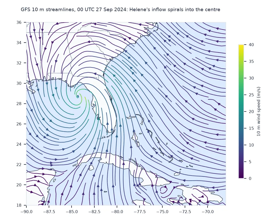
Streamlines draw a wind field as continuous curves that follow the flow, and they show what arrows hide: where air converges, where it spirals into a low, where two streams meet. Matplotlib's streamplot draws them in one call, after two surprises. It refuses grids whose coordinates decrease, which GFS latitudes do. And it integrates the curves in the units of the axes: on a longitude-latitude plot, a metre per second eastward and a metre per second northward move different distances on screen, so the curves are drawn at the wrong angle, by a few degrees near the tropics and far more towards the poles, unless u is converted to degrees of longitude.
This page draws streamlines of the GFS 10-metre wind around Hurricane Helene at 00 UTC on 27 September 2024, and measures how much the uncorrected curves are off.
Quick answer
Flip the latitudes to increasing, convert u to degrees of longitude per unit time, and colour by speed:
w = W.sortby("latitude")                                        # streamplot needs increasing coordinates
lon, lat = w.longitude.values - 360, w.latitude.values
u, v = w.u10.values, w.v10.values
u_deg = u / np.cos(np.radians(lat))[:, None]                    # metres east → degrees of longitude, like v → degrees of latitude
speed = np.hypot(u, v)
fig, ax = plt.subplots(figsize=(8, 6.5))
ax.set_aspect(1 / np.cos(np.radians(27)))
sp = ax.streamplot(lon, lat, u_deg, v, color=speed, cmap="viridis", density=1.6, linewidth=0.8, arrowsize=0.8)
fig.colorbar(sp.lines, label="10 m wind speed (m/s)")
fig.savefig("helene_streamlines.png", dpi=150)
print(f"{len(sp.lines.get_segments()):,} coloured pieces drawn (one per integration step); latitudes now {lat[0]} to {lat[-1]}")
3,507 coloured pieces drawn (one per integration step); latitudes now 18.0 to 36.0
Increasing coordinates, map units, a density
1. Give it increasing coordinates
Pass GFS's north-to-south latitudes straight in and streamplot stops:
try:
    plt.streamplot(W.longitude.values, W.latitude.values, W.u10.values, W.v10.values)
except ValueError as e:
    print(f"ValueError: {e}")
plt.close("all")
ValueError: 'y' must be strictly increasing
2. Convert u to the map's units
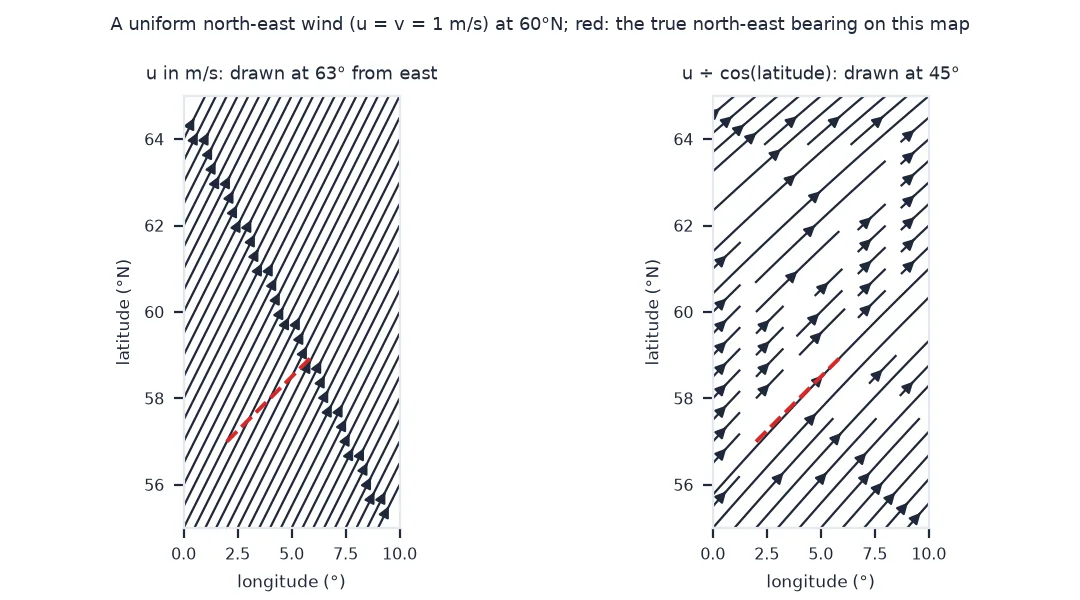
The curves are traced in axis units, here degrees. A metre per second north is the same distance at every latitude, but a metre per second east covers more degrees of longitude the further north you go, by a factor of 1/cos(latitude):
r = 1 / np.cos(np.radians(27))                                  # the aspect: 1° of latitude is drawn r times 1° of longitude
true_angle = np.degrees(np.arctan2(v, u))                       # direction of the wind on the ground, from east
raw = np.degrees(np.arctan2(v * r, u))                          # as drawn with u in m/s
fixed = np.degrees(np.arctan2(v * r, u_deg))                    # as drawn with u in degrees of longitude
wrap = lambda a: np.abs((a + 180) % 360 - 180)
print(f"largest error in the drawn direction, 18–36°N: {wrap(raw - true_angle).max():.1f}° without the conversion, "
      f"{wrap(fixed - true_angle).max():.1f}° with it")
for phi in (27, 45, 60):
    print(f"  a north-east wind on a map at {phi}°N, unconverted: drawn at {np.degrees(np.arctan2(1, np.cos(np.radians(phi)))):.1f}° from east, not 45°")
largest error in the drawn direction, 18–36°N: 3.3° without the conversion, 2.8° with it
a north-east wind on a map at 27°N, unconverted: drawn at 48.3° from east, not 45°
a north-east wind on a map at 45°N, unconverted: drawn at 54.7° from east, not 45°
a north-east wind on a map at 60°N, unconverted: drawn at 63.4° from east, not 45°
Over this map the error is small either way, 3.3° without the conversion and 2.8° with it, because a single aspect for the whole map is itself exact only at 27°N. The conversion matters as maps move poleward: at 60°N an unconverted north-easterly is drawn 18° too steep. For a map that is right everywhere, project the data and rotate the winds instead of plotting degrees.
3. Choose the density
density controls how closely the lines are packed: 1 divides the domain into a 30 × 30 grid of cells, each allowed one line. More density shows more structure but crowds the map:
for d in (0.8, 1.6, 3.0):
    f, a = plt.subplots(); s = a.streamplot(lon, lat, u_deg, v, density=d); plt.close(f)
    print(f"density {d}: {len(s.lines.get_segments()):,} streamlines")
density 0.8: 59 streamlines
density 1.6: 131 streamlines
density 3.0: 227 streamlines
Line width as wind speed
The data used on this page
The GFS 0.25° analysis for 00 UTC on 27 September 2024 from the NOAA GFS bucket on AWS, 10 m UGRD and VGRD, cut to 18–36°N and 90–68°W.
from pathlib import Path

import matplotlib
matplotlib.use("Agg")
import matplotlib.pyplot as plt
import numpy as np
import requests
import xarray as xr

Path("data").mkdir(exist_ok=True)
GFS = "https://noaa-gfs-bdp-pds.s3.amazonaws.com/gfs.20240927/00/atmos/gfs.t00z.pgrb2.0p25.f000"
G = Path("data/gfs_helene.grib2")
if not G.exists():
    lines = requests.get(GFS + ".idx", timeout=60).text.splitlines()
    starts = [int(l.split(":")[1]) for l in lines]
    with open(G, "wb") as f:
        for i, l in enumerate(lines):
            if ":UGRD:10 m above ground:" in l or ":VGRD:10 m above ground:" in l:
                f.write(requests.get(GFS, headers={"Range": f"bytes={starts[i]}-{starts[i + 1] - 1}"}, timeout=120).content)
ds = xr.open_dataset(G, engine="cfgrib", decode_timedelta=False, backend_kwargs={
    "indexpath": "", "filter_by_keys": {"typeOfLevel": "heightAboveGround", "level": 10}}).load()
W = ds.sel(latitude=slice(36, 18), longitude=slice(270, 292))
print(f"{W.sizes['latitude']} × {W.sizes['longitude']}; first latitudes {W.latitude.values[:3]}")
73 × 89; first latitudes [36. 35.75 35.5 ]
Example 1: line width as speed
Line width can carry speed instead of colour, leaving colour free for another field:
lw = 0.4 + 2.2 * speed / speed.max()
f, a = plt.subplots(figsize=(8, 6.5)); a.set_aspect(1 / np.cos(np.radians(27)))
a.streamplot(lon, lat, u_deg, v, linewidth=lw, color="k", density=1.4, arrowsize=0.7)
f.savefig("helene_streamlines_width.png", dpi=150); plt.close(f)
print(f"line widths from {lw.min():.2f} to {lw.max():.2f} points")
line widths from 0.42 to 2.60 points
A streamline is not a trajectory
A streamline is a curve that is tangent to the wind everywhere along it, traced at one instant. It is not the path a parcel of air follows over time, which is a trajectory; in a field that changes, as around a moving hurricane, the two differ. Streamlines are best at showing the topology of a flow: where it converges into a low, diverges out of a high, or splits around an obstacle.
Matplotlib traces streamlines by integrating the field in axis coordinates, so the units of u and v must match the units of the axes. On a longitude-latitude plot that means degrees per unit time in both directions, which is why u is divided by the cosine of latitude. On a projected map, the components have to be rotated into the projection's x and y and expressed per metre of map distance.
Even spacing, start points and broken lines
- Even spacing:
streamplotneeds an evenly spaced grid; regrid irregular data first. - Start points:
start_pointsdraws lines through chosen locations, such as station positions. - Broken lines: lines stop at the edge of a cell already used, which is how
densityworks; raisedensityfor longer lines. - Time: streamlines are a snapshot; for movement over time, compute trajectories.
- Speed: streamlines on their own lose speed; add colour or width.
Internal links
- How to draw a wind arrow map in Python — arrows instead of lines
- How to plot wind barbs in Python — barbs in knots
FAQ
How do I draw wind streamlines in Python?
Use matplotlib.pyplot.streamplot(x, y, u, v) with increasing, evenly spaced coordinates; on a longitude-latitude grid divide u by the cosine of latitude.
Why does streamplot say y must be strictly increasing?
GFS and many other grids store latitude from north to south; sort the data by latitude before plotting.
What is the difference between streamlines and trajectories?
Streamlines follow the wind at one instant; trajectories follow air parcels through time and differ when the wind field changes.
How do I show wind speed on a streamline map?
Pass the speed array to color with a colour map, or to linewidth.