
How to Draw a Wind Arrow Map in Python
On this page
Problem statement
An arrow per grid point is the most direct way to draw a wind field: the arrow points where the air is going, and its length shows the speed. Drawn naively, it is also unreadable. The 0.25° GFS has 6,497 points in a view of the Gulf of Mexico and the south-east, so the arrows overlap into a texture; matplotlib's automatic scaling makes the length mean nothing a reader can decode; and without a reference arrow nobody knows what length is 10 m/s.
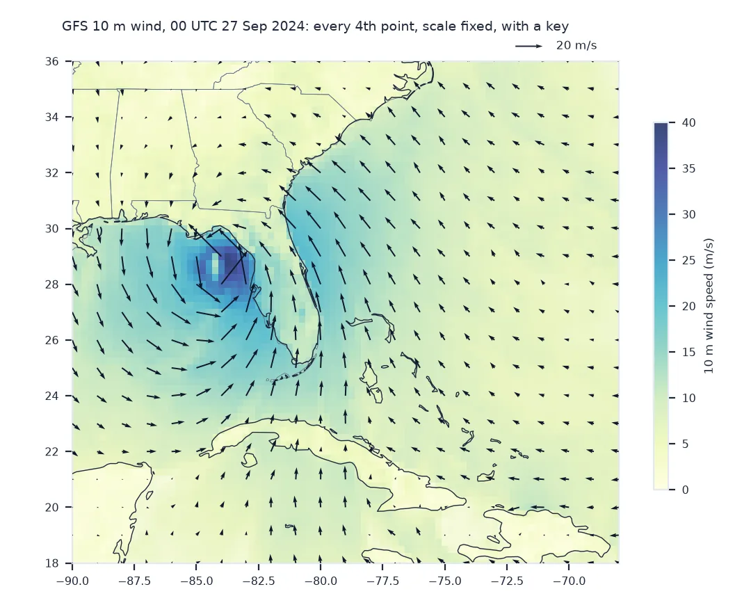
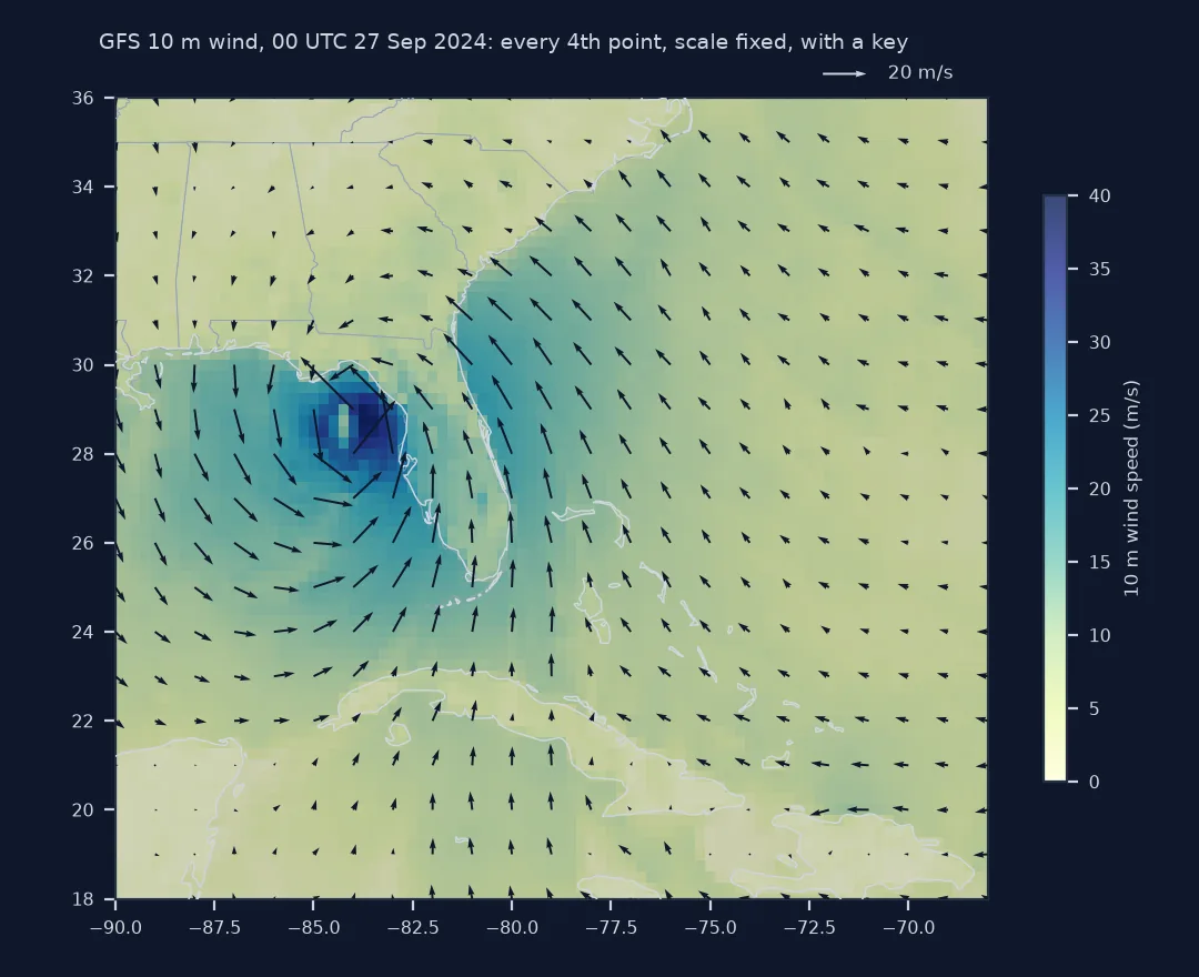
This page draws the GFS 10-metre wind around Hurricane Helene at 00 UTC on 27 September 2024 with matplotlib.pyplot.quiver, choosing the thinning, the scale and the key deliberately.
Quick answer
Thin the grid to a readable density, fix the scale in data units, and add a key:
step = 4                                                       # every 4th point: 1° apart on a 0.25° grid
fig, ax = plt.subplots(figsize=(8, 6.5))
ax.set_aspect(1 / np.cos(np.radians(27)))                      # degrees of longitude are shorter than degrees of latitude
speed = np.hypot(W.u10, W.v10)
ax.pcolormesh(LON, LAT, speed, cmap="YlGnBu", vmin=0, vmax=40, shading="nearest")
q = ax.quiver(LON[::step], LAT[::step], W.u10.values[::step, ::step], W.v10.values[::step, ::step],
              scale=400, scale_units="width", width=0.0025)     # 400 m/s spans the axes width
ax.quiverkey(q, 0.88, 1.03, 20, "20 m/s", labelpos="E")
fig.savefig("helene_arrows.png", dpi=150)
print(f"grid {W.u10.shape[0]} × {W.u10.shape[1]} = {W.u10.size:,} points; arrows drawn: {W.u10.values[::step, ::step].size:,}")
print(f"speed: median {float(speed.median()):.1f} m/s, strongest {float(speed.max()):.1f} m/s")
grid 73 × 89 = 6,497 points; arrows drawn: 437
speed: median 6.8 m/s, strongest 39.4 m/s
Choose density, fix the scale, keep north up
1. Choose the density
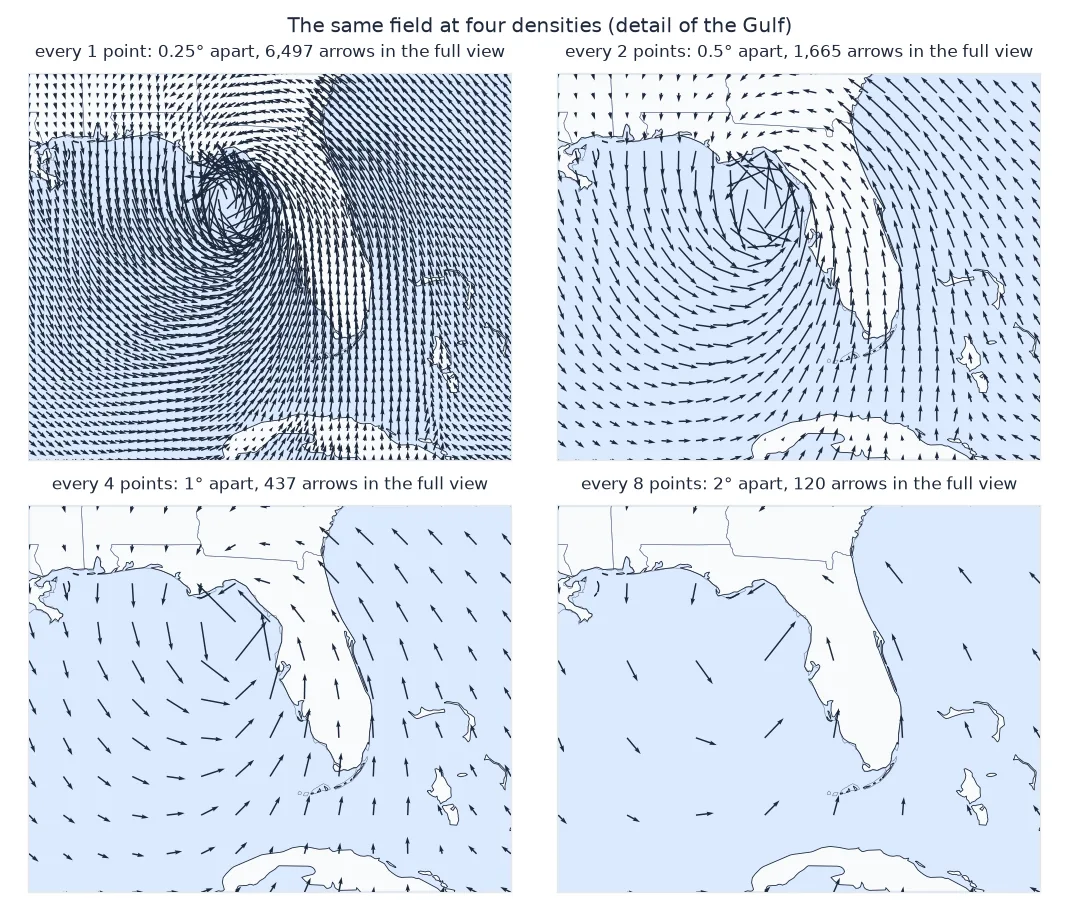
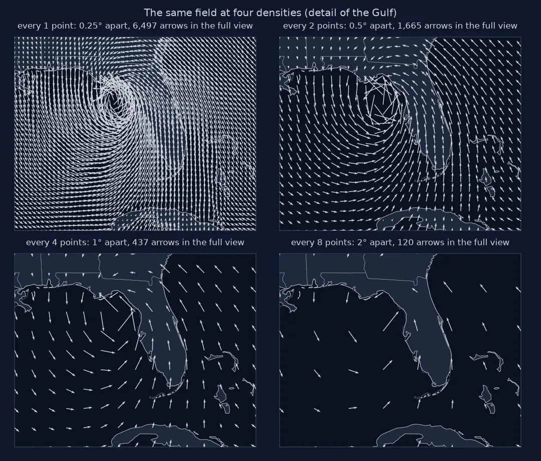
Arrows need room to be read: as a rule of thumb, an arrow's length at typical speeds should be shorter than the spacing between arrows:
for s in (1, 2, 4, 8):
    n = W.u10.values[::s, ::s].size
    print(f"every {s} point(s): {n:>6,} arrows, {0.25 * s:.2f}° apart")
every 1 point(s): 6,497 arrows, 0.25° apart
every 2 point(s): 1,665 arrows, 0.50° apart
every 4 point(s): 437 arrows, 1.00° apart
every 8 point(s): 120 arrows, 2.00° apart
2. Fix the scale
By default quiver picks a scale from the data, so two maps with different winds get arrows of the same length. With scale_units="width", scale=400 means 400 m/s is drawn as the full width of the axes, so the same wind is the same length on every map that uses it:
axes_width_deg = float(LON.max() - LON.min())
for v in (5, 20, float(speed.max())):
    print(f"{v:4.1f} m/s → {v / 400:.1%} of the width = {v / 400 * axes_width_deg:.2f}° of longitude")
5.0 m/s → 1.2% of the width = 0.28° of longitude
20.0 m/s → 5.0% of the width = 1.10° of longitude
39.4 m/s → 9.8% of the width = 2.17° of longitude
At 1° spacing, 20 m/s is a little longer than the gap to the next arrow, and the strongest wind about twice that, which is crowded only in the eyewall.
3. Keep north up and east right
quiver draws an arrow from its u and v in screen space by default (angles="uv"). On a plain longitude-latitude plot, east is to the right and north is up, so that is correct even after set_aspect. On a projected map the axes are not east and north, and the components have to be rotated first:
print(f"aspect: 1° of longitude is drawn {np.cos(np.radians(27)):.2f} as long as 1° of latitude at 27°N")
print("quiver default angles:", plt.quiver.__doc__.split("angles : {'uv', 'xy'} or array-like, default: ")[1][:4])
aspect: 1° of longitude is drawn 0.89 as long as 1° of latitude at 27°N
quiver default angles: 'uv'
Colouring arrows by speed
The data used on this page
The GFS 0.25° analysis for 00 UTC on 27 September 2024 from the NOAA GFS bucket on AWS, 10 m UGRD and VGRD, cut to 18–36°N and 90–68°W.
from pathlib import Path

import matplotlib
matplotlib.use("Agg")
import matplotlib.pyplot as plt
import numpy as np
import requests
import xarray as xr

Path("data").mkdir(exist_ok=True)
GFS = "https://noaa-gfs-bdp-pds.s3.amazonaws.com/gfs.20240927/00/atmos/gfs.t00z.pgrb2.0p25.f000"
G = Path("data/gfs_helene.grib2")
if not G.exists():
    lines = requests.get(GFS + ".idx", timeout=60).text.splitlines()
    starts = [int(l.split(":")[1]) for l in lines]
    with open(G, "wb") as f:
        for i, l in enumerate(lines):
            if ":UGRD:10 m above ground:" in l or ":VGRD:10 m above ground:" in l:
                f.write(requests.get(GFS, headers={"Range": f"bytes={starts[i]}-{starts[i + 1] - 1}"}, timeout=120).content)
ds = xr.open_dataset(G, engine="cfgrib", decode_timedelta=False, backend_kwargs={
    "indexpath": "", "filter_by_keys": {"typeOfLevel": "heightAboveGround", "level": 10}}).load()
W = ds.sel(latitude=slice(36, 18), longitude=slice(270, 292))
LON, LAT = W.longitude.values - 360, W.latitude.values
print(f"{W.sizes['latitude']} × {W.sizes['longitude']} grid points, {LON.min()} to {LON.max()}°E, {LAT.min()} to {LAT.max()}°N")
73 × 89 grid points, -90.0 to -68.0°E, 18.0 to 36.0°N
Example 1: colour by speed instead of a background
Arrows can carry the speed in colour as well as length, which frees the background for something else, such as pressure:
fig, ax = plt.subplots(figsize=(8, 6.5))
ax.set_aspect(1 / np.cos(np.radians(27)))
s = (slice(None, None, step), slice(None, None, step))
q = ax.quiver(LON[::step], LAT[::step], W.u10.values[s], W.v10.values[s], speed.values[s],
              cmap="viridis", scale=400, scale_units="width", width=0.003)
fig.colorbar(q, label="10 m wind speed (m/s)")
fig.savefig("helene_arrows_coloured.png", dpi=150)
print(f"colour range: {float(speed.values[s].min()):.1f} to {float(speed.values[s].max()):.1f} m/s across the thinned arrows")
colour range: 0.4 to 34.2 m/s across the thinned arrows
The thinned arrows top out at 34.2 m/s. The strongest wind on the full grid, 39.4 m/s, lies between them, which is the cost of thinning by taking every fourth point.
Why wind maps show speed twice
An arrow shows direction directly, but its length means nothing until it is read against the key, and long arrows crowd their neighbours. That is why wind maps often show speed twice, in arrow length and in a colour field beneath, and why the key matters: it is the only way to read a length as a number.
Thinning by taking every nth point is the simplest choice and is fine for a smooth field. Where the field has small, strong features, as near a hurricane's eye, it can skip the strongest winds altogether; averaging the components over each block before drawing keeps them. Thinning never changes the data: compute from the full grid, thin only for display.
Arrow heads, data units and the dateline
- Arrow head: very short arrows become dots; set
minlengthor mask calm points. - Data units vs screen:
scale_units="xy"withangles="xy"ties arrows to data units, which distorts directions when the aspect is not 1. - Projected maps: rotate
uandvto the map's x and y before drawing; on a Lambert or polar map north is not up. - Averaging for thinning: average
uandv, never speeds and directions. - Pole and dateline: thin and plot regional cuts; global arrow maps crowd at high latitudes on a plate carrée grid.
Internal links
- How to calculate wind speed and direction from u and v — the components
- How to download GFS wind data from AWS — the data
FAQ
How do I plot wind arrows in Python?
Use matplotlib.pyplot.quiver(lon, lat, u, v) with a thinned grid, a fixed scale and a quiverkey showing the length of a known speed.
Why are my quiver arrows all the same length on every map?
quiver scales arrows from the data by default; set scale and scale_units explicitly so the same wind speed is the same length on every map.
How many wind arrows should a map have?
Few enough that arrows at typical speeds are shorter than the space between them; on a regional map, roughly one per degree.
Should I use arrows or wind barbs?
Arrows suit general audiences and show flow; barbs, read in knots by meteorologists, show speed more precisely.