
Why Is My Flow Map an Unreadable Tangle of Lines?
On this page
Problem statement
You draw every origin–destination pair as a line and get a solid smudge. Thousands of lines cross the same pixels, the busy routes disappear under the quiet ones, and the map says only "there is a lot of movement here". This is overplotting, and adding more styling does not fix it. The fix is to draw less, by filtering, aggregating or letting transparency add up. Each of those throws something away, so the honest version says what share of the flows the picture still shows.
This page reproduces the tangle with a month of Citi Bike trips between 157 stations in Jersey City and Hoboken. It measures four ways out of it: the ink each covers and the trips each represents.
Quick answer
Do not draw every pair. Either keep the pairs that carry most trips, or aggregate the endpoints into larger zones first, and say what share of trips the map shows:
cells = pairs.assign(o=pairs.start_station_id.map(CELL), d=pairs.end_station_id.map(CELL))
cells = cells[cells.o != cells.d].groupby(["o", "d"], as_index=False).trips.sum()
keep = cells.nlargest(60, "trips")
print(f"{len(pairs):,} station pairs -> {len(cells):,} H3 cell pairs; top 60 cell pairs carry "
      f"{keep.trips.sum() / pairs.trips.sum():.0%} of trips between stations")
5,506 station pairs -> 777 H3 cell pairs; top 60 cell pairs carry 58% of trips between stations
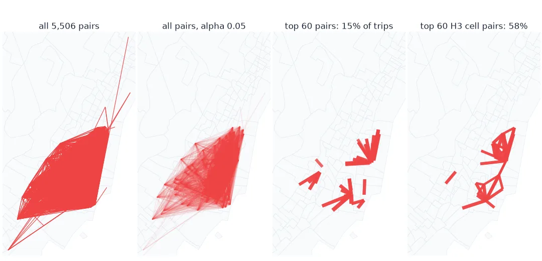
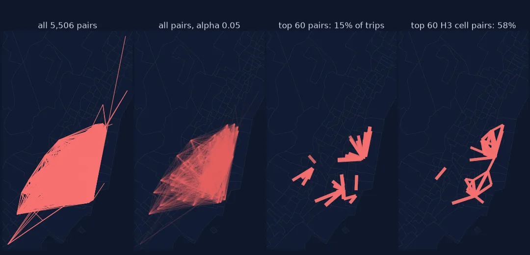
Measure the tangle, try transparency, compare representations
1. Measure the tangle
Render each version at the same size and count how much of the frame the lines cover. A map whose lines cover most of the land carries no pattern:
def coverage(segments, widths, alpha=1.0):
    fig = plt.figure(figsize=(4, 5), dpi=100); ax = fig.add_axes([0, 0, 1, 1]); ax.set_axis_off()
    ax.add_collection(LineCollection(segments, linewidths=widths, colors="black", alpha=alpha))
    ax.set_xlim(*XLIM); ax.set_ylim(*YLIM); fig.canvas.draw()
    img = np.asarray(fig.canvas.buffer_rgba())[..., 0]; plt.close(fig)
    return (img < 128).mean()                                                 # share of pixels darker than mid-grey

seg = lambda df, xy: [[xy[a], xy[b]] for a, b in zip(df.iloc[:, 0], df.iloc[:, 1])]
all_lines = coverage(seg(pairs, XY), 0.6)
top60 = pairs.nlargest(60, "trips")
print(f"all {len(pairs):,} pairs: {all_lines:.0%} of the frame covered; top 60: {coverage(seg(top60, XY), 1.5):.0%}")
all 5,506 pairs: 17% of the frame covered; top 60: 1%
2. Try transparency
With a low alpha, overlapping lines add up, so busy corridors darken and single trips fade. It keeps every pair but shows density rather than individual flows:
faint = coverage(seg(pairs, XY), 0.6, alpha=0.05)
print(f"all pairs at alpha 0.05: {faint:.0%} of the frame darker than mid-grey")
all pairs at alpha 0.05: 7% of the frame darker than mid-grey
3. Compare what each version represents
Ink is half the story; the other half is how many trips the picture accounts for:
rows = [("all station pairs", len(pairs), 1.0),
        ("top 60 station pairs", 60, top60.trips.sum() / pairs.trips.sum()),
        ("top 60 H3 cell pairs", 60, keep.trips.sum() / pairs.trips.sum())]
for name, n, share in rows:
    print(f"{name:22s}: {n:>5,} lines, {share:.0%} of trips between stations")
all station pairs : 5,506 lines, 100% of trips between stations
top 60 station pairs : 60 lines, 15% of trips between stations
top 60 H3 cell pairs : 60 lines, 58% of trips between stations
Cell pairs drawn with their coverage
The data used on this page
Citi Bike system data, Jersey City and Hoboken trips for June 2024. Stations are grouped into H3 cells at resolution 8 (about 0.7 km² each) with the h3 library; coordinates are projected to New Jersey State Plane (EPSG:3424).
import zipfile
from pathlib import Path

import geopandas as gpd
import h3
import matplotlib
matplotlib.use("Agg")
import matplotlib.pyplot as plt
import numpy as np
import pandas as pd
import requests
from matplotlib.collections import LineCollection

Path("data").mkdir(exist_ok=True)
F = Path("data/JC-202406-citibike-tripdata.csv.zip")
if not F.exists():
    F.write_bytes(requests.get("https://s3.amazonaws.com/tripdata/" + F.name, timeout=600).content)
with zipfile.ZipFile(F) as z:
    t = pd.read_csv(z.open("JC-202406-citibike-tripdata.csv"), dtype={"start_station_id": str, "end_station_id": str})
t = t.dropna(subset=["start_station_id", "end_station_id"])
t = t[t.start_station_id != t.end_station_id]
st = t.groupby("start_station_id")[["start_lat", "start_lng"]].median()
t = t[t.end_station_id.isin(st.index)]
pairs = t.groupby(["start_station_id", "end_station_id"]).size().rename("trips").reset_index()
p = gpd.GeoSeries(gpd.points_from_xy(st.start_lng, st.start_lat), crs=4326).to_crs(3424)
XY = dict(zip(st.index, zip(p.x, p.y)))
CELL = {s: h3.latlng_to_cell(r.start_lat, r.start_lng, 8) for s, r in st.iterrows()}
cell_pts = {c: np.mean([XY[s] for s in st.index if CELL[s] == c], axis=0) for c in set(CELL.values())}
x0, y0, x1, y1 = p.total_bounds
XLIM, YLIM = (x0 - 1000, x1 + 1000), (y0 - 1000, y1 + 1000)
print(f"{len(pairs):,} station pairs, {pairs.trips.sum():,} trips; {len(st)} stations in {len(cell_pts)} H3 cells")
5,506 station pairs, 104,718 trips; 156 stations in 37 H3 cells
Example 1: cell pairs drawn with their coverage
cell_cov = coverage(seg(keep[["o", "d"]], cell_pts), 1.5)
print(f"top 60 H3 cell pairs: {cell_cov:.0%} of the frame covered")
top 60 H3 cell pairs: 2% of the frame covered
Too many lines for the pixels available
Overplotting is a ratio problem: too many lines for the pixels available. A flow map at street scale has thousands of pairs, most of them a few trips each, and every line costs the same ink whatever it carries. Drawing them all shows that bikes go everywhere, which the reader already assumed. The pattern, where the heavy flows run, is in a small fraction of the pairs.
The three remedies differ in what they discard. Filtering keeps a few individual pairs and drops the rest, so it should state the share of trips it shows. Transparency keeps everything and turns the picture into a density map, where single routes can no longer be read. Aggregation merges nearby stations so that many small flows become a few larger ones. It loses detail inside each zone but covers more of the trips with the same number of lines. Here the top 60 cell pairs account for more trips than the top 60 station pairs.
Draw order, zone choice and edge bundling
- Draw order still matters after filtering: sort by flow so the largest lines are on top.
- Zone choice changes the picture; H3 cells are neutral, while neighbourhoods match how people describe places.
- Edge bundling (merging lines that run in parallel) is another remedy; it distorts geometry and needs explaining.
- Small multiples by time of day split one tangle into several readable maps.
- Coverage depends on line width and image size; compare versions at the size they will be published.
Internal links
- How to make a flow map in Python — widths, curves and drawing order
- How to map bike-share trips as flows — the same trips mapped
FAQ
How do I fix an overcrowded flow map?
Draw fewer lines: keep the flows that carry most of the volume, aggregate endpoints into larger zones, or use transparency to turn the lines into a density picture.
What alpha should I use for many flow lines?
Low enough that a single line is faint and a busy corridor is dark, typically 0.02–0.1 for thousands of lines. Check the result at publication size.
Does filtering flows hide data?
Yes, by design. State what share of trips or movers the map shows, so the reader knows what is left out.
Is aggregation better than filtering?
It often represents more of the trips with the same number of lines, at the cost of detail within each zone.