
How to Make a Flow Map in Python
On this page
Problem statement
A flow map draws movement between places as lines whose width shows how much moved. It is the natural map for migration, commuting, trade and trips. It is also easy to make unreadable. Draw every pair and the lines pile into a black tangle. Draw them straight and flows in opposite directions sit on top of each other. Scale width linearly and one big flow hides everything else. Draw small lines last and they cover the big ones.
This page draws the largest moves out of Los Angeles County, from the Census county-to-county migration flows. It shows the choices that make a flow map readable: which flows to draw, how to bend them, how to scale and order them.
Quick answer
Project the county centroids, keep the largest flows, bend each line into a curve, scale width by the square root of the flow, and draw the smallest first:
def bezier(p0, p1, bend=0.2, n=40):
    p0, p1 = np.asarray(p0), np.asarray(p1)
    mid, d = (p0 + p1) / 2, p1 - p0
    ctrl = mid + bend * np.array([d[1], -d[0]])                        # perpendicular, to the right of travel
    t = np.linspace(0, 1, n)[:, None]
    return (1 - t) ** 2 * p0 + 2 * (1 - t) * t * ctrl + t ** 2 * p1

top = flows.nlargest(40, "movers").sort_values("movers")              # small first, so big flows sit on top
o = CENTROID["06037"]
fig, ax = plt.subplots(figsize=(10, 6))
STATES.plot(ax=ax, color="#f2f2f2", edgecolor="#bbbbbb", lw=0.4)
for _, r in top.iterrows():
    d = CENTROID[r.dest]
    ax.plot(*bezier(o, d, bend=0.2).T, color="#c0392b", lw=0.3 + 5 * np.sqrt(r.movers / top.movers.max()),
            alpha=0.75, solid_capstyle="round")
ax.set_axis_off()
fig.savefig("data/la_flows.png", dpi=150)
print(f"{len(top)} flows drawn, {top.movers.sum():,.0f} of {flows.movers.sum():,.0f} movers ({top.movers.sum() / flows.movers.sum():.0%})")
40 flows drawn, 227,761 of 321,009 movers (71%)
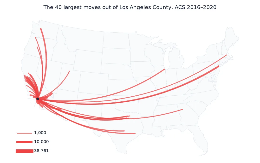
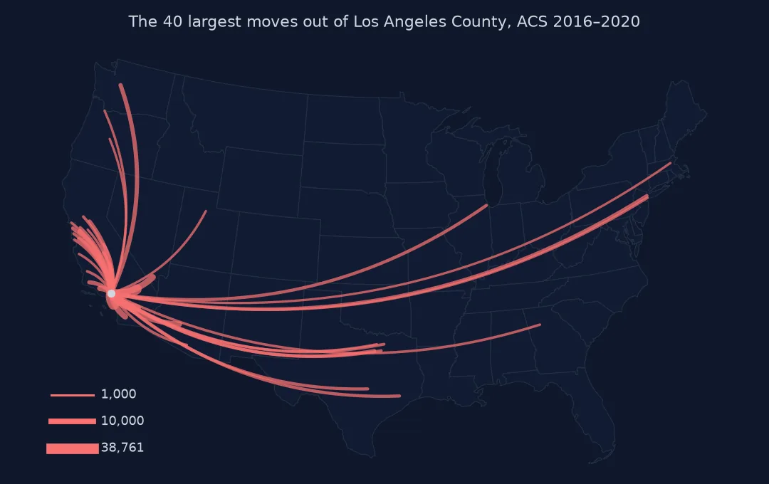
How many flows, bent lines, scaled widths, draw order
1. Decide how many flows to draw
Los Angeles sent people to more than a thousand counties. A few carry most of the volume, so a cut-off loses little:
s = flows.sort_values("movers", ascending=False).movers
share = s.cumsum() / s.sum()
for n in (10, 40, 100, 400):
    print(f"top {n:>3} flows: {share.iloc[n - 1]:.0%} of movers")
print(f"flows needed for 80% of movers: {int((share < 0.8).sum()) + 1} of {len(s):,}")
top 10 flows: 50% of movers
top 40 flows: 71% of movers
top 100 flows: 83% of movers
top 400 flows: 97% of movers
flows needed for 80% of movers: 78 of 1,023
2. Bend the lines
A straight line from Los Angeles to Las Vegas and one from Las Vegas to Los Angeles would overlap exactly. Bending every line the same way, here to the right of its direction of travel, separates the two directions and makes the map easier to read where lines fan out. The quick answer's bezier is a quadratic Bézier curve: one control point, offset sideways from the midpoint. Check that it separates the two directions:
a, b = CENTROID["06037"], CENTROID["32003"]                             # Los Angeles and Clark County, Nevada
out, back = bezier(a, b), bezier(b, a)
print(f"LA -> Clark and Clark -> LA midpoints are {np.linalg.norm(out[20] - back[20]) / 1000:.0f} km apart")
LA -> Clark and Clark -> LA midpoints are 64 km apart
3. Scale the width
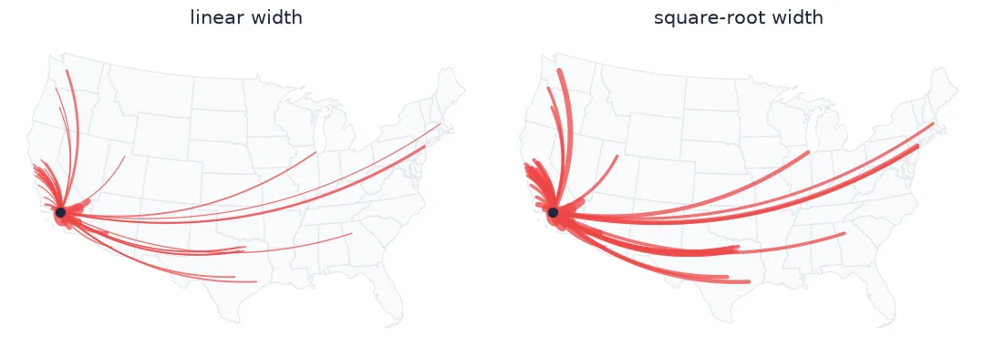
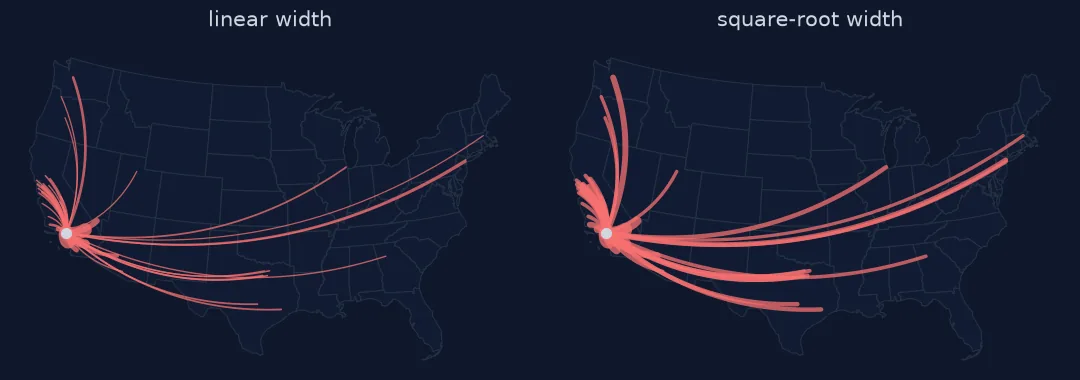
Flows span four orders of magnitude. With linear width, a 1,000-person flow becomes a hairline next to the 38,761 who moved to Orange County; square-root width keeps it visible:
big, small = top.movers.max(), 1000
for name, f in (("linear", lambda v: v / big), ("square root", lambda v: np.sqrt(v / big))):
    print(f"{name:12s}: widest {0.3 + 5 * f(big):.1f} pt, a 1,000-person flow {0.3 + 5 * f(small):.2f} pt")
linear : widest 5.3 pt, a 1,000-person flow 0.43 pt
square root : widest 5.3 pt, a 1,000-person flow 1.10 pt
4. Order the drawing
Matplotlib draws in call order, so the last line is on top. Sorting ascending puts the widest flows on top, where they cannot be hidden. The reverse order buries them under a mesh of thin lines.
Moves in and out of Los Angeles on one map
The data used on this page
County-to-county migration flows, 2016–2020 ACS (the "ins, outs, nets, gross" workbook) and the Census Bureau's 2023 cartographic boundary files for counties and states, projected to CONUS Albers (EPSG:5070).
from pathlib import Path

import geopandas as gpd
import matplotlib
matplotlib.use("Agg")
import matplotlib.pyplot as plt
import numpy as np
import pandas as pd
import requests

Path("data").mkdir(exist_ok=True)
GEO = "https://www2.census.gov/geo/tiger/GENZ2023/shp/"
SRC = {"county-to-county-2016-2020-ins-outs-nets-gross.xlsx": "https://www2.census.gov/programs-surveys/demo/tables/geographic-mobility/2020/"
       "county-to-county-migration-2016-2020/county-to-county-migration-flows/county-to-county-2016-2020-ins-outs-nets-gross.xlsx",
       "cb_2023_us_county_20m.zip": GEO + "cb_2023_us_county_20m.zip", "cb_2023_us_state_20m.zip": GEO + "cb_2023_us_state_20m.zip"}
for name, url in SRC.items():
    if not Path("data", name).exists():
        Path("data", name).write_bytes(requests.get(url, timeout=600).content)
COLS = ["a_st", "a_cty", "b_st", "b_cty", "a_state", "a_county", "b_state", "b_county",
        "flow", "flow_moe", "counter", "counter_moe", "net", "net_moe", "gross", "gross_moe"]
ca = pd.read_excel("data/county-to-county-2016-2020-ins-outs-nets-gross.xlsx", sheet_name="California",
                   header=None, skiprows=3, names=COLS, dtype=str)
la = ca[(ca.a_cty == "037") & ca.b_st.str.fullmatch(r"\d{3}", na=False)]
flows = pd.DataFrame({"dest": la.b_st.str[1:] + la.b_cty, "movers": pd.to_numeric(la.counter, errors="coerce")})
counties = gpd.read_file("data/cb_2023_us_county_20m.zip").query("STUSPS not in ['AK', 'HI', 'PR']").to_crs(5070)
flows = flows[flows.dest.isin(counties.GEOID) & (flows.movers > 0)]
CENTROID = {g: (p.x, p.y) for g, p in zip(counties.GEOID, counties.representative_point())}
STATES = gpd.read_file("data/cb_2023_us_state_20m.zip").query("STUSPS not in ['AK', 'HI', 'PR']").to_crs(5070)
print(f"{len(flows):,} flows out of Los Angeles County to contiguous US counties, {flows.movers.sum():,.0f} movers")
1,023 flows out of Los Angeles County to contiguous US counties, 321,009 movers
Example 1: in and out on one map
inflow = pd.DataFrame({"dest": la.b_st.str[1:] + la.b_cty, "movers": pd.to_numeric(la.flow, errors="coerce")})
inflow = inflow[inflow.dest.isin(counties.GEOID)].nlargest(15, "movers")
outflow = flows.nlargest(15, "movers")
print("both directions in the top 15:", sorted(set(inflow.dest) & set(outflow.dest)))
print(f"top-15 out {outflow.movers.sum():,.0f}, top-15 in {inflow.movers.sum():,.0f}")
both directions in the top 15: ['04013', '06001', '06029', '06059', '06065', '06071', '06073', '06075', '06085', '06111', '32003', '36061', '53033']
top-15 out 182,404, top-15 in 105,444
Every visual choice changes what is seen first
A flow map turns a table of pairs into lines, and every visual choice changes what the reader sees first. Cutting to the top flows keeps the picture readable and loses surprisingly little. Curving separates directions and stops lines crossing at the origin. Square-root widths compress the range so small flows stay visible. Drawing order puts the largest flows on top.
Two things are easy to forget. Line length is not data: a long line to New York draws far more ink than a short line to Orange County, though the Orange County flow is several times larger. The eye reads ink as importance, so width must carry the message, and the legend should say what width means. And a flow map from one origin is a different object from a map of all flows between all places. The second needs aggregation or filtering before any line is drawn.
Projection, centroids and short flows
- Projection: draw in a projected CRS (here EPSG:5070); straight lines in longitude and latitude bend unpredictably once projected.
- Centroids: use
representative_point()so the line ends inside the county, even for odd shapes. - Short flows between neighbours are hard to see as lines; a choropleth of the same values complements them.
- Legend: show two or three line widths with their values.
- Uncertainty: small ACS flows have large margins of error; drawing only the top flows also avoids drawing noise.
Internal links
- How to read county-to-county migration flows — the data behind this map
- Flow maps explained — the design choices in general
FAQ
How do I make a flow map in Python?
Get origin and destination coordinates in a projected CRS, then draw a line for each flow with matplotlib, with width scaled to the flow, sorted so the largest lines are drawn last.
Why curve the lines on a flow map?
Curves separate opposite directions between the same two places and reduce overlap where many lines leave one origin.
How should line width scale with flow size?
Usually with the square root of the flow, so that one very large flow does not make all the others invisible.
How many flows should a flow map show?
Enough to carry most of the volume. Here, 40 of more than a thousand flows carry most of the movers.