
Flow Maps Explained: What a Line on a Map Says About Movement
On this page
Problem statement
A flow map draws movement as lines between places, usually with width showing volume. It is one of the oldest thematic map types. Charles Minard drew trade and migration flows in the 1800s. It is also one of the easiest to misread. A line has length, curvature, direction, colour and width, but only width is meant to carry the data. The eye weighs a line by all of them at once, and length dominates: a long line to a distant city draws far more ink than a short, heavy flow to the next county. Every design decision on a flow map either fights that bias or feeds it.
This page explains what a flow map encodes, the main kinds of flow map, and how much the length bias distorts the picture. It measures that bias on a map of moves out of Los Angeles County.
Quick answer
On a flow map, width carries the volume; length, curvature and position carry geography, not data. Because ink grows with length × width, long flows look more important than they are. Measure the bias on a map before trusting it:
top = flows.nlargest(40, "movers").copy()
top["km"] = [np.hypot(*(np.array(CENTROID[d]) - np.array(ORIGIN))) / 1000 for d in top.dest]
top["width"] = 0.3 + 5 * np.sqrt(top.movers / top.movers.max())
top["ink"] = top.km * top.width
far = top.km > 1000
print(f"flows over 1,000 km: {far.mean():.0%} of the lines, {top.loc[far, 'movers'].sum() / top.movers.sum():.0%} of the movers, "
      f"{top.loc[far, 'ink'].sum() / top.ink.sum():.0%} of the ink")
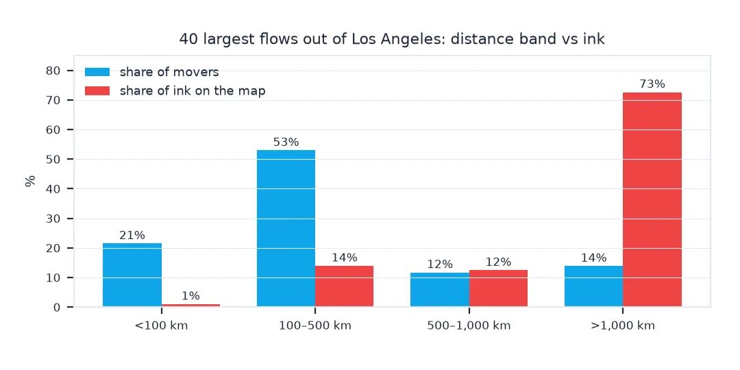
flows over 1,000 km: 35% of the lines, 14% of the movers, 73% of the ink
What each visual property means, and the distance bias
1. Know what each visual property means
A flow line's width is scaled to the flow (here by its square root). Its endpoints are fixed by geography. Its length is the distance between them. Curvature and colour are free design choices, commonly used for direction. A reader who equates "big on the map" with "important" is reading length and width together, so the map must show widths clearly in a legend.
2. See the bias by distance
Group the flows by distance and compare their share of movers with their share of ink:
band = pd.cut(top.km, [0, 100, 500, 1000, 5000], labels=["<100 km", "100–500 km", "500–1,000 km", ">1,000 km"])
summary = top.groupby(band, observed=True).agg(lines=("movers", "size"), movers=("movers", "sum"), ink=("ink", "sum"))
summary["movers %"] = summary.movers / summary.movers.sum()
summary["ink %"] = summary.ink / summary.ink.sum()
print(summary[["lines", "movers %", "ink %"]].to_string(formatters={"movers %": "{:.0%}".format, "ink %": "{:.0%}".format}))
lines movers % ink %
km
<100 km 2 21% 1%
100–500 km 15 53% 14%
500–1,000 km 9 12% 12%
>1,000 km 14 14% 73%
3. Counter it
Three habits reduce the bias. Use a legend with real widths. Add a companion chart or choropleth of the same numbers, where length plays no part. And in the caption, name the largest flows, which are often the shortest.
The shortest heavy flows
The data used on this page
The Census Bureau's county-to-county migration flows, 2016–2020 ACS for Los Angeles County and 2023 county outlines, projected to EPSG:5070 for distances.
from pathlib import Path

import geopandas as gpd
import numpy as np
import pandas as pd
import requests

Path("data").mkdir(exist_ok=True)
SRC = {"county-to-county-2016-2020-ins-outs-nets-gross.xlsx": "https://www2.census.gov/programs-surveys/demo/tables/geographic-mobility/2020/"
       "county-to-county-migration-2016-2020/county-to-county-migration-flows/county-to-county-2016-2020-ins-outs-nets-gross.xlsx",
       "cb_2023_us_county_20m.zip": "https://www2.census.gov/geo/tiger/GENZ2023/shp/cb_2023_us_county_20m.zip"}
for name, url in SRC.items():
    if not Path("data", name).exists():
        Path("data", name).write_bytes(requests.get(url, timeout=600).content)
COLS = ["a_st", "a_cty", "b_st", "b_cty", "a_state", "a_county", "b_state", "b_county",
        "flow", "flow_moe", "counter", "counter_moe", "net", "net_moe", "gross", "gross_moe"]
ca = pd.read_excel("data/county-to-county-2016-2020-ins-outs-nets-gross.xlsx", sheet_name="California",
                   header=None, skiprows=3, names=COLS, dtype=str)
la = ca[(ca.a_cty == "037") & ca.b_st.str.fullmatch(r"\d{3}", na=False)]
flows = pd.DataFrame({"dest": la.b_st.str[1:] + la.b_cty, "movers": pd.to_numeric(la.counter, errors="coerce")}).dropna()
counties = gpd.read_file("data/cb_2023_us_county_20m.zip").query("STUSPS not in ['AK', 'HI', 'PR']").to_crs(5070)
flows = flows[flows.dest.isin(counties.GEOID)]
CENTROID = {g: (p.x, p.y) for g, p in zip(counties.GEOID, counties.representative_point())}
ORIGIN = CENTROID["06037"]
print(f"{len(flows):,} flows out of Los Angeles County")
1,192 flows out of Los Angeles County
Example 1: the shortest heavy flows
print(top.nsmallest(3, "km")[["dest", "km", "movers"]].to_string(index=False, formatters={"km": "{:.0f}".format, "movers": "{:,.0f}".format}))
print(f"these three: {top.nsmallest(3, 'km').movers.sum() / top.movers.sum():.0%} of the 40 flows' movers, "
      f"{top.nsmallest(3, 'km').ink.sum() / top.ink.sum():.0%} of the ink")
dest km movers
06059 82 38,761
06111 89 10,187
06029 123 10,503
these three: 26% of the 40 flows' movers, 2% of the ink
Radial, network and other flow maps
There are several kinds of flow map, and they suit different data. A radial or "spider" map shows flows from one origin, like the Los Angeles map here. A network flow map shows flows among many places, and needs filtering or aggregation to stay readable. Desire lines are straight lines between zone centres, used in transport planning. Arc maps raise flows above a 3D map in the browser. All of them share the same grammar: two endpoints fixed by geography, and a width (sometimes a colour) for the data.
The length bias is the price of that grammar, and it is large. On the Los Angeles map, the flows over 1,000 km are a small share of the movers but a large share of the ink. The three shortest flows, to neighbouring counties, carry a big share of the movers in very little ink. A flow map is good at showing where people go and poor at showing how many. Pair it with something that shows how many, and the reader gets both.
Minimum widths, opacity and direction
- Minimum widths make tiny flows visible but add ink; a map of many tiny flows inherits the length bias at full strength.
- Opacity by volume helps long weak flows recede.
- Proportional symbols at the destinations (circles sized by movers) show volume without length.
- Direction needs its own encoding (arrows, curve side, two-colour ends); width alone does not say which way.
- Uncertainty: survey flows have margins of error; widths should not imply precision the data lacks.
Internal links
- How to make a flow map in Python — building the Los Angeles map
- Origin–destination data explained — the data behind every flow map
- Gross vs net migration explained — which numbers a flow map should show
FAQ
What is a flow map?
A map that shows movement between places as lines, usually with line width proportional to the amount moving.
What are the types of flow map?
Radial (one origin to many destinations), network (many to many), desire lines (straight lines between zone centres for transport planning) and interactive arc maps.
Why can flow maps be misleading?
Long lines draw more ink than short ones, so distant flows look more important than nearby flows of the same or larger size.
How do I make a flow map less misleading?
Give a width legend, name the largest flows in the caption, and show the same numbers in a chart or choropleth where length plays no part.