
Election Map Colours Explained: Diverging Scales, Midpoints and Breaks
On this page
Problem statement
The colours on an election map are not decoration; they are the data. A diverging scheme has to put its neutral colour on the tie, or the map tells each side it did better or worse than it did. Class breaks decide whether the country looks like a sea of deep red or a patchwork. And the two party colours have to stay distinct for the roughly one in twelve men with red-green colour vision deficiency. Most election-map mistakes are colour mistakes made by a default setting.
This page uses the 2024 US county margins to measure how three common classification schemes change the picture, what an off-centre scale does, and why red and blue survive colour blindness where red and green do not.
Quick answer
Centre the diverging scale on zero, use breaks that are symmetric around it, and check how many areas each class holds:
breaks = [-1, -0.5, -0.3, -0.15, -0.05, 0, 0.05, 0.15, 0.3, 0.5, 1]                 # symmetric, zero is a break
cls = np.clip(np.searchsorted(breaks, x, side="right") - 1, 0, 9)
print(f"zero sits between classes {np.searchsorted(breaks, 0, side='right') - 2} and {np.searchsorted(breaks, 0, side='right') - 1} "
      f"of 0-9; counties per class: {np.bincount(cls, minlength=10).tolist()}")
blue_side = cls < 5
print(f"Republican-won counties drawn in a blue shade: {np.sum(blue_side & (x > 0))}; Democratic in red: {np.sum(~blue_side & (x < 0))}")
zero sits between classes 4 and 5 of 0-9; counties per class: [41, 87, 130, 123, 67, 90, 174, 423, 758, 1216]
Republican-won counties drawn in a blue shade: 0; Democratic in red: 0
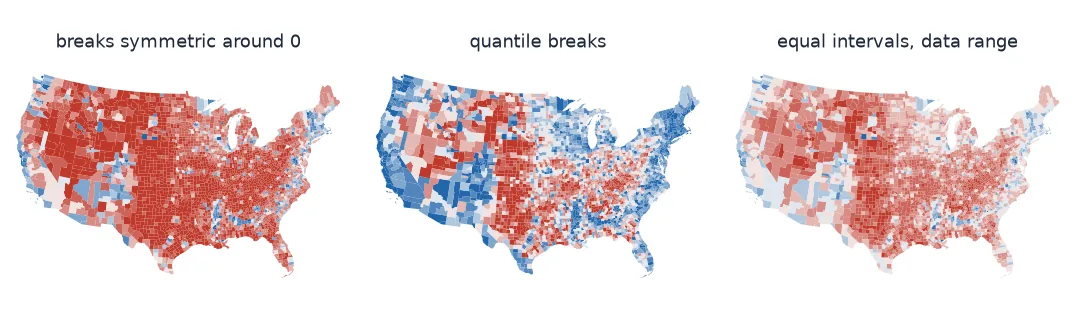
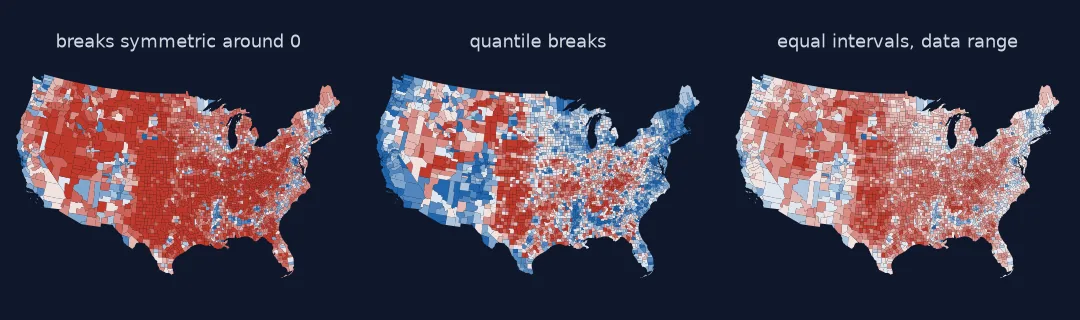
Neutral on the tie, breaks around it, colour checks
1. Put the neutral colour on the tie
A diverging colour scheme has two arms and a pale centre. The centre must sit at a margin of zero. Matplotlib's default Normalize(vmin, vmax) stretches the scale between the data's minimum and maximum, which are not symmetric:
lo, hi = x.min(), x.max()
print(f"data range {lo:+.3f} to {hi:+.3f}; zero lands at {(0 - lo) / (hi - lo):.3f} of the scale instead of 0.500")
for norm_name, norm in (("Normalize(min, max)", Normalize(lo, hi)), ("TwoSlopeNorm(vcenter=0)", TwoSlopeNorm(0, lo, hi)),
                        ("Normalize(-m, +m)", Normalize(-max(-lo, hi), max(-lo, hi)))):
    print(f"{norm_name:24s}: a tied county gets position {float(norm(0)):.3f}")
data range -0.838 to +0.925; zero lands at 0.475 of the scale instead of 0.500
Normalize(min, max) : a tied county gets position 0.475
TwoSlopeNorm(vcenter=0) : a tied county gets position 0.500
Normalize(-m, +m) : a tied county gets position 0.500
TwoSlopeNorm or a symmetric Normalize puts a tied county on the neutral colour. With the data range, a tie is drawn very slightly blue here. The asymmetry is small because the 2024 extremes happen to be similar, but in other data the shift can be large.
2. Choose breaks that respect the midpoint
Classification changes the picture more than any other setting:
schemes = {"symmetric": breaks, "quantile": np.quantile(x, np.linspace(0, 1, 11)), "equal interval (data range)": np.linspace(lo, hi, 11)}
for name, b in schemes.items():
    k = np.clip(np.searchsorted(b, x, side="right") - 1, 0, 9)
    wrong = np.sum((k < 5) & (x > 0)) + np.sum((k >= 5) & (x < 0))
    print(f"{name:28s}: darkest-red class {np.mean(k == 9):5.1%}; counties on the wrong side of the colour scale {wrong:,}")
symmetric : darkest-red class 39.1%; counties on the wrong side of the colour scale 0
quantile : darkest-red class 10.0%; counties on the wrong side of the colour scale 1,106
equal interval (data range) : darkest-red class 4.8%; counties on the wrong side of the colour scale 77
Quantile breaks put a tenth of the counties in each class. That sounds fair, but because almost seven in eight counties voted Republican, the zero falls inside the second class. Every class from there up holds Republican counties, and the four blue-coloured classes above the first paint 1,106 counties in the wrong party's colour. Equal intervals over the data range do better but still misplace 77, because zero is not one of their breaks, and they give fewer than 5% of counties the darkest red. Breaks symmetric around zero are the only scheme here that keeps every county on the correct side.
3. Check the colours for colour-vision deficiency
About 8% of men of European ancestry have red-green colour vision deficiency. Simulate it and measure how different the two party colours still are:
for a, b in (("#c0392b", "#2166ac"), ("#c0392b", "#2ca25f")):
    d_norm = delta_e(hex_rgb(a), hex_rgb(b))
    d_deut = delta_e(simulate(a, DEUTAN), simulate(b, DEUTAN))
    d_prot = delta_e(simulate(a, PROTAN), simulate(b, PROTAN))
    print(f"{a} vs {b}: colour difference normal {d_norm:5.1f}, deuteranopia {d_deut:5.1f}, protanopia {d_prot:5.1f}")
#c0392b vs #2166ac: colour difference normal 95.8, deuteranopia 90.8, protanopia 69.8
#c0392b vs #2ca25f: colour difference normal 102.6, deuteranopia 23.2, protanopia 25.0
Red and blue stay far apart under both common deficiencies; red and green, almost as different as red and blue for normal vision, collapse to a fraction of that. The US convention of red and blue happens to be one of the safest pairings.
How much of the map each class colours
The data used on this page
2024 presidential results by county from tonmcg/US_County_Level_Election_Results_08-24; county boundaries from the US Census Bureau cartographic boundary files, 2023, 1:20 million. Colour-vision simulation uses the matrices of Machado, Oliveira and Fernandes (2009) at full severity; colour difference is CIE76 ΔE in CIELAB (D65).
from pathlib import Path

import geopandas as gpd
import numpy as np
import pandas as pd
import requests
from matplotlib.colors import Normalize, TwoSlopeNorm

Path("data").mkdir(exist_ok=True)
for name, url in {"2024_US_County_Level_Presidential_Results.csv": "https://raw.githubusercontent.com/tonmcg/US_County_Level_Election_Results_08-24/master/2024_US_County_Level_Presidential_Results.csv",
                  "cb_2023_us_county_20m.zip": "https://www2.census.gov/geo/tiger/GENZ2023/shp/cb_2023_us_county_20m.zip"}.items():
    if not Path("data", name).exists():
        Path("data", name).write_bytes(requests.get(url, timeout=300).content)
res = pd.read_csv("data/2024_US_County_Level_Presidential_Results.csv", dtype={"county_fips": str})
res["fips"] = np.where(res.state_name == "District of Columbia", "11001", res.county_fips)
res = res.groupby("fips")[["votes_gop", "votes_dem", "total_votes"]].sum()
c = gpd.read_file("data/cb_2023_us_county_20m.zip")
c = c[~c.STATEFP.isin(["02", "15", "60", "66", "69", "72", "78"])].join(res, on="GEOID", how="inner")
x = ((c.votes_gop - c.votes_dem) / c.total_votes).to_numpy()

DEUTAN = np.array([[0.367322, 0.860646, -0.227968], [0.280085, 0.672501, 0.047413], [-0.011820, 0.042940, 0.968881]])
PROTAN = np.array([[0.152286, 1.052583, -0.204868], [0.114503, 0.786281, 0.099216], [-0.003882, -0.048116, 1.051998]])


def hex_rgb(h):
    return np.array([int(h[i:i + 2], 16) / 255 for i in (1, 3, 5)])


def to_linear(c):
    return np.where(c <= 0.04045, c / 12.92, ((c + 0.055) / 1.055) ** 2.4)


def to_srgb(c):
    c = np.clip(c, 0, 1)
    return np.where(c <= 0.0031308, 12.92 * c, 1.055 * c ** (1 / 2.4) - 0.055)


def simulate(h, matrix):
    return to_srgb(matrix @ to_linear(hex_rgb(h)))


def lab(rgb):
    xyz = np.array([[0.4124, 0.3576, 0.1805], [0.2126, 0.7152, 0.0722], [0.0193, 0.1192, 0.9505]]) @ to_linear(rgb)
    t = xyz / np.array([0.95047, 1.0, 1.08883])
    f = np.where(t > 216 / 24389, np.cbrt(t), (24389 / 27 * t + 16) / 116)
    return np.array([116 * f[1] - 16, 500 * (f[0] - f[1]), 200 * (f[1] - f[2])])


def delta_e(a, b):
    return float(np.linalg.norm(lab(a) - lab(b)))


print(f"{len(x):,} county margins from {x.min():+.3f} to {x.max():+.3f}")
3,109 county margins from -0.838 to +0.925
Example 1: how much of the map each class colours
c5070 = c.to_crs(5070)
area = (c5070.area / c5070.area.sum()).to_numpy()
for name, b in schemes.items():
    cl = np.clip(np.searchsorted(b, x, side="right") - 1, 0, 9)
    print(f"{name:28s}: darkest red covers {area[cl == 9].sum():.0%} of the map, darkest blue {area[cl == 0].sum():.1%}")
symmetric : darkest red covers 39% of the map, darkest blue 0.6%
quantile : darkest red covers 11% of the map, darkest blue 9.8%
equal interval (data range) : darkest red covers 6% of the map, darkest blue 0.1%
Which side, and how strongly
Colour on a choropleth has two jobs: to say which side a place is on, and how strongly. A diverging scheme does both if its midpoint sits on the tie and its arms are symmetric, so equal distances from zero get equally strong colours on both sides. Classification then decides how many places land in each strength. Quantiles answer "where does this county rank?", which is a different question from "how lopsided was it?" and is wrong for diverging data. Breaks at meaningful margins (5, 15, 30, 50 points) answer the question readers ask.
The colours themselves must stay distinguishable for every reader and in every medium. That means checking them under simulated colour-vision deficiency, in greyscale, and on the light and dark backgrounds the map will be shown on. Red and blue pass; red and green, the pairing many default "good versus bad" palettes use, do not.
Two-slope norms, continuous colour and purple
TwoSlopeNorm(vcenter=0)in matplotlib, orvmin=-m, vmax=m, keeps a tie on the neutral colour.- Unclassed (continuous) colour avoids break choices but makes exact values harder to read; add a legend with ticks.
- Turnout and share maps are sequential, not diverging; use a single-hue scheme.
- Third-party wins need a third colour outside the diverging scheme.
- Purple maps (blending red and blue) show mixture but make the winner hard to read; label them clearly.
- Party colours differ by country: in the UK, red is Labour and blue Conservative, the opposite of the US.
Internal links
- Choropleth classification explained — break methods in general
- GeoPandas choropleth colours wrong — the plotting pitfalls
- How to make a US county election map
- Election maps explained
FAQ
What colour scheme should an election margin map use?
A diverging scheme centred on a tie (margin 0), with breaks symmetric around it.
Why does my election map look too red (or too blue)?
Either the classification (quantiles put the midpoint in the wrong place) or the colour normalisation (min–max scaling moves the neutral colour off zero).
Are red and blue colour-blind safe?
Largely yes: under simulated deuteranopia and protanopia they stay far apart, unlike red and green.
Should I use quantile breaks for election results?
Not for margins: with lopsided data, quantiles put most classes on one side of zero and colour some places with the wrong party's colour.