
How to Make a Proportional-Symbol Election Map in Python
On this page
Problem statement
A proportional-symbol map puts a circle on each place, sized by a quantity. For an election the most telling quantity is often the winner's lead in votes, the raw number by which one candidate beat the other. A county that went 80% Republican with 3,000 voters adds a few hundred votes to the national margin. A city that went 70% Democratic adds hundreds of thousands. A choropleth colours them the same; a bubble map does not. The idea is old, but the details decide whether it works: area or radius, how large, what order to draw in, and where to put the circles.
This page draws the 2024 presidential lead by county as circles, using the county results and boundaries. It measures how concentrated each party's lead was and shows the scaling error that makes most bubble maps lie.
Quick answer
Size each circle's area — not its radius — in proportion to the absolute lead, place it at a point inside the county, and draw the largest first:
c["lead"] = c.votes_gop - c.votes_dem
area_pt2 = c.lead.abs() / c.lead.abs().max() * 900                  # matplotlib's s= is marker area in points²
order = np.argsort(-area_pt2.values)
pt = c.representative_point()
fig, ax = plt.subplots(figsize=(10, 6))
ax.scatter(pt.x.values[order], pt.y.values[order], s=area_pt2.values[order],
           c=np.where(c.lead.values[order] > 0, "#c0392b", "#2166ac"), alpha=0.55, edgecolors="white", linewidths=0.3)
ax.set_aspect("equal"); ax.set_axis_off(); fig.savefig("data/lead_bubbles.png", dpi=150)
print(f"{len(c):,} circles; largest lead {c.lead.abs().max():,} votes in {c.loc[c.lead.abs().idxmax(), 'NAME']}")
3,109 circles; largest lead 1,227,247 votes in Los Angeles
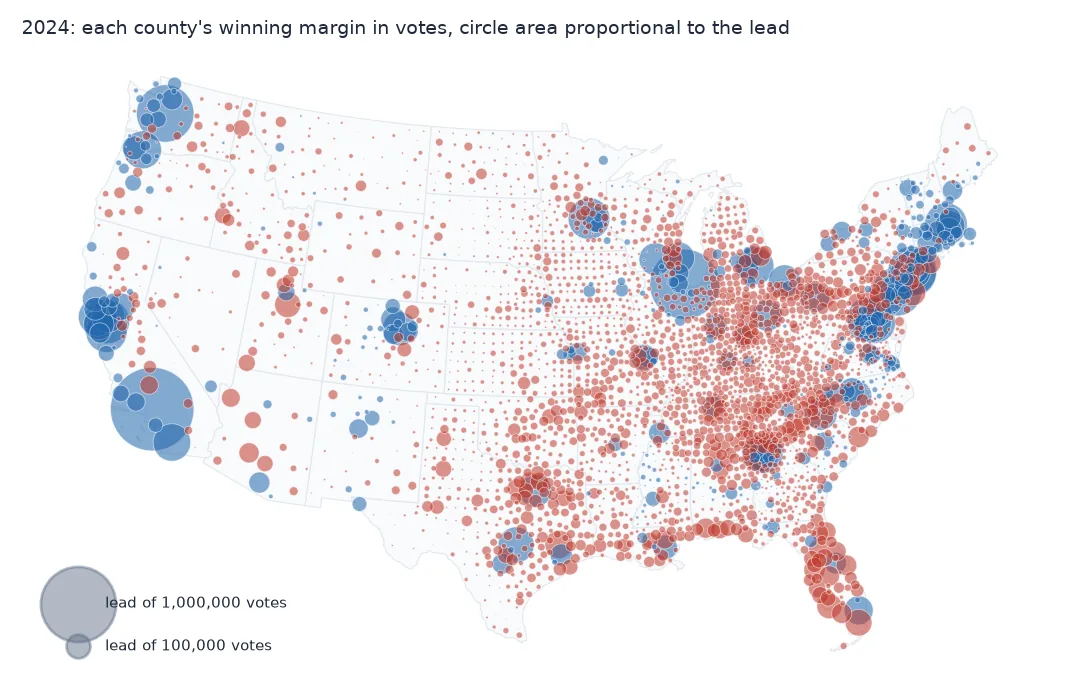
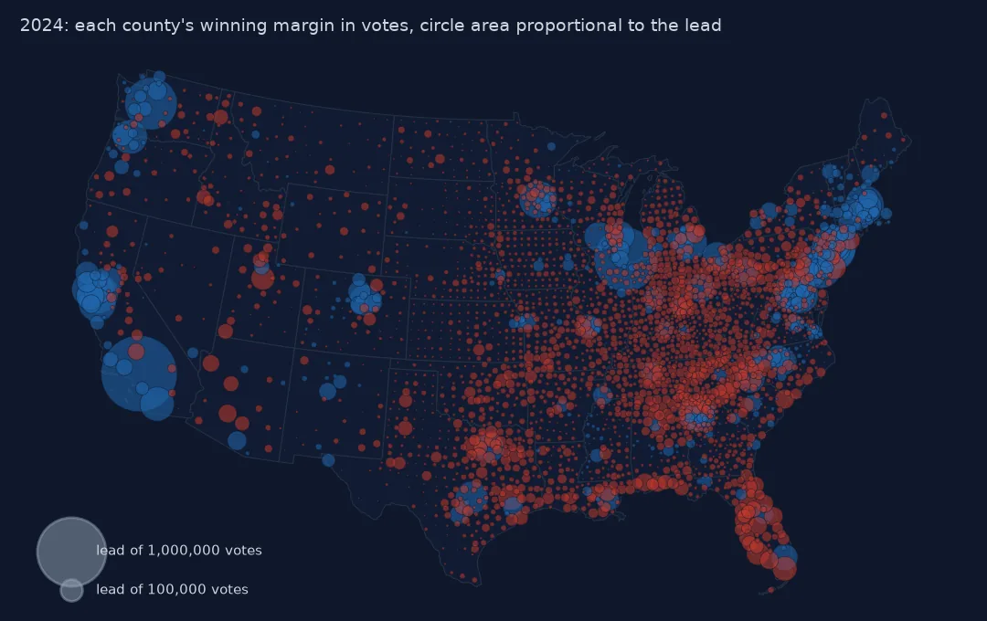
The quantity, concentration, area scaling, the largest circle
1. Choose the quantity
Votes cast, the winner's votes and the lead all make different maps. The lead is the one that adds up to the national result:
r, d = c[c.lead > 0], c[c.lead < 0]
print(f"Republican-won counties: {len(r):,}, total lead {r.lead.sum():,}")
print(f"Democratic-won counties: {len(d):,}, total lead {-d.lead.sum():,}")
print(f"net: {c.lead.sum():+,} votes (lower 48 and DC)")
Republican-won counties: 2,661, total lead 21,332,446
Democratic-won counties: 448, total lead 18,969,720
net: +2,362,726 votes (lower 48 and DC)
2. See how concentrated each side is
for name, part in (("Republican", r.lead), ("Democratic", -d.lead)):
    top = part.sort_values(ascending=False)
    print(f"{name}: top 10 counties hold {top.head(10).sum() / top.sum():.0%} of the party's total lead; "
          f"top 100 hold {top.head(100).sum() / top.sum():.0%}; median county lead {top.median():,.0f}")
print("largest Democratic leads:", d.nsmallest(3, "lead")[["NAME", "STUSPS", "lead"]].values.tolist())
print("largest Republican leads:", r.nlargest(3, "lead")[["NAME", "STUSPS", "lead"]].values.tolist())
Republican: top 10 counties hold 5% of the party's total lead; top 100 hold 24%; median county lead 4,445
Democratic: top 10 counties hold 27% of the party's total lead; top 100 hold 83%; median county lead 6,944
largest Democratic leads: [['Los Angeles', 'CA', -1227247], ['Cook', 'IL', -863969], ['King', 'WA', -580413]]
largest Republican leads: [['Montgomery', 'TX', 139687], ['Miami-Dade', 'FL', 125235], ['Ocean', 'NJ', 121443]]
A hundred counties supply 83% of the Democratic lead, and Los Angeles's lead alone is larger than any Republican state's lead except Texas's and Florida's. The Republican lead is spread across thousands of small and medium circles: the top hundred supply only 24%, and the largest single Republican lead, Montgomery County, Texas, is a ninth of Los Angeles's. That is the structure the bubble map shows at a glance, and the choropleth cannot.
3. Scale area, not radius
Readers judge circles by area. If the radius is made proportional to the value, area grows with its square and large values are exaggerated:
v = np.array([1_000_000, 100_000, 10_000])
print("lead            :", v.tolist())
print("area if r ∝ value:", (v / v[0]) ** 2, "  (a 10x larger lead looks 100x larger)")
print("area if A ∝ value:", v / v[0])
lead : [1000000, 100000, 10000]
area if r ∝ value: [1.e+00 1.e-02 1.e-04] (a 10x larger lead looks 100x larger)
area if A ∝ value: [1. 0.1 0.01]
Matplotlib's scatter(s=...) takes marker area, so passing a value proportional to the lead is correct. Passing a radius, or a "size" computed for another library that expects radius, silently squares it.
4. Size the largest circle
Pick the largest circle's size so the dense parts of the map overlap but stay readable, and give the reader a legend with round values:
for top_pt2 in (300, 900, 2500):
    a = c.lead.abs() / c.lead.abs().max() * top_pt2
    r_pt = np.sqrt(a / np.pi)
    print(f"largest circle {top_pt2:5d} pt² (radius {np.sqrt(top_pt2 / np.pi):4.1f} pt): "
          f"{(r_pt < 0.5).mean():.0%} of counties smaller than a 1-pt dot")
largest circle 300 pt² (radius 9.8 pt): 39% of counties smaller than a 1-pt dot
largest circle 900 pt² (radius 16.9 pt): 13% of counties smaller than a 1-pt dot
largest circle 2500 pt² (radius 28.2 pt): 4% of counties smaller than a 1-pt dot
State totals from the circles
The data used on this page
2024 presidential results by county from tonmcg/US_County_Level_Election_Results_08-24; county boundaries from the US Census Bureau cartographic boundary files, 2023, 1:20 million. Lower 48 states and DC.
from pathlib import Path

import geopandas as gpd
import matplotlib
matplotlib.use("Agg")
import matplotlib.pyplot as plt
import numpy as np
import pandas as pd
import requests

Path("data").mkdir(exist_ok=True)
for name, url in {"2024_US_County_Level_Presidential_Results.csv": "https://raw.githubusercontent.com/tonmcg/US_County_Level_Election_Results_08-24/master/2024_US_County_Level_Presidential_Results.csv",
                  "cb_2023_us_county_20m.zip": "https://www2.census.gov/geo/tiger/GENZ2023/shp/cb_2023_us_county_20m.zip"}.items():
    if not Path("data", name).exists():
        Path("data", name).write_bytes(requests.get(url, timeout=300).content)
res = pd.read_csv("data/2024_US_County_Level_Presidential_Results.csv", dtype={"county_fips": str})
res["fips"] = np.where(res.state_name == "District of Columbia", "11001", res.county_fips)
res = res.groupby("fips")[["votes_gop", "votes_dem", "total_votes"]].sum()
c = gpd.read_file("data/cb_2023_us_county_20m.zip")
c = c[~c.STATEFP.isin(["02", "15", "60", "66", "69", "72", "78"])].join(res, on="GEOID", how="inner").to_crs(5070).reset_index(drop=True)
print(f"{len(c):,} counties")
3,109 counties
Example 1: state totals from the circles
by_state = c.groupby("STUSPS").lead.sum().sort_values()
print("biggest Democratic state leads:", (-by_state.head(3)).to_dict())
print("biggest Republican state leads:", by_state.tail(3).to_dict())
print("closest states:", by_state.abs().nsmallest(4).to_dict())
biggest Democratic state leads: {'CA': 3194482, 'NY': 1040296, 'MA': 875237}
biggest Republican state leads: {'TN': 910600, 'FL': 1427087, 'TX': 1558347}
closest states: {'NH': 22918, 'WI': 29397, 'NV': 46008, 'NM': 55411}
Size separated from direction
Proportional symbols separate two things a choropleth mixes together: how big a place is and what it did. The circle's area carries the quantity, its colour the direction, and its position the place. Because circles from different places can be compared directly, readers can see that a single city's lead can outweigh a whole region of small counties. That is the arithmetic behind most close national elections.
The pitfalls are mechanical. Scale by area. Draw the largest first and use transparency so overlaps stay legible. Put the circle inside the area it represents. Show a legend with two or three round values. With thousands of symbols, most will be tiny; that is the data, and the legend should make it clear that small means small, not missing.
Area against radius, overlap and legends
- Area, not radius:
s=in matplotlib is area;markersize=inplotis a diameter-like size in points. - Ties (a lead of zero) produce no circle; mark them if they matter.
- Overlap in dense regions hides small circles; transparency and largest-first ordering help, a Dorling layout removes it.
- Representative points, not centroids, keep circles inside oddly shaped counties.
- Legends should use the same scaling function as the map, with round numbers.
- Perceptual compensation (Flannery scaling) is sometimes applied because large circles are underestimated; if used, say so in the legend.
Internal links
- How to make a Dorling cartogram — the same circles, pushed apart
- How to make a US county election map — the choropleth view
- How to make an election swing map — arrows instead of circles
FAQ
How do I make a proportional symbol map in Python?
Compute a point inside each area, scale marker area in proportion to the value, sort largest first, and draw with scatter(s=...), which takes marker area in points².
Should circle size be proportional to radius or area?
Area. Radius scaling makes a value ten times larger look a hundred times larger.
What should the circles show on an election map?
The winner's lead in votes shows how each place contributed to the overall margin; votes cast shows turnout; each has its place.
Why are most circles on my map tiny?
Most counties are small; with area scaling, a county with a hundredth of the largest lead gets a hundredth of its area. That is accurate; explain it in the legend.