
How to Make a Value-by-Alpha Election Map in Python
On this page
Problem statement
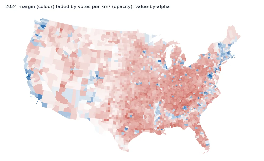
A county choropleth of an election is dominated by large, empty counties; a cartogram fixes that but bends the map out of shape. A value-by-alpha map, introduced by Robert Roth, Andy Woodruff and Zachary Johnson in 2010, keeps the real geography and fades each area by how much it matters. Colour shows the result. Opacity shows how many people are behind it. Empty counties fade into the background, and cities stand out at their true size.
This page builds a value-by-alpha map of the 2024 presidential margin by county, with opacity driven by votes per square kilometre. It measures how much it changes the balance of the map and shows the two decisions that make or break it: the opacity scale and the background colour.
Quick answer
Compute the margin colour per county, then set each polygon's alpha from its vote density on a log scale:
def vba_alpha(votes, km2, floor=0.06):
    density = np.log10(np.maximum(votes / km2, 0.01))
    lo, hi = np.percentile(density, [2, 98])                                 # robust to a few extreme counties
    return np.clip((density - lo) / (hi - lo), 0, 1) * (1 - floor) + floor

g["alpha"] = vba_alpha(g.total_votes.values, g.km2.values)
rgba = plt.get_cmap("RdBu_r")(np.clip(g.margin.values / 1.2 + 0.5, 0, 1))
rgba[:, 3] = g.alpha
ax = g.plot(color=rgba, edgecolor="none", figsize=(10, 6))
ax.set_facecolor("white"); ax.set_axis_off()
ax.figure.savefig("data/vba_2024.png", dpi=150)
print(f"alpha from {g.alpha.min():.2f} to {g.alpha.max():.2f}; median county {g.alpha.median():.2f}")
alpha from 0.06 to 1.00; median county 0.51
The quantity behind opacity, its effect, the scale's ends
1. Pick the quantity that drives opacity
Opacity should encode the thing the map otherwise exaggerates. For an election mapped on land, that is votes relative to area: total votes would make big rural counties opaque simply because they are big. Votes per km² spans five orders of magnitude, so use its logarithm:
dens = g.total_votes / g.km2
print(f"votes per km2: min {dens.min():.2f}, median {dens.median():.1f}, max {dens.max():,.0f}")
print(g.assign(d=dens).nlargest(3, "d")[["NAME", "STUSPS", "d"]].round(0).to_string(index=False))
votes per km2: min 0.03, median 8.0, max 6,985
NAME STUSPS d
New York NY 6985.0
San Francisco CA 3536.0
Kings NY 3153.0
2. Measure what the fading does to the map
The point of value-by-alpha is to change the visual weight. Compare how much of the map's "ink" — area times opacity — each party gets, against plain area and votes:
red = g.margin > 0
ink = g.km2 * g.alpha
print(f"Republican-won share of land {g.km2[red].sum() / g.km2.sum():.0%}, "
      f"of ink {ink[red].sum() / ink.sum():.0%}, of votes cast {g.total_votes[red].sum() / g.total_votes.sum():.0%}")
Republican-won share of land 86%, of ink 80%, of votes cast 51%
The faded map moves the visual balance only a little: from 86% Republican by land to 80% by ink, against 51% by votes. Area still counts, so a large county at medium density keeps a lot of ink. Value-by-alpha is a way of de-emphasising empty land, not a substitute for a cartogram when the question is how many people voted which way.
3. Choose the scale's ends
The opacity range needs a floor, so the faintest counties are still visible, and a clipped top, so a handful of dense counties do not set the scale for everyone:
for floor, (p_lo, p_hi) in ((0.0, (0, 100)), (0.06, (2, 98)), (0.2, (2, 98))):
    d = np.log10(dens.values); lo, hi = np.percentile(d, [p_lo, p_hi])
    a = np.clip((d - lo) / (hi - lo), 0, 1) * (1 - floor) + floor
    print(f"floor {floor:.2f}, clip {p_lo}-{p_hi}%: {np.mean(a < 0.2):.0%} of counties nearly invisible (alpha < 0.2); "
          f"red share of ink {(g.km2 * a)[red].sum() / (g.km2 * a).sum():.0%}")
floor 0.00, clip 0-100%: 5% of counties nearly invisible (alpha < 0.2); red share of ink 82%
floor 0.06, clip 2-98%: 9% of counties nearly invisible (alpha < 0.2); red share of ink 80%
floor 0.20, clip 2-98%: 0% of counties nearly invisible (alpha < 0.2); red share of ink 82%
4. Choose the background
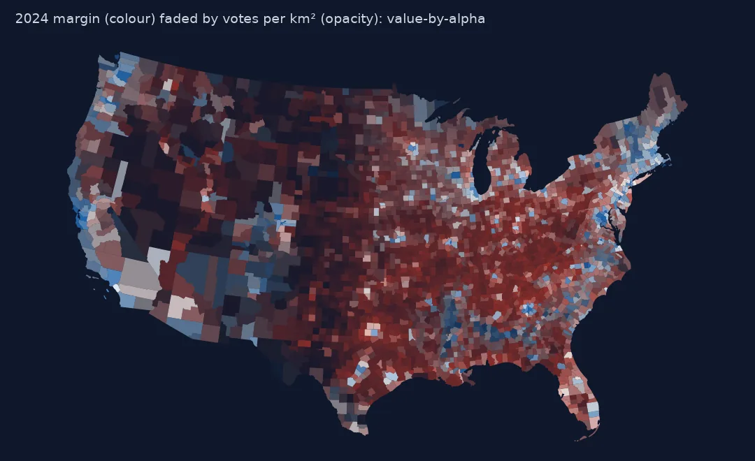
Transparency mixes each colour with what is behind it. On white, faded counties turn pale and the strong colours stay saturated. On black, faded counties go dark and close, dense counties, which are near-white in a diverging scheme, light up:
for bg in ("white", "black"):
    base = np.array([1.0, 1.0, 1.0]) if bg == "white" else np.zeros(3)
    shown = rgba[:, :3] * rgba[:, 3:4] + base * (1 - rgba[:, 3:4])
    lum = shown @ np.array([0.2126, 0.7152, 0.0722])
    maricopa = g.index[(g.NAME == "Maricopa") & (g.STUSPS == "AZ")][0]
    print(f"{bg}: luminance of Maricopa {lum[maricopa]:.2f}, of the median county {np.median(lum):.2f}")
white: luminance of Maricopa 0.95, of the median county 0.74
black: luminance of Maricopa 0.77, of the median county 0.16
On white, a close, dense county such as Maricopa is paler than almost everything else, which is the wrong emphasis. On black it is far brighter than the median county. The original 2010 maps used a dark background for exactly this reason. A light background suits a sequential colour scheme better than a diverging one.
A printable bivariate legend
The data used on this page
2024 presidential results by county from tonmcg/US_County_Level_Election_Results_08-24; county boundaries from the US Census Bureau cartographic boundary files, 2023, 1:20 million. Lower 48 states and DC.
from pathlib import Path

import geopandas as gpd
import matplotlib
matplotlib.use("Agg")
import matplotlib.pyplot as plt
import numpy as np
import pandas as pd
import requests

Path("data").mkdir(exist_ok=True)
for name, url in {"2024_US_County_Level_Presidential_Results.csv": "https://raw.githubusercontent.com/tonmcg/US_County_Level_Election_Results_08-24/master/2024_US_County_Level_Presidential_Results.csv",
                  "cb_2023_us_county_20m.zip": "https://www2.census.gov/geo/tiger/GENZ2023/shp/cb_2023_us_county_20m.zip"}.items():
    if not Path("data", name).exists():
        Path("data", name).write_bytes(requests.get(url, timeout=300).content)
res = pd.read_csv("data/2024_US_County_Level_Presidential_Results.csv", dtype={"county_fips": str})
res["fips"] = np.where(res.state_name == "District of Columbia", "11001", res.county_fips)
res = res.groupby("fips")[["votes_gop", "votes_dem", "total_votes"]].sum()
g = gpd.read_file("data/cb_2023_us_county_20m.zip")
g = g[~g.STATEFP.isin(["02", "15", "60", "66", "69", "72", "78"])].join(res, on="GEOID", how="inner").to_crs(5070).reset_index(drop=True)
g["km2"] = g.area / 1e6
g["margin"] = (g.votes_gop - g.votes_dem) / g.total_votes
print(f"{len(g):,} counties")
3,109 counties
Example 1: a bivariate legend you can print
dens_bins = np.percentile(np.log10(dens), [0, 25, 50, 75, 100])
margin_bins = [-1, -0.2, 0, 0.2, 1]
counts = pd.crosstab(pd.cut(g.margin, margin_bins), pd.cut(np.log10(dens), dens_bins, include_lowest=True))
counts.columns = [f"density Q{i + 1}" for i in range(4)]
print(counts.to_string())
density Q1 density Q2 density Q3 density Q4
margin
(-1.0, -0.2] 34 16 21 137
(-0.2, 0.0] 31 38 41 130
(0.0, 0.2] 52 73 91 178
(0.2, 1.0] 661 650 624 332
The crosstab is the legend's data. In the densest quarter of counties, about a third were won by the Democrat (267 of 777); in the sparsest quarter, 65 of 778, while 661 went Republican by more than 20 points. Those sparse, strongly Republican counties are the ones the fading pushes back.
Two channels of very different strength
Value-by-alpha is a bivariate map that uses two channels with very different strengths. Hue carries the categorical or diverging variable, here the margin. Opacity, perceived as lightness against the background, carries the "how much does this area matter" variable. Because the geography is untouched, readers can still find their county. Because empty areas fade, the eye is drawn to where the people are.
Its weaknesses are the other side of the same choices. Opacity is perceived less precisely than position or length. A faded colour against a light background can look like a different, paler category. And the visual balance depends on the scale ends and the background as much as on the data. State the opacity variable and its range on the map, and show a legend that crosses both variables.
Density not totals, log scales and printing
- Density, not totals, should drive opacity when the base map is land area.
- Log scales are almost always needed; vote density spans five orders of magnitude.
- Diverging colour schemes have a pale middle that disappears on white; use a dark background or a sequential scheme.
- Overlapping or adjacent polygons do not change with alpha here, but transparent strokes double up; draw without edges.
- Printing turns alpha into fixed colours; export with the background flattened.
- Colour-blind readers see red-blue fine; check the faded colours too.
Internal links
- How to make a US county election map — the unfaded choropleth
- How to make a Dorling cartogram — the alternative that moves the counties
- Choropleth classification explained — the colour classes
FAQ
What is a value-by-alpha map?
A choropleth in which each area's opacity encodes a second variable — usually how many people it represents — so sparsely populated areas fade into the background.
What should control the transparency?
A density such as votes or people per km², on a log scale, when the map's areas are land; totals would favour large areas.
Should a value-by-alpha map have a dark or light background?
With a diverging colour scheme, dark: the pale middle colours of close, dense places then stand out instead of vanishing.
How do I set per-polygon transparency in GeoPandas?
Build an RGBA array from the colormap, set its fourth column to the alpha values, and pass it as color= to GeoDataFrame.plot.