
How to Make an Election Swing Map in Python
On this page
Problem statement
An election map shows who won. A swing map shows what changed: how far each place moved between two elections. Change is often the story of an election. In 2024 it was the near-uniform rightward shift across the United States, including in many places that still voted Democratic. A winner map hides that, because a county that went from Democratic by 23 points to Republican by 2 looks the same as one that barely moved. Swing is also a harder join than a single result, because the units have to match in both years.
This page computes the county swing from the 2020 to the 2024 presidential election and draws it as arrows, in the style popularised by the New York Times. It deals with the counties that changed between the elections and measures how uniform the shift was.
Quick answer
Compute each county's margin in both years, subtract, and draw an arrow whose length and direction show the change:
swing = load(2020).join(load(2024), lsuffix="20", rsuffix="24", how="inner")
swing["swing"] = swing.margin24 - swing.margin20                      # + means toward the Republican
print(f"{len(swing):,} units in both years; {(swing.swing > 0).mean():.0%} moved Republican; "
      f"median {swing.swing.median() * 100:+.1f} points, vote-weighted {np.average(swing.swing, weights=swing.total_votes24) * 100:+.1f}")
3,105 units in both years; 90% moved Republican; median +3.2 points, vote-weighted +4.8
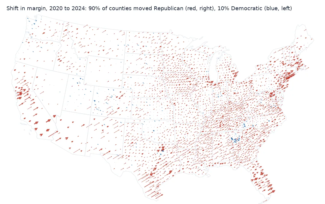
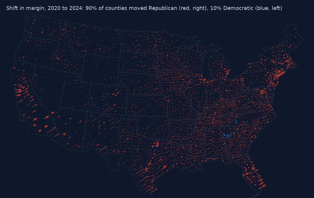
Same units both years, margin and swing, outliers, arrows
1. Use the same units in both years
Swing is a difference, so a unit present in only one year has none. Compare the identifiers before joining:
raw20, raw24 = (pd.read_csv(f"data/{y}_US_County_Level_Presidential_Results.csv", dtype={"county_fips": str}) for y in (2020, 2024))
only20 = sorted(set(raw20.county_fips) - set(raw24.county_fips))
only24 = sorted(set(raw24.county_fips) - set(raw20.county_fips))
print(f"only in 2020: {len(only20)} ({raw20.set_index('county_fips').loc[only20].state_name.value_counts().to_dict()})")
print(f"only in 2024: {len(only24)} ({raw24.set_index('county_fips').loc[only24].state_name.value_counts().to_dict()})")
only in 2020: 48 ({'Alaska': 40, 'Connecticut': 8})
only in 2024: 56 ({'Alaska': 40, 'Connecticut': 9, 'District of Columbia': 7})
Connecticut reported its eight old counties in 2020 and its nine planning regions in 2024. They do not nest, so the only common unit is the state. Alaska reports by house district, and its districts were redrawn between the elections, so it is left out. DC's wards are summed in both years. The load function in the setup does all three.
2. Compute margin and swing
Margin is the Republican minus the Democratic share of all votes cast. Swing is the change in margin, in percentage points:
print(swing[["margin20", "margin24", "swing"]].describe().loc[["mean", "50%", "min", "max"]].mul(100).round(1).to_string())
nat = {y: (swing[f"votes_gop{y}"].sum() - swing[f"votes_dem{y}"].sum()) / swing[f"total_votes{y}"].sum() for y in ("20", "24")}
print(f"national margin of these units: 2020 {nat['20'] * 100:+.1f}, 2024 {nat['24'] * 100:+.1f}, swing {(nat['24'] - nat['20']) * 100:+.1f} points")
margin20 margin24 swing
mean 31.8 35.3 3.5
50% 38.5 42.1 3.2
min -86.8 -83.8 -9.2
max 93.1 92.5 28.0
national margin of these units: 2020 -4.5, 2024 +1.5, swing +5.9 points
The vote-weighted swing is larger than the median county's because the biggest shifts came in some of the most populous places.
3. Find the outliers
names = raw24.set_index("county_fips")[["county_name", "state_name"]]
show = lambda d: d.join(names)[["county_name", "state_name", "margin20", "margin24", "swing"]].round(3).to_string()
print("largest move toward the Republican:\n" + show(swing.nlargest(5, "swing")))
print("largest move toward the Democrat:\n" + show(swing.nsmallest(5, "swing")))
largest move toward the Republican:
county_name state_name margin20 margin24 swing
fips
48323 Maverick County Texas -0.095 0.185 0.280
48479 Webb County Texas -0.233 0.022 0.255
06025 Imperial County California -0.244 0.009 0.252
36005 Bronx County New York -0.676 -0.454 0.221
48427 Starr County Texas -0.050 0.160 0.210
largest move toward the Democrat:
county_name state_name margin20 margin24 swing
fips
13151 Henry County Georgia -0.205 -0.297 -0.092
08111 San Juan County Colorado -0.249 -0.320 -0.071
08015 Chaffee County Colorado -0.068 -0.136 -0.067
13247 Rockdale County Georgia -0.408 -0.475 -0.067
48301 Loving County Texas 0.848 0.784 -0.065
Several of the largest rightward swings are along the Texas border and in the Imperial Valley, majority-Hispanic counties where the shift was widely reported. The Bronx moved 22 points and still voted Democratic by 45. That is the kind of change a winner map cannot show.
4. Draw the arrows
Arrows start at a point inside each county. They lean right for a Republican swing and left for a Democratic one, with length proportional to the swing. Width classes by votes cast keep the populous counties visible:
c = counties.join(swing, on="fips", how="inner").to_crs(5070)
pt = c.representative_point()
scale = 600_000                                                      # metres of arrow per 100 points of swing
fig, ax = plt.subplots(figsize=(10, 6))
for sign, colour in ((1, "#c0392b"), (-1, "#2166ac")):
    k = (np.sign(c.swing) == sign).values
    ax.quiver(pt.x.values[k], pt.y.values[k], c.swing.values[k] * scale, np.abs(c.swing.values[k]) * scale * 0.6,
              angles="xy", scale_units="xy", scale=1, color=colour, width=0.0012)
ax.set_aspect("equal"); ax.set_axis_off()
fig.savefig("data/swing_arrows.png", dpi=150)
print(f"{len(c):,} arrows; longest {c.swing.abs().max() * scale / 1000:.0f} km on the map")
3,101 arrows; longest 168 km on the map
How uniform the 2024 shift was
The data used on this page
County-level 2020 and 2024 presidential results from tonmcg/US_County_Level_Election_Results_08-24; county boundaries from the US Census Bureau cartographic boundary files, 2023, 1:20 million.
from pathlib import Path

import geopandas as gpd
import matplotlib
matplotlib.use("Agg")
import matplotlib.pyplot as plt
import numpy as np
import pandas as pd
import requests

Path("data").mkdir(exist_ok=True)
SRC = "https://raw.githubusercontent.com/tonmcg/US_County_Level_Election_Results_08-24/master/"
for name in ("2020_US_County_Level_Presidential_Results.csv", "2024_US_County_Level_Presidential_Results.csv"):
    if not Path("data", name).exists():
        Path("data", name).write_bytes(requests.get(SRC + name, timeout=300).content)
if not Path("data/cb_2023_us_county_20m.zip").exists():
    Path("data/cb_2023_us_county_20m.zip").write_bytes(
        requests.get("https://www2.census.gov/geo/tiger/GENZ2023/shp/cb_2023_us_county_20m.zip", timeout=300).content)


def load(year):
    d = pd.read_csv(f"data/{year}_US_County_Level_Presidential_Results.csv", dtype={"county_fips": str})
    d = d[d.state_name != "Alaska"]                                               # house districts, redrawn
    d["fips"] = np.select([d.state_name == "District of Columbia", d.state_name == "Connecticut"],
                          ["11001", "09CT"], d.county_fips)                            # wards; counties vs regions
    g = d.groupby("fips")[["votes_gop", "votes_dem", "total_votes"]].sum()
    g["margin"] = (g.votes_gop - g.votes_dem) / g.total_votes
    return g


counties = gpd.read_file("data/cb_2023_us_county_20m.zip")
counties = counties[~counties.STATEFP.isin(["02", "15", "60", "66", "69", "72", "78"])].copy()
counties["fips"] = np.where(counties.STATEFP == "09", "09CT", counties.GEOID)
counties = counties.dissolve("fips", as_index=False)
print(f"{len(counties):,} mapped units in the lower 48 and DC")
3,101 mapped units in the lower 48 and DC
Example 1: how uniform was the shift?
bands = pd.cut(swing.swing * 100, [-20, -2, 0, 2, 5, 10, 30])
print(bands.value_counts().sort_index().to_string())
print(f"counties that moved Republican but still voted Democratic: {((swing.swing > 0) & (swing.margin24 < 0)).sum()}")
swing
(-20, -2] 76
(-2, 0] 236
(0, 2] 668
(2, 5] 1321
(5, 10] 708
(10, 30] 96
counties that moved Republican but still voted Democratic: 395
Example 2: the states with the most counties moving left
st = swing.assign(state=swing.index.str[:2], left=swing.swing < 0).groupby("state").left.agg(["sum", "size"])
st = st[st["sum"] > 0].sort_values("sum", ascending=False).head(5)
st.index = st.index.map(raw24.drop_duplicates("county_fips").assign(sf=lambda d: d.county_fips.str[:2]).drop_duplicates("sf").set_index("sf").state_name)
print(st.rename(columns={"sum": "moved Democratic", "size": "counties"}).to_string())
moved Democratic counties
state
Colorado 30 64
Georgia 24 159
Kansas 24 105
Oklahoma 19 77
North Carolina 19 100
What changed, not who won
Swing maps answer "what changed?" rather than "who won?" They need a difference between two results on the same units, and the denominator matters. Margin swing, the change in the gap between the two main parties, is standard for two-party systems. It is not the same as the change in one party's share, because third-party votes and turnout move both.
The arrow form works because it shows two things at once: direction and size. Length shows how far a place moved, so a big swing in a small county still shows up. Direction makes a uniform national shift visible as a field of parallel arrows. The exceptions stand out instantly, here the Atlanta suburbs and a scattering of Colorado mountain counties. A choropleth of swing can show the same numbers, but it loses the sense of a whole country moving in one direction.
Matching units, Hawaii and Alaska
- Units must match in both years: aggregate to the coarsest common unit (Connecticut to the state here).
- Hawaii's four counties are in the swing table but outside the lower-48 map; inset them or say they are left out.
- Alaska's house districts were redrawn between 2020 and 2024; they cannot be compared directly.
- Margin swing vs share change: a county where both parties lost share to a third party can have no margin swing.
- Turnout changes move totals independently of swing; map them separately.
- Arrow scale is arbitrary; state it ("600 km per 100 points") so maps can be compared.
- Tiny counties produce noisy swings from a few hundred votes; Loving County, Texas, cast fewer than a hundred.
Internal links
- How to make a US county election map — the single-year map and its joins
- Election results won't join the boundaries — the identifier problems in detail
- Choropleth classification explained — if you map swing as colour
FAQ
What is electoral swing?
The change in the margin between the two main parties from one election to the next, in percentage points.
How do I make an NYT-style swing arrow map in Python?
Compute the margin change per county, then use matplotlib's quiver with arrows starting at each county's representative point, leaning right for one party and left for the other.
Why can't I compute swing for Connecticut counties between 2020 and 2024?
Connecticut's 2020 results use the eight old counties and its 2024 results the nine planning regions; they do not nest, so compare at the state level.
How uniform was the 2020–2024 swing?
About nine in ten counties moved toward the Republican; the median county moved about 3 points, and the vote-weighted swing was nearly 5 points.