
How to Make a US State Tile Grid Map in Python
On this page
Problem statement
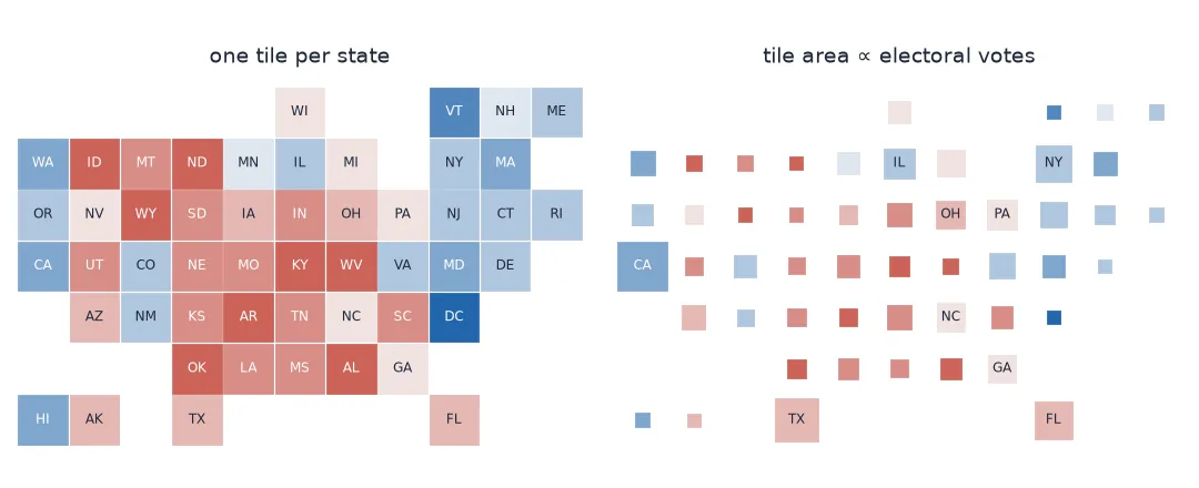
A tile grid map draws each US state as one equal square, arranged roughly by geography. It is the standard way to show a per-state value when Rhode Island must be as visible as Texas. GeoPandas is no help here, because there is no geometry, only a row and a column for each state. You need a published layout, results joined to it, labels, and a decision about what each tile stands for. When states are not equal in what you are mapping, as with electoral votes, you also need a way to make the tiles unequal.
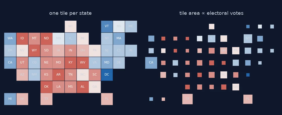
This page draws the 2024 presidential result on the geofacet us_state_grid1 layout. It validates the layout, scales the tiles by electoral votes, and uses the grid for small multiples of each state's change since 2020.
Quick answer
Read the layout (row, column, code), join the per-state values, and draw a square per state with its code on it:
grid = pd.read_csv("data/us_state_grid1.csv").set_index("code")
grid = grid.join(state, on="name")
fig, ax = plt.subplots(figsize=(8, 5.5))
for code, s in grid.iterrows():
    ax.add_patch(plt.Rectangle((s.col - 0.46, -s.row - 0.46), 0.92, 0.92, color=plt.get_cmap("RdBu_r")(0.5 + s.margin24 / 1.2)))
    ax.text(s.col, -s.row, code, ha="center", va="center", fontsize=8, color="white" if abs(s.margin24) > 0.15 else "black")
ax.set_xlim(grid.col.min() - 1, grid.col.max() + 1); ax.set_ylim(-grid.row.max() - 1, -grid.row.min() + 1)
ax.set_aspect("equal"); ax.set_axis_off(); fig.savefig("data/tiles_2024.png", dpi=150)
print(f"{len(grid)} tiles; {grid.margin24.isna().sum()} without a result")
51 tiles; 0 without a result
Validate the layout, build values, decide what a tile means
1. Validate the layout
A layout file is hand-made data. Check it before trusting it: every state once, no two tiles on the same square:
print(f"{len(grid)} rows; duplicated codes: {grid.index.duplicated().sum()}; "
      f"duplicated positions: {grid.duplicated(['row', 'col']).sum()}")
print("missing:", sorted(set(STATE_NAMES) - set(grid.name)))
print(f"grid is {grid.row.max() - grid.row.min() + 1} rows by {grid.col.max() - grid.col.min() + 1} columns")
51 rows; duplicated codes: 0; duplicated positions: 0
missing: []
grid is 7 rows by 11 columns
2. Build the per-state values
State results are the sum of the county results, with Alaska's house districts and DC's wards summed in; 2020 and 2024 both aggregate cleanly at state level, even though Connecticut's sub-state units changed:
print(state[["margin20", "margin24"]].describe().loc[["min", "max"]].round(3).to_string())
print("closest 2024 states:", state.margin24.abs().nsmallest(4).round(4).to_dict())
margin20 margin24
min -0.868 -0.838
max 0.434 0.462
closest 2024 states: {'Wisconsin': 0.0086, 'Michigan': 0.0141, 'Pennsylvania': 0.0171, 'Georgia': 0.0219}
3. Decide what a tile means
One tile per state treats Wyoming like California. For a per-state rate or a Senate map that is right. For the presidency it is not, because the tiles then misstate the outcome:
won = grid.margin24 > 0
print(f"Republican-won tiles: {won.sum()} of {len(grid)} ({won.mean():.0%}); "
      f"electoral votes: {grid.ev[won].sum()} of {grid.ev.sum()} ({grid.ev[won].sum() / grid.ev.sum():.0%})")
Republican-won tiles: 31 of 51 (61%); electoral votes: 312 of 538 (58%)
Scaling each tile's area by electoral votes keeps the layout and fixes the weighting: side length proportional to the square root of the electoral votes, with the largest state, California, at full tile size.
grid["side"] = 0.92 * np.sqrt(grid.ev / grid.ev.max())
print(grid.sort_values("side")[["ev", "side"]].iloc[[0, 1, -2, -1]].round(2).to_string())
print(f"red share of scaled tile area: {(grid.side ** 2)[won].sum() / (grid.side ** 2).sum():.0%}")
ev side
code
AK 3 0.22
DE 3 0.22
TX 40 0.79
CA 54 0.92
red share of scaled tile area: 58%
4. Use the grid for small multiples
A tile grid is also a layout for small charts: each state's square becomes a tiny plot. Here, the margin in 2020 and in 2024 per state:
grid["swing"] = grid.margin24 - grid.margin20
print(f"states that moved Republican: {(grid.swing > 0).sum()} of {len(grid)}; "
      f"largest moves: {grid.swing.nlargest(3).round(3).to_dict()}; smallest: {grid.swing.nsmallest(2).round(3).to_dict()}")
fig, axes = plt.subplots(grid.row.max(), grid.col.max(), figsize=(11, 7))
for a in axes.ravel():
    a.set_axis_off()
for code, s in grid.iterrows():
    a = axes[s.row - 1, s.col - 1]
    a.plot([0, 1], [s.margin20, s.margin24], color="#c0392b" if s.swing > 0 else "#2166ac", lw=2)
    a.axhline(0, color="#999999", lw=0.5); a.set_ylim(-1, 0.6); a.set_title(code, fontsize=7)
fig.savefig("data/tiles_swing.png", dpi=150)
states that moved Republican: 51 of 51; largest moves: {'NY': 0.105, 'NJ': 0.1, 'FL': 0.097}; smallest: {'WA': 0.009, 'UT': 0.011}
Every one of the 51 lines slopes the same way. Between 2020 and 2024 every state and DC moved toward the Republican, from under one point in Washington and Utah to about ten in New York and New Jersey. The tile grid makes the uniformity obvious in a way a single national number does not.
Two published layouts compared
The data used on this page
The us_state_grid1 layout from the geofacet project's grid designer (MIT licence); 2020 and 2024 presidential results by county from tonmcg/US_County_Level_Election_Results_08-24, summed to states; House seats from the US Census Bureau's 2020 apportionment table.
from pathlib import Path

import matplotlib
matplotlib.use("Agg")
import matplotlib.pyplot as plt
import numpy as np
import pandas as pd
import requests

Path("data").mkdir(exist_ok=True)
TON = "https://raw.githubusercontent.com/tonmcg/US_County_Level_Election_Results_08-24/master/"
SOURCES = {"us_state_grid1.csv": "https://raw.githubusercontent.com/hafen/grid-designer/master/grids/us_state_grid1.csv",
           "2020_US_County_Level_Presidential_Results.csv": TON + "2020_US_County_Level_Presidential_Results.csv",
           "2024_US_County_Level_Presidential_Results.csv": TON + "2024_US_County_Level_Presidential_Results.csv",
           "apportionment-2020-table01.xlsx": "https://www2.census.gov/programs-surveys/decennial/2020/data/apportionment/apportionment-2020-table01.xlsx"}
for name, url in SOURCES.items():
    if not Path("data", name).exists():
        Path("data", name).write_bytes(requests.get(url, timeout=300).content)
state = {}
for y in (2020, 2024):
    r = pd.read_csv(f"data/{y}_US_County_Level_Presidential_Results.csv").groupby("state_name")[["votes_gop", "votes_dem", "total_votes"]].sum()
    state[f"margin{str(y)[2:]}"] = (r.votes_gop - r.votes_dem) / r.total_votes
state = pd.DataFrame(state)
seats = pd.read_excel("data/apportionment-2020-table01.xlsx", header=None).iloc[4:54, [0, 2]]
state["ev"] = pd.Series(dict(zip(seats[0], seats[2].astype(int) + 2)) | {"District of Columbia": 3})
STATE_NAMES = list(state.index)
print(f"{len(state)} states + DC; {int(state.ev.sum())} electoral votes")
51 states + DC; 538 electoral votes
Example 1: compare two published layouts
g2 = pd.read_csv("https://raw.githubusercontent.com/hafen/grid-designer/master/grids/us_state_grid2.csv").set_index("code")
common = grid.index.intersection(g2.index)
moved = ((grid.loc[common, ["row", "col"]] - g2.loc[common, ["row", "col"]]).abs().max(axis=1))
print(f"grid1 vs grid2: {(moved == 0).sum()} of {len(common)} states in the same place; "
      f"{(moved >= 2).sum()} moved two or more tiles: {moved[moved >= 2].index.tolist()}")
grid1 vs grid2: 12 of 51 states in the same place; 7 moved two or more tiles: ['AK', 'CA', 'ID', 'IL', 'NV', 'NC', 'WI']
A fixed mark at a rough position
A layout is somebody's judgement, not a measurement, and two published grids can disagree a lot: between geofacet's grid1 and grid2, 39 of 51 states sit in a different square, and seven move two or more tiles. A reader who learnt where Ohio sits on one map will look for it in the wrong place on the next, so pick one layout and keep it across a series. When the tiles should be equal at all is the question of tile and hex maps explained.
Practically, a tile map needs no projection, no geometry and no spatial join: it is a lookup table drawn as squares. The care goes into the join (state names or codes that match the layout's), the labels (every tile needs one), and the meaning of a tile. When the tiles are scaled, the gaps between them become part of the picture: they show how much of the grid the small states give up.
Two-letter codes, row direction and territories
- Join on two-letter codes, not names; "District of Columbia" and "Washington DC" will not match.
- Grid rows run downward; negate the row for plotting with y upward.
- DC is in
us_state_grid1; some layouts omit it. - Territories need a layout that includes them (
us_states_territories_grid1). - Scaled tiles should keep the largest at full size so nothing overlaps.
- Legends for scaled tiles need a size key as well as a colour key.
Internal links
- Hex and tile maps explained — when equal tiles are right
- How to make an election swing map — the county-level swing
- How to make a contiguous cartogram — sizing real shapes instead
FAQ
Where can I get a US state tile grid layout?
The geofacet project publishes many as CSV files with row, column, code and name; us_state_grid1 includes DC.
How do I draw a tile grid map in matplotlib?
Draw one Rectangle per state at (column, −row), colour it by the value, and add the state code as text.
How do I show electoral votes on a tile map?
Scale each tile's area by electoral votes — side length proportional to the square root — keeping the largest state at full tile size.
Can I put charts in a tile grid?
Yes: create a subplot grid the size of the layout and draw each state's chart in its row and column, leaving the empty cells blank.