
Animated Maps Explained: When Motion Helps and When It Misleads
On this page
Problem statement
An animated map plays time as time: each frame is a moment, and the reader watches the map change. Done well, it shows what no static map can: a storm's rotation, the order in which a fault ruptured, the spread of a drought. Done badly, it shows movement that is not in the data and hides change that is. Animation is not a neutral way to display a time series. It asks the reader to remember previous frames, it sets the pace for them, and it turns every flicker of the colours or the frame into apparent change.
This page explains what an animated map can and cannot show, how the data's own clock relates to the animation's, and the design rules that keep motion honest. It draws on measurements from the guides in this cluster.
Quick answer
Animate when the point is motion or process: something moving, spreading, rotating or decaying. Use a static alternative when the point is comparison of particular moments. Keep the data's clock and the animation's clock in a known ratio. Fix everything that is not data (extent, colours, frame size) across all frames. Label every frame with its time and zone.
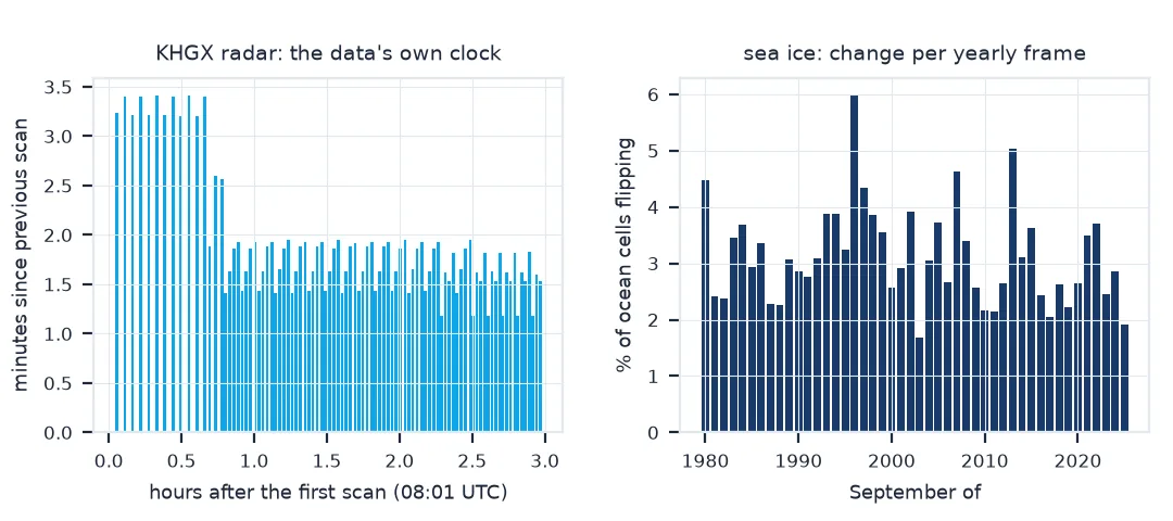
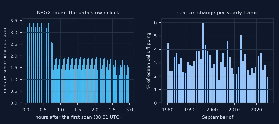
Two numbers decide much of the design: how regular the data's time steps are, and how much of the map changes between frames. Measure both before animating:
gaps = np.diff(SCAN_TIMES).astype("timedelta64[s]").astype(float) / 60
print(f"KHGX radar, 8 Jul 2024 08–11 UTC: {len(SCAN_TIMES)} scans, {gaps.min():.1f}–{gaps.max():.1f} min apart (median {np.median(gaps):.1f})")
print(f"Arctic sea ice, Septembers 1979–2025: median {np.median(FLIPS):.1%} of ocean cells change ice/no-ice between frames, max {max(FLIPS):.1%}")
KHGX radar, 8 Jul 2024 08–11 UTC: 95 scans, 1.2–3.4 min apart (median 1.8)
Arctic sea ice, Septembers 1979–2025: median 3.0% of ocean cells change ice/no-ice between frames, max 6.0%
What motion is good and bad at, and two clocks
1. Know what animation is good at
Motion is the one thing animation shows directly. The eye tracks a moving shape across frames: a hurricane's track, rain bands rotating around an eye, a dot moving along a rail line. Process is the second: growth and decay, such as aftershocks thinning out or drought spreading over a summer. Both are about the change between frames, and that is what the eye perceives in motion.
2. Know what it is bad at
Comparison of two particular moments is hard, because the earlier frame is gone when the later one appears. Readers remember only a few objects across a frame change. Small differences, such as a county moving one class or ice retreating by 25 km, are easy to miss. And the reader cannot control the pace. Small multiples and change maps exist for these jobs; see small multiples vs animation.
3. Relate the data's clock to the animation's
Every animation maps data time to playback time. If the data arrive at regular intervals, one frame per time step keeps that mapping constant. If not, as with radar scans whose spacing changes with the scanning strategy, a fixed frame rate plays the storm at a changing speed. Count the gaps:
counts = pd.Series(np.round(gaps, 1)).value_counts().sort_index()
print("scan gaps (min): " + ", ".join(f"{g}: {n}" for g, n in counts.items()))
print(f"at a fixed frame rate the storm moves {gaps.max() / gaps.min():.1f}x as fast across the longest gap as across the shortest")
scan gaps (min): 1.2: 6, 1.4: 14, 1.5: 6, 1.6: 20, 1.8: 5, 1.9: 25, 2.0: 4, 2.6: 2, 3.2: 6, 3.4: 6
at a fixed frame rate the storm moves 2.9x as fast across the longest gap as across the shortest
4. Keep everything that is not data still
Any change between frames reads as change in the data. The guides in this cluster measured what happens otherwise. Classifying a weekly drought map by its own quintiles changed the colour of 10.7% of counties whose values had not moved. Autoscaling a hurricane map zoomed it 71-fold over the track. A label beside the storm changed the frame size. Fixing the extent, the colour key and the frame size before the first frame removes all of these.
5. Choose a step the eye can follow
If most of the map changes between frames, the eye has nothing to anchor to and the animation reads as noise. If almost nothing changes, it reads as a still image. The share of the map that changes per frame is a quick check on the frame step:
print(f"sea ice, one frame per year: {np.median(FLIPS):.1%} of ocean cells flip per frame; "
      f"largest jump {YEARS[int(np.argmax(FLIPS)) + 1]} ({max(FLIPS):.1%})")
sea ice, one frame per year: 3.0% of ocean cells flip per frame; largest jump 1996 (6.0%)
Frame duration from data time
The data used on this page
NEXRAD Level III scan times for the Houston radar (KHGX) on 8 July 2024, listed from the Unidata Level III archive on AWS; NSIDC Sea Ice Index v4 September concentration grids, 1979–2025.
import re
from pathlib import Path

import matplotlib
matplotlib.use("Agg")
import matplotlib.pyplot as plt
import numpy as np
import pandas as pd
import rasterio
import requests

L3 = "https://unidata-nexrad-level3.s3.amazonaws.com/"
keys = []
for hour in ("08", "09", "10"):
    keys += re.findall(r"<Key>([^<]+)</Key>", requests.get(L3, params={"list-type": 2, "prefix": f"HGX_N0B_2024_07_08_{hour}_"}, timeout=60).text)
SCAN_TIMES = np.array(sorted(pd.to_datetime([k[-19:] for k in keys], format="%Y_%m_%d_%H_%M_%S")), dtype="datetime64[s]")

D = Path("data/seaice"); D.mkdir(parents=True, exist_ok=True)
YEARS = list(range(1979, 2026))
BASE = "https://noaadata.apps.nsidc.org/NOAA/G02135/north/monthly/geotiff/09_Sep"


def ice(y):
    f = D / f"N_{y}09_concentration_v4.0.tif"
    if not f.exists():
        f.write_bytes(requests.get(f"{BASE}/{f.name}", timeout=120).content)
    a = rasterio.open(f).read(1)
    return ((a >= 150) & (a <= 1000)) | (a == 2510), a <= 1000


grids = [ice(y) for y in YEARS]
FLIPS = [np.mean(a[0][a[1] & b[1]] != b[0][a[1] & b[1]]) for a, b in zip(grids[:-1], grids[1:])]
print(f"{len(SCAN_TIMES)} radar scans; {len(YEARS)} sea ice grids")
95 radar scans; 47 sea ice grids
Example 1: frame duration from data time
seconds_per_minute = 0.06                                       # 1 minute of storm = 60 ms of playback
durations_ms = np.round(gaps * seconds_per_minute * 1000).astype(int)
print(f"paced by scan time: frame durations {durations_ms.min()}–{durations_ms.max()} ms; "
      f"the loop runs {durations_ms.sum() / 1000:.1f} s for {gaps.sum() / 60:.1f} h of storm")
paced by scan time: frame durations 71–205 ms; the loop runs 10.7 s for 3.0 h of storm
The claim an animated map makes
An animated map makes a claim the reader cannot check: that the motion on screen is motion in the world. Three kinds of motion are not. Display motion is the frame, extent or colours changing, which the guides here measured and removed. Clock motion is a variable relationship between data time and playback time, such as uneven scan gaps played at a fixed rate. Sampling motion is a time step too coarse for the process: frames a year apart show ice "jumping" between states that happened gradually. The design job is to make the only motion left be motion in the data.
When that is done, animation is the most direct way to show process. It is also limited by memory and by pace, so it works best alongside something static: the final frame, a small-multiples grid, a chart of the summary number, or a change map. The guides in this cluster pair each animation with a check that its frames agree with official numbers, because a convincing animation of wrong frames is still convincing.
Loops, speed, print and interaction
- Loops suit cyclic processes (diurnal, seasonal); a sequence with a beginning and an end should hold its last frame.
- Speed: readers need time to read labels; 4–10 frames per second suits most map animations, with slower frames where the story changes.
- Accessibility: provide a pause control and a static alternative; flashing content above three times a second is a seizure risk.
- Print: animations do not print; publish a key frame or small multiples alongside.
- Interaction: a time slider gives readers the pace control animation lacks.
Internal links
- How to make a radar loop animation — pacing frames by scan time
- Small multiples vs animation — when a grid works better
- Time-series maps explained — the kinds of temporal data a map can show
FAQ
When should I use an animated map?
When the message is motion or process: something moving, spreading, growing or decaying. For comparing particular moments, use small multiples or a change map.
What frame rate should a map animation use?
Low by video standards: 4–10 frames per second is typical. More important is a constant ratio between data time and playback time, or a deliberate, labelled change in it.
Why does my animation look like the data is changing when it is not?
Something besides the data changes between frames: the colour scale, the extent, the frame size or the labels. Fix them once for all frames.
Are animated maps accessible?
Only with care: a pause control, no rapid flashing, alt text describing the change, and a static alternative.