
Small Multiples vs Animation: Choosing How to Show Change on a Map
On this page
Problem statement
The same time series can be shown as an animation, one map after another in the same place, or as small multiples, many small maps side by side. They use the same frames and support opposite tasks. Animation is good at showing motion and poor at comparison, because each frame replaces the last. Small multiples are good at comparison and poor at motion, because the eye has to jump between panels. They also differ in practical ways: how many moments fit, how much detail each one keeps, and whether the result can be printed.
This page compares the two on 47 Septembers of Arctic sea ice and gives a way to decide, including how many panels a grid can hold before the data stops being visible.
Quick answer
Choose by the reader's task, then check the numbers:
- Compare moments (which year had less ice, where did it change): small multiples, up to the point where panels get too small for the data.
- Follow motion or process (where the storm went, how the drought spread): animation.
- See the net change between two moments: a single change map.
How many panels fit depends on the page width and the data's resolution. For the 25 km sea-ice grid on a 1,000-pixel-wide page:
for cols in (2, 3, 4, 6, 8):
    panel_px = (PAGE_PX - (cols - 1) * GAP_PX) / cols
    km_per_px = MAP_KM / panel_px
    print(f"{cols} columns: panels {panel_px:.0f} px wide, {km_per_px:.1f} km per pixel, "
          f"{'cells visible' if km_per_px <= CELL_KM else 'cells smaller than a pixel'}")
2 columns: panels 496 px wide, 10.5 km per pixel, cells visible
3 columns: panels 328 px wide, 15.9 km per pixel, cells visible
4 columns: panels 244 px wide, 21.3 km per pixel, cells visible
6 columns: panels 160 px wide, 32.5 km per pixel, cells smaller than a pixel
8 columns: panels 118 px wide, 44.1 km per pixel, cells smaller than a pixel
Name the task, count moments, keep panels comparable
1. Name the task
Animation and small multiples fail in opposite ways. Ask what the reader must do with the map. "See the ice retreat towards the pole over four decades" is a process: watch it. "Was 2012 lower than 2020, and where?" is a comparison: lay the two side by side. "How much has changed since 1980?" is a net change: subtract.
2. Count the moments
Small multiples have a hard limit: every panel shares one page. Animation has a softer limit, the reader's patience, at a few frames per second. Count what each form must carry:
print(f"{len(YEARS)} Septembers: as an animation at 4 frames/s that is {len(YEARS) / 4:.0f} s; "
      f"as small multiples at 4 columns that is {int(np.ceil(len(YEARS) / 4))} rows")
step = 5
chosen = YEARS[::step]
print(f"every {step} years: {len(chosen)} panels ({chosen[0]}–{chosen[-1]})")
47 Septembers: as an animation at 4 frames/s that is 12 s; as small multiples at 4 columns that is 12 rows
every 5 years: 10 panels (1979–2024)
Thinning the series for small multiples is normal; say what was left out.
3. Keep the panels comparable
Every panel uses the same extent, palette and scale, or the comparison is meaningless. Check that the thinned series still shows the range of the full one:
full = official.loc[YEARS, "extent"]
thin = official.loc[chosen, "extent"]
print(f"all years: {full.min():.2f}–{full.max():.2f} million km² (lowest {full.idxmin()}); "
      f"panels: {thin.min():.2f}–{thin.max():.2f} (lowest {thin.idxmin()})")
all years: 3.57–7.67 million km² (lowest 2012); panels: 4.35–7.14 (lowest 2024)
4. Decide what is lost
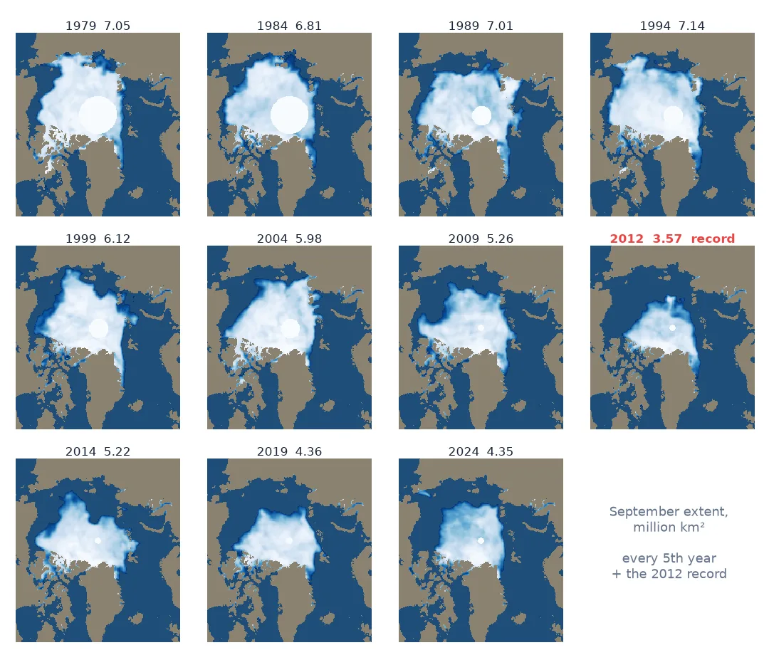
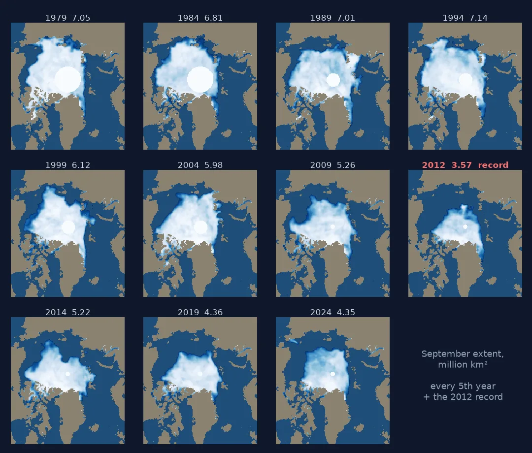
Thinning to every fifth year dropped the record low. A grid that misses the most important moment needs a different selection, such as the record year added as its own panel, or an animation that shows every year.
A selection of Septembers that keeps the record
The data used on this page
NSIDC Sea Ice Index v4: the official September extent table, 1979–2025.
from pathlib import Path

import numpy as np
import pandas as pd
import requests

Path("data").mkdir(exist_ok=True)
CSV = Path("data/N_09_extent_v4.0.csv")
if not CSV.exists():
    CSV.write_bytes(requests.get("https://noaadata.apps.nsidc.org/NOAA/G02135/north/monthly/data/N_09_extent_v4.0.csv", timeout=120).content)
official = pd.read_csv(CSV, skipinitialspace=True)
official.columns = official.columns.str.strip()
official = official.set_index("year").loc[:2025]  # the table gains a row each October
YEARS = list(official.index)
PAGE_PX, GAP_PX = 1000, 8                     # page width and gap between panels, in screen pixels
MAP_KM, CELL_KM = 5200, 25                    # width of the Arctic map shown, and the grid cell size
print(f"{len(YEARS)} Septembers, {YEARS[0]}–{YEARS[-1]}")
47 Septembers, 1979–2025
Example 1: a selection that keeps the record
record = int(official.extent.idxmin())
panels = sorted(set(chosen) | {record})
print(f"{len(panels)} panels: {panels}")
print(f"range now {official.loc[panels, 'extent'].min():.2f}–{official.loc[panels, 'extent'].max():.2f} million km²")
11 panels: [1979, 1984, 1989, 1994, 1999, 2004, 2009, 2012, 2014, 2019, 2024]
range now 3.57–7.14 million km²
Where each form stores its frames
An animation stores every frame in the same place on the screen and in time; a grid of small multiples stores them in different places and all at once. That one difference explains their strengths. In an animation the eye perceives change as motion, and in a grid it compares shapes side by side at its own pace. Neither is better in general, and the same frames can be published both ways at little cost.
The practical limits are as real as the perceptual ones. A grid on a 1,000-pixel page can hold about four columns of Arctic maps before a 25 km cell is smaller than a pixel. It prints, but it forces a selection, and a selection can miss the moment that matters: every fifth September skips 2012. An animation keeps every frame but needs a screen and a reader willing to watch. Publishing both, the animation for the process and the grid for the comparison, is often the honest answer.
Uneven selections and mobile screens
- Uneven selections (adding a record year) break the regular spacing; label every panel with its time.
- Shared legend: one legend for the grid, never one per panel.
- Reading order: left to right, top to bottom, the same as text; say so if the grid runs otherwise.
- Mobile screens halve the page width, and with it the number of usable columns.
- Interactive pages can offer both: a grid that opens an animation, or a slider over the same frames.
Internal links
- How to make small-multiple maps — building the grid in matplotlib
- Animated maps explained — what motion can and cannot show
- How to animate Arctic sea ice — the same frames as an animation
FAQ
When should I use small multiples instead of an animation?
When the reader needs to compare particular moments, or the result must print. Use animation for motion and process.
How many small multiples can I show?
Until panels are too small for the data: here, about four columns of Arctic maps on a 1,000-pixel page. Beyond that, select moments or animate.
Can I use both?
Yes, and it is often best: the same frames as an animation for the process and as small multiples for comparison.
What is a change map?
A single map of the difference between two moments, such as after minus before. It shows net change directly but not the path between.