
How to Make an Animated Drought Map in Python
On this page
Problem statement
The US Drought Monitor publishes a new map every week: polygons of abnormal dryness (D0) through exceptional drought (D4), drawn by climatologists from dozens of indicators. Fifty-two weekly maps played in sequence show a drought being born, spreading and breaking, which no single week can. Building that animation means downloading a year of shapefiles, understanding how the categories are stored, clipping and colouring them consistently, and checking the numbers behind the picture against the official statistics.
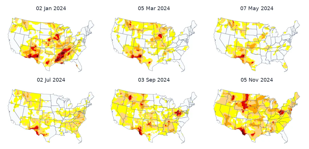
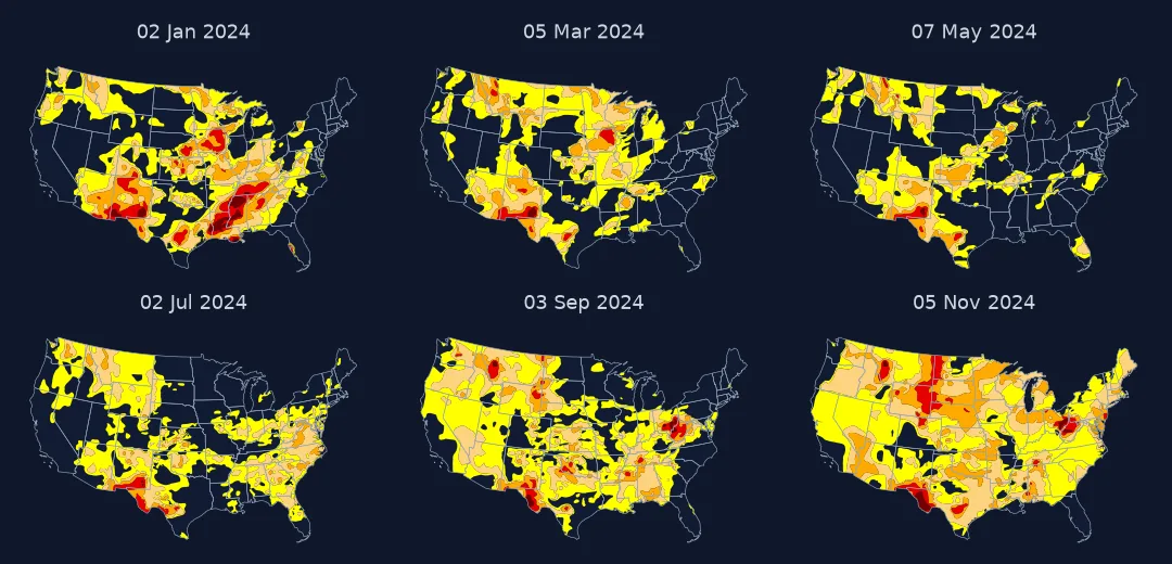
This page animates the 2024 drought year across the contiguous United States. That year ran from a spring low to a record-breaking autumn flash drought. Each frame is checked against the Drought Monitor's own area statistics.
Quick answer
Download each week's shapefile, clip to the contiguous US, colour by category with the official palette, and add the week's date and drought share to each frame:
images = []
for week in WEEKS:
    g = gpd.read_file(f"data/usdm/USDM_{week:%Y%m%d}_M.zip").to_crs(5070)
    g["geometry"] = g.geometry.intersection(CONUS)
    share = g[g.DM >= 1].area.sum() / CONUS.area * 100
    images.append(render(g, week, share))
images[0].save("data/drought_2024.gif", save_all=True, append_images=images[1:], duration=300, loop=0)
print(f"{len(images)} weekly frames; {Path('data/drought_2024.gif').stat().st_size / 1e6:.1f} MB")
53 weekly frames; 1.6 MB
Know the categories, clip, check every frame against official numbers
1. Understand the categories in the file
Each weekly file has up to five polygons, one per category, and they do not overlap: the D1 polygon holds only areas at exactly D1. The official statistics are cumulative ("D1 or worse"), so add the categories up:
g = gpd.read_file("data/usdm/USDM_20240702_M.zip").to_crs(5070)
print(g[["DM"]].assign(km2=(g.area / 1e6).round(0)).to_string(index=False))
d0, d1 = g.geometry.iloc[0], g.geometry.iloc[1]
print(f"overlap of the D0 and D1 polygons: {d0.intersection(d1).area / 1e6:.1f} km2 — categories are disjoint")
DM km2
0 2394935.0
1 1178247.0
2 221105.0
3 73191.0
4 1365.0
overlap of the D0 and D1 polygons: 0.0 km2 — categories are disjoint
2. Clip to the area you report on
The files cover the whole United States, including Alaska, Hawaii and Puerto Rico. The national statistics most often quoted are for the contiguous states, so clip before measuring:
inside = g.geometry.intersection(CONUS).area.sum() / g.area.sum()
print(f"share of the 2 July drought polygons' area inside the contiguous US: {inside:.0%}")
share of the 2 July drought polygons' area inside the contiguous US: 95%
3. Check every frame against the official numbers
The Drought Monitor publishes weekly area percentages. Computing the same number from the polygons is a test that the download, the clip and the category logic are right:
rows = []
for week in WEEKS:
    g = gpd.read_file(f"data/usdm/USDM_{week:%Y%m%d}_M.zip").to_crs(5070)
    a = g.geometry.intersection(CONUS).area
    rows.append({"week": week, "mine": a[g.DM >= 1].sum() / CONUS.area * 100})
check = pd.DataFrame(rows).merge(official, on="week")
diff = check.mine - check.D1
print(f"{len(check)} weeks: D1-or-worse share, mine minus official: mean {diff.mean():+.2f}, range {diff.min():+.2f} to {diff.max():+.2f} points")
53 weeks: D1-or-worse share, mine minus official: mean -0.18, range -0.36 to -0.08 points
The small, consistent shortfall most likely comes from the generalised 1:20 million state outline used for clipping, against the more detailed boundary behind the official figures. A difference of a few tenths of a point, in the same direction every week, is a pass. A difference of several points, or one that changes sign, means something is wrong.
4. Read the year
s = official.set_index("week")
print(f"D1 or worse: lowest {s.D1.min():.1f}% on {s.D1.idxmin():%d %b}, highest {s.D1.max():.1f}% on {s.D1.idxmax():%d %b}")
print(f"D0 or worse peaked at {s.D0.max():.1f}% on {s.D0.idxmax():%d %b}")
print(f"week with the largest one-week rise in D1+: {s.D1.diff().idxmax():%d %b} (+{s.D1.diff().max():.1f} points)")
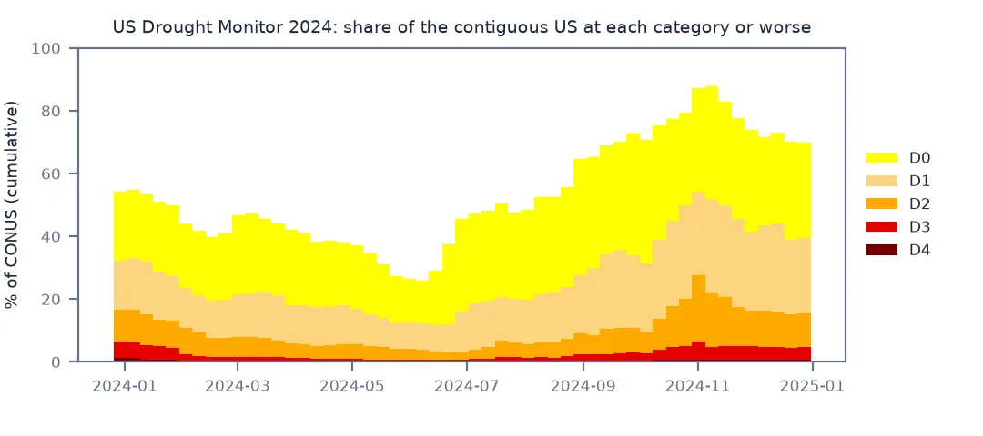
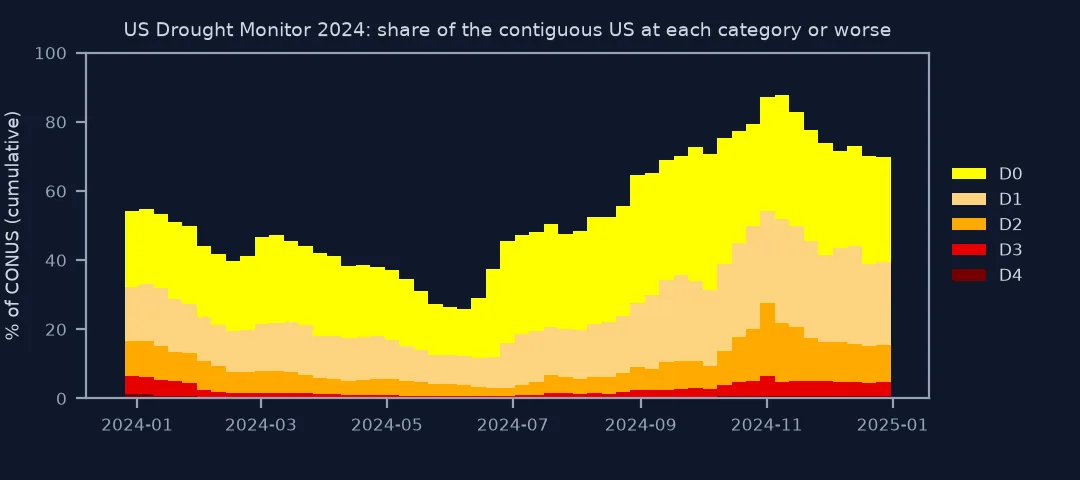
D1 or worse: lowest 11.8% on 11 Jun, highest 54.1% on 29 Oct
D0 or worse peaked at 87.8% on 05 Nov
week with the largest one-week rise in D1+: 10 Dec (+5.1 points)
The animation shows what those numbers mean on the ground. The drought shrank into the Southwest by June, then spread from the Ohio Valley and the Plains in late summer. By early November dryness covered almost the whole country east of the Rockies.
Frame sizes and formats for a drought map
The data used on this page
US Drought Monitor weekly shapefiles for 2024 and CONUS area statistics, from the National Drought Mitigation Center (University of Nebraska–Lincoln, USDA and NOAA); state outlines from the US Census Bureau cartographic boundary files, 2023, 1:20 million.
import io
from pathlib import Path

import geopandas as gpd
import matplotlib
matplotlib.use("Agg")
import matplotlib.pyplot as plt
import numpy as np
import pandas as pd
import requests
from PIL import Image

Path("data/usdm").mkdir(parents=True, exist_ok=True)
WEEKS = pd.date_range("2024-01-02", "2024-12-31", freq="7D")                 # maps are dated Tuesdays
for week in WEEKS:
    f = Path(f"data/usdm/USDM_{week:%Y%m%d}_M.zip")
    if not f.exists():
        f.write_bytes(requests.get(f"https://droughtmonitor.unl.edu/data/shapefiles_m/{f.name}", timeout=120).content)
if not Path("data/cb_2023_us_state_20m.zip").exists():
    Path("data/cb_2023_us_state_20m.zip").write_bytes(requests.get("https://www2.census.gov/geo/tiger/GENZ2023/shp/cb_2023_us_state_20m.zip", timeout=300).content)
states = gpd.read_file("data/cb_2023_us_state_20m.zip").query("STUSPS not in ['AK', 'HI', 'PR']").to_crs(5070)
CONUS = states.union_all()
api = requests.get("https://usdmdataservices.unl.edu/api/USStatistics/GetDroughtSeverityStatisticsByAreaPercent",
                   params={"aoi": "conus", "startdate": "1/1/2024", "enddate": "12/31/2024", "statisticsType": 1}, timeout=120).text
official = pd.read_csv(io.StringIO(api)).assign(week=lambda d: pd.to_datetime(d.MapDate.astype(str)))
official = official[official.week.isin(WEEKS)]
PALETTE = ["#ffff00", "#fcd37f", "#ffaa00", "#e60000", "#730000"]          # the Drought Monitor's own colours


def render(g, week, share):
    fig = plt.figure(figsize=(6, 3.8), dpi=90)
    ax = fig.add_axes([0, 0.08, 1, 0.92]); ax.set_axis_off()
    states.plot(ax=ax, color="#f4f4f4", edgecolor="#bbbbbb", lw=0.3)
    g.plot(ax=ax, color=[PALETTE[int(c)] for c in g.DM], edgecolor="none")
    states.boundary.plot(ax=ax, color="#666666", lw=0.25)
    ax.text(0.01, 0.97, f"{week:%d %b %Y}   D1 or worse: {share:.0f}%", transform=ax.transAxes, fontsize=9, va="top")
    bar = fig.add_axes([0.05, 0.03, 0.9, 0.02]); bar.set_axis_off(); bar.set_xlim(WEEKS[0], WEEKS[-1])
    bar.axvspan(WEEKS[0], week, color="#888888")                                  # progress through the year
    fig.canvas.draw(); im = Image.fromarray(np.asarray(fig.canvas.buffer_rgba())).convert("RGB")
    plt.close(fig)
    return im


print(f"{len(WEEKS)} weekly files; official statistics for {len(official)} weeks")
53 weekly files; official statistics for 53 weeks
Example 1: frame size and format
images[0].save("data/drought_2024.webp", save_all=True, append_images=images[1:], duration=300, loop=0, quality=80)
for f in ("drought_2024.gif", "drought_2024.webp"):
    print(f"{f:18s} {Path('data', f).stat().st_size / 1e6:.2f} MB")
print(f"distinct colours in a frame: {len(np.unique(np.asarray(images[26]).reshape(-1, 3), axis=0))}")
drought_2024.gif 1.64 MB
drought_2024.webp 0.81 MB
distinct colours in a frame: 3041
When an animated choropleth works
An animated choropleth works when the regions stay put and their values change. That is the Drought Monitor's case exactly, except that its "regions" are the drought polygons themselves, redrawn every week. The animation therefore shows two things at once: the category at each place, and the shape of the drought areas growing, splitting and merging. A table or a line chart can give the national share. Only the map shows that the autumn 2024 drought was not one drought but several, joining up.
Animated choropleths need the same discipline as any animation. Keep a fixed palette, here the Drought Monitor's own. Keep a fixed extent and a constant time step: weekly maps are evenly spaced, so a constant frame duration is honest. Add a date and a progress bar to each frame. Checking a frame-derived number against the published statistics is cheap insurance that what the animation shows is what the data says.
Disjoint categories and validity weeks
- Categories are disjoint polygons; sum D1–D4 for "D1 or worse".
- Some weeks have fewer than five polygons when a category is absent; colour by the
DMvalue, not the row order. - Maps are valid Tuesday to Monday and released on Thursday; label frames with the map date.
- Short-term and long-term impact labels (S, L) are separate layers, not in these category polygons.
- The palette is a standard; readers who know the Drought Monitor read it instantly.
- Comparing years needs the same clip and boundary throughout; the statistics are recalculated if boundaries change.
Internal links
- How to make a weather radar loop — another fixed-colour animation
- Choropleth maps in GeoPandas — the single-frame version
FAQ
Where can I download US Drought Monitor shapefiles?
From droughtmonitor.unl.edu/data/shapefiles_m/USDM_YYYYMMDD_M.zip, one file per Tuesday map date.
Are Drought Monitor polygons cumulative?
No. Each polygon holds only its own category; add D1 to D4 to get the "D1 or worse" area that the official statistics report.
How do I check my drought area calculation?
Compare with the Drought Monitor's area statistics service for the same area of interest; differences of a few tenths of a point come from boundary detail.
What frame duration should a weekly animation use?
A constant one, since the maps are evenly spaced; about 0.3 s per week plays a year in about 16 seconds.