
How to Animate a Hurricane Track in Python
On this page
Problem statement
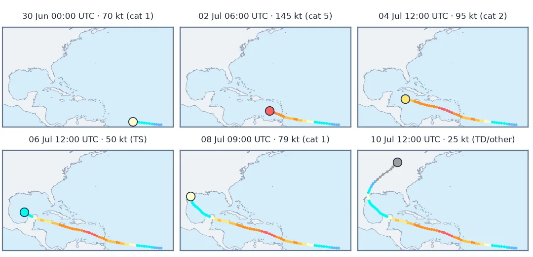
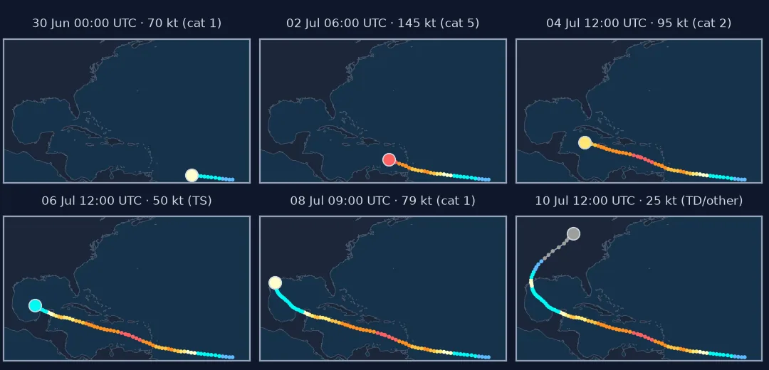
A static track map shows where a hurricane went. An animation shows how: the long, fast run across the Atlantic, the rapid strengthening, the slow crawl into the Gulf, the turn and the acceleration inland. Best-track data is not a video feed, though. Points come every three hours, with extra points at landfall, so they are unevenly spaced in time. The map has to stay still while the storm moves. Intensity has to be readable on every frame.
This page animates the full life of Hurricane Beryl, 28 June to 11 July 2024, from the IBTrACS best track. It resamples the track to an even clock, colours each position by Saffir–Simpson category, and writes the animation to a file with a frame count that does not depend on the data's irregularities.
Quick answer
Interpolate the best track onto a regular hourly clock, draw each frame on a fixed map extent, and colour the current position by category:
clock = pd.date_range(track.t.min(), track.t.max(), freq="1h")
sec = lambda t: (pd.Index(t) - track.t.min()).total_seconds()        # seconds since the first point
hourly = pd.DataFrame({k: np.interp(sec(clock), sec(track.t), track[k]) for k in ("lat", "lon", "wind")}, index=clock)
fig, ax = base_map()                                                   # fixed extent, drawn once
trail, = ax.plot([], [], color="0.4", lw=1)
head = ax.scatter([], [], s=80, edgecolors="k", zorder=5)
label = ax.text(0.02, 0.95, "", transform=ax.transAxes, va="top")
def frame(i):
    trail.set_data(hourly.lon[:i + 1], hourly.lat[:i + 1])
    head.set_offsets([[hourly.lon.iloc[i], hourly.lat.iloc[i]]]); head.set_color(colour(hourly.wind.iloc[i]))
    label.set_text(f"{hourly.index[i]:%d %b %H:%M} UTC  {hourly.wind.iloc[i]:.0f} kt")
anim = FuncAnimation(fig, frame, frames=range(0, len(hourly), 3))
anim.save("data/beryl.gif", writer=PillowWriter(fps=12))
print(f"{len(track)} best-track points -> {len(hourly)} hourly positions -> {len(range(0, len(hourly), 3))} frames; "
      f"{Path('data/beryl.gif').stat().st_size / 1e6:.1f} MB")
109 best-track points -> 313 hourly positions -> 105 frames; 0.4 MB
Read the timing, resample evenly, keep the map still
1. Read the best track and look at its timing
gaps = track.t.diff().dropna()
print(f"{len(track)} points {track.t.min():%d %b %H:%M} – {track.t.max():%d %b %H:%M}; time steps:",
      gaps.value_counts().sort_index().rename(lambda x: f"{x.total_seconds() / 60:.0f} min").to_dict())
print("off-clock points:", track[~track.t.dt.hour.isin(range(0, 24, 3)) | (track.t.dt.minute > 0)][["t", "wind"]].astype(str).values.tolist())
109 points 28 Jun 12:00 – 11 Jul 12:00; time steps: {'20 min': 2, '45 min': 1, '60 min': 1, '120 min': 1, '135 min': 1, '160 min': 2, '180 min': 100}
off-clock points: [['2024-07-01 15:20:00', '120'], ['2024-07-02 09:45:00', '145'], ['2024-07-05 11:00:00', '80'], ['2024-07-08 08:40:00', '80']]
Most points are three hours apart; the extra ones mark landfalls and peak intensity, added by the National Hurricane Center's post-storm analysis. Animated one point per frame, the storm would freeze at each of those moments.
2. Resample to an even clock
Linear interpolation of latitude, longitude and wind onto hourly steps keeps the special points' information while making each frame the same length of time:
from pyproj import Geod
_, _, d = Geod(ellps="WGS84").inv(hourly.lon[:-1].values, hourly.lat[:-1].values, hourly.lon[1:].values, hourly.lat[1:].values)
speed = pd.Series(d / 1000, index=hourly.index[1:])                      # km per hour
print(f"track length {speed.sum():,.0f} km in {len(hourly) - 1} hours; forward speed median {speed.median():.0f} km/h, "
      f"fastest {speed.max():.0f} km/h around {speed.idxmax():%d %b %H:%M}")
track length 9,039 km in 312 hours; forward speed median 29 km/h, fastest 60 km/h around 09 Jul 19:00
3. Keep the map still
Every frame must have the same extent, projection and background. Letting matplotlib autoscale to the points drawn so far makes the map zoom and pan as the track grows, which reads as motion that never happened. Draw the base map once, then update only the track artists:
print("extent:", base_extent, "| track bounds:",
      [round(float(v), 1) for v in (hourly.lon.min(), hourly.lat.min(), hourly.lon.max(), hourly.lat.max())])
extent: (-100, -35, 8, 46) | track bounds: [-96.0, 8.9, -39.6, 43.1]
4. Make intensity readable
Colour the current position and the trail by Saffir–Simpson category, and print the wind speed in the label. The category comes from the maximum sustained wind:
cats = pd.cut(hourly.wind, [0, 34, 64, 83, 96, 113, 137, 300], right=False, labels=["TD", "TS", "1", "2", "3", "4", "5"])
print(cats.value_counts().reindex(["TD", "TS", "1", "2", "3", "4", "5"]).to_dict(), "hours by category")
print(f"category 4 or 5 for {(cats.isin(['4', '5'])).sum()} hours; first best-track point at category 5: {track.t[track.wind >= 137].iloc[0]:%d %b %H:%M}")
{'TD': 73, 'TS': 89, '1': 26, '2': 20, '3': 39, '4': 48, '5': 18} hours by category
category 4 or 5 for 66 hours; first best-track point at category 5: 02 Jul 00:00
A track coloured by intensity in a still image
The data used on this page
IBTrACS v04r01, North Atlantic list, from NOAA NCEI (USA agency wind and Saffir–Simpson category); land from Natural Earth 1:50m.
from pathlib import Path

import geopandas as gpd
import matplotlib
matplotlib.use("Agg")
import matplotlib.pyplot as plt
import numpy as np
import pandas as pd
import requests
from matplotlib.animation import FuncAnimation, PillowWriter

Path("data").mkdir(exist_ok=True)
SRC = {"ibtracs.NA.list.v04r01.csv": "https://www.ncei.noaa.gov/data/international-best-track-archive-for-climate-stewardship-ibtracs/v04r01/access/csv/ibtracs.NA.list.v04r01.csv",
       "ne_50m_land.zip": "https://naciscdn.org/naturalearth/50m/physical/ne_50m_land.zip"}
for name, url in SRC.items():
    if not Path("data", name).exists():
        Path("data", name).write_bytes(requests.get(url, timeout=600).content)
ib = pd.read_csv("data/ibtracs.NA.list.v04r01.csv", skiprows=[1], low_memory=False, keep_default_na=False)
track = ib[(ib.NAME == "BERYL") & (ib.SEASON.astype(int) == 2024)].copy()
track = track.assign(t=pd.to_datetime(track.ISO_TIME), lat=pd.to_numeric(track.LAT), lon=pd.to_numeric(track.LON),
                     wind=pd.to_numeric(track.USA_WIND)).reset_index(drop=True)[["t", "lat", "lon", "wind"]]
land = gpd.read_file("data/ne_50m_land.zip")
base_extent = (-100, -35, 8, 46)
COLOURS = ["#5ebaff", "#00faf4", "#ffffcc", "#ffe775", "#ffc140", "#ff8f20", "#ff6060"]


def colour(kt):
    return COLOURS[int(np.searchsorted([34, 64, 83, 96, 113, 137], kt, side="right"))]


def base_map():
    fig, ax = plt.subplots(figsize=(6, 4), dpi=100)
    ax.set_facecolor("#d6ecfa"); land.plot(ax=ax, color="#eef2f6", edgecolor="#94a3b8", lw=0.3)
    ax.set_xlim(base_extent[:2]); ax.set_ylim(base_extent[2:]); ax.set_xticks([]); ax.set_yticks([])
    return fig, ax


print(f"Beryl 2024: {len(track)} points, peak {track.wind.max():.0f} kt")
Beryl 2024: 109 points, peak 145 kt
Example 1: trail coloured by intensity in a still image
fig, ax = base_map()
for (_, a), (_, b) in zip(hourly.iloc[:-1].iterrows(), hourly.iloc[1:].iterrows()):
    ax.plot([a.lon, b.lon], [a.lat, b.lat], color=colour(a.wind), lw=2.5, solid_capstyle="round")
fig.savefig("data/beryl_track.png", dpi=150)
print("segments drawn:", len(hourly) - 1)
segments drawn: 312
Mapping storm time onto playback time
A storm-track animation maps time onto playback time, and space onto a fixed map. Both mappings have to be constant for the motion to be honest. Best-track data is designed for analysis, not playback: its points are synoptic times plus special points at landfall and peak intensity. Interpolating onto an even clock is the step that turns it into frames. It does not add information, it only spaces what is there evenly in time.
What the animation shows best is the change in speed and intensity: the steady run across the Atlantic at a median 29 km/h, the explosive strengthening to category 5, the weakening over Yucatán, and the acceleration after landfall in Texas. A static map can show the same path, but it compresses thirteen days into one picture, where the storm's pace is invisible. Pair the animation with a static intensity-coloured track for print and for readers who cannot watch it.
The dateline, sustained winds and extratropical stages
- Interpolating across the dateline needs continuous longitudes; see the dateline guide.
- Linear interpolation between 3-hourly points is fine for display; for analysis, use the original points.
- Wind is the 1-minute sustained maximum in the USA columns; other agencies use 10-minute winds.
- Extratropical stages (category codes below 0) should look different from tropical ones; the colours above treat them as depressions.
- Frame count sets file size; a frame every three hours of storm keeps the GIF small.
- Aspect ratio: plot in a projected CRS or set
ax.set_aspectnear the storm's latitude to avoid stretched tracks.
Internal links
- How to map a hurricane track from IBTrACS — the static map
- Storm track crosses the dateline — longitudes past 180°
- How to make a weather radar loop — the same storm from the ground
FAQ
How do I animate a hurricane track in Python?
Interpolate the best track onto an even clock, draw the base map once with a fixed extent, and update a trail line and a current-position marker in FuncAnimation, saving with PillowWriter or FFMpegWriter.
Why does my hurricane animation stall at some points?
Best-track files contain extra points at landfall and peak intensity; animating one point per frame lingers there. Resample to an even time step.
How do I colour a track by hurricane category?
Map the maximum sustained wind to Saffir–Simpson categories (64, 83, 96, 113 and 137 kt thresholds) and colour each segment or marker by category.
Why does my animation zoom as the track grows?
Matplotlib autoscales to the data; set fixed axis limits before animating.