
How to Build a Space-Time Cube in Python
On this page
Problem statement
A space-time cube stacks time on top of a map: x and y are position, the vertical axis is time. Events become points in the cube and moving objects become lines climbing through it. Patterns that an animation shows one frame at a time, such as activity moving along a fault, appear all at once as shapes in 3D. The same idea in a gridded form, counts in x-y-time bins, is the data structure behind hot-spot trend analysis. Both need a projected coordinate system so that a kilometre is a kilometre in each direction. They also need a time axis scaled so the shape is readable, and enough events per bin for the counts to mean something.
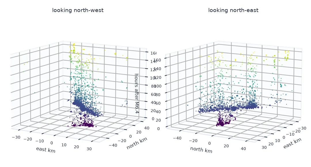
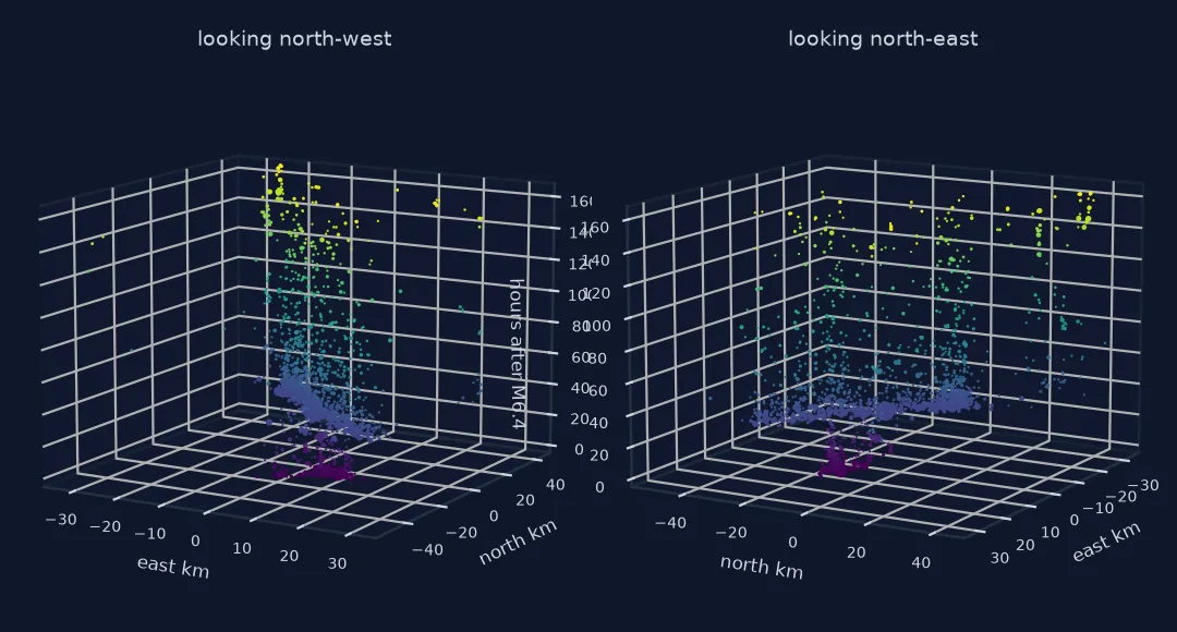
This page builds both forms for the 2019 Ridgecrest earthquake sequence: a 3D point cube showing the M6.4 and M7.1 aftershocks on two crossing faults, and a binned cube of daily counts.
Quick answer
Project the events, turn time into hours since a reference, and plot x, y and t on 3D axes:
t0 = q.loc[q.mag == 6.4, "time"].iloc[0]
q["x_km"], q["y_km"] = (xy.x - xy.x.mean()) / 1000, (xy.y - xy.y.mean()) / 1000
q["hours"] = (q.time - t0).dt.total_seconds() / 3600
fig = plt.figure(figsize=(6, 6))
ax = fig.add_subplot(projection="3d")
ax.scatter(q.x_km, q.y_km, q.hours, s=2 * 2.5 ** (q.mag - 2.5), c=q.hours, cmap="viridis", depthshade=False)
ax.set_xlabel("east (km)"); ax.set_ylabel("north (km)"); ax.set_zlabel("hours after the M6.4")
ax.view_init(elev=15, azim=-60)
fig.savefig("data/cube_points.png", dpi=150)
print(f"{len(q):,} events, x {q.x_km.min():.0f} to {q.x_km.max():.0f} km, y {q.y_km.min():.0f} to {q.y_km.max():.0f} km, "
      f"t {q.hours.min():.1f} to {q.hours.max():.0f} h")
2,449 events, x -32 to 34 km, y -52 to 44 km, t -0.5 to 654 h
Project first, see the sheets, bin, check cell counts
1. Project before you build the cube
In degrees, a step east is shorter than a step north at 36° N. In a cube that distortion stretches every shape. Project to a metric CRS first, here UTM zone 11N:
lon_km = 111.32 * np.cos(np.radians(q.latitude.mean()))
print(f"at {q.latitude.mean():.2f}° N one degree of longitude is {lon_km:.1f} km, one degree of latitude about 111 km")
print(f"extent: {np.ptp(q.longitude):.2f}° x {np.ptp(q.latitude):.2f}° = {np.ptp(q.x_km):.0f} km x {np.ptp(q.y_km):.0f} km")
at 35.80° N one degree of longitude is 90.3 km, one degree of latitude about 111 km
extent: 0.74° x 0.86° = 66 km x 96 km
2. See the two ruptures as two sheets
In the cube, the aftershocks of each mainshock form a sheet that starts at that mainshock's time. Measure each sheet's direction and how elongated it is with a principal-axis fit, using the first six hours after each mainshock:
t71 = (q.loc[q.mag == 7.1, "time"].iloc[0] - t0).total_seconds() / 3600

def axis(sel):
    xy = np.column_stack([sel.x_km - sel.x_km.mean(), sel.y_km - sel.y_km.mean()])
    _, sv, vt = np.linalg.svd(xy, full_matrices=False)
    return np.degrees(np.arctan2(vt[0, 0], vt[0, 1])) % 180, sv[0] / sv[1]   # compass bearing, elongation

for name, start in (("M6.4", 0.0), ("M7.1", t71)):
    sel = q[(q.hours >= start) & (q.hours < start + 6)]
    bearing, ratio = axis(sel)
    print(f"6 h after the {name} (t = {start:.1f} h): {len(sel)} events, long axis {bearing:.0f}°, elongation {ratio:.1f} : 1")
6 h after the M6.4 (t = 0.0 h): 172 events, long axis 36°, elongation 1.6 : 1
6 h after the M7.1 (t = 33.8 h): 802 events, long axis 142°, elongation 5.8 : 1
The M7.1's aftershocks form a long, narrow sheet running north-west to south-east. The M6.4's are a much rounder cloud with a weak north-east trend: they lit up both the north-east fault and the north-west one that the M7.1 later ruptured, so no single axis fits them well. Over 30 hours the M6.4's best-fit axis swings from 36° to 9° as more events land on the cross fault. A cube shows that cross shape directly; a single fitted line would hide it.
3. Bin into a gridded cube
For counting and trend analysis, bin the events into x-y-t cells. Here a cell is 5 km by 5 km by one day, with days counted from the M6.4 (the first bin holds the 24 hours before it):
xe = np.arange(np.floor(q.x_km.min() / 5) * 5, q.x_km.max() + 5, 5)
ye = np.arange(np.floor(q.y_km.min() / 5) * 5, q.y_km.max() + 5, 5)
te = np.arange(np.floor(q.hours.min() / 24) * 24, q.hours.max() + 24, 24)
cube, _ = np.histogramdd(np.column_stack([q.x_km, q.y_km, q.hours]), bins=[xe, ye, te])
print(f"cube {cube.shape} (x, y, day) = {cube.size:,} cells; {np.count_nonzero(cube):,} non-empty; "
      f"total {int(cube.sum()):,} = events {len(q):,}")
busiest = np.unravel_index(cube.argmax(), cube.shape)
print(f"busiest cell: {int(cube.max())} events, hours {te[busiest[2]]:.0f} to {te[busiest[2] + 1]:.0f} after the M6.4")
cube (14, 20, 29) (x, y, day) = 8,120 cells; 468 non-empty; total 2,449 = events 2,449
busiest cell: 223 events, hours 24 to 48 after the M6.4
4. Check the cells have enough events
A cube of mostly empty or near-empty cells cannot support a trend per cell. Count how many cells have enough events for a time series:
per_column = cube.sum(axis=2)                                       # events per x-y column over the month
active = per_column > 0
print(f"{active.sum()} of {active.size} columns have any events; "
      f"{(per_column >= 30).sum()} have 30 or more")
nonzero = cube[cube > 0]
print(f"non-empty cells: median {np.median(nonzero):.0f} events, {np.mean(nonzero == 1):.0%} hold a single event")
86 of 280 columns have any events; 23 have 30 or more
non-empty cells: median 2 events, 49% hold a single event
The sequence is concentrated: a few columns along the faults hold almost everything. Hot-spot trend tests on the binned cube would only be meaningful for those columns.
Slices through an earthquake cube
The data used on this page
Earthquakes of magnitude 2.5 and above from the USGS ComCat catalogue, box 35.3–36.2° N, 118.0–117.2° W, July 2019, projected to UTM zone 11N (EPSG:32611).
from pathlib import Path

import geopandas as gpd
import matplotlib
matplotlib.use("Agg")
import matplotlib.pyplot as plt
import numpy as np
import pandas as pd
import requests

Path("data").mkdir(exist_ok=True)
CAT = Path("data/ridgecrest_2019.csv")
if not CAT.exists():
    params = dict(format="csv", starttime="2019-07-01", endtime="2019-08-01", minlatitude=35.3, maxlatitude=36.2,
                  minlongitude=-118.0, maxlongitude=-117.2, minmagnitude=2.5, orderby="time-asc")
    CAT.write_text(requests.get("https://earthquake.usgs.gov/fdsnws/event/1/query", params=params, timeout=120).text)
q = pd.read_csv(CAT)
q["time"] = pd.to_datetime(q.time, utc=True)
q = q[q.type == "earthquake"].reset_index(drop=True)
xy = gpd.GeoSeries(gpd.points_from_xy(q.longitude, q.latitude), crs=4326).to_crs(32611)
print(f"{len(q):,} earthquakes projected to EPSG:32611")
2,449 earthquakes projected to EPSG:32611
Example 1: slices through the cube
fig, axes = plt.subplots(1, 4, figsize=(12, 3.2), sharex=True, sharey=True)
for ax, k in zip(axes, (1, 2, 3, 10)):
    ax.imshow(cube[:, :, k].T, origin="lower", extent=(xe[0], xe[-1], ye[0], ye[-1]), cmap="magma_r", vmin=0, vmax=cube.max())
    ax.set_title(f"{te[k]:.0f}–{te[k + 1]:.0f} h: {int(cube[:, :, k].sum())} events")
fig.savefig("data/cube_slices.png", dpi=150)
print("events per day from the day before the M6.4:", cube.sum(axis=(0, 1))[:10].astype(int).tolist())
events per day from the day before the M6.4: [1, 269, 1147, 254, 129, 75, 72, 89, 48, 30]
Trading one kind of reading for another
A space-time cube trades one kind of reading for another. An animation shows each moment clearly but asks the reader to remember the sequence. The cube shows the whole sequence as a shape, but the reader has to read depth from a 2D picture, which is easy to get wrong. It works best when the shape is meaningful, like the Ridgecrest sequence: a rounder cloud after the M6.4 and, 34 hours later, a long sheet after the M7.1. Showing it from two angles, or interactively, removes most of the ambiguity.
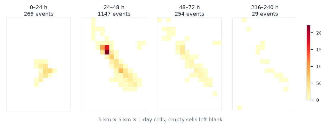
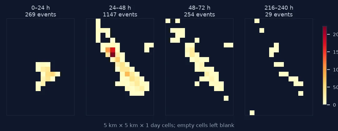
The gridded cube is less visual and more analytical. It is what tools such as emerging hot-spot analysis consume: a regular array of counts per location per time step, to which a trend test is applied column by column. Its two choices, cell size and time step, decide what can be found. Too-fine cells leave most columns empty or with single events, as here, and a trend test on a handful of events has almost no power. Count the events per column before running any statistic on a cube.
Time scaling, log time and depth
- Time scaling is arbitrary in a point cube: hours, days or log-time each produce a different shape. Pick the scale that makes the pattern readable, and label it.
- Log time suits aftershock sequences, which decay roughly as 1/t; a linear axis squeezes the first day into a thin slab.
- Depth is a fourth dimension for earthquakes and is lost here; colour by depth if it matters.
- Interactive 3D (plotly, pydeck) lets readers rotate the cube; a static figure needs at least two viewpoints.
- Cell size for a binned cube should follow the process scale and the event density, not a round number.
- Edges: the box and the month clip the sequence; aftershocks outside either are missing from the cube.
Internal links
- How to animate an earthquake sequence — the same catalogue frame by frame
- How to make a time-slider web map — letting readers step through time
FAQ
What is a space-time cube?
A 3D representation with two map axes and a time axis. Events are points in it and moving objects are lines; in gridded form it is an array of counts per location per time step.
How do I make a space-time cube in Python?
Project the coordinates, convert times to a number (hours since a reference), and plot them with matplotlib's 3D axes; for the gridded form use np.histogramdd or xarray.
Why does my space-time cube look distorted?
The x and y axes are in degrees. Project to a metric CRS so that distances are equal in both directions.
How big should the cells of a space-time cube be?
Big enough that most columns hold a usable number of events. Count events per column and cell before running trend statistics.