
How to Animate an Earthquake Sequence in Python
On this page
Problem statement
An earthquake sequence unfolds over days to weeks. Foreshocks come first, then the mainshock, then thousands of aftershocks spreading along the fault and slowly dying away. A static map of a month's catalogue shows one dense smear. An animation shows the order: where the rupture started, which way it grew, and how fast the activity decayed. Building one honestly means answering four questions. How should old events fade? How big should a magnitude 7 dot be next to a magnitude 2.5? Which clock do the frame labels use? And can the animation be trusted in the first hours after a big shock, when the network misses many small events?
This page animates the 2019 Ridgecrest, California sequence, an M6.4 on 4 July and an M7.1 thirty-four hours later, from the USGS earthquake catalogue.
Quick answer
Query the USGS FDSN event service, step a clock through the sequence, and draw every event so far with an opacity that halves each day, down to a floor that keeps the fault visible:
frames = pd.date_range("2019-07-04 12:00", "2019-07-14 12:00", freq="6h", tz="UTC")
images = []
for t in frames:
    seen = q[q.time <= t]
    age_h = (t - seen.time).dt.total_seconds() / 3600
    rgba = np.zeros((len(seen), 4)); rgba[:, 0] = 0.8
    rgba[:, 3] = np.maximum(0.5 ** (age_h / 24), 0.1)          # 24-hour half-life, never below 0.1
    fig, ax = plt.subplots(figsize=(5, 5), dpi=80)
    PLACES.plot(ax=ax, color="#dddddd")
    ax.scatter(seen.longitude, seen.latitude, s=2 * 2.5 ** (seen.mag - 2.5), c=rgba, edgecolors="none")
    ax.set_xlim(-118.0, -117.2); ax.set_ylim(35.3, 36.2)
    ax.set_title(f"{t.tz_convert('America/Los_Angeles'):%d %b %H:%M} PDT   {len(seen):,} events")
    fig.canvas.draw(); images.append(np.asarray(fig.canvas.buffer_rgba())[..., :3].copy()); plt.close(fig)
iio.imwrite("data/ridgecrest.gif", images, duration=150, loop=0)
print(f"{len(images)} frames, {Path('data/ridgecrest.gif').stat().st_size / 1e6:.2f} MB")
41 frames, 0.26 MB
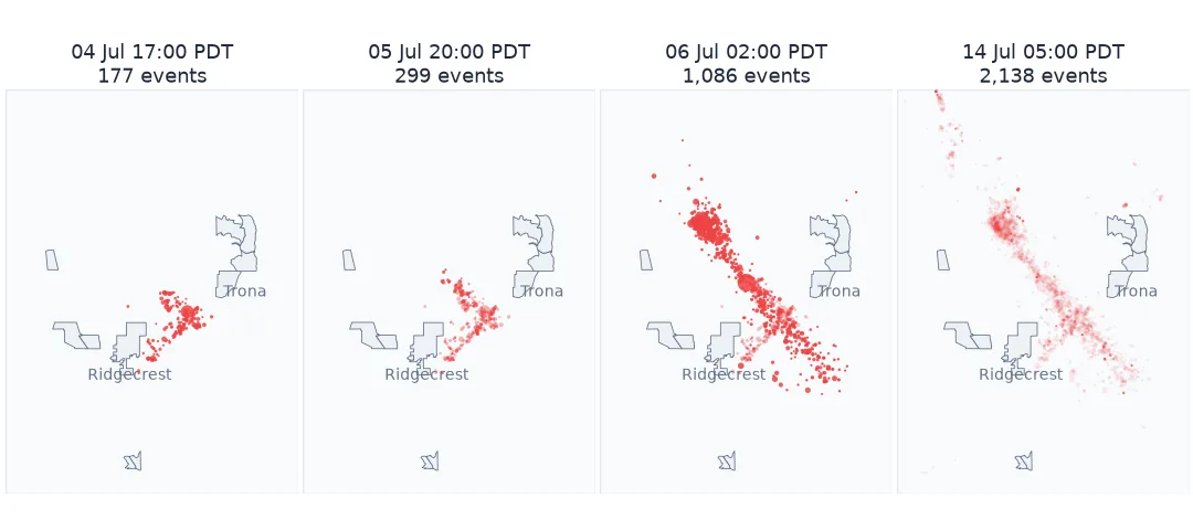
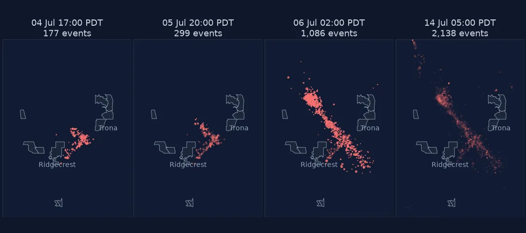
Query, local time, gentle sizes, Omori's decay
1. Query the catalogue
The USGS FDSN event web service returns any box, period and magnitude range as CSV. Keep orderby=time-asc so frames can be built by slicing:
print(f"{len(q):,} events M{q.mag.min()} to M{q.mag.max()}, {q.time.min():%d %b %H:%M} to {q.time.max():%d %b %H:%M} UTC")
print(q.nlargest(4, "mag")[["time", "mag", "magType", "depth"]].to_string(index=False))
2,449 events M2.5 to M7.1, 04 Jul 17:02 to 31 Jul 23:30 UTC
time mag magType depth
2019-07-06 03:19:53.040000+00:00 7.10 mw 8.00
2019-07-04 17:33:49+00:00 6.40 mw 10.50
2019-07-06 03:47:53.420000+00:00 5.50 mw 5.04
2019-07-06 04:18:55.790000+00:00 5.44 mw 7.41
The catalogue is revised as events are reviewed (the updated column records when), so counts drift slightly over the years. Save the CSV you animated alongside the animation.
2. Put the clock in local time
Catalogue times are UTC. People remember the local time, and the two disagree on the date:
for m in (6.4, 7.1):
    t = q.loc[q.mag == m, "time"].iloc[0]
    print(f"M{m}: {t:%Y-%m-%d %H:%M} UTC = {t.tz_convert('America/Los_Angeles'):%Y-%m-%d %H:%M %Z}")
gap = q.loc[q.mag == 7.1, "time"].iloc[0] - q.loc[q.mag == 6.4, "time"].iloc[0]
print(f"time between them: {gap.total_seconds() / 3600:.1f} hours")
M6.4: 2019-07-04 17:33 UTC = 2019-07-04 10:33 PDT
M7.1: 2019-07-06 03:19 UTC = 2019-07-05 20:19 PDT
time between them: 33.8 hours
Convert with a named zone (America/Los_Angeles), not a fixed offset, so a sequence that spans a daylight-saving change stays right.
3. Size by magnitude, gently
Magnitude is logarithmic: each step is about 32 times more energy. Scaled to energy, the M7.1 dot would cover millions of M2.5 dots. Use a gentle exponential instead (the quick answer's 2 * 2.5 ** (mag - 2.5)) and say so in the legend:
def size(mag):
    return 2 * 2.5 ** (mag - 2.5)        # marker area in points²

for m in (2.5, 4.0, 5.5, 7.1):
    print(f"M{m}: marker area {size(m):7.1f} pt²  (energy {10 ** (1.5 * (m - 2.5)):>13,.0f} × an M2.5)")
M2.5: marker area 2.0 pt² (energy 1 × an M2.5)
M4.0: marker area 7.9 pt² (energy 178 × an M2.5)
M5.5: marker area 31.2 pt² (energy 31,623 × an M2.5)
M7.1: marker area 135.4 pt² (energy 7,943,282 × an M2.5)
4. Check the decay against Omori's law
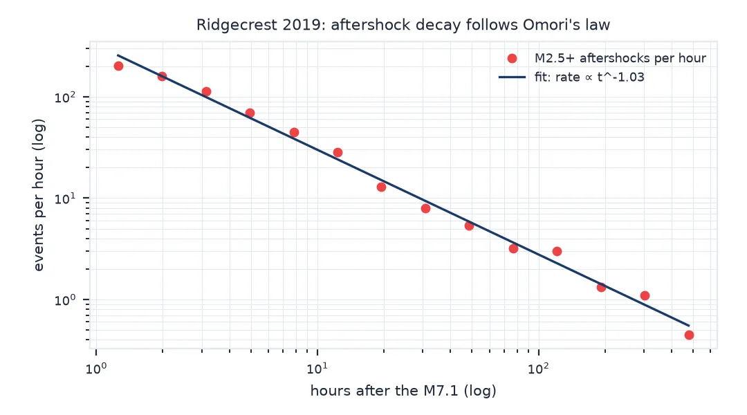
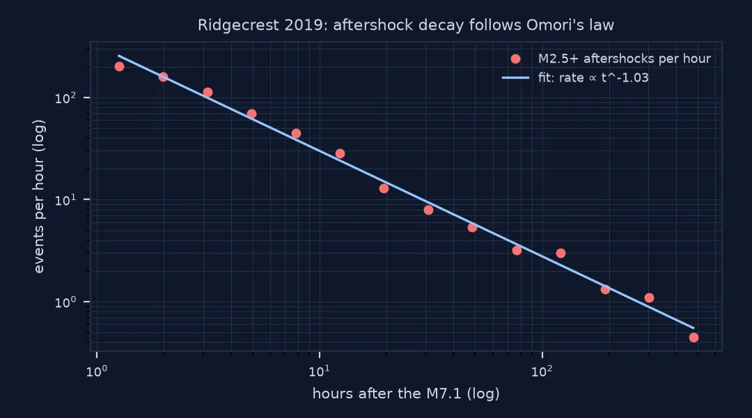
Aftershock rates fall roughly as 1 / tp after a mainshock (the modified Omori law, with p near 1). Fitting it is a check that the animation's fading matches the data rather than a choice of half-life:
t0 = q.loc[q.mag == 7.1, "time"].iloc[0]
after = q[(q.time > t0) & (q.time < t0 + pd.Timedelta(days=25))]
hours = (after.time - t0).dt.total_seconds() / 3600
edges = np.logspace(np.log10(1), np.log10(600), 15)                  # 1 hour to 25 days, log-spaced
counts, _ = np.histogram(hours, edges)
rate = counts / np.diff(edges)
mid = np.sqrt(edges[:-1] * edges[1:])
p, logk = np.polyfit(np.log10(mid), np.log10(rate), 1)
print(f"aftershock rate ~ t^{p:.2f}  ({rate[0]:.0f}/h at {mid[0]:.1f} h, {rate[-1]:.2f}/h at {mid[-1]:.0f} h)")
aftershock rate ~ t^-1.03 (202/h at 1.3 h, 0.45/h at 477 h)
5. Know when the catalogue is incomplete
Straight after a large shock, seismograms are full of overlapping waves and small events are missed. The share of small events reveals it. With a Gutenberg–Richter b-value near 1, about two thirds of M2.5+ events should be below M3:
def small_share(a, b):
    w = q[(q.time > t0 + pd.Timedelta(hours=a)) & (q.time <= t0 + pd.Timedelta(hours=b))]
    return len(w), (w.mag < 3).mean()

for a, b in ((0, 3), (3, 24), (24, 24 * 7), (24 * 7, 24 * 25)):
    n, s = small_share(a, b)
    print(f"{a:>4}–{b:<4} h after M7.1: {n:>4} events, {s:.0%} below M3")
0–3 h after M7.1: 562 events, 29% below M3
3–24 h after M7.1: 693 events, 69% below M3
24–168 h after M7.1: 539 events, 66% below M3
168–600 h after M7.1: 348 events, 68% below M3
The first hours are short of small events, so the animation undercounts there. That is worth a note on the first frames.
An MP4 export and daily counts
The data used on this page
Earthquakes from the USGS ComCat catalogue via its FDSN event service (box 35.3–36.2° N, 118.0–117.2° W, July 2019, M2.5+); place outlines from the US Census Bureau cartographic boundary files, California places, 2023.
from pathlib import Path

import geopandas as gpd
import imageio
import imageio.v3 as iio
import matplotlib
matplotlib.use("Agg")
import matplotlib.pyplot as plt
import numpy as np
import pandas as pd
import requests

Path("data").mkdir(exist_ok=True)
CAT = Path("data/ridgecrest_2019.csv")
if not CAT.exists():
    params = dict(format="csv", starttime="2019-07-01", endtime="2019-08-01", minlatitude=35.3, maxlatitude=36.2,
                  minlongitude=-118.0, maxlongitude=-117.2, minmagnitude=2.5, orderby="time-asc")
    CAT.write_text(requests.get("https://earthquake.usgs.gov/fdsnws/event/1/query", params=params, timeout=120).text)
if not Path("data/cb_2023_06_place_500k.zip").exists():
    Path("data/cb_2023_06_place_500k.zip").write_bytes(
        requests.get("https://www2.census.gov/geo/tiger/GENZ2023/shp/cb_2023_06_place_500k.zip", timeout=300).content)
q = pd.read_csv(CAT)
q["time"] = pd.to_datetime(q.time, utc=True)
q = q[q.type == "earthquake"].reset_index(drop=True)
PLACES = gpd.read_file("data/cb_2023_06_place_500k.zip").cx[-118.0:-117.2, 35.3:36.2]
print(f"{len(q):,} earthquakes; {len(PLACES)} places in the box: {', '.join(sorted(PLACES.NAME)[:4])} ...")
2,449 earthquakes; 11 places in the box: China Lake Acres, Homewood Canyon, Inyokern, Johannesburg ...
Example 1: export as MP4 as well
with imageio.get_writer("data/ridgecrest.mp4", format="FFMPEG", fps=6, codec="libx264", quality=7, macro_block_size=1) as w:
    for im in images:
        w.append_data(im)
for f in ("data/ridgecrest.gif", "data/ridgecrest.mp4"):
    print(f"{f}: {Path(f).stat().st_size / 1e6:.2f} MB")
data/ridgecrest.gif: 0.26 MB
data/ridgecrest.mp4: 0.08 MB
Example 2: daily counts
local = q.time.dt.tz_convert("America/Los_Angeles")
daily = local.dt.date.value_counts().sort_index()
print(daily.head(10).to_string())
time
2019-07-04 220
2019-07-05 718
2019-07-06 647
2019-07-07 166
2019-07-08 91
2019-07-09 68
2019-07-10 93
2019-07-11 65
2019-07-12 32
2019-07-13 32
Three choices layered on a point animation
An earthquake animation is a point animation with three choices layered on top. Fading keeps the newest activity bright and lets older events recede, so the eye follows where the sequence is now. Size must rank magnitudes without letting the largest event swallow the map. Time must be labelled the way readers remember it.
The decay check matters because a fading animation looks the same whatever the data does. Fitting the Omori law shows the activity really does fall by orders of magnitude over the days shown, and the incompleteness check shows where the first frames understate it. Both take a few lines, and both belong in the caption.
Events outside the box, duplicates and depth
- Events outside the box are cut off; choose the box from the full aftershock zone, not the epicentre.
- Duplicate events from different networks are merged in ComCat, but regional catalogues may list both.
typeincludes quarry blasts and explosions in some areas; filter toearthquake.- Depth is lost in a map view; colour by depth or add a cross-section if it matters.
- Equal frame steps spend most frames on the quiet tail; a log-time clock (frames at 1 h, 2 h, 4 h ...) spends them where the action is, but must be labelled clearly.
Internal links
- How to make a radar loop animation — the raster equivalent
- How to animate a hurricane track — a single moving point
FAQ
How do I download earthquake data in Python?
Query the USGS FDSN event service (https://earthquake.usgs.gov/fdsnws/event/1/query) with format=csv, a box, a time range and minmagnitude, and read the result with pandas.
How should I size earthquake markers?
By a gentle exponential of magnitude, and say so; energy-proportional sizes make the largest event cover the whole map.
Why are the dates in my earthquake animation a day off?
Catalogue times are UTC. Convert to the local time zone by name before labelling frames.
Why are there fewer small aftershocks right after the mainshock?
The network misses them in the coda of the large event; the catalogue is temporarily incomplete at small magnitudes.