
Why Do the Colours Flicker in My Map Animation?
On this page
Problem statement
You render a choropleth for each week, play the frames back, and counties blink between colours even though their values barely moved. Nothing in the data is flickering. The colour key is. When each frame is classified on its own, with its own quantiles or its own minimum and maximum, the same value gets a different colour in different frames. The reader cannot see the key change. They only see the colours change, and they read that as the data changing.
This page reproduces the problem on a year of weekly US Drought Monitor statistics for Texas's 254 counties, measures how many colour changes are false, and fixes it.
Quick answer
Decide the class breaks once, for all frames, and reuse them for every frame:
BREAKS = [10, 25, 50, 75]                                # % of county area in drought, fixed for every week
classes = wide.apply(lambda col: pd.Series(np.digitize(col, BREAKS, right=True), index=col.index))
print(f"{wide.shape[1]} weeks x {wide.shape[0]} counties classified with one set of breaks: {BREAKS}")
54 weeks x 254 counties classified with one set of breaks: [10, 25, 50, 75]
See the breaks move, count false changes, fix the breaks
1. See the breaks move
Classify each week by its own quintiles, the default in many tools, and print the breaks for a few weeks:
def quintiles(col):
    return mapclassify.Quantiles(col.to_numpy(), k=5)

for week in wide.columns[[0, 20, 40]]:
    q = quintiles(wide[week])
    print(f"{week:%d %b %Y}: {len(q.bins)} classes, upper bounds {np.round(q.bins, 1).tolist()}")
26 Dec 2023: 3 classes, upper bounds [0.0, 46.3, 100.0]
14 May 2024: 3 classes, upper bounds [0.0, 18.0, 100.0]
01 Oct 2024: 4 classes, upper bounds [0.0, 16.2, 90.8, 100.0]
The breaks move from week to week, and there are fewer than five classes. Most counties sit at exactly 0% or 100%, and quantiles cannot split tied values, so the classes collapse.
2. Count the false changes
Take every county-week whose drought share changed by less than one percentage point since the previous week. Its colour should not change. Count how often it does:
per_week = {w: pd.Series(quintiles(wide[w]).yb, index=wide.index) for w in wide.columns}
still = flips_q = flips_f = 0
for a, b in zip(wide.columns[:-1], wide.columns[1:]):
    s = (wide[b] - wide[a]).abs() < 1
    still += s.sum()
    flips_q += (per_week[a][s] != per_week[b][s]).sum()
    flips_f += (classes[a][s] != classes[b][s]).sum()
print(f"{still:,} county-weeks changed by < 1 point; colour changed anyway: "
      f"{flips_q:,} ({flips_q / still:.1%}) with weekly quintiles, {flips_f} ({flips_f / still:.2%}) with fixed breaks")
11,717 county-weeks changed by < 1 point; colour changed anyway: 1,253 (10.7%) with weekly quintiles, 2 (0.02%) with fixed breaks
3. Choose breaks that hold for every frame
Fixed breaks can come from meaning (10%, 25%, 50%, 75% of a county in drought) or from the data, computed once on all weeks pooled. Check that the pooled values use all the classes:
pooled = wide.to_numpy().ravel()
counts = np.bincount(np.digitize(pooled, BREAKS, right=True), minlength=len(BREAKS) + 1)
labels = ["≤10%", "10–25%", "25–50%", "50–75%", ">75%"]
print(", ".join(f"{l}: {c / counts.sum():.0%}" for l, c in zip(labels, counts)))
≤10%: 64%, 10–25%: 4%, 25–50%: 5%, 50–75%: 4%, >75%: 24%
Per-frame and fixed classifications side by side
The data used on this page
County statistics from the US Drought Monitor data services: the percentage of each Texas county's area in moderate drought or worse (D1+) for every weekly map from 26 December 2023 to 31 December 2024; county outlines from the US Census Bureau cartographic boundary files, 2023.
import io
import warnings
from pathlib import Path

import geopandas as gpd
import mapclassify
import matplotlib
matplotlib.use("Agg")
import matplotlib.pyplot as plt
import numpy as np
import pandas as pd
import requests

warnings.filterwarnings("ignore", message="Not enough unique values")   # mapclassify warns when quantiles collapse
Path("data").mkdir(exist_ok=True)
CSV = Path("data/tx_county_2024.csv")
if not CSV.exists():
    CSV.write_text(requests.get("https://usdmdataservices.unl.edu/api/CountyStatistics/GetDroughtSeverityStatisticsByAreaPercent",
                                params={"aoi": "TX", "startdate": "1/1/2024", "enddate": "12/31/2024", "statisticsType": 1},
                                headers={"Accept": "text/csv"}, timeout=120).text)
if not Path("data/cb_2023_us_county_20m.zip").exists():
    Path("data/cb_2023_us_county_20m.zip").write_bytes(requests.get("https://www2.census.gov/geo/tiger/GENZ2023/shp/cb_2023_us_county_20m.zip", timeout=300).content)
stats = pd.read_csv(CSV)
stats["week"] = pd.to_datetime(stats.MapDate.astype(str))
wide = stats.pivot(index="FIPS", columns="week", values="D1").sort_index(axis=1)      # D1 = % of area in D1 or worse
counties = gpd.read_file("data/cb_2023_us_county_20m.zip").query("STATEFP == '48'").astype({"GEOID": int}).set_index("GEOID").to_crs(3083)
print(f"{wide.shape[0]} counties x {wide.shape[1]} weeks; {np.mean(wide.to_numpy() == 0):.0%} of values are exactly 0, "
      f"{np.mean(wide.to_numpy() == 100):.0%} exactly 100; {len(counties)} county outlines")
254 counties x 54 weeks; 59% of values are exactly 0, 18% exactly 100; 254 county outlines
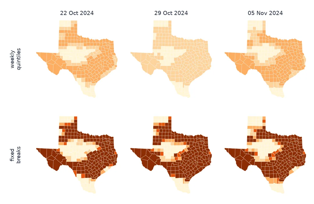
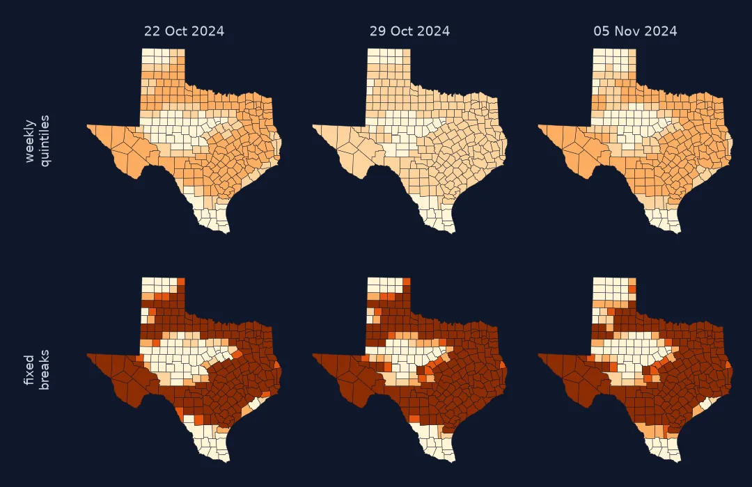
Example 1: the two classifications side by side
cmap = matplotlib.colormaps["YlOrBr"].resampled(5)
weeks = wide.columns[[43, 44, 45]]                                   # late October to early November 2024
fig, axes = plt.subplots(2, 3, figsize=(10, 6.5))
for col, w in enumerate(weeks):
    g = counties.join(pd.DataFrame({"quintile": per_week[w], "fixed": classes[w]}))
    g.plot(ax=axes[0, col], column="quintile", cmap=cmap, vmin=0, vmax=4, edgecolor="white", linewidth=0.2)
    g.plot(ax=axes[1, col], column="fixed", cmap=cmap, vmin=0, vmax=4, edgecolor="white", linewidth=0.2)
    axes[0, col].set_title(f"{w:%d %b}: weekly quintiles")
    axes[1, col].set_title(f"{w:%d %b}: fixed breaks")
for ax in axes.flat:
    ax.set_axis_off()
fig.savefig("data/flicker_compare.png", dpi=120)
pairs = list(zip(weeks[:-1], weeks[1:]))
print("counties changing colour week to week: quintiles", [int((per_week[a] != per_week[b]).sum()) for a, b in pairs],
      "fixed", [int((classes[a] != classes[b]).sum()) for a, b in pairs])
counties changing colour week to week: quintiles [168, 168] fixed [42, 37]
A colour scale is a key
A colour scale is a key that maps values to colours. Animate a map whose key changes every frame and the reader has no way to know. The legend, if there is one, changes too fast to read, so the eye takes every colour change for a change in the data. Quantile classes make this worse in an animation: they try to give each colour a fifth of the counties in that frame, so a county's colour depends on every other county's value that week. Between 22 and 29 October 2024, 168 of Texas's 254 counties changed colour under weekly quintiles; with fixed breaks, 42 did, because their values crossed a break.
The same mistake appears in rasters. imshow without vmin and vmax stretches each frame to its own minimum and maximum. xarray's .plot(robust=True) picks the 2nd and 98th percentiles of the array it is given, so calling it once per frame rescales every frame. A GIF with a palette chosen per frame shifts colours in smooth gradients. The fix is always the same: decide the key once, for all frames, before drawing any of them.
Pooled quantiles, outliers and diverging data
- Pooled quantiles are a fair compromise when there are no meaningful breaks: compute them once on all frames' values together.
- Outliers: pooled min and max can be set by one odd value; use pooled percentiles and clip.
- Diverging data (anomalies): fix a symmetric range around zero for all frames.
- Legends: draw one legend for the whole animation; it must never change between frames.
- Ties: quantiles on data with many identical values (0%, 100%) collapse to fewer classes; mapclassify warns, so do not silence the warning without reading it.
Internal links
- How to make an animated drought map — the national polygons with a fixed palette
- Why does my GIF have colour banding? — palette problems in the file itself
FAQ
Why do the colours change between frames of my animation?
Each frame is classified or scaled on its own. Use the same class breaks, or the same vmin/vmax, for every frame.
Should I use quantile classes in an animated choropleth?
Not per frame. If you want quantiles, compute them once on the values of all frames pooled together.
Does matplotlib autoscale colours by default?
Yes. imshow and pcolormesh without vmin/vmax or a norm scale each array to its own minimum and maximum.
How do I choose fixed class breaks?
From meaning when the variable has natural thresholds (percent of area, regulatory limits), otherwise from percentiles of all frames pooled.