
Crop phenology and growing seasons explained
Problem statement
A field is not one object. In March it is bare soil, in June a closed canopy, in September a stubble — and any analysis that samples it once is an analysis of a moment, not of a crop.
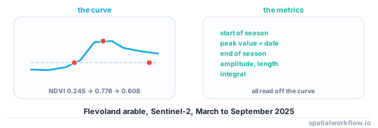
Phenology is the study of that curve: when the crop emerges, how fast it develops, when it peaks, when it senesces. Nearly everything useful in agricultural remote sensing is a property of the curve rather than of any single image, and the two things that make it hard are that the curve is sampled irregularly by cloud and that its calendar shifts by weeks between years and between fields.
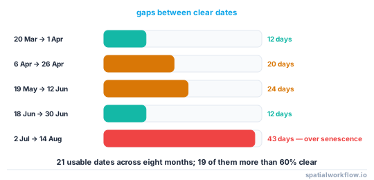
On a real Sentinel-2 series over Dutch arable land in 2025, the field-median NDVI ran from 0.245 on 7 March to a peak of 0.776 on 12 June and back to 0.608 by 6 September — and only 19 of 21 cloud-screened dates were more than 60% clear.
Quick answer
Build the curve first, extract metrics second:
import pandas as pd, numpy as np

s = (season.set_index("date")["ndvi"]
     .reindex(pd.date_range(season.date.min(), season.date.max(), freq="D"))
     .interpolate("time")
     .rolling(15, center=True, min_periods=5).mean())

peak_value = s.max()
peak_date = s.idxmax()
amplitude = peak_value - s.min()
sos = s[(s >= s.min() + 0.2 * amplitude) & (s.index < peak_date)].index.min()
eos = s[(s >= s.min() + 0.2 * amplitude) & (s.index > peak_date)].index.max()
print(f"start {sos.date()}, peak {peak_date.date()} at {peak_value:.3f}, end {eos.date()}")
Interpolating to a daily grid and smoothing is not cosmetic: the raw series has gaps of up to six weeks, and any metric computed from the observations alone is a metric about when the sky was clear.
Step-by-step solution
1. Know the metrics and what each is for
- Start of season — emergence or green-up, usually a threshold on the rising limb.
- Peak value and peak date — maximum greenness and when it occurred.
- End of season — senescence or harvest on the falling limb.
- Length of season — end minus start.
- Amplitude — peak minus the seasonal minimum, a proxy for how much biomass was grown.
- Integral — the area under the curve above the baseline, the best single proxy for accumulated production.
2. Expect the calendar to move
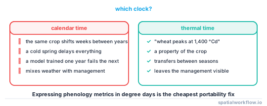
The same crop in the same field emerges weeks apart between years. Comparing fields or years by calendar date rather than by phenological stage is the commonest error in this area, and thermal time is the usual fix — Growing degree days explained.
3. Expect irregular sampling
Optical satellites see the ground only when it is clear. In the reference series, 21 usable dates across eight months included gaps of 20 days in April–May and 43 days in July–August, which is exactly when a cereal senesces.
4. Interpolate deliberately, and say how
Linear interpolation on a daily grid plus a smoothing window is the simple approach. Savitzky–Golay, double-logistic fitting and harmonic regression are the standard alternatives; each imposes a shape, and the choice changes the metrics.
5. Choose thresholds and state them
A start of season at 20% of amplitude and one at 50% are different dates, often by ten days. Neither is right; the undocumented one is wrong.
6. Work per field, not per pixel, where you can
Field-median series are far less noisy than pixel series, and the field is the management unit anyway. Pixel-level phenology matters for within-field variation and for fields with more than one crop.
7. Beware the double peak
A cover crop before a main crop, a cut grassland, a catch crop after harvest — all produce two peaks in one season, and a single-peak extractor reports a nonsense season length.
Code examples
Example 1 — the real seasonal curve
import pandas as pd

season = pd.read_csv("season.csv", parse_dates=["date"])
print(season[["date", "clear_frac", "ndvi_med", "ndre_med"]].to_string(index=False))
date clear_frac ndvi_med ndre_med
2025-03-07 0.998 0.245 0.151
2025-03-20 1.000 0.209 0.136
2025-04-06 1.000 0.238 0.184
2025-05-01 0.995 0.326 0.222
2025-05-13 0.993 0.400 0.279
2025-05-19 0.892 0.481 0.326
2025-06-12 0.996 0.776 0.543
2025-06-18 0.993 0.770 0.548
2025-06-30 0.998 0.774 0.514
2025-07-02 0.847 0.705 0.487
2025-08-14 0.996 0.640 0.397
2025-08-19 0.995 0.654 0.388
2025-09-06 1.000 0.608 0.385
Two features are worth noticing. NDVI plateaus at about 0.77 from 12 to 30 June — that is saturation, not a stable canopy. And the 43-day gap between 2 July and 14 August hides whatever happened at senescence.
Example 2 — extract the metrics with the thresholds explicit
import numpy as np, pandas as pd

def phenology(dates, values, threshold=0.2, smooth_days=15):
    s = (pd.Series(values, index=pd.DatetimeIndex(dates))
         .reindex(pd.date_range(min(dates), max(dates), freq="D"))
         .interpolate("time")
         .rolling(smooth_days, center=True, min_periods=smooth_days // 3).mean()
         .dropna())
    base, peak = float(s.min()), float(s.max())
    amp = peak - base
    peak_date = s.idxmax()
    level = base + threshold * amp
    rising = s[(s >= level) & (s.index <= peak_date)]
    falling = s[(s >= level) & (s.index >= peak_date)]
    sos = rising.index.min() if len(rising) else None
    eos = falling.index.max() if len(falling) else None
    return {
        "baseline": round(base, 3), "peak": round(peak, 3),
        "amplitude": round(amp, 3), "peak_date": str(peak_date.date()),
        "sos": str(sos.date()) if sos is not None else None,
        "eos": str(eos.date()) if eos is not None else None,
        "length_days": (eos - sos).days if sos is not None and eos is not None else None,
        "integral": round(float((s - base).clip(lower=0).sum()), 1),
        "threshold": threshold, "smooth_days": smooth_days,
    }
Returning the threshold and the smoothing window inside the result is the point: a phenology metric without them cannot be compared with anybody else's.
Example 3 — show how much the threshold matters
for t in (0.1, 0.2, 0.3, 0.5):
    m = phenology(season.date, season.ndvi_med, threshold=t)
    print(f"threshold {t:.1f}: sos {m['sos']}, eos {m['eos']}, "
          f"length {m['length_days']} days")
Run it on your own series. A 0.1 and a 0.5 threshold typically differ by two to three weeks at each end, which is larger than most of the differences anyone is trying to detect.
Explanation
Why the curve, not the image, is the unit
A single image separates bare soil from vegetation and very little else — two crops at the same growth stage look alike. What distinguishes them is when they green up, how long they stay green and how fast they senesce, which is why crop classification from a time series works and classification from one date does not.
Why cloud makes this a modelling problem
Optical phenology depends on observations that arrive when the sky allows. A 43-day gap over senescence means the end of season is interpolated rather than observed, and the confidence in that metric should reflect it. Reporting the number of clear observations within each window is the minimum honest accompaniment to any phenology metric.
Why thermal time beats calendar time
Development rate depends on temperature, so a cold spring delays everything by a fortnight. Comparing fields or years on the calendar mixes weather with management; comparing them on accumulated degree days removes most of the weather and leaves the management.
Why saturation distorts the curve's shape
Between 12 and 30 June the reference series sits at 0.770–0.776 — flat. The canopy was not flat; NDVI was. That flattening shortens the apparent time to peak, flattens the apparent peak, and makes the integral insensitive to exactly the period when most biomass is being produced. A red-edge index gives a curve with the peak still in it.
Edge cases or notes
- Double cropping gives two peaks. Detect them rather than fitting one.
- Cut grassland has several peaks a year and no single season.
- Perennials never reach a low baseline. The amplitude metric fails on orchards.
- Winter crops span the new year. Define the season, not the calendar year.
- Shadow and haze depress an index and look like early senescence.
- Snow gives a negative index and must be masked, not interpolated across.
- Smoothing shifts the peak by roughly half the window on an asymmetric curve.
- Report the observation count in every window the metric depends on.
Internal links
- How to extract phenology metrics from an NDVI time series — the implementation in full
- Vegetation indices explained: NDVI, EVI, NDRE and when each fails — why the peak is flat
- Growing degree days explained — the thermal clock
- How to classify crop types from a satellite time series — the main consumer of the curve
- How to build an NDVI time series for a polygon in Python — assembling the series
- How to resample a time series in xarray — regular grids from irregular observations
- How to build a cloud-free composite in Python — filling the gaps differently
- NDVI stops responding in a dense canopy — the flat peak
FAQ
What is crop phenology?
The timing of a crop's development through a season — emergence, green-up, peak, senescence and harvest — and the metrics derived from a vegetation index curve that tracks it.
Why do I need a time series rather than one image?
Because crops at the same growth stage look alike on one date. What separates them is the shape and timing of the curve.
How do I handle cloudy gaps?
Interpolate onto a daily grid and smooth, and report how many clear observations fall in each window. A real season had a 43-day gap covering senescence.
What threshold defines the start of season?
Whatever you state. A 20% and a 50% threshold on the amplitude typically differ by two to three weeks.
Should I work per pixel or per field?
Per field for management decisions — the series is far less noisy. Per pixel for within-field variation.
Why is my season curve flat at the top?
NDVI saturation. Between 12 and 30 June a real series sat between 0.770 and 0.776 while the canopy was still developing.