
How to Make Small-Multiple Maps in Python
On this page
Problem statement
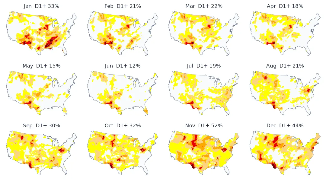
Small multiples are a grid of small maps, one per time step or category, drawn at the same scale with the same colours, so that the eye compares them side by side. For change over time they are often better than an animation: every moment is visible at once, readers can look back and forth at their own pace, and the result prints. Doing it well in matplotlib takes more than a loop over subplots. Every panel needs the same extent and colours. The geometry must be light enough to draw a dozen times. Each panel needs a label that carries a number. And sometimes a change map is clearer than any number of panels.
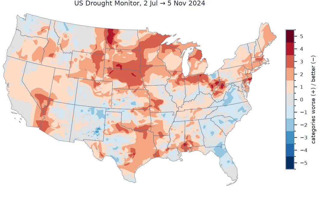
This page draws twelve monthly maps of the 2024 US drought from the Drought Monitor's weekly polygons. It then condenses them into a single map of where drought worsened between July and November.
Quick answer
Create the grid once, draw each period on its own axes with fixed limits and a fixed palette, and put the period's headline number in the title:
fig, axes = plt.subplots(3, 4, figsize=(12, 7), constrained_layout=True)
for ax, week in zip(axes.flat, MONTHS):
    g = load(week)
    OUTLINE.plot(ax=ax, color="#f4f4f4", edgecolor="#999999", lw=0.3)
    g.plot(ax=ax, color=[PALETTE[int(c)] for c in g.DM], edgecolor="none")
    ax.set_xlim(XLIM); ax.set_ylim(YLIM); ax.set_axis_off()
    ax.set_title(f"{week:%b}  D1+ {official.loc[week, 'D1']:.0f}%", fontsize=10)
fig.savefig("data/drought_multiples.png", dpi=150)
print(f"{len(MONTHS)} panels; first map of each month: {[w.strftime('%d %b') for w in MONTHS]}")
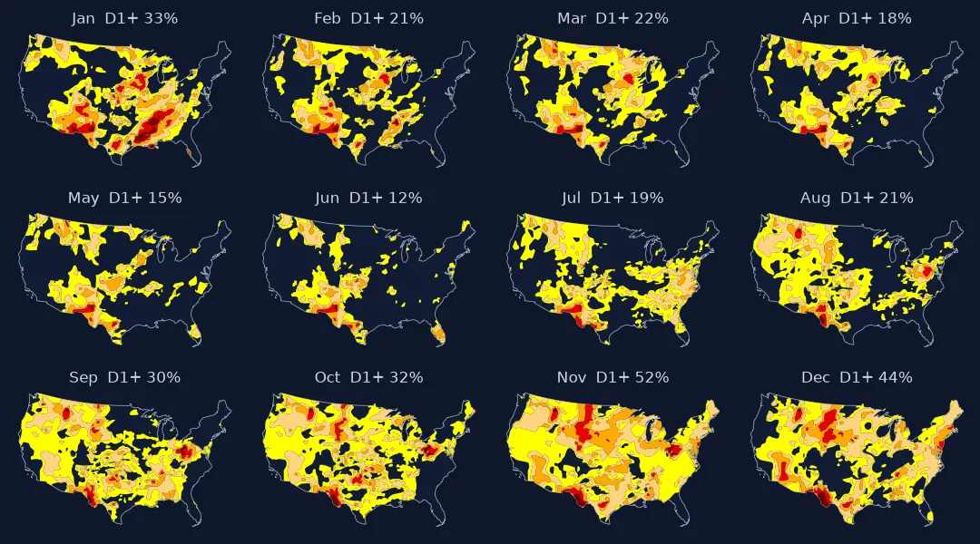
12 panels; first map of each month: ['02 Jan', '06 Feb', '05 Mar', '02 Apr', '07 May', '04 Jun', '02 Jul', '06 Aug', '03 Sep', '01 Oct', '05 Nov', '03 Dec']
Pick periods, lighten geometry, share everything else
1. Pick the periods
Twelve monthly panels fit a 3 × 4 grid. Use the same rule in each period, here the first Drought Monitor map of each month. Weekly maps cannot land on the same calendar day every month, so the spacing varies by up to a week; say so in the caption rather than letting readers assume exact months:
gaps = pd.Series(MONTHS).diff().dt.days.dropna()
print(f"panel spacing: {gaps.min():.0f}–{gaps.max():.0f} days (weekly maps, first of each month)")
panel spacing: 28–35 days (weekly maps, first of each month)
2. Lighten the geometry
Each panel draws the national drought polygons, twelve times over. In a raster PNG that costs little, but saved as SVG or PDF for print every vertex is written to the file. Simplify once to a tolerance below the panel's pixel size:
g_full = load(MONTHS[10], simplify=0)
g_light = load(MONTHS[10], simplify=5000)
nv = lambda g: len(shapely.get_coordinates(g.geometry.values))
for name, g in (("full", g_full), ("simplified 5 km", g_light)):
    fig, ax = plt.subplots(figsize=(3, 2))
    g.plot(ax=ax, color=[PALETTE[int(c)] for c in g.DM]); ax.set_axis_off()
    fig.savefig(f"data/panel_{name[:4]}.svg"); plt.close(fig)
    print(f"{name:16s}: {nv(g):>8,} vertices, one panel as SVG {Path(f'data/panel_{name[:4]}.svg').stat().st_size / 1e3:,.0f} kB")
full : 115,970 vertices, one panel as SVG 2,794 kB
simplified 5 km : 10,185 vertices, one panel as SVG 276 kB
A panel 300 pixels wide shows the contiguous US at about 15 km per pixel, so a 5 km tolerance is invisible.
3. Share everything that is not the data
Same extent, same palette, same outline, same label format. If panels autoscale, a small drought area zooms in and looks as large as a big one. Fixing the limits once is what makes the panels comparable:
print("extent (EPSG:5070 metres):", [int(v) for v in (*XLIM, *YLIM)])
print("palette:", dict(zip(["D0", "D1", "D2", "D3", "D4"], PALETTE)))
extent (EPSG:5070 metres): [-2406113, 2308154, 218660, 3215721]
palette: {'D0': '#ffff00', 'D1': '#fcd37f', 'D2': '#ffaa00', 'D3': '#e60000', 'D4': '#730000'}
4. Show the change in one map
Small multiples show states; the change between two of them is easier to see on a single map. Rasterise two weeks' categories onto a common grid and subtract:
def raster(week, res=5000):
    g = load(week)
    shapes = [(geom, int(dm) + 1) for geom, dm in zip(g.geometry, g.DM)]       # 0 = no drought, 1 = D0 ... 5 = D4
    return rasterize(shapes, out_shape=GRID_SHAPE, transform=GRID_TRANSFORM, fill=0)

before, after = raster(pd.Timestamp("2024-07-02")), raster(pd.Timestamp("2024-11-05"))
inside = CONUS_MASK
change = (after.astype(int) - before.astype(int))[inside]
print(f"2 Jul -> 5 Nov: worsened {np.mean(change > 0):.0%} of the contiguous US, improved {np.mean(change < 0):.0%}, "
      f"unchanged {np.mean(change == 0):.0%}; worsened by 2+ categories {np.mean(change >= 2):.0%}")
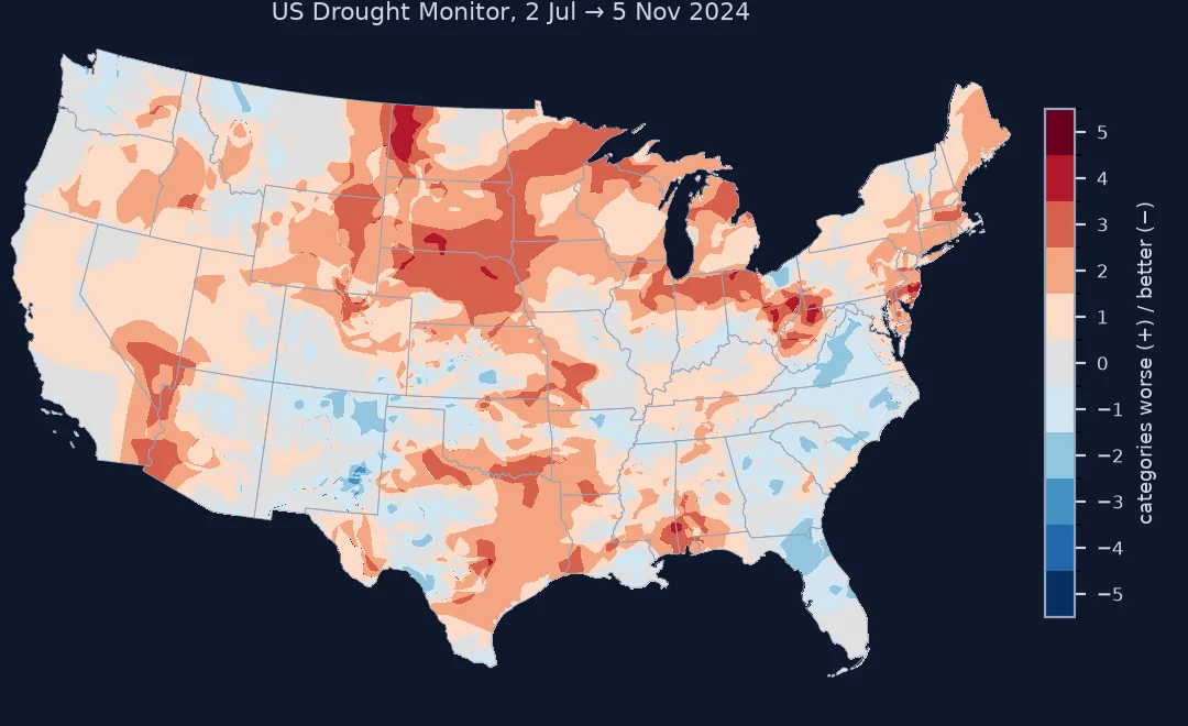
2 Jul -> 5 Nov: worsened 64% of the contiguous US, improved 12%, unchanged 24%; worsened by 2+ categories 34%
A change map alongside the panels
The data used on this page
US Drought Monitor weekly shapefiles for 2024 and its CONUS area statistics, from the National Drought Mitigation Center; state outlines from the US Census Bureau cartographic boundary files, 2023.
import io
from pathlib import Path

import geopandas as gpd
import matplotlib
matplotlib.use("Agg")
import matplotlib.pyplot as plt
import numpy as np
import pandas as pd
import requests
import shapely
from rasterio.features import rasterize
from rasterio.transform import from_origin

Path("data/usdm").mkdir(parents=True, exist_ok=True)
WEEKS = pd.date_range("2024-01-02", "2024-12-31", freq="7D")
MONTHS = [w for w in WEEKS if w.day <= 7]
for week in MONTHS + [pd.Timestamp("2024-07-02"), pd.Timestamp("2024-11-05")]:
    f = Path(f"data/usdm/USDM_{week:%Y%m%d}_M.zip")
    if not f.exists():
        f.write_bytes(requests.get(f"https://droughtmonitor.unl.edu/data/shapefiles_m/{f.name}", timeout=120).content)
if not Path("data/cb_2023_us_state_20m.zip").exists():
    Path("data/cb_2023_us_state_20m.zip").write_bytes(requests.get("https://www2.census.gov/geo/tiger/GENZ2023/shp/cb_2023_us_state_20m.zip", timeout=300).content)
states = gpd.read_file("data/cb_2023_us_state_20m.zip").query("STUSPS not in ['AK', 'HI', 'PR']").to_crs(5070)
CONUS = states.union_all()
OUTLINE = gpd.GeoSeries([CONUS.simplify(5000)], crs=5070)
x0, y0, x1, y1 = CONUS.bounds
XLIM, YLIM = (x0 - 50_000, x1 + 50_000), (y0 - 50_000, y1 + 50_000)
PALETTE = ["#ffff00", "#fcd37f", "#ffaa00", "#e60000", "#730000"]
api = requests.get("https://usdmdataservices.unl.edu/api/USStatistics/GetDroughtSeverityStatisticsByAreaPercent",
                   params={"aoi": "conus", "startdate": "1/1/2024", "enddate": "12/31/2024", "statisticsType": 1}, timeout=120).text
official = pd.read_csv(io.StringIO(api)).assign(week=lambda d: pd.to_datetime(d.MapDate.astype(str))).set_index("week")
GRID_TRANSFORM = from_origin(XLIM[0], YLIM[1], 5000, 5000)
GRID_SHAPE = (int((YLIM[1] - YLIM[0]) / 5000), int((XLIM[1] - XLIM[0]) / 5000))
CONUS_MASK = rasterize([(CONUS, 1)], out_shape=GRID_SHAPE, transform=GRID_TRANSFORM, fill=0).astype(bool)


def load(week, simplify=5000):
    g = gpd.read_file(f"data/usdm/USDM_{week:%Y%m%d}_M.zip").to_crs(5070)
    g["geometry"] = g.geometry.intersection(CONUS)
    if simplify:
        g["geometry"] = g.geometry.simplify(simplify)
    return g


print(f"{len(MONTHS)} monthly maps; grid {GRID_SHAPE} at 5 km")
12 monthly maps; grid (599, 942) at 5 km
Example 1: a change map
fig, ax = plt.subplots(figsize=(8, 5))
shown = np.where(CONUS_MASK, after.astype(int) - before.astype(int), np.nan)
im = ax.imshow(shown, cmap="RdBu_r", vmin=-5, vmax=5, extent=(XLIM[0], XLIM[1], YLIM[0], YLIM[1]))
OUTLINE.boundary.plot(ax=ax, color="#555555", lw=0.4); ax.set_axis_off()
fig.colorbar(im, ax=ax, label="change in drought category, 2 Jul to 5 Nov 2024")
fig.savefig("data/drought_change.png", dpi=150)
print("max worsening:", int(np.nanmax(shown)), "categories; max improvement:", int(-np.nanmin(shown)))
max worsening: 5 categories; max improvement: 4
Why comparison is easier side by side
Small multiples work because comparison is easier side by side than across time. An animation asks readers to remember the previous frame; a grid lets them look back. For twelve months of drought the grid shows the whole year's arc — shrinking to the June low, spreading through the autumn — in one glance, and it prints, embeds in a report and needs no controls.
The rules are few and strict. Every panel uses the same projection, extent, palette and classification, because any difference between panels must come from the data. Keep panels small and the geometry light, and label every panel with its time and its key number. When the question is "what changed between these two dates?", subtract them and map the change. That is the one comparison small multiples leave to the reader's eye.
Too many panels, layouts and shared legends
- Too many panels shrink each map past readability; beyond about 16, aggregate the periods or use an animation.
constrained_layoutkeeps titles and panels from colliding;tight_layoutstruggles with map aspect ratios.- Missing periods should leave an empty, labelled panel, not close the gap.
- Category rasters need an explicit "no category" value (0 here) so subtraction works.
- Raster resolution for the change map should match the precision of the polygons; 5 km suits national Drought Monitor maps.
- Share one legend for all panels, placed once.
Internal links
- How to make an animated drought map — the same data as an animation
- Choropleth maps in GeoPandas — single-panel basics
FAQ
How do I make small multiple maps in Python?
Create a subplot grid with plt.subplots(rows, cols), draw each period on its own axes with the same extent and colour mapping, and title each panel with its period.
Small multiples or animation?
Small multiples for comparison and print; animation for showing motion and continuous change. Producing both from the same frames is cheap.
Why do my small multiples look inconsistent?
Each panel is autoscaling its extent or its colours; set axis limits and a fixed colour mapping before drawing.
How do I map the change between two dates?
Rasterise both dates onto the same grid with a numeric category, subtract, and map the difference with a diverging colour scale.