
How to Map Sea-Ice Concentration in Python
On this page
Problem statement
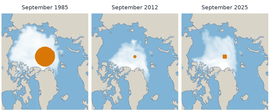
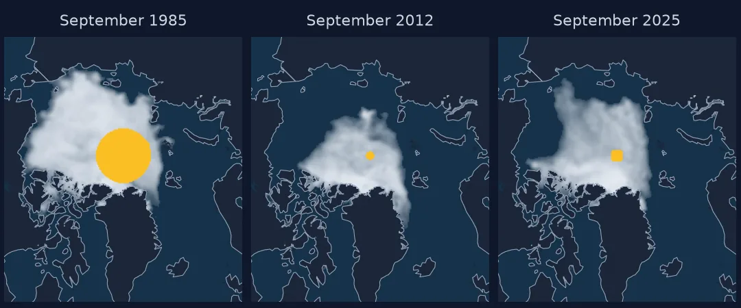
NSIDC publishes a sea-ice concentration grid for every day and month since 1978, and a map of it is the quickest way to see where the Arctic's ice has gone. Drawing one correctly takes more than plt.imshow. The values are tenths of a percent with flag codes mixed in, the grid is in a polar stereographic projection that most plotting defaults ignore, the satellite's blind spot over the pole changes size with the sensor, and comparing two dates means comparing cells, not colours.
This page maps September mean concentration for 1985 and 2025 from the NSIDC Sea Ice Index, measures where the ice edge retreated and by how much, and shows what happens when the grid is drawn in longitude and latitude instead.
Quick answer
Read the GeoTIFF, mask the flags, scale to percent, and draw it in its own coordinates with coastlines projected into the same CRS:
with rasterio.open("data/N_202509_concentration_v4.0.tif") as src:
    a, b, crs = src.read(1), src.bounds, src.crs
conc = np.where(a <= 1000, a / 10.0, np.nan)               # percent; >1000 are flags
land = gpd.read_file("/vsizip/data/ne_110m_land.zip").clip_by_rect(-180, 30, 180, 90).to_crs(crs)
fig, ax = plt.subplots(figsize=(6, 7))
ax.imshow(np.where(conc >= 15, conc, np.nan), cmap="Blues_r", vmin=15, vmax=100, extent=(b.left, b.right, b.bottom, b.top))
land.boundary.plot(ax=ax, color="0.4", lw=0.5)
ax.set_xlim(-2.8e6, 2.8e6); ax.set_ylim(-3.3e6, 2.8e6); ax.set_axis_off()
fig.savefig("data/arctic_sept_2025.png", dpi=150, bbox_inches="tight")
print(crs.to_epsg(), a.shape, f"ice cells (>=15%): {(conc >= 15).sum():,}")
3411 (448, 304) ice cells (>=15%): 7,273
Download, mask flags, draw in its own projection
1. Download the monthly grids
The Sea Ice Index monthly GeoTIFFs live in one folder per month, one file per year. They are small — 304 × 448 cells of 25 km — so a whole September series is a few megabytes:
for ym in ("198509", "202509"):
    with rasterio.open(f"data/N_{ym}_concentration_v4.0.tif") as src:
        print(ym, src.crs.to_epsg(), src.res, src.dtypes[0], src.bounds.left, src.bounds.top)
198509 3411 (25000.0, 25000.0) uint16 -3850000.0 5850000.0
202509 3411 (25000.0, 25000.0) uint16 -3850000.0 5850000.0
2. Mask the flags before anything else
Concentration is stored as tenths of a percent, 0–1000. Above that sit flags — 2510 for the pole hole, 2530 coast, 2540 land. A colour scale stretched to 2540 makes all the ice look the same pale colour:
print({int(k): int(v) for k, v in zip(*np.unique(a[a > 1000], return_counts=True))})
print("max of raw values:", a.max(), "- max concentration after masking:", np.nanmax(conc))
{2510: 96, 2530: 5052, 2540: 63212}
max of raw values: 2540 - max concentration after masking: 100.0
3. Draw it in its own projection
EPSG:3411 is the NSIDC north polar stereographic grid on the Hughes 1980 ellipsoid. Plotting the array with its bounds as the extent puts each cell where it belongs; coastlines reprojected to the same CRS land on top correctly. Greenland ends up at the bottom because the projection's central meridian, 45° W, points down the page — that is the grid's convention, not a mistake.
4. Compare two dates cell by cell
A side-by-side pair shows change; a difference map measures it. Classify each cell as ice in both years, lost, or gained, using only cells observed in both:
a85 = rasterio.open("data/N_198509_concentration_v4.0.tif").read(1)
obs = (a85 <= 1000) & (a <= 1000)
lost = obs & (a85 >= 150) & (a < 150)
gained = obs & (a85 < 150) & (a >= 150)
print(f"lost: {lost.sum():,} cells, {(CELL_KM2 * lost).sum() / 1e6:.2f} million km²; "
      f"gained: {gained.sum():,} cells, {(CELL_KM2 * gained).sum() / 1e6:.2f} million km²")
lost: 3,412 cells, 2.18 million km²; gained: 113 cells, 0.07 million km²
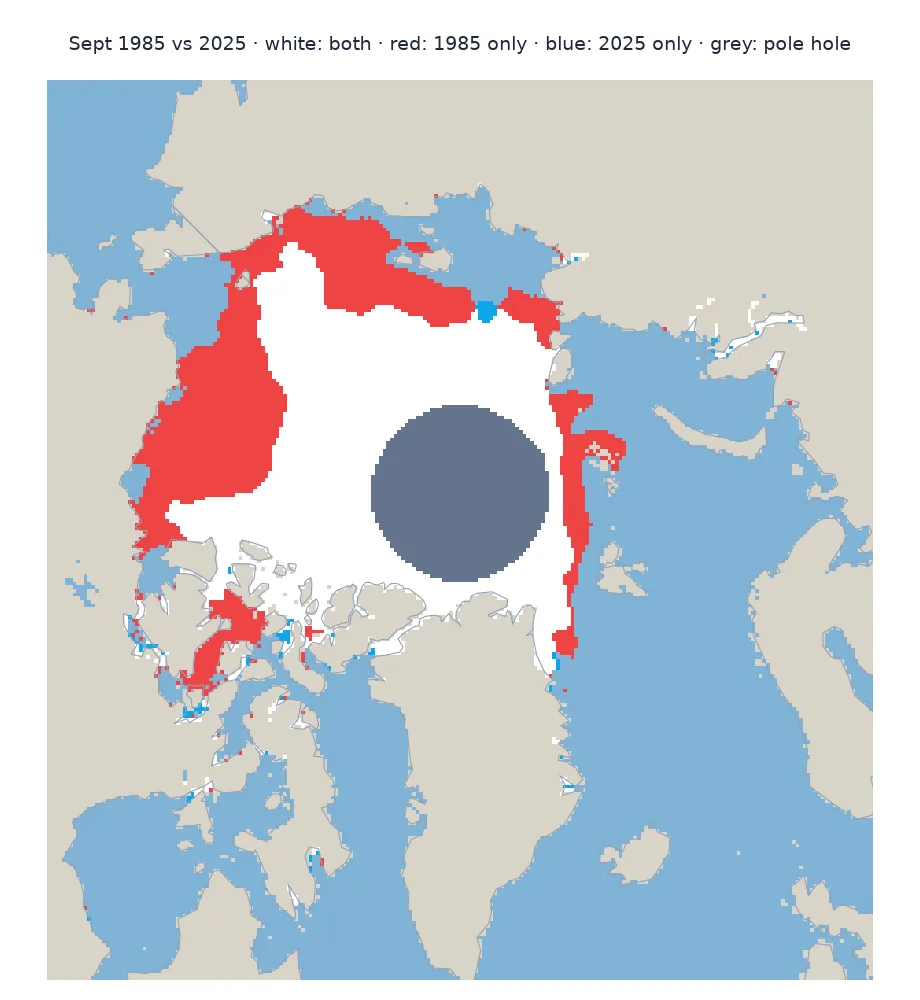
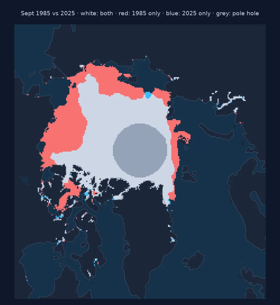
The 1985 pole hole is excluded from that comparison — it was unobserved — which is why the grey disc in the map is neither lost nor kept.
5. Say where
Grouping the lost cells by longitude sector shows the retreat is concentrated on the Pacific side of the Arctic:
for name, (l0, l1) in SECTORS.items():
    m = lost & (LON >= l0) & (LON < l1)
    print(f"{name:30} {(CELL_KM2 * m).sum() / 1e3:5.0f} thousand km²")
Chukchi (180-150 W) 515 thousand km²
Beaufort (150-125 W) 496 thousand km²
East Siberian (150 E-180) 472 thousand km²
Laptev (100-150 E) 237 thousand km²
Kara-Barents (20-100 E) 223 thousand km²
What longitude-latitude does to the grid
The data used on this page
NSIDC Sea Ice Index, version 4 (G02135), monthly concentration GeoTIFFs for September 1985 and 2025, Northern Hemisphere, from NSIDC / NOAA; coastlines from Natural Earth 1:110m land (public domain).
from pathlib import Path

import geopandas as gpd
import matplotlib
matplotlib.use("Agg")
import matplotlib.pyplot as plt
import numpy as np
import rasterio
import requests
from pyproj import Proj, Transformer

Path("data").mkdir(exist_ok=True)
UA = {"User-Agent": "spatialworkflow.io guide (https://www.spatialworkflow.io)"}
BASE = "https://noaadata.apps.nsidc.org/NOAA/G02135/north/monthly/geotiff/09_Sep"
for ym in ("198509", "202509"):
    f = Path(f"data/N_{ym}_concentration_v4.0.tif")
    if not f.exists():
        f.write_bytes(requests.get(f"{BASE}/{f.name}", headers=UA, timeout=120).content)
if not Path("data/ne_110m_land.zip").exists():
    Path("data/ne_110m_land.zip").write_bytes(requests.get(
        "https://naciscdn.org/naturalearth/110m/physical/ne_110m_land.zip", headers=UA, timeout=120).content)

with rasterio.open("data/N_202509_concentration_v4.0.tif") as src:          # longitude, latitude, true area per cell
    rows, cols = np.mgrid[0:src.height, 0:src.width]
    xs, ys = rasterio.transform.xy(src.transform, rows.ravel(), cols.ravel())
    lon, lat = Transformer.from_crs(src.crs, 4326, always_xy=True).transform(np.array(xs), np.array(ys))
    LON, LAT = lon.reshape(src.shape), lat.reshape(src.shape)
    CELL_KM2 = (625 / Proj(src.crs).get_factors(lon, lat).areal_scale).reshape(src.shape)
SECTORS = {"Chukchi (180-150 W)": (-180, -150), "Beaufort (150-125 W)": (-150, -125),
           "East Siberian (150 E-180)": (150, 180), "Laptev (100-150 E)": (100, 150), "Kara-Barents (20-100 E)": (20, 100)}
print(sorted(p.name for p in Path("data").iterdir()))
['N_198509_concentration_v4.0.tif', 'N_202509_concentration_v4.0.tif', 'ne_110m_land.zip']
Example 1: what longitude–latitude does to the grid
Converting each cell centre to longitude and latitude and plotting those is a common shortcut. It works for a quick look and fails as a map:
ice = conc >= 15
print(f"cells north of 85 N: {(LAT >= 85).sum()} ({(CELL_KM2 * (LAT >= 85)).sum() / 1e6:.2f} million km²) "
      f"spread across all 360 degrees of longitude")
fig, ax = plt.subplots(figsize=(8, 3))
ax.scatter(LON[ice], LAT[ice], c=conc[ice], s=1, cmap="Blues_r")
fig.savefig("data/latlon_scatter.png", dpi=120)
cells north of 85 N: 1476 (0.98 million km²) spread across all 360 degrees of longitude
The 1,476 cells north of 85° N — under a million km² — stretch across the whole width of the plot, so the central Arctic looks enormous and the marginal seas small — the opposite of where the change happened.
Example 2: reproject to a common CRS for overlays
For combining with other data, reproject rather than re-plot. EPSG:3413 is the WGS 84 version of the NSIDC grid; nearest-neighbour resampling keeps the flags intact:
from rasterio.warp import calculate_default_transform, reproject, Resampling
with rasterio.open("data/N_202509_concentration_v4.0.tif") as src:
    t, w, h = calculate_default_transform(src.crs, "EPSG:3413", src.width, src.height, *src.bounds, resolution=25000)
    out = np.zeros((h, w), np.uint16)
    reproject(src.read(1), out, src_transform=src.transform, src_crs=src.crs, dst_transform=t, dst_crs="EPSG:3413",
              resampling=Resampling.nearest)
print(out.shape, "cells in EPSG:3413; ice cells:", int(((out >= 150) & (out <= 1000)).sum()), "vs", int(ice.sum()))
(448, 304) cells in EPSG:3413; ice cells: 7273 vs 7273
The reprojected grid has the same shape and exactly the same number of ice cells: EPSG:3411 and EPSG:3413 differ only in their ellipsoid, a shift far smaller than a 25 km cell. Between less similar CRSs the count would change, which is why area statistics belong on the original grid.
A concentration grid is not an image
A concentration grid is not an image; it is a table of measurements with a projection. Every step on this page follows from that. The flag values are part of the table and have to be read as flags; the projection decides where each cell sits and how big it is; and a comparison between dates is a comparison between cells, with the unobserved ones set aside.
The polar stereographic projection is the natural choice for the Arctic: it keeps shapes near the pole, puts the whole ocean in one compact view, and its distortion is small and well known. Drawing it in its native coordinates is both simpler and more honest than converting to longitude and latitude, which stretches the central Arctic across the full width of a page.
Measured cell by cell, September's ice edge in 2025 lay well north of 1985's around most of the basin, with over two million square kilometres of 1985's ice cover open water in 2025, mostly on the Pacific side — the Chukchi, Beaufort and East Siberian seas.
Flags, the Hughes ellipsoid and the pole hole
- Mask values above 1000 before scaling or colouring.
- EPSG:3411 uses the Hughes 1980 ellipsoid; EPSG:3413 is the WGS 84 equivalent. Use the CRS in the file.
- Greenland at the bottom is the projection's convention.
- Exclude the pole hole from any change between dates with different sensors.
- Reproject with nearest neighbour to keep flags; average only after masking.
- Monthly grids are averages, so the monthly ice edge is smoother than any day's.
Internal links
- Sea-ice extent versus area explained — totals from these grids
- Polar stereographic projections explained — the grid's geometry
- Polar data lands in the wrong place — when the projection is wrong
- How to analyse a sea-ice extent time series — the daily record
- Sea-ice extent numbers disagree — comparing sources
FAQ
How do I plot NSIDC sea-ice concentration in Python?
Read the GeoTIFF with rasterio, set values above 1000 to NaN, divide by 10 for percent, and plot with imshow using the raster bounds as the extent; reproject coastlines to the file's CRS (EPSG:3411) and draw them on top.
What do the values in an NSIDC concentration GeoTIFF mean?
0–1000 is concentration in tenths of a percent; 2510 is the pole hole, 2530 coast and 2540 land.
Where has Arctic sea ice been lost since the 1980s?
Comparing September 1985 and 2025 cell by cell, about 2.2 million km² of 1985's ice-covered ocean was open water in 2025, most of it in the Chukchi, Beaufort and East Siberian seas.
Should I convert polar data to latitude and longitude?
For analysis keep the native polar grid or reproject to another polar CRS; plotting in longitude–latitude stretches the area near the pole enormously.