
How to Map Net Migration by County in Python
On this page
Problem statement
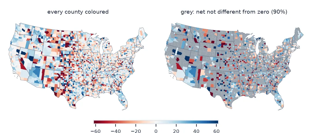
Net migration, people moving in minus people moving out, is the single number most often mapped from migration data. A choropleth of it shows at a glance which places are gaining people from elsewhere in the country and which are losing them. Three choices decide whether that map is honest. Net must be a rate, not a count, or the map just shows where the big counties are. The colour scale must diverge around zero. And for most counties the net is a small difference between two uncertain estimates, so many cannot be told apart from zero.
This page builds a national map of net domestic migration from the Census county-to-county flows for 2016–2020. It turns the counts into rates per 1,000 residents and greys out the counties whose net is not distinguishable from zero.
Quick answer
Read every state's sheet, sum the flows in and out for each county, divide by population, and map with a diverging scale centred on zero:
us = flows[flows.b_st.str.fullmatch(r"\d{3}")]                                # moves between US counties only
by = us.groupby("geoid").agg(inflow=("flow", "sum"), outflow=("counter", "sum"))
by["net"] = by.inflow - by.outflow
by = by.join(pop)
by["rate"] = 1000 * by.net / by.pop2020
print(f"{len(by):,} counties; net domestic migration sums to {by.net.sum():+,.0f} "
      f"(in {by.inflow.sum():,.0f}, out {by.outflow.sum():,.0f})")
print(by.rate.describe(percentiles=[0.05, 0.5, 0.95]).round(1).to_string())
3,221 counties; net domestic migration sums to +0 (in 18,061,885, out 18,061,885)
count 3135.0
mean -0.4
std 37.8
min -1047.6
5% -44.0
50% 0.4
95% 45.0
max 207.6
A zero national net, rates, significance, then the map
1. Check that the national net is zero
Every domestic move is an out-move for one county and an in-move for another, so the national sum of domestic net migration must be zero, or close to it after rounding and suppression. That is a quick check that in and out are read the right way round:
print(f"sum of all county nets: {by.net.sum():+,.0f} people, {by.net.sum() / by.inflow.sum():+.3%} of all in-moves")sum of all county nets: +0 people, +0.000% of all in-moves
2. Use a rate, not a count
The counties with the largest net counts are simply big counties. Compare the top of the two rankings, using rates only for counties of more than 100,000 people, where the estimates are steadier:
named = by.join(NAMES)
print("largest net losses (count):", ", ".join(named.nsmallest(3, "net")["name"]))
print("largest net losses (rate): ", ", ".join(named[named.pop2020 > 100_000].nsmallest(3, "rate")["name"]))
print("largest net gains (rate):  ", ", ".join(named[named.pop2020 > 100_000].nlargest(3, "rate")["name"]))
largest net losses (count): Los Angeles County, California, Cook County, Illinois, Kings County, New York
largest net losses (rate): Potter County, Texas, Anchorage Municipality, Alaska, Peoria County, Illinois
largest net gains (rate): Monroe County, Indiana, Pitt County, North Carolina, Clarke County, Georgia
The rates point at different places. Among counties of more than 100,000 people, the largest gains are college towns: Bloomington (Monroe County, Indiana), Greenville (Pitt County, North Carolina) and Athens (Clarke County, Georgia). The ACS counts students where they live, so their arrival shows as domestic migration.
3. Test whether each net differs from zero
Each county's net has a margin of error. Sum the row-level net MOEs in quadrature (the Census approximation for sums), then compare the net with its MOE:
moe = us.assign(m2=us.net_moe.fillna(0) ** 2).groupby("geoid").m2.sum() ** 0.5
by["net_moe"] = moe
by["significant"] = by.net.abs() > by.net_moe
print(f"{by.significant.sum():,} of {len(by):,} counties ({by.significant.mean():.0%}) have a net "
      f"that differs from zero at the 90% level")
print(f"population in counties with a significant net: {by.loc[by.significant, 'pop2020'].sum() / by.pop2020.sum():.0%}")
1,099 of 3,221 counties (34%) have a net that differs from zero at the 90% level
population in counties with a significant net: 60%
4. Map it with a diverging scale
Fix the colour limits symmetrically around zero so gains and losses get the same visual weight, and draw insignificant counties in grey:
g = COUNTIES.join(by, on="GEOID", how="inner")
lim = float(np.nanpercentile(by.rate.abs(), 95))
fig, ax = plt.subplots(figsize=(10, 6))
g[~g.significant].plot(ax=ax, color="#d9d9d9", edgecolor="none")
g[g.significant].plot(ax=ax, column="rate", cmap="RdBu", vmin=-lim, vmax=lim, edgecolor="none", legend=True,
                      legend_kwds={"label": "net domestic migration per 1,000 residents", "shrink": 0.6})
ax.set_axis_off(); fig.savefig("data/net_migration.png", dpi=150)
print(f"colour limits ±{lim:.0f} per 1,000; {len(g):,} counties drawn")
colour limits ±62 per 1,000; 3,100 counties drawn
The counties that did not join
The data used on this page
The Census Bureau's county-to-county migration flows, 2016–2020 ACS ("ins, outs, nets, gross" workbook, all 52 sheets), the county population estimates (April 2020 base, vintage 2023), and 2023 county outlines projected to EPSG:5070.
from pathlib import Path

import geopandas as gpd
import matplotlib
matplotlib.use("Agg")
import matplotlib.pyplot as plt
import numpy as np
import pandas as pd
import requests

Path("data").mkdir(exist_ok=True)
SRC = {"county-to-county-2016-2020-ins-outs-nets-gross.xlsx": "https://www2.census.gov/programs-surveys/demo/tables/geographic-mobility/2020/"
       "county-to-county-migration-2016-2020/county-to-county-migration-flows/county-to-county-2016-2020-ins-outs-nets-gross.xlsx",
       "co-est2023-alldata.csv": "https://www2.census.gov/programs-surveys/popest/datasets/2020-2023/counties/totals/co-est2023-alldata.csv",
       "cb_2023_us_county_20m.zip": "https://www2.census.gov/geo/tiger/GENZ2023/shp/cb_2023_us_county_20m.zip"}
for name, url in SRC.items():
    if not Path("data", name).exists():
        Path("data", name).write_bytes(requests.get(url, timeout=600).content)
COLS = ["a_st", "a_cty", "b_st", "b_cty", "a_state", "a_county", "b_state", "b_county",
        "flow", "flow_moe", "counter", "counter_moe", "net", "net_moe", "gross", "gross_moe"]
sheets = pd.read_excel("data/county-to-county-2016-2020-ins-outs-nets-gross.xlsx", sheet_name=None, header=None,
                       skiprows=3, names=COLS, dtype=str)
flows = pd.concat(sheets.values())
flows = flows[flows.a_cty.notna() & flows.b_st.notna()].copy()
for c in COLS[8:]:
    flows[c] = pd.to_numeric(flows[c], errors="coerce")
flows["geoid"] = flows.a_st.str[1:] + flows.a_cty
pe = pd.read_csv("data/co-est2023-alldata.csv", encoding="latin-1", dtype={"STATE": str, "COUNTY": str})
pe = pe[pe.SUMLEV == 50]
pop = pd.Series(pe.ESTIMATESBASE2020.to_numpy(), index=pe.STATE + pe.COUNTY, name="pop2020")
NAMES = pd.Series((pe.CTYNAME + ", " + pe.STNAME).to_numpy(), index=pe.STATE + pe.COUNTY, name="name")
COUNTIES = gpd.read_file("data/cb_2023_us_county_20m.zip").query("STUSPS not in ['AK', 'HI', 'PR']").to_crs(5070)
print(f"{len(sheets)} sheets, {len(flows):,} rows; {len(pop):,} county populations")
52 sheets, 416,203 rows; 3,144 county populations
Example 1: the counties that did not join
missing_pop = sorted(set(by.index[by.pop2020.isna()]))
print(f"{len(missing_pop)} flow counties without a 2020 population: {missing_pop[:10]}")
86 flow counties without a 2020 population: ['09001', '09003', '09005', '09007', '09009', '09011', '09013', '09015', '72001', '72003']
Two maps compressed into their difference
A net migration map compresses two maps, the in-moves and the out-moves, into their difference. That is its strength and its risk. The difference highlights where population is being redistributed. But the in- and out-flows are each estimates with margins of error, and their difference inherits both uncertainties while usually being much smaller than either. For many small counties the net is a few dozen people with a margin of several hundred.
Greying out the insignificant counties changes the map's message. Without it, every county gets a confident colour and the map reads as a complete picture of gains and losses. With it, the clear patterns stand out. The largest significant losses are big-city cores: Los Angeles, Cook County (Chicago), Brooklyn, Queens, Miami-Dade and Manhattan. The gains are in their outer suburbs, such as Riverside and San Bernardino counties and Williamson County, Texas, and in Florida, Arizona, Texas and the Carolinas. The grey majority is where the data cannot say.
Connecticut, denominators and tiny counties
- Connecticut flows use the pre-2022 counties; the vintage 2023 population file and the 2023 outlines use planning regions, so those counties drop out.
- Denominator: the April 2020 population is used for a 2016–2020 rate; a five-year average population would be more exact.
- International moves are excluded here: the ACS sees moves from abroad but not moves out of the country, so a net including them would be biased.
- Alaska and Hawaii are left off the projection for space; include them as insets for a national product.
- Rates for tiny counties swing wildly: Loving County, Texas, with 63 residents, comes out at −1,048 per 1,000. Check the margin before reading anything into such a county.
Internal links
- How to read county-to-county migration flows — the workbook and its margins of error
- Gross vs net migration explained — what net migration hides
FAQ
How do I calculate net migration by county?
Sum moves into the county from other counties and subtract moves out to them; divide by population for a rate.
Should I map net migration as a count or a rate?
As a rate, usually per 1,000 residents. Counts mostly show where the large counties are.
How do I know whether a county's net migration is real?
Combine the margins of error of its flows and check whether the net is larger than its margin. Grey out the ones that are not.
Why does national net migration not sum exactly to zero?
Suppressed and rounded flows; the sum should still be close to zero relative to the total number of moves.