
How to Make a Folium Choropleth With Tooltips in Python
On this page
Problem statement
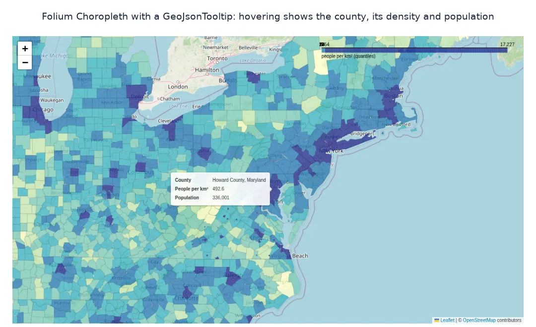
Folium's Choropleth colours polygons by a value and draws a legend, but it does not show the value when you hover over a polygon, which is the first thing readers try. The usual answer is a second layer: a GeoJson layer with a GeoJsonTooltip that reads fields from each feature's properties. Getting the two to work together means putting the data into the GeoJSON itself, choosing class breaks that suit skewed data, and keeping the file small.
This page maps the 2023 population density of US counties with folium.Choropleth, adds hover tooltips with a GeoJsonTooltip, uses quantile class breaks instead of equal intervals, highlights the county under the cursor, and measures the HTML file.
Quick answer
Draw the colours with Choropleth, then add a transparent GeoJson layer whose tooltip reads the properties:
import folium
m = folium.Map(location=[38, -96], zoom_start=4)
folium.Choropleth(geo_data=GJ, data=G, columns=["GEOID", "density_km2"], key_on="feature.properties.GEOID",
                  bins=list(BINS), fill_color="YlGnBu", fill_opacity=0.8, line_opacity=0.1, legend_name="people per km² (quantiles)").add_to(m)
folium.GeoJson(GJ, style_function=lambda f: {"fillOpacity": 0, "weight": 0},
               tooltip=folium.GeoJsonTooltip(fields=["NAME", "density_txt", "pop_txt"], aliases=["County", "People per km²", "Population"])).add_to(m)
m.save("data/county_choropleth.html")
print(f"counties: {len(G):,}; bins: {[round(float(b), 1) for b in BINS]}; HTML {Path('data/county_choropleth.html').stat().st_size / 1e6:.2f} MB")
counties: 3,109; bins: [0.0, 4.7, 11.9, 23.9, 62.8, 363.9, 17226.7]; HTML 3.54 MB
The quantile breaks are 4.7, 11.9, 23.9, 62.8 and 363.9 people per km², ending at the maximum, 17,226.7. With the full geometry stored twice, once for the colours and once for the tooltips, the page is 3.54 MB.
Data in the GeoJSON, breaks for skewed data, highlights
1. Put the tooltip data in the GeoJSON
GeoJsonTooltip can only show properties of the features. Merge the values into the GeoDataFrame before converting, as formatted strings so the tooltip reads well:
props = GJ["features"][0]["properties"]
print(f"properties of the first feature: {props}")
print(f"features: {len(GJ['features']):,}; all have the tooltip fields: {all({'NAME', 'density_txt', 'pop_txt'} <= f['properties'].keys() for f in GJ['features'])}")
properties of the first feature: {'GEOID': '13027', 'NAME': 'Brooks County, Georgia', 'density_km2': 12.823392234258126, 'density_txt': '12.8', 'pop_txt': '16,245'}
features: 3,109; all have the tooltip fields: True
Every feature carries the tooltip fields. The first is Brooks County, Georgia, with 16,245 people at 12.8 per km². The number is stored both raw, for the colour scale, and as a formatted string, for the tooltip.
2. Class breaks for skewed data
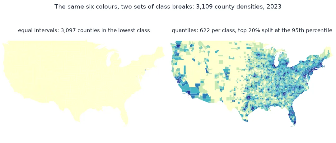
Choropleth uses six equal-width classes by default. On densities from almost zero to over 17,000 people per km², almost every county lands in the first class. Compare with quantile breaks:
eq = np.linspace(G.density_km2.min(), G.density_km2.max(), 7)
print("equal-interval classes:", pd.cut(G.density_km2, eq, include_lowest=True).value_counts(sort=False).tolist())
print("quantile classes:      ", pd.cut(G.density_km2, BINS, include_lowest=True).value_counts(sort=False).tolist())
equal-interval classes: [3097, 7, 2, 2, 0, 1]
quantile classes: [622, 622, 621, 622, 466, 156]
With equal intervals, 3,097 of the 3,109 counties fall into the lowest class, below about 2,870 people per km², and the map is a single colour. The quantile classes hold 622, 622, 621 and 622 counties, then 466 and 156: the last two classes split the top 20% at the 95th percentile, so the densest 5% get their own colour.
3. Highlight on hover
A highlight_function restyles the feature under the cursor, which makes it clear which polygon the tooltip describes:
m2 = folium.Map(location=[38, -96], zoom_start=4)
folium.GeoJson(GJ, style_function=lambda f: {"fillColor": colour(f["properties"]["density_km2"]), "color": "white", "weight": 0.3, "fillOpacity": 0.8},
               highlight_function=lambda f: {"weight": 2, "color": "#1e293b"},
               tooltip=folium.GeoJsonTooltip(fields=["NAME", "density_txt"], aliases=["County", "People per km²"])).add_to(m2)
m2.save("data/county_highlight.html")
print(f"single-layer version, styled per feature: HTML {Path('data/county_highlight.html').stat().st_size / 1e6:.2f} MB")
single-layer version, styled per feature: HTML 1.78 MB
Drawing the colours and the tooltip from one GeoJson layer halves the file to 1.78 MB, because the geometry is stored only once.
What the tooltip shows for a few counties
The data used on this page
The US Census Bureau's 2023 county cartographic boundaries (1:20 million) and Vintage 2023 county population estimates, with areas measured in the US Albers equal-area projection (EPSG:5070). Geometry is simplified to 0.01° to keep the page small. CARTO's raster basemaps, which many Folium examples load with tiles="CartoDB positron", now return a grey tile stamped "API KEY REQUIRED" (checked on 2 October 2026), so this page uses Folium's default OpenStreetMap tiles, within the OpenStreetMap tile usage policy.
import json
from pathlib import Path

import branca.colormap as cm
import geopandas as gpd
import numpy as np
import pandas as pd
import requests

Path("data").mkdir(exist_ok=True)
def cached(path, url):
    p = Path(path)
    if not p.exists():
        r = requests.get(url, timeout=600)
        r.raise_for_status()
        p.write_bytes(r.content)
    return p
C = gpd.read_file(cached("data/cb_2023_us_county_20m.zip", "https://www2.census.gov/geo/tiger/GENZ2023/shp/cb_2023_us_county_20m.zip")).to_crs(4326)
est = pd.read_csv(cached("data/co-est2023-alldata.csv", "https://www2.census.gov/programs-surveys/popest/datasets/2020-2023/counties/totals/co-est2023-alldata.csv"),
                  encoding="latin-1", dtype={"STATE": str, "COUNTY": str})
est = est[est.SUMLEV == 50].assign(GEOID=lambda d: d.STATE + d.COUNTY)[["GEOID", "STNAME", "CTYNAME", "POPESTIMATE2023"]]
G = C[~C.STATEFP.isin(["02", "15", "72"])].merge(est, on="GEOID")
G["density_km2"] = G.POPESTIMATE2023 / (G.to_crs(5070).area / 1e6)
G["NAME"] = G.CTYNAME + ", " + G.STNAME
G["density_txt"] = G.density_km2.map("{:,.1f}".format)
G["pop_txt"] = G.POPESTIMATE2023.map("{:,}".format)
G["geometry"] = G.geometry.simplify(0.01, preserve_topology=True)
GJ = json.loads(G[["GEOID", "NAME", "density_km2", "density_txt", "pop_txt", "geometry"]].to_json())
BINS = G.density_km2.quantile([0, 0.2, 0.4, 0.6, 0.8, 0.95, 1]).values
colour = cm.StepColormap(["#ffffcc", "#c7e9b4", "#7fcdbb", "#41b6c4", "#2c7fb8", "#253494"], index=list(BINS), vmin=BINS[0], vmax=BINS[-1])
print(f"{len(G):,} counties in the conterminous US; median density {G.density_km2.median():.1f} per km²")
3,109 counties in the conterminous US; median density 17.0 per km²
The data covers the 3,109 counties and county equivalents of the conterminous US. The median density is 17.0 people per km².
Example 1: what the tooltip shows for a few counties
Check the strings that will appear on hover for the densest and the sparsest counties:
for _, r in pd.concat([G.nlargest(2, "density_km2"), G.nsmallest(2, "density_km2")]).iterrows():
    print(f"{r.NAME:>32}: {r.density_txt:>9} people per km², population {r.pop_txt}")
New York County, New York: 17,226.7 people per km², population 1,597,451
Kings County, New York: 9,667.2 people per km², population 2,561,225
Loving County, Texas: 0.0 people per km², population 43
Kenedy County, Texas: 0.1 people per km², population 343
Manhattan (New York County) is the densest county, at 17,226.7 people per km², followed by Brooklyn (Kings County). Loving County, Texas, with 43 people, is shown as 0.0 to one decimal place, because its true density is below 0.05.
What folium.Choropleth does and does not attach
folium.Choropleth is a convenience: it joins a DataFrame to GeoJSON features through key_on, classifies the values into bins, colours each feature and adds a legend. It does not attach the values to the features, so a tooltip has nothing to show; hence the common pattern of a second, invisible GeoJson layer carrying the tooltip, or a single GeoJson layer styled per feature with a colour function, which gives full control and one copy of the geometry.
Class breaks shape the reading. Equal-width bins on skewed data put almost everything in one class; quantiles put the same number of areas in each class, so the map shows rank rather than magnitude, and the legend must say so. The geometry is the bulk of the file: two layers of the same counties double it, and simplifying boundaries for a national map makes no visible difference while keeping the page responsive.
Key paths, timestamps and missing values
- key_on path: it must start with
feature., for examplefeature.properties.GEOID; a wrong path colours nothing and raises no error. - Timestamps in properties:
Timestampvalues cannot be serialised to JSON; convert them to strings first, see the serialisation fix. - Missing values: counties without data get
nan_fill_color; set it so gaps are visible. - Bins and the legend: with quantile bins, say so in
legend_name.
Internal links
- How to make a choropleth map with Plotly in Python — the same map in Plotly
- Choropleth classification explained — choosing breaks
- Fixing a Folium map that is slow with many markers — keeping pages light
FAQ
How do I add tooltips to a Folium choropleth?
Add a folium.GeoJson layer with tooltip=folium.GeoJsonTooltip(fields=[...]), with the values stored in each feature's properties.
Why does my Folium choropleth not show values on hover?
Choropleth does not add tooltips; the values must be in the GeoJSON properties and shown with a GeoJsonTooltip.
How do I change the class breaks in Folium?
Pass a list of break values as bins, for example quantiles of the data.
Why is my Folium map file so large?
Each GeoJSON layer embeds the full geometry; simplify it and avoid duplicating layers.