
How to Plot Points on an Interactive Map With Plotly in Python
On this page
Problem statement
You have a table with latitude and longitude columns, earthquakes, stores, sensors, sightings, and want an interactive map: zoomable, with a basemap, points sized and coloured by their values and details on hover. Plotly Express's scatter_map does it in one call from a DataFrame, with no GeoPandas needed, and saves a standalone HTML file. The defaults need adjusting for real data: point sizes that are linear in a skewed variable, colour scales that hide the interesting values, and hover labels full of raw column names.
This page maps every magnitude 4.5 and larger earthquake of 2024 from the USGS catalogue with plotly.express.scatter_map, sizes the points by magnitude and colours them by depth, formats the hover labels, compares basemap styles, and checks the file size of the result.
Quick answer
Give scatter_map the DataFrame and the latitude and longitude columns:
import plotly.express as px
fig = px.scatter_map(Q, lat="latitude", lon="longitude", color="depth", size="size", size_max=14,
                     color_continuous_scale="Plasma_r", range_color=(0, 300), zoom=0.6, center={"lat": 10, "lon": 150},
                     map_style="carto-positron", hover_name="place",
                     hover_data={"mag": ":.1f", "depth": ":.0f", "time": "|%Y-%m-%d", "size": False, "latitude": False, "longitude": False})
fig.update_layout(margin=dict(l=0, r=0, t=0, b=0))
fig.write_html("data/quakes_2024.html", include_plotlyjs="cdn")
print(f"earthquakes: {len(Q):,}; magnitudes {Q.mag.min()} to {Q.mag.max()}; HTML {Path('data/quakes_2024.html').stat().st_size / 1e6:.2f} MB")
earthquakes: 6,397; magnitudes 4.5 to 7.5; HTML 0.98 MB
The interactive map of all 6,397 earthquakes, from M4.5 to M7.5, is a 0.98 MB file.
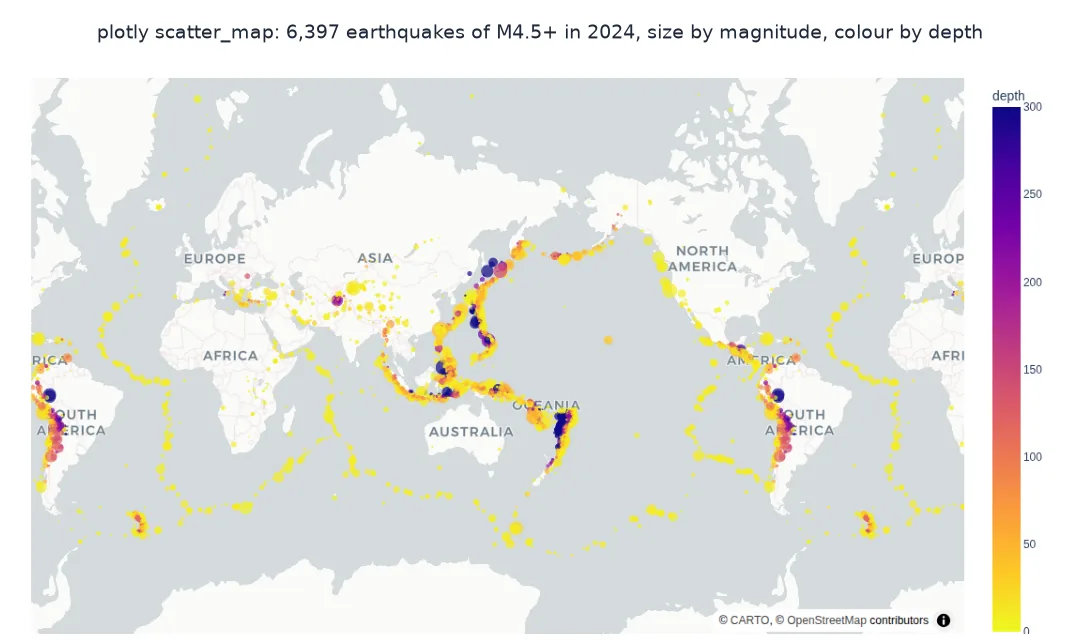
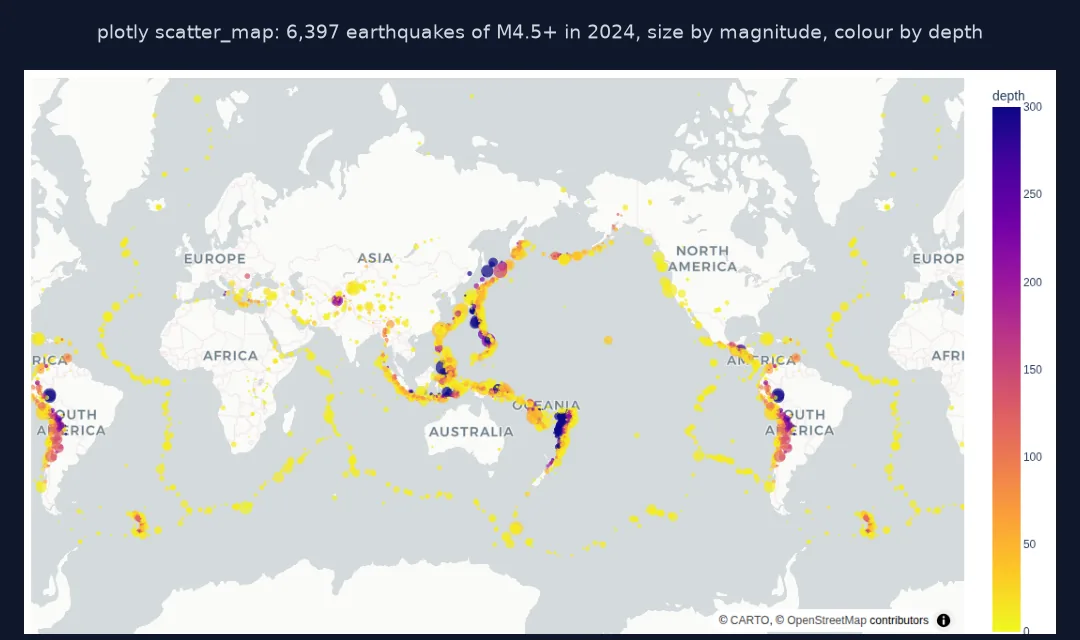
Size by magnitude, colour by depth, choose a basemap
1. Size by magnitude
Plotly scales marker area linearly with the size column. Magnitude is logarithmic, so a magnitude 7 would look barely bigger than a 5 unless the size column grows faster:
for name, s in (("magnitude itself", Q.mag), ("exp(magnitude)", np.exp(Q.mag)), ("(magnitude - 4)^2", (Q.mag - 4) ** 2)):
    ratio = s[Q.mag >= 7].mean() / s[Q.mag < 5].mean()
    print(f"{name:>18}: an M7+ marker has {ratio:,.1f}x the area of an M4.5-5")
print(f"M7 or larger: {(Q.mag >= 7).sum()}; largest: M{Q.mag.max()} {Q.loc[Q.mag.idxmax(), 'place']}")
magnitude itself: an M7+ marker has 1.6x the area of an M4.5-5
exp(magnitude): an M7+ marker has 13.0x the area of an M4.5-5
(magnitude - 4)^2: an M7+ marker has 24.1x the area of an M4.5-5
M7 or larger: 10; largest: M7.5 2024 Noto Peninsula, Japan Earthquake
Sized by magnitude directly, an M7+ earthquake gets only 1.6 times the marker area of an M4.5–5: the map would show the largest events of the year as dots barely bigger than the rest. Sized by (magnitude − 4)², they get 24 times the area. The year had 10 earthquakes of M7 or more; the largest, M7.5, was the Noto Peninsula earthquake in Japan on 1 January.
2. Colour by depth, with a sensible range
Depths run from the surface to about 700 km, but most earthquakes are shallow. Fix the colour range so the shallow majority is not one colour:
print(Q.depth.describe(percentiles=[0.5, 0.9, 0.99]).round(0).to_string())
print(f"deeper than 300 km: {(Q.depth > 300).sum()} ({(Q.depth > 300).mean():.1%}); with range_color=(0, 300) they share the end colour")
count 6397.0
mean 67.0
std 117.0
min 1.0
50% 16.0
90% 165.0
99% 586.0
max 654.0
deeper than 300 km: 314 (4.9%); with range_color=(0, 300) they share the end colour
Half the earthquakes are shallower than 16 km and 90% shallower than 165 km, but the deepest reach 654 km. With a colour range of 0 to 300 km, the 314 events deeper than 300 km, 4.9%, share the last colour, and the shallow majority spreads over the rest of the scale.
3. Basemap styles
map_style chooses the basemap. Styles such as carto-positron, carto-darkmatter and open-street-map need no token; white-bg has no tiles at all:
styles = ["open-street-map", "carto-positron", "carto-darkmatter", "white-bg"]
for st in styles:
    f = px.scatter_map(Q.head(10), lat="latitude", lon="longitude", map_style=st)
    print(f"{st:>17}: layout.map.style = {f.layout.map.style!r}")
open-street-map: layout.map.style = 'open-street-map'
carto-positron: layout.map.style = 'carto-positron'
carto-darkmatter: layout.map.style = 'carto-darkmatter'
white-bg: layout.map.style = 'white-bg'
Each style is just a name in the layout; switching basemaps changes one string and needs no account or token.
Only the largest earthquakes, labelled
The data used on this page
Every earthquake of magnitude 4.5 or more worldwide in 2024 from the USGS FDSN event service, as CSV.
from pathlib import Path

import numpy as np
import pandas as pd
import requests

Path("data").mkdir(exist_ok=True)
p = Path("data/quakes_m45_2024.csv")
if not p.exists():
    r = requests.get("https://earthquake.usgs.gov/fdsnws/event/1/query", timeout=600,
                     params=dict(format="csv", starttime="2024-01-01", endtime="2025-01-01", minmagnitude=4.5, orderby="time-asc"))
    r.raise_for_status()
    p.write_bytes(r.content)
Q = pd.read_csv(p)
Q = Q[Q["type"] == "earthquake"].reset_index(drop=True)
Q["time"] = pd.to_datetime(Q.time)
Q["size"] = (Q.mag - 4) ** 2
print(f"{len(Q):,} earthquakes of M4.5+ in 2024")
6,397 earthquakes of M4.5+ in 2024
The USGS catalogue has 6,397 earthquakes of magnitude 4.5 or more in 2024.
Example 1: only the largest, labelled
For a cleaner map, filter to the largest events and add their magnitudes as text:
big = Q[Q.mag >= 6.5].copy()
big["label"] = "M" + big.mag.round(1).astype(str)
f3 = px.scatter_map(big, lat="latitude", lon="longitude", size="size", size_max=18, color="mag", color_continuous_scale="OrRd",
                    text="label", zoom=0.6, center={"lat": 10, "lon": 150}, map_style="carto-positron", hover_name="place")
f3.update_traces(textposition="top right")
f3.write_html("data/quakes_2024_big.html", include_plotlyjs="cdn")
print(f"M6.5 and larger: {len(big)}; months: {big.time.dt.month.value_counts().sort_index().to_dict()}")
M6.5 and larger: 28; months: {1: 5, 3: 2, 4: 4, 5: 1, 6: 1, 7: 3, 8: 5, 9: 1, 10: 1, 11: 2, 12: 3}
28 earthquakes were M6.5 or larger, five each in January and August; February had none.
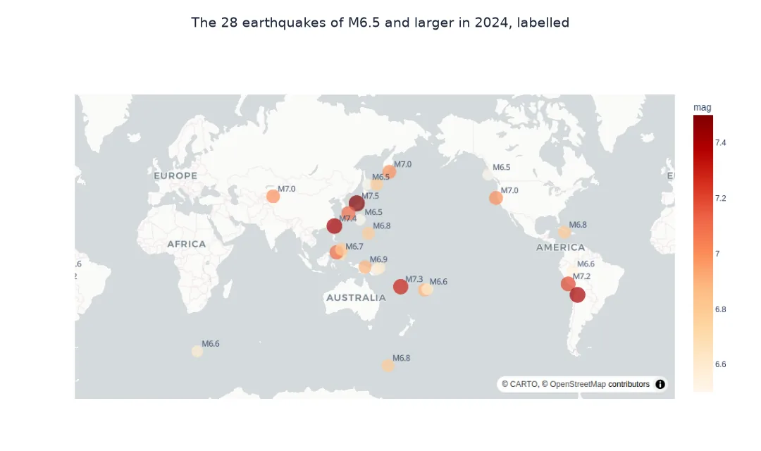
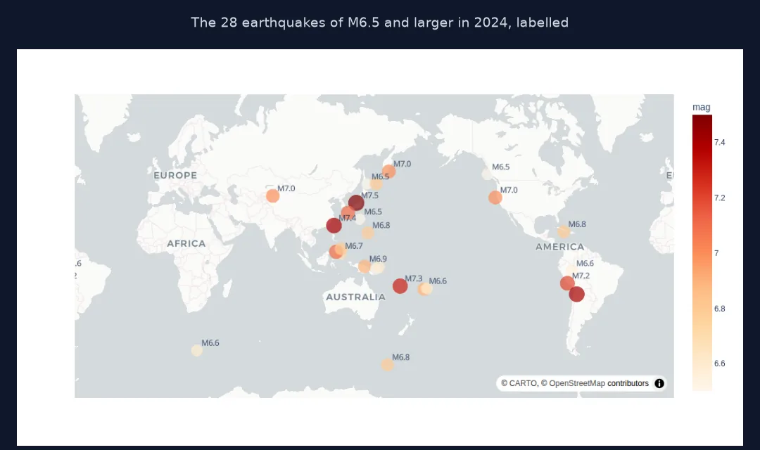
One marker per row on a MapLibre map
scatter_map draws a scatter trace on a MapLibre map in Web Mercator, one marker per row. Every visual property can come from a column: size scales the marker area between zero and size_max pixels, color maps a numeric column through a continuous colour scale or a categorical one through a discrete palette, and hover_data controls what appears on hover, with d3-style formats such as :.1f or |%Y-%m-%d for dates. The whole figure, data included, is serialised to JSON in the HTML file, so a few thousand points stay small, and a hundred thousand become a heavy page.
Skewed data is the norm on maps. Earthquake magnitudes are logarithmic, depths cluster near the surface, incomes and populations have long tails. Linear sizes and default colour ranges then make most points look alike and a few dominate; transforming the size column, fixing range_color at a meaningful value and filtering to what matters at the zoom level shown make the map readable. For hundreds of thousands of points, density maps or GPU-based libraries such as lonboard work better than individual markers.
Old function names, negative sizes and many points
- Old function names:
scatter_mapboxandmap_stylereplacedmapbox_style; the old names still exist but are deprecated. - Negative sizes: the size column must be non-negative; shift or transform before plotting.
- Many points: beyond about 100,000 markers the browser slows; switch to
density_mapor lonboard. - Dates on hover: format with
|%Y-%m-%d, or the full timestamp appears.
Internal links
- How to make a density heatmap map with Plotly in Python — the same points as a surface
- How to animate points on a map with Plotly in Python — the points over time
- How to plot millions of points with lonboard in Python — when markers are too many
FAQ
How do I plot latitude and longitude on a map in Python?
With Plotly Express: px.scatter_map(df, lat="lat", lon="lon"), then fig.show() or fig.write_html("map.html").
How do I change the basemap in Plotly?
Set map_style, for example "carto-positron", "carto-darkmatter" or "open-street-map"; none needs a token.
How do I size points by a value?
Pass the column as size and set size_max; for logarithmic quantities such as magnitude, transform the column first.
How do I save a Plotly map?
fig.write_html("map.html") for an interactive file; fig.write_image() needs the kaleido package and a browser for static images.