
How to Make a Density Heatmap Map With Plotly in Python
On this page
Problem statement
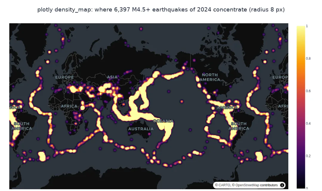
Thousands of overlapping points on a map turn into a blob in which nothing can be counted. A density heatmap replaces them with a smooth surface: each point contributes a kernel, a small bump of a given radius, and the sum shows where points concentrate. Plotly Express's density_map draws one on an interactive basemap from latitude and longitude columns, and two parameters decide what it shows: the radius of each kernel, and whether points are weighted by a value.
This page draws a density map of every magnitude 4.5 and larger earthquake of 2024 from the USGS catalogue, shows how the kernel radius changes the result, weights the earthquakes by their seismic moment instead of counting them, and checks the hotspots the map shows against counts in grid cells.
Quick answer
Pass the coordinates and a radius in pixels; add z to weight the points:
import plotly.express as px
fig = px.density_map(Q, lat="latitude", lon="longitude", radius=8, zoom=0.6, center={"lat": 10, "lon": 150},
                     map_style="carto-darkmatter", color_continuous_scale="Inferno", hover_name="place")
fig.update_layout(margin=dict(l=0, r=0, t=0, b=0))
fig.write_html("data/quakes_density.html", include_plotlyjs="cdn")
print(f"earthquakes: {len(Q):,}; trace type {fig.data[0].type}; radius {fig.data[0].radius}px; HTML {Path('data/quakes_density.html').stat().st_size / 1e6:.2f} MB")
earthquakes: 6,397; trace type densitymap; radius 8px; HTML 0.36 MB
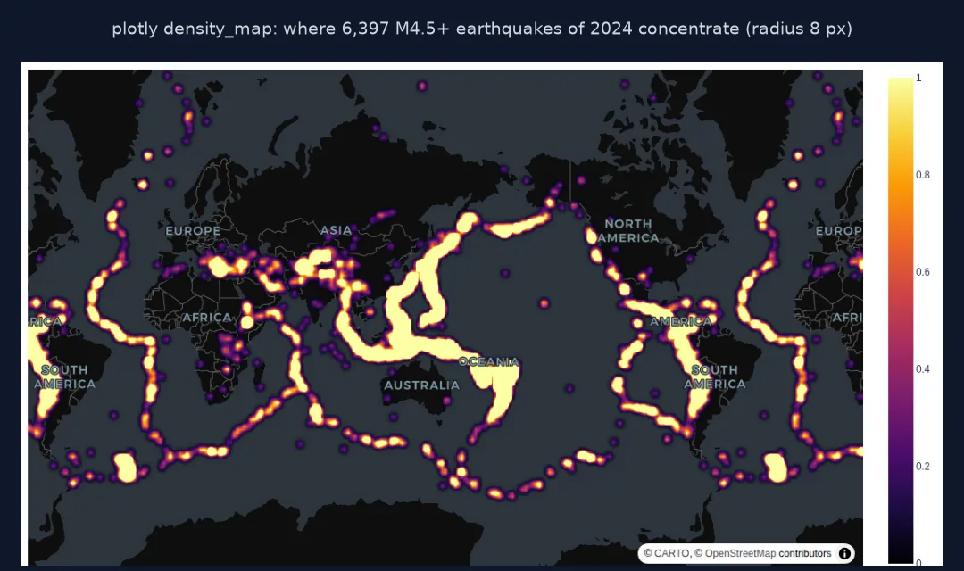
The density map is a densitymap trace with an 8-pixel radius; its HTML file is 0.36 MB, smaller than the scatter map because it carries only coordinates.
Check where points really are, choose a radius, weight by moment
1. Where the points really are
The heatmap's hotspots should match where the points are. Count earthquakes in 5° cells and list the busiest:
cell = Q.assign(cy=(Q.latitude // 5) * 5, cx=(Q.longitude // 5) * 5).groupby(["cy", "cx"])
top = cell.size().nlargest(6)
for (cy, cx), n in top.items():
    sub = cell.get_group((cy, cx))
    print(f"{cy:>4.0f} to {cy + 5:.0f}°, {cx:>5.0f} to {cx + 5:.0f}°: {n:>4} earthquakes, e.g. {sub.place.mode()[0]}")
print(f"cells with any earthquake: {cell.ngroups}; share of all events in the 10 busiest: {cell.size().nlargest(10).sum() / len(Q):.0%}")
20 to 25°, 120 to 125°: 244 earthquakes, e.g. 27 km S of Hualien City, Taiwan
5 to 10°, 125 to 130°: 221 earthquakes, e.g. 1 km WNW of Marihatag, Philippines
-25 to -20°, -180 to -175°: 180 earthquakes, e.g. south of the Fiji Islands
-35 to -30°, -180 to -175°: 171 earthquakes, e.g. south of the Kermadec Islands
-20 to -15°, -175 to -170°: 164 earthquakes, e.g. 112 km NNE of Hihifo, Tonga
-20 to -15°, 165 to 170°: 161 earthquakes, e.g. 101 km ENE of Luganville, Vanuatu
cells with any earthquake: 494; share of all events in the 10 busiest: 27%
The busiest 5° cell is eastern Taiwan, 244 earthquakes, 93% of them on or after the M7.4 Hualien earthquake of 2 April. The Philippines, the Fiji–Tonga–Kermadec arc and Vanuatu follow. 494 cells had at least one earthquake, and the 10 busiest hold 27% of all events: the hotspots a density map shows are real concentrations.
2. The radius
The radius is in screen pixels, not kilometres: the same radius covers 10 times more ground at zoom 0 than at zoom 3.3. Compute the ground distance one pixel represents at the equator for a few zoom levels:
for z in (0, 1, 2, 4, 6):
    m_per_px = 156543.03 * np.cos(0) / 2 ** z
    print(f"zoom {z}: 1 px = {m_per_px / 1000:7.1f} km at the equator; radius 8 px = {8 * m_per_px / 1000:7.1f} km")
zoom 0: 1 px = 156.5 km at the equator; radius 8 px = 1252.3 km
zoom 1: 1 px = 78.3 km at the equator; radius 8 px = 626.2 km
zoom 2: 1 px = 39.1 km at the equator; radius 8 px = 313.1 km
zoom 4: 1 px = 9.8 km at the equator; radius 8 px = 78.3 km
zoom 6: 1 px = 2.4 km at the equator; radius 8 px = 19.6 km
At zoom 0, the world view, one pixel is 156.5 km at the equator and an 8-pixel kernel spreads each earthquake over 1,252 km; at zoom 6 the same kernel is 19.6 km. The density surface is a display, not a measurement.
3. Weight by moment
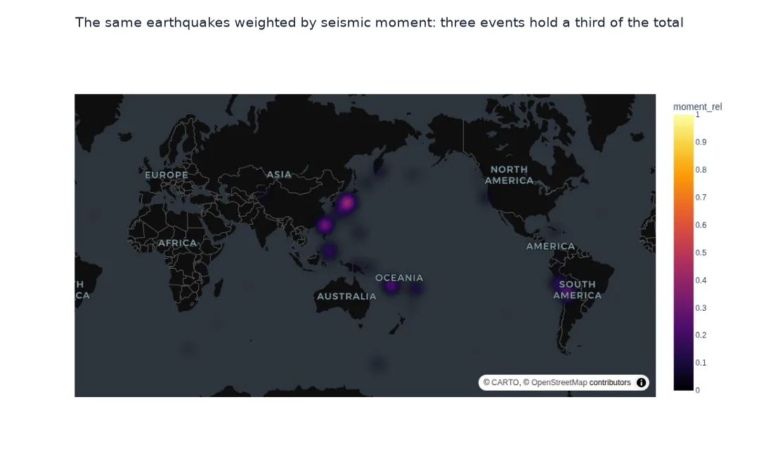
Counting treats an M4.5 and an M8 the same. Weighting by seismic moment, which grows 32 times per magnitude unit, shows where energy was released instead:
Q["moment"] = 10 ** (1.5 * Q.mag + 9.1)
Q["moment_rel"] = Q.moment / Q.moment.max()                              # raw moments (~1e20) overflow the WebGL heatmap
f2 = px.density_map(Q, lat="latitude", lon="longitude", z="moment_rel", radius=25, zoom=0.6, center={"lat": 10, "lon": 150},
                    map_style="carto-darkmatter", color_continuous_scale="Inferno")
f2.write_html("data/quakes_density_moment.html", include_plotlyjs="cdn")
top_m = Q.nlargest(3, "moment")
print(f"share of the year's moment in the 3 largest earthquakes: {top_m.moment.sum() / Q.moment.sum():.0%}")
print(top_m[["time", "mag", "place"]].assign(time=top_m.time.dt.strftime("%Y-%m-%d")).to_string(index=False))
share of the year's moment in the 3 largest earthquakes: 33%
time mag place
2024-01-01 7.5 2024 Noto Peninsula, Japan Earthquake
2024-04-02 7.4 15 km S of Hualien City, Taiwan
2024-07-19 7.4 41 km ESE of San Pedro de Atacama, Chile
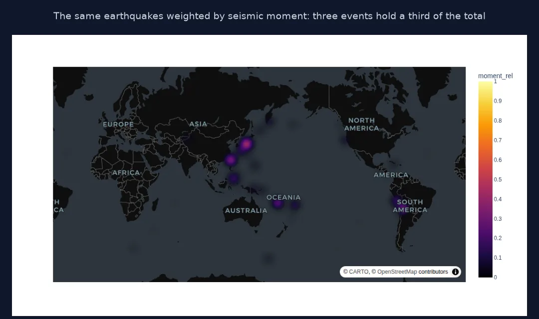
Weighted by seismic moment, the map changes completely: the three largest earthquakes of the year, Noto, Hualien and northern Chile, released 33% of the moment of all 6,397, so the weighted map is dominated by three spots.
Density with the points on top
The data used on this page
Every earthquake of magnitude 4.5 or more worldwide in 2024 from the USGS FDSN event service, as CSV.
from pathlib import Path

import numpy as np
import pandas as pd
import requests

Path("data").mkdir(exist_ok=True)
p = Path("data/quakes_m45_2024.csv")
if not p.exists():
    r = requests.get("https://earthquake.usgs.gov/fdsnws/event/1/query", timeout=600,
                     params=dict(format="csv", starttime="2024-01-01", endtime="2025-01-01", minmagnitude=4.5, orderby="time-asc"))
    r.raise_for_status()
    p.write_bytes(r.content)
Q = pd.read_csv(p)
Q = Q[Q["type"] == "earthquake"].reset_index(drop=True)
Q["time"] = pd.to_datetime(Q.time)
print(f"{len(Q):,} earthquakes of M4.5+ in 2024")
6,397 earthquakes of M4.5+ in 2024
The USGS catalogue has 6,397 earthquakes of magnitude 4.5 or more in 2024.
Example 1: density with points on top
A density layer and a sparse layer of the largest events together show both concentration and the events that matter:
import plotly.graph_objects as go
f3 = px.density_map(Q, lat="latitude", lon="longitude", radius=6, zoom=0.6, center={"lat": 10, "lon": 150},
                    map_style="carto-darkmatter", color_continuous_scale="Inferno")
big = Q[Q.mag >= 7]
f3.add_trace(go.Scattermap(lat=big.latitude, lon=big.longitude, mode="markers+text", text="M" + big.mag.astype(str),
                           textposition="top right", textfont=dict(color="white"), marker=dict(size=9, color="cyan"), name="M7+"))
f3.write_html("data/quakes_density_points.html", include_plotlyjs="cdn")
print(f"traces: {[t.type for t in f3.data]}; M7+ events: {len(big)}")
traces: ['densitymap', 'scattermap']; M7+ events: 10
The combined figure has a density layer and a scatter layer with the 10 earthquakes of M7 or more labelled on top.
Kernel density drawn by the browser
A density map is kernel density estimation drawn by the browser: each point is rendered as a blurred disc of radius pixels, and overlapping discs add up into the colour scale. Because the radius is in pixels, the surface changes with zoom: zoomed out, each kernel spans hundreds of kilometres and neighbouring clusters merge; zoomed in, they separate. That makes density maps good for seeing patterns interactively and poor for measuring anything, since the same radius means a different ground distance at every zoom level and latitude.
Weighting changes the question. Without z, the map shows where events are frequent; with z, where the weighted quantity is large. For earthquakes the two are very different: the frequency map lights up every subduction zone, while the moment map is dominated by the few largest earthquakes. For analysis rather than display, count points in grid cells or hexagons, or compute a kernel density with a radius in kilometres, and map that.
The old name, skewed weights and colour range
- Old name:
density_mapboxis the deprecated predecessor ofdensity_map. - Skewed weights: a weight spanning many orders of magnitude, like moment, makes one point dominate; log weights are a compromise. Scale very large weights to 0–1 first: values near 10²⁰ drew an empty map in testing.
- Colour range: set
range_colorto compare two density maps on the same scale. - Web Mercator: high-latitude areas appear stretched, so the same pixel radius covers less ground there.
Internal links
- How to plot points on an interactive map with Plotly in Python — the individual points
- How to make a heatmap with Folium in Python — the Leaflet equivalent
- The Gutenberg-Richter law explained — why the largest events dominate moment
FAQ
How do I make a heatmap on a map in Plotly?
Use px.density_map(df, lat="lat", lon="lon", radius=10) and adjust the radius and zoom.
What does the radius mean in density_map?
The radius of each point's kernel in screen pixels, so its ground size changes with the zoom level.
How do I weight a heatmap by a value?
Pass the column as z; each point's contribution is multiplied by it.
Is a density map good for measuring hotspots?
No: its look depends on the radius and zoom; count points in cells or compute a kernel density in kilometres for analysis.