
Interactive vs Static Maps, Explained
On this page
Problem statement
The first decision in making a map is not the library or the colours but the medium: a static image that every reader sees identically, or an interactive page that each reader explores. Static maps print, embed in any document, archive well and say exactly what their author decided. Interactive maps let readers zoom to their own street, hover for exact values and switch layers, at the cost of a browser, a network connection and the author's control over what is seen. Choosing the wrong one leads to maps nobody can read in a report, or dashboards that answer no question.
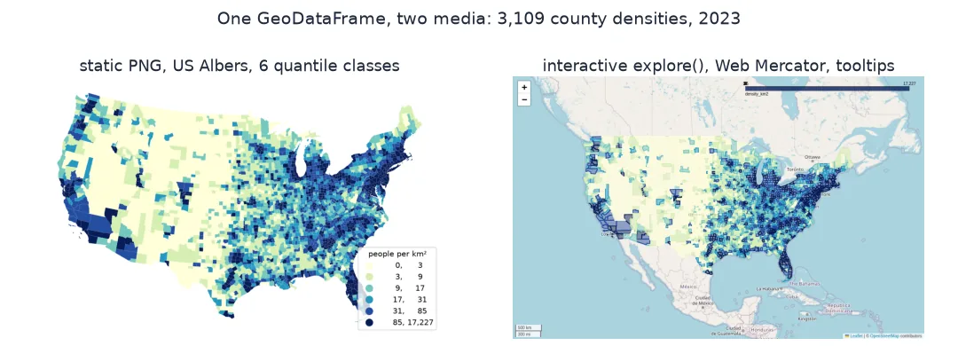
This page makes the same map, the 2023 population density of US counties, both ways. It compares what each file contains, what the reader can learn from it, how it travels and prints, and which decisions each medium forces on the author.
Quick answer
Make both from one GeoDataFrame and compare what each holds:
fig, ax = plt.subplots(figsize=(10, 6))
G.plot(ax=ax, column="density_km2", scheme="Quantiles", k=6, cmap="YlGnBu", lw=0.05, edgecolor="white", legend=True,
       legend_kwds={"title": "people per km²", "loc": "lower right", "fmt": "{:,.0f}"})
ax.set_axis_off(); fig.savefig("data/static.png", dpi=150, bbox_inches="tight"); plt.close(fig)
G.explore(column="density_km2", scheme="Quantiles", k=6, cmap="YlGnBu", tooltip=["NAME", "density_txt"]).save("data/interactive.html")
html = Path("data/interactive.html").read_text()
print(f"static PNG: {Path('data/static.png').stat().st_size / 1e6:.2f} MB, {Image.open('data/static.png').size[0]} x {Image.open('data/static.png').size[1]} px")
print(f"interactive HTML: {len(html.encode()) / 1e6:.2f} MB; county names in the page: {sum(n in html for n in G.NAME)} of {len(G):,}")
static PNG: 0.37 MB, 1133 x 723 px
interactive HTML: 3.24 MB; county names in the page: 3104 of 3,109
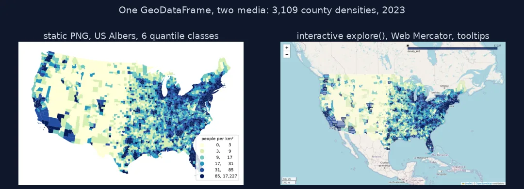
The static map is a 0.37 MB PNG of 1133 × 723 pixels. The interactive one is a 3.24 MB page that carries the data itself: 3,104 of the 3,109 county names appear in it verbatim. The other five, O'Brien, Prince George's, Queen Anne's, St. Mary's and Doña Ana, contain an apostrophe or an ñ, which the page stores escaped.
What readers learn, how each travels, what authors decide
1. What the reader can learn
In the static map the reader gets six classes and a legend. In the interactive one, every county's exact value is a hover away. Compare how precisely each lets a reader answer "how dense is my county?":
import mapclassify
c = mapclassify.Quantiles(G.density_km2, k=6)
widths = np.diff(np.r_[G.density_km2.min(), c.bins])
print(f"static: a county is placed in one of 6 classes; class widths {', '.join(f'{w:,.0f}' for w in widths)} people per km²")
print(f"interactive: the tooltip gives the value to 0.1 people per km² for each of {len(G):,} counties")
static: a county is placed in one of 6 classes; class widths 3, 6, 8, 14, 54, 17,142 people per km²
interactive: the tooltip gives the value to 0.1 people per km² for each of 3,109 counties
In the static map, a county's density can only be read as one of six classes. Those are 3 to 14 people per km² wide at the low end, while the top class spans 17,142, from rural fringes to Manhattan. The interactive map gives every county's value to a tenth.
2. How each travels and prints
A PNG is pixels at a fixed size; an HTML map needs a browser and fetches tiles and scripts when opened:
import re
w, h = Image.open("data/static.png").size
print(f"static at 300 dpi: {w / 300 * 2.54:.1f} x {h / 300 * 2.54:.1f} cm; at 150 dpi: {w / 150 * 2.54:.1f} x {h / 150 * 2.54:.1f} cm")
hosts = sorted(set(re.findall(r'(?:src|href)="https?://([^/"]+)', html)))
print(f"interactive: scripts and styles from {len(hosts)} external hosts; basemap tiles from tile.openstreetmap.org: {'tile.openstreetmap.org' in html}")
static at 300 dpi: 9.6 x 6.1 cm; at 150 dpi: 19.2 x 12.2 cm
interactive: scripts and styles from 4 external hosts; basemap tiles from tile.openstreetmap.org: True
At print quality, 300 dpi, the PNG covers 9.6 × 6.1 cm, a column-width figure, and needs nothing else. The interactive page loads scripts and styles from 4 external hosts, and its basemap from tile.openstreetmap.org, every time it opens.
3. What each forces the author to decide
A static map must fix everything in advance; an interactive one can defer some choices to the reader:
| Decision | Static | Interactive |
|---|---|---|
| extent and zoom | fixed by the author | reader pans and zooms |
| detail shown | classes and labels chosen once | tooltips on demand |
| emphasis | annotations, insets, title | must be designed in, or the reader may miss the point |
| projection | any | Web Mercator, almost always |
| longevity | the file is the map | depends on tile servers and libraries |
Static small multiples
The data used on this page
The US Census Bureau's 2023 county cartographic boundaries (1:20 million) and Vintage 2023 county population estimates, for the 3,109 counties of the conterminous US, drawn in the US Albers equal-area projection (EPSG:5070) for the static map.
from pathlib import Path

import geopandas as gpd
import matplotlib
matplotlib.use("Agg")
import matplotlib.pyplot as plt
import numpy as np
import pandas as pd
import requests
from PIL import Image

Path("data").mkdir(exist_ok=True)
def cached(path, url):
    p = Path(path)
    if not p.exists():
        r = requests.get(url, timeout=600)
        r.raise_for_status()
        p.write_bytes(r.content)
    return p
C = gpd.read_file(cached("data/cb_2023_us_county_20m.zip", "https://www2.census.gov/geo/tiger/GENZ2023/shp/cb_2023_us_county_20m.zip"))
est = pd.read_csv(cached("data/co-est2023-alldata.csv", "https://www2.census.gov/programs-surveys/popest/datasets/2020-2023/counties/totals/co-est2023-alldata.csv"),
                  encoding="latin-1", dtype={"STATE": str, "COUNTY": str})
est = est[est.SUMLEV == 50].assign(GEOID=lambda d: d.STATE + d.COUNTY)[["GEOID", "STNAME", "CTYNAME", "POPESTIMATE2023"]]
G = C[~C.STATEFP.isin(["02", "15", "72"])].merge(est, on="GEOID").to_crs(5070)
G["density_km2"] = G.POPESTIMATE2023 / (G.area / 1e6)
G["NAME"] = G.CTYNAME + ", " + G.STNAME
G["density_txt"] = G.density_km2.map("{:,.1f}".format)
G["geometry"] = G.geometry.simplify(1000)
print(f"{len(G):,} counties, in {G.crs.name}")
3,109 counties, in NAD83 / Conus Albers
The 3,109 counties are projected to NAD83 / Conus Albers, an equal-area projection, for the static map.
Example 1: static small multiples
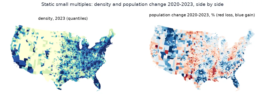
Comparison is where static maps are strongest: several maps side by side, each fixed, for the eye to compare. Map the change in population from 2020 to 2023 next to the density:
G = G.merge(pd.read_csv("data/co-est2023-alldata.csv", encoding="latin-1", dtype={"STATE": str, "COUNTY": str})
              .query("SUMLEV == 50").assign(GEOID=lambda d: d.STATE + d.COUNTY)[["GEOID", "POPESTIMATE2020"]], on="GEOID")
G["change_pct"] = (G.POPESTIMATE2023 / G.POPESTIMATE2020 - 1) * 100
fig, axes = plt.subplots(1, 2, figsize=(14, 4.6))
G.plot(ax=axes[0], column="density_km2", scheme="Quantiles", k=6, cmap="YlGnBu", lw=0)
G.plot(ax=axes[1], column="change_pct", cmap="RdBu", vmin=-8, vmax=8, lw=0)
for a, t in zip(axes, ("density, 2023 (quantiles)", "population change 2020-2023, % (red loss, blue gain)")):
    a.set_axis_off(); a.set_title(t)
fig.savefig("data/static_pair.png", dpi=120, bbox_inches="tight"); plt.close(fig)
print(f"counties that grew: {(G.change_pct > 0).sum():,}; shrank: {(G.change_pct < 0).sum():,}; fastest growth {G.change_pct.max():.1f}% ({G.loc[G.change_pct.idxmax(), 'NAME']})")
counties that grew: 1,706; shrank: 1,398; fastest growth 26.2% (Kaufman County, Texas)
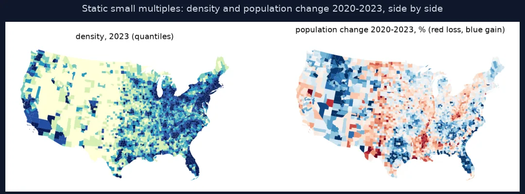
From 2020 to 2023, 1,706 counties grew and 1,398 shrank. The fastest growth was in Kaufman County, Texas, east of Dallas, at 26.2%. Side by side, the two static maps let the eye compare where people live with where they are moving, which an interactive map showing one layer at a time does less well.
A static map is an argument
A static map is an argument. The author chooses the extent, the projection, the classes, the labels and the emphasis, and every reader receives the same picture, which can be printed, cited, archived and read without any software beyond an image viewer. Its limits are just as fixed: one scale, one level of detail, and values that can only be read to the precision of the legend. Static maps excel at comparison, as small multiples, at showing a pattern the author wants seen, and in every medium that is not a screen.
An interactive map is a tool. It hands the reader the extent, the zoom and the detail, so each reader can find their own county and its exact value, and it can hold far more information than one image, revealed on demand. The price is control and durability: readers may never find the pattern the map was made to show, the page depends on a browser, scripts and tile servers that may change or disappear, as CARTO's free tiles did in 2026, and nearly all web maps use Web Mercator, which inflates areas toward the poles. A good interactive map is designed with a default view that already makes its point. Many projects publish both, a static map for the story and an interactive one for looking things up.
Accessibility, vector output and archiving
- Accessibility: give static maps alt text and a data table; interactive maps need keyboard navigation and text alternatives too.
- Vector static output: SVG and PDF keep static maps sharp at any size and make their text searchable.
- Archiving an interactive map: save a static image of its default view alongside the HTML.
- Projection: static maps can use equal-area projections such as US Albers for density; most web maps are locked to Web Mercator.
Internal links
- Choosing a Python map library explained — the libraries for each medium
- How to save a Folium map as a PNG image in Python — from interactive to static
- Choosing a map projection for display — what Web Mercator distorts
FAQ
Should I use an interactive or a static map?
Static for print, reports, papers and a single clear message; interactive when readers need to look up their own area or exact values.
Can a map be both interactive and static?
Yes; publish a static image of the main view alongside the interactive page, or export the interactive map's default view as an image.
Why do interactive maps use Web Mercator?
Web map tiles are built in Web Mercator (EPSG:3857), which keeps shapes locally correct at every zoom but inflates areas away from the equator.
Are interactive maps less durable than static ones?
Usually; they depend on JavaScript libraries and tile servers that can change, while an image file stays readable indefinitely.