
How to Make a Dorling Cartogram in Python
On this page
Problem statement
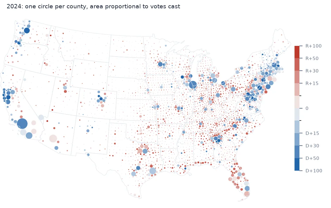
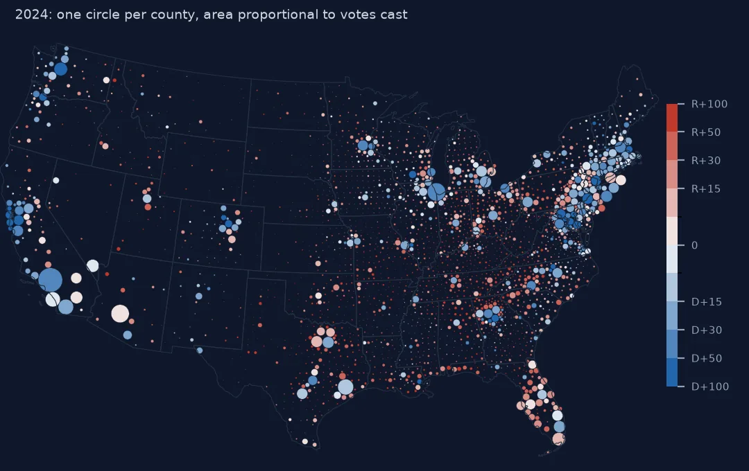
A Dorling cartogram replaces every region with a circle whose area is proportional to a value, then nudges the circles apart until none overlap. Each circle stays as close to home as the crowd allows. Shape is given up entirely, but size is exact and position is approximately right. For thousands of small units — US counties, for example — it is often more readable than a contiguous cartogram, which would have to twist 3,000 outlines.
This page builds a Dorling cartogram of the 2024 presidential vote by county in about 20 lines of NumPy and SciPy. It measures how far the circles have to move, and shows the one design decision that controls everything: how much of the map the circles are allowed to fill.
Quick answer
Place one circle per county at a point inside it, with radius from its share of the votes, and repeatedly push overlapping pairs apart, the larger circle moving less:
def dorling(xy, r, iterations=1000, tolerance=1.0):
    p = xy.copy()
    for it in range(iterations):
        pairs = cKDTree(p).query_pairs(2 * r.max(), output_type="ndarray")
        d = np.hypot(*(p[pairs[:, 0]] - p[pairs[:, 1]]).T)
        overlap = r[pairs[:, 0]] + r[pairs[:, 1]] - d
        hit = overlap > tolerance                                        # metres
        if not hit.any():
            return p, it
        a, b = pairs[hit].T
        u = (p[a] - p[b]) / np.maximum(d[hit], 1e-6)[:, None]
        w = r[b] ** 2 / (r[a] ** 2 + r[b] ** 2)                           # small circles move more
        move = np.zeros_like(p)
        np.add.at(move, a, u * (overlap[hit] * w)[:, None])
        np.add.at(move, b, -u * (overlap[hit] * (1 - w))[:, None])
        p += move
    return p, iterations

r = np.sqrt(c.total_votes / c.total_votes.sum() * c.area.sum() * FILL / np.pi).values
moved, passes = dorling(XY, r)
shift = np.hypot(*(moved - XY).T) / 1000
print(f"{len(c):,} circles, fill {FILL:.0%}: no overlaps after {passes} passes; "
      f"median move {np.median(shift):.1f} km, 95th percentile {np.percentile(shift, 95):.1f} km, max {shift.max():.0f} km")
3,109 circles, fill 12%: no overlaps after 320 passes; median move 0.0 km, 95th percentile 17.0 km, max 132 km
Start inside each county, choose the fill, find who moved
1. Start each circle inside its county
Use representative_point(), not centroid. A centroid can fall outside a concave or multi-part county, and the circle should start on land the county owns:
cent = c.geometry.centroid
outside = ~c.geometry.contains(cent)
print(f"{outside.sum()} of {len(c):,} county centroids fall outside their county, e.g. {c.loc[outside, 'NAME'].head(4).tolist()}")
8 of 3,109 county centroids fall outside their county, e.g. ['Iron', 'Henry', 'Pepin', 'Keweenaw']
2. Choose how much of the map the circles fill
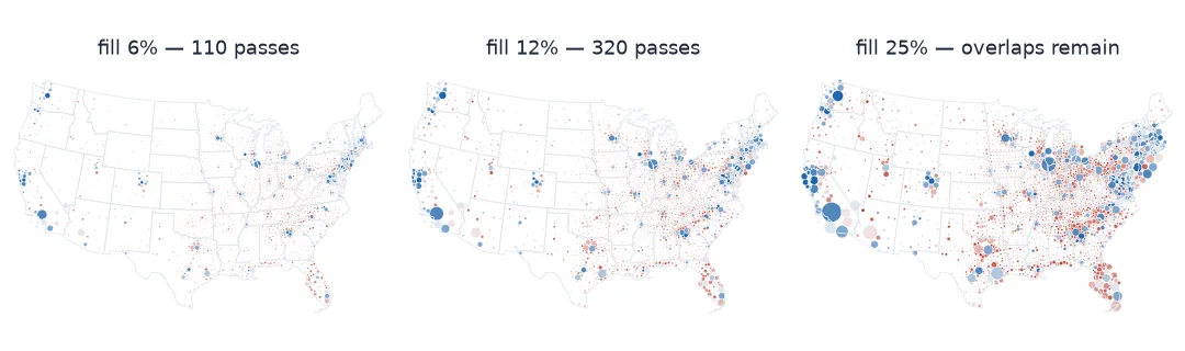
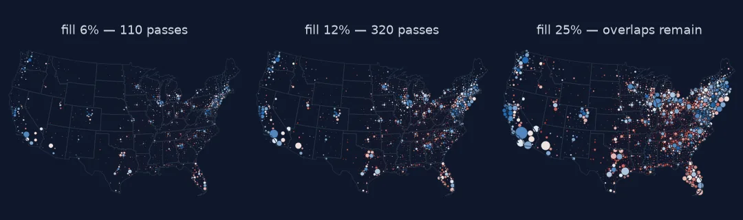
The circles' total area is a free choice: a fraction of the land area. Small circles barely move but leave rural counties as specks; large circles are readable but must travel far from home:
for fill in (0.06, 0.12, 0.25):
    rr = np.sqrt(c.total_votes / c.total_votes.sum() * c.area.sum() * fill / np.pi).values
    pp, n = dorling(XY, rr)
    s = np.hypot(*(pp - XY).T) / 1000
    print(f"fill {fill:4.0%}: largest radius {rr.max() / 1000:5.1f} km, smallest {rr.min():6.0f} m; "
          f"{n:4d} passes{' (not resolved)' if n == 1000 else ''}; 95th-percentile move {np.percentile(s, 95):5.1f} km, max {s.max():4.0f} km")
fill 6%: largest radius 60.2 km, smallest 307 m; 110 passes; 95th-percentile move 1.5 km, max 66 km
fill 12%: largest radius 85.1 km, smallest 434 m; 320 passes; 95th-percentile move 17.0 km, max 132 km
fill 25%: largest radius 122.9 km, smallest 627 m; 1000 passes (not resolved); 95th-percentile move 59.9 km, max 260 km
3. Find who moved and why
The biggest displacements happen where large circles crowd together: dense metropolitan regions of many small, populous counties.
c["moved_km"] = shift
print(c.nlargest(6, "moved_km")[["NAME", "STUSPS", "total_votes", "moved_km"]].round(0).to_string(index=False))
NAME STUSPS total_votes moved_km
Nassau NY 706541 132.0
Bergen NJ 459077 123.0
Essex NJ 313283 116.0
Richmond NY 197496 113.0
Bronx NY 359844 111.0
Union NJ 240632 106.0
4. Colour and draw
Draw the largest circles first so small ones stay visible on top, and colour by margin:
order = np.argsort(-r)
fig, ax = plt.subplots(figsize=(10, 6))
ax.add_collection(PatchCollection([Circle(moved[i], r[i]) for i in order], array=c.margin.values[order],
                                  cmap="RdBu_r", clim=(-0.6, 0.6), edgecolor="white", linewidth=0.2))
ax.set_aspect("equal"); ax.autoscale_view(); ax.set_axis_off()
fig.savefig("data/dorling_2024.png", dpi=150)
print("drawn", len(order), "circles")
drawn 3109 circles
What the circles say that the map did not
The data used on this page
2024 presidential results by county from tonmcg/US_County_Level_Election_Results_08-24; county boundaries from the US Census Bureau cartographic boundary files, 2023, 1:20 million. The lower 48 states and DC; Alaska reports by house district and is left out.
from pathlib import Path

import geopandas as gpd
import matplotlib
matplotlib.use("Agg")
import matplotlib.pyplot as plt
import numpy as np
import pandas as pd
import requests
from matplotlib.collections import PatchCollection
from matplotlib.patches import Circle
from scipy.spatial import cKDTree

Path("data").mkdir(exist_ok=True)
for name, url in {"2024_US_County_Level_Presidential_Results.csv": "https://raw.githubusercontent.com/tonmcg/US_County_Level_Election_Results_08-24/master/2024_US_County_Level_Presidential_Results.csv",
                  "cb_2023_us_county_20m.zip": "https://www2.census.gov/geo/tiger/GENZ2023/shp/cb_2023_us_county_20m.zip"}.items():
    if not Path("data", name).exists():
        Path("data", name).write_bytes(requests.get(url, timeout=300).content)
res = pd.read_csv("data/2024_US_County_Level_Presidential_Results.csv", dtype={"county_fips": str})
res["fips"] = np.where(res.state_name == "District of Columbia", "11001", res.county_fips)       # DC's 8 wards
res = res.groupby("fips")[["votes_gop", "votes_dem", "total_votes"]].sum()
c = gpd.read_file("data/cb_2023_us_county_20m.zip")
c = c[~c.STATEFP.isin(["02", "15", "60", "66", "69", "72", "78"])].join(res, on="GEOID", how="inner").to_crs(5070).reset_index(drop=True)
c["margin"] = (c.votes_gop - c.votes_dem) / c.total_votes
pts = c.geometry.representative_point()
XY = np.c_[pts.x, pts.y]
FILL = 0.12
print(f"{len(c):,} counties, {c.total_votes.sum():,} votes")
3,109 counties, 154,022,941 votes
Example 1: what the circles say that the map did not
red = c.margin > 0
circle_area = np.pi * r ** 2
print(f"Republican-won counties: {c.area[red].sum() / c.area.sum():.0%} of the land, "
      f"{circle_area[red].sum() / circle_area.sum():.0%} of the circle area")
print(f"the 10 largest circles hold {np.sort(c.total_votes.values)[-10:].sum() / c.total_votes.sum():.0%} of all votes")
Republican-won counties: 86% of the land, 51% of the circle area
the 10 largest circles hold 11% of all votes
Example 2: keep circles nearer home with a pull
A spring back towards each circle's start reduces displacement but can stop the overlaps from resolving:
def dorling_pull(xy, r, k, iterations=500):
    p = xy.copy()
    for it in range(iterations):
        pairs = cKDTree(p).query_pairs(2 * r.max(), output_type="ndarray")
        d = np.hypot(*(p[pairs[:, 0]] - p[pairs[:, 1]]).T)
        overlap = r[pairs[:, 0]] + r[pairs[:, 1]] - d
        hit = overlap > 1.0
        a, b = pairs[hit].T
        u = (p[a] - p[b]) / np.maximum(d[hit], 1e-6)[:, None]
        w = r[b] ** 2 / (r[a] ** 2 + r[b] ** 2)
        move = np.zeros_like(p)
        np.add.at(move, a, u * (overlap[hit] * w)[:, None])
        np.add.at(move, b, -u * (overlap[hit] * (1 - w))[:, None])
        p += move + (xy - p) * k
    return hit.sum()

for k in (0.0, 0.005, 0.01):
    print(f"pull {k}: {dorling_pull(XY, r, k)} overlapping pairs left after 500 passes")
pull 0.0: 0 overlapping pairs left after 500 passes
pull 0.005: 467 overlapping pairs left after 500 passes
pull 0.01: 476 overlapping pairs left after 500 passes
Even a weak pull leaves hundreds of overlaps that never clear: the circles in dense regions reach an equilibrium between push and pull instead of separating. Push alone converges.
Only value and rough location are kept
Danny Dorling's cartograms, from 1996, kept only two properties of each region: its value, as the area of a circle, and its rough location. Abandoning shape removes the hardest part of making a contiguous cartogram. Nothing has to stay connected, and each circle can move independently. The price is that readers navigate by the overall outline of the country and by a few big, labelled circles, not by the regions' own shapes.
The fill fraction is the real design choice. At 12% of the land, most of the 3,100 counties do not move at all, because their circles are smaller than the gaps around them. The big metropolitan circles shoulder each other aside, by up to 132 km around New York, but the national pattern stays readable. Double the fill to 25% and the 95th-percentile move quadruples to 60 km, and 1,000 passes are no longer enough to clear every overlap. Halve it to 6% and the smallest counties shrink to circles 300 m across, invisible at any map scale.
Starting points, draw order and circle area
- Use
representative_point()for the starting position; centroids can fall outside their county. - Draw large circles first so small ones are not hidden underneath.
- Zero values become circles of zero radius; leave them out or give them a visible floor.
- Circle area, not radius, must be proportional to the value.
- Very different sizes (a 100-vote county next to Los Angeles) make the smallest circles sub-pixel; say so in the legend.
- A spring force toward home sounds sensible but can stop the overlaps from resolving at all.
Internal links
- How to make a contiguous cartogram — keeping the shapes
- How to make a US county election map — the data and the joins
- Hexbin points in Python — another way to escape area
FAQ
What is a Dorling cartogram?
A cartogram that replaces each region with a circle whose area is proportional to a value, moved just enough that no circles overlap.
How do I make a Dorling cartogram in Python?
Compute radii from the values, start each circle at a point inside its region, and iteratively push overlapping circles apart with a KD-tree to find neighbours (as above).
How big should the circles be?
Choose a total circle area as a fraction of the land; around a tenth keeps displacement modest for US counties. Larger fills read better but move circles further.
Why do some circles end up far from their region?
They sit in dense clusters of large circles, such as metropolitan counties, and have to be pushed out to make room.