
The Ecological Fallacy Explained
On this page
Problem statement
Most health maps show areas: the share of a tract that is uninsured, the death rate of a county. A relationship between two such shares, that places with more poverty have more disability, is a fact about places. The ecological fallacy is reading it as a fact about people: that poor people are disabled at the rate the area pattern implies, or even that the relationship has the same sign for individuals. Area-level relationships are often much stronger than the individual ones beneath them, and sometimes point the other way.
This page measures the gap with real data where both levels are available: the American Community Survey's individual records (PUMS) for 71,796 working-age adults in Illinois, and the same records summarised for the state's 88 Public Use Microdata Areas (PUMAs).
Quick answer
Compute the same correlation twice, once across people and once across the areas they live in:
def wcorr(x, y, w):
    mx, my = np.average(x, weights=w), np.average(y, weights=w)
    return np.average((x - mx) * (y - my), weights=w) / np.sqrt(np.average((x - mx) ** 2, weights=w) * np.average((y - my) ** 2, weights=w))

for x, y in [("no_diploma", "uninsured"), ("poor", "disabled"), ("uninsured", "public_cover")]:
    print(f"{x:>10} × {y:<12}  people: r = {wcorr(P[x], P[y], P.PWGTP):+.2f}   areas: r = {wcorr(A[x], A[y], A['pop']):+.2f}")
no_diploma × uninsured people: r = +0.16 areas: r = +0.82
poor × disabled people: r = +0.15 areas: r = +0.66
uninsured × public_cover people: r = -0.15 areas: r = +0.41
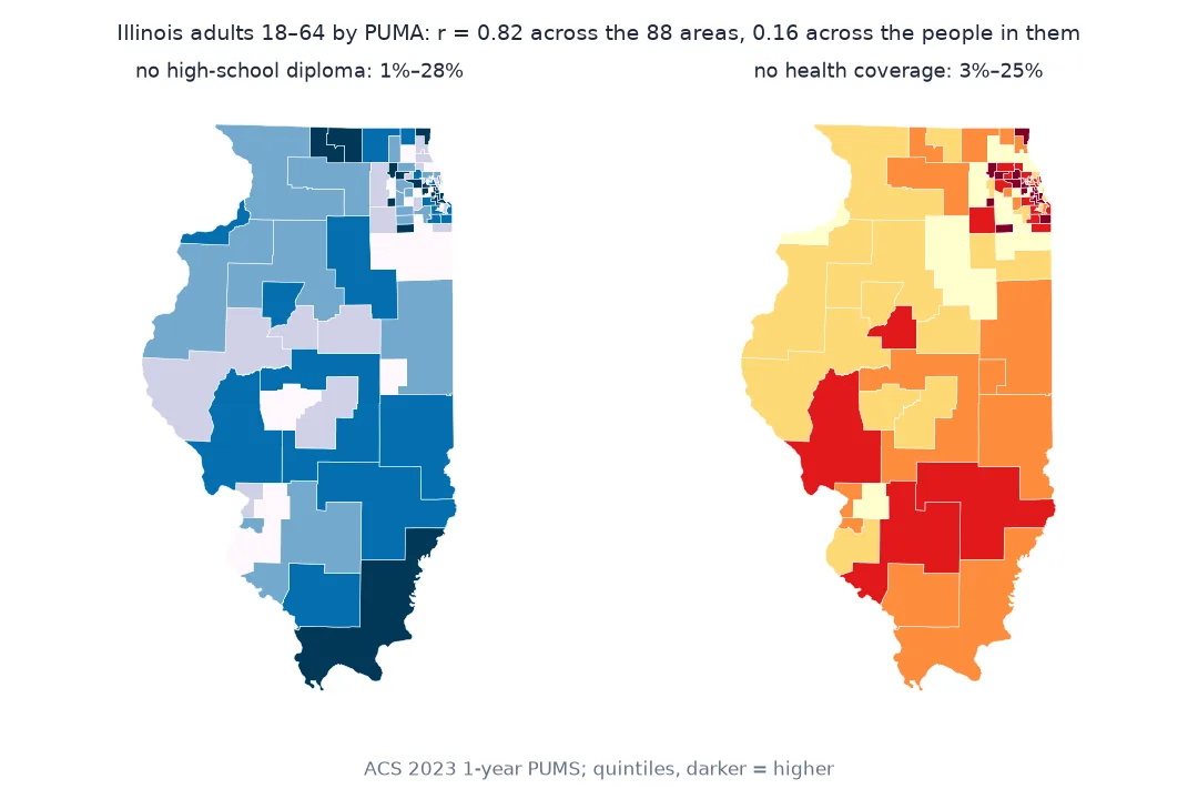
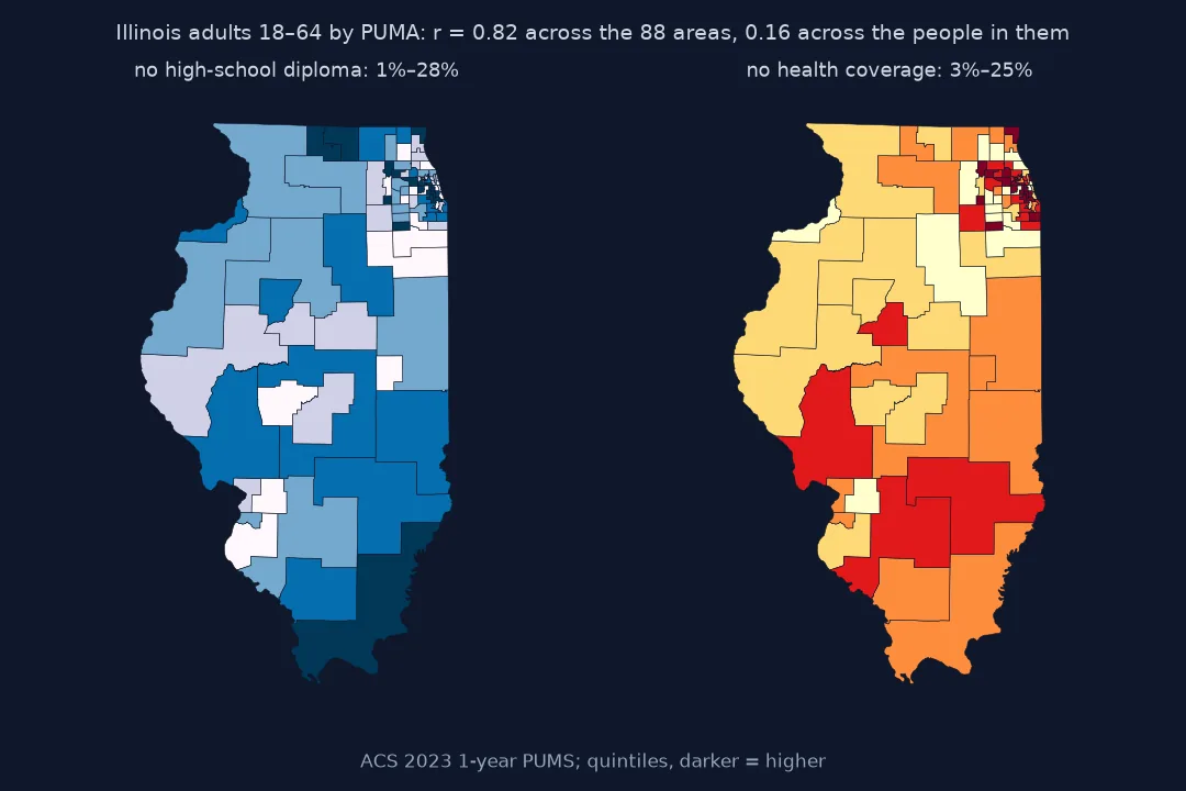
Same data at two levels, ecological regression, shifting relationships
1. Same data, two levels
The two correlations use exactly the same people. The area-level one first averages them within each PUMA, which removes all the variation within areas and keeps only the variation between them. Whatever sorts people into areas, such as income, housing costs or immigration history, is all that is left.
2. Ecological regression: what the areas imply about people
Regressing the area shares on each other and reading the line at 0% and 100% gives the rates the areas imply for the two groups. Compare them with the rates measured directly:
for x, y in [("no_diploma", "uninsured"), ("poor", "disabled")]:
    slope, icept = np.polyfit(A[x], A[y], 1, w=np.sqrt(A["pop"]))
    yes, no = P[P[x] == 1], P[P[x] == 0]
    print(f"{y} among {x} = 1: areas imply {icept + slope:.1%}, people show {np.average(yes[y], weights=yes.PWGTP):.1%}; "
          f"among {x} = 0: areas imply {icept:.1%}, people show {np.average(no[y], weights=no.PWGTP):.1%}")
grads = P[P.no_diploma == 0].groupby("PUMA").apply(lambda d: np.average(d.uninsured, weights=d.PWGTP), include_groups=False)
print(f"across areas, the share without a diploma against the uninsured rate among graduates: r = {A.no_diploma.corr(grads):.2f}")
uninsured among no_diploma = 1: areas imply 74.7%, people show 23.2%; among no_diploma = 0: areas imply 2.5%, people show 7.5%
disabled among poor = 1: areas imply 52.6%, people show 23.3%; among poor = 0: areas imply 5.0%, people show 8.5%
across areas, the share without a diploma against the uninsured rate among graduates: r = 0.76
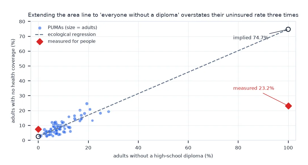
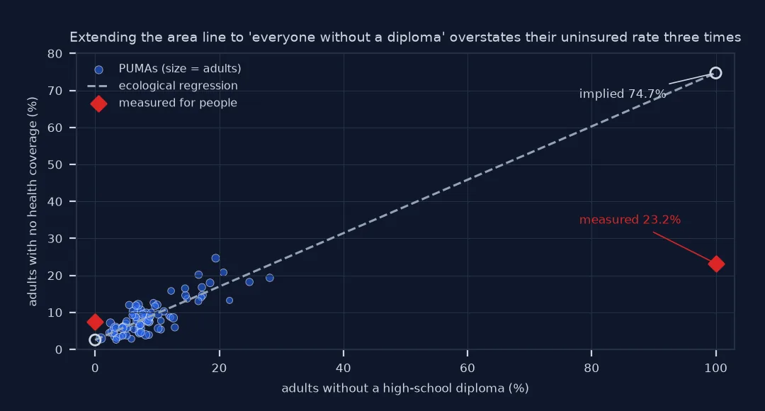
The area regression implies that three in four adults without a high-school diploma are uninsured; the survey shows fewer than one in four. Areas with many adults without diplomas also have more uninsured graduates (r = 0.76 across PUMAs), and the regression attributes all of that to the people without one, so it overstates one group's rate and understates the other's.
3. A relationship that changes sign
Public health coverage and being uninsured are mutually exclusive for a person: the uninsured have no coverage of any kind. Across areas they go together:
both = ((P.uninsured == 1) & (P.public_cover == 1)).sum()
print(f"people both uninsured and publicly covered: {both}")
print(f"areas: the most-uninsured fifth average {A[A.uninsured >= A.uninsured.quantile(0.8)].public_cover.mean():.0%} with public coverage, "
      f"the least-uninsured fifth {A[A.uninsured <= A.uninsured.quantile(0.2)].public_cover.mean():.0%}")
people both uninsured and publicly covered: 0
areas: the most-uninsured fifth average 23% with public coverage, the least-uninsured fifth 11%
Poorer areas have both more people on Medicaid and more people with no coverage at all, because the thing they share, low income, raises both. An area-level analysis that found "public coverage goes with being uninsured" would be correct about places and impossible for people.
Correlations for every pair, by area scheme
The data used on this page
The American Community Survey 2023 1-year Public Use Microdata Sample for Illinois (person records), adults aged 18–64 with a known poverty status, weighted by the person weight PWGTP. PUMAs are the smallest areas the microdata identify, each with at least 100,000 residents.
import zipfile
from pathlib import Path

import numpy as np
import pandas as pd
import requests

Path("data").mkdir(exist_ok=True)
Z = Path("data/csv_pil_2023.zip")
if not Z.exists():
    Z.write_bytes(requests.get("https://www2.census.gov/programs-surveys/acs/data/pums/2023/1-Year/csv_pil.zip", timeout=600).content)
cols = ["PWGTP", "PUMA", "AGEP", "POVPIP", "SCHL", "HICOV", "PUBCOV", "DIS"]
P = pd.read_csv(zipfile.ZipFile(Z).open("psam_p17.csv"), usecols=cols)
P = P[P.AGEP.between(18, 64) & P.POVPIP.notna()].copy()
P["uninsured"] = (P.HICOV == 2).astype(float)            # no health coverage of any kind
P["public_cover"] = (P.PUBCOV == 1).astype(float)        # Medicaid, Medicare, VA and other public coverage
P["poor"] = (P.POVPIP < 100).astype(float)               # income below the poverty line
P["no_diploma"] = (P.SCHL < 16).astype(float)            # no high-school diploma or equivalent
P["disabled"] = (P.DIS == 1).astype(float)
VARS = ["uninsured", "public_cover", "poor", "no_diploma", "disabled"]
A = P.groupby("PUMA").apply(lambda d: pd.Series({v: np.average(d[v], weights=d.PWGTP) for v in VARS} | {"pop": d.PWGTP.sum()}),
                            include_groups=False)
print(f"{len(P):,} adults aged 18–64 in the sample, standing for {P.PWGTP.sum():,}; {len(A)} PUMAs")
71,796 adults aged 18–64 in the sample, standing for 7,466,104; 88 PUMAs
Example 1: correlations for every pair
import itertools

rows = [(x, y, wcorr(P[x], P[y], P.PWGTP), wcorr(A[x], A[y], A["pop"])) for x, y in itertools.combinations(VARS, 2)]
R = pd.DataFrame(rows, columns=["x", "y", "people", "areas"]).round(2)
print(R.sort_values("areas", ascending=False).to_string(index=False))
print(f"area correlation stronger than the individual one in {(R.areas.abs() > R.people.abs()).sum()} of {len(R)} pairs")
x y people areas
public_cover disabled 0.28 0.82
uninsured no_diploma 0.16 0.82
public_cover poor 0.34 0.71
poor disabled 0.15 0.66
public_cover no_diploma 0.12 0.50
uninsured public_cover -0.15 0.41
uninsured poor 0.09 0.30
no_diploma disabled 0.06 0.30
poor no_diploma 0.10 0.25
uninsured disabled -0.02 0.22
area correlation stronger than the individual one in 10 of 10 pairs
Every pair is more strongly correlated across areas than across people, and two pairs that are negative or close to zero for people are clearly positive for places.
Example 2: the answer depends on the areas
Grouping the PUMAs into fewer, larger areas changes the answer again. The first three digits of an Illinois PUMA code are the FIPS code of its main county, so integer division by 100 groups them by county:
R2 = P.assign(region=P.PUMA // 100).groupby("region").apply(
    lambda d: pd.Series({v: np.average(d[v], weights=d.PWGTP) for v in VARS} | {"pop": d.PWGTP.sum()}), include_groups=False)
for name, T in (("people", None), (f"{len(A)} PUMAs", A), (f"{len(R2)} county groups", R2)):
    r = wcorr(P.no_diploma, P.uninsured, P.PWGTP) if T is None else wcorr(T.no_diploma, T.uninsured, T["pop"])
    print(f"{name:>18}: r = {r:.2f}")
people: r = 0.16
88 PUMAs: r = 0.82
32 county groups: r = 0.54
Here the larger areas give a weaker correlation, not a stronger one. Aggregation does not push the answer in a fixed direction; it moves with the boundaries, which is why an area-level coefficient cannot be read as a property of people.
Averaging removes individual noise
An area-level correlation measures how two averages move together across places. It can be strong when the individual relationship is weak, because averaging removes the individual noise and leaves whatever sorts people into places. It can even have the opposite sign, when a third factor raises both quantities across places while they exclude each other within people. Robinson showed this in 1950 with US census data on literacy and being foreign-born, and the effect appears whenever people are grouped by something related to both variables. The size of the area-level relationship also depends on how the areas are drawn, the modifiable areal unit problem in another form.
None of this makes area data wrong. Questions about places, such as where to put a clinic or how a county's death rate changed, are properly answered with area data. The fallacy is only in the step from a place to the people in it. When the question is about people, the answer needs data on people: surveys with individual records, linked health records, or at least models that include the individual level.
The atomistic fallacy and model-based estimates
- Atomistic fallacy: the reverse error, assuming an individual relationship holds for places, is also possible.
- PLACES and other model-based estimates: they carry individual-level survey relationships to areas by construction, which mixes both levels.
- Weights: PUMS records must be weighted with
PWGTP; unweighted correlations describe the sample, not the population. - Area size: the same correlation was 0.82 across 88 PUMAs and 0.54 across 32 county groups; there is no correct scale for it.
- Mixed models: multilevel models estimate the individual and area effects together and are the standard way to use both.
Internal links
- Why does my health map look like a poverty map? — area estimates built from individual relationships
- How to map CDC PLACES health estimates by census tract — tract-level data and their limits
FAQ
What is the ecological fallacy?
Drawing conclusions about individuals from relationships observed between groups or areas, such as assuming that a correlation between county poverty and county disability rates holds for people.
Can an area-level correlation have the opposite sign from the individual one?
Yes. In Illinois, being uninsured and having public coverage exclude each other for a person (r = −0.15), but areas with more uninsured people also have more public coverage (r = +0.41).
Is area-level data useless for health research?
No. It answers questions about places correctly; it only misleads when used to answer questions about individuals.
How do I avoid the ecological fallacy?
Use individual-level data for individual-level questions, or a multilevel model that separates individual and area effects.