
How to Make a Bivariate Map of Health and Poverty in Python
On this page
Problem statement
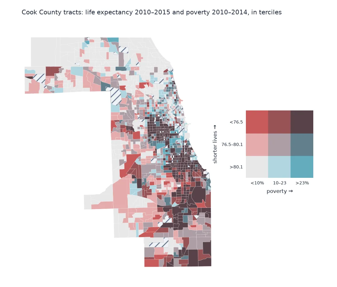
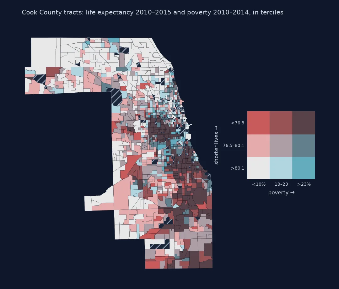
Two maps side by side, one of life expectancy and one of poverty, ask the reader to compare them tract by tract, which nobody can do. A bivariate choropleth puts both on one map: each variable is cut into classes, and every combination of classes gets its own colour from a two-dimensional legend. Most tracts fall on the diagonal, where low income and short lives coincide, and the map's real value is in the tracts off it: poor neighbourhoods where people live long, and better-off ones where they do not.
This page builds a three-by-three bivariate map of Cook County, Illinois, from USALEEP life expectancy for 2010–2015 and the poverty rate from the CDC Social Vulnerability Index 2014, both on 2010 census tracts, and measures the gradient between them.
Quick answer
Cut each variable into terciles, combine the two class numbers into one code, and colour by code:
M["pov_class"] = pd.qcut(M.EP_POV, 3, labels=False)                # 0 = lowest poverty
M["le_class"] = 2 - pd.qcut(M["e(0)"], 3, labels=False)            # 0 = longest lives, so 0/0 is the best corner
M["code"] = M.pov_class * 3 + M.le_class
counts = M.groupby(["pov_class", "le_class"]).size().unstack()
print(f"{len(M)} tracts; poverty terciles split at {M.EP_POV.quantile([1/3, 2/3]).round(1).tolist()}%, "
      f"life expectancy at {M['e(0)'].quantile([1/3, 2/3]).round(1).tolist()} years")
print(counts.rename_axis(index="poverty tercile", columns="life expectancy tercile (0 = longest)").to_string())
1200 tracts; poverty terciles split at [10.3, 22.8]%, life expectancy at [76.5, 80.1] years
life expectancy tercile (0 = longest) 0 1 2
poverty tercile
0 242 130 31
1 119 191 87
2 33 82 285
Match time and space, measure the gradient, find off-diagonal tracts
1. Match the two datasets in time and space
USALEEP estimates are for 2010–2015 on 2010 tracts. The SVI 2014 uses the American Community Survey for 2010–2014 on the same tracts, so the two join directly on the tract ID:
print(f"USALEEP tracts in Cook County: {len(LE)}; SVI 2014 tracts: {len(SVI)}; joined: {len(M)}")
print(f"poverty: SVI codes missing values as -999; excluded: {(SVI.EP_POV < 0).sum()}")
USALEEP tracts in Cook County: 1200; SVI 2014 tracts: 1318; joined: 1200
poverty: SVI codes missing values as -999; excluded: 0
2. Measure the gradient before mapping it
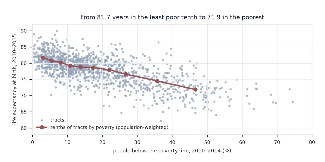
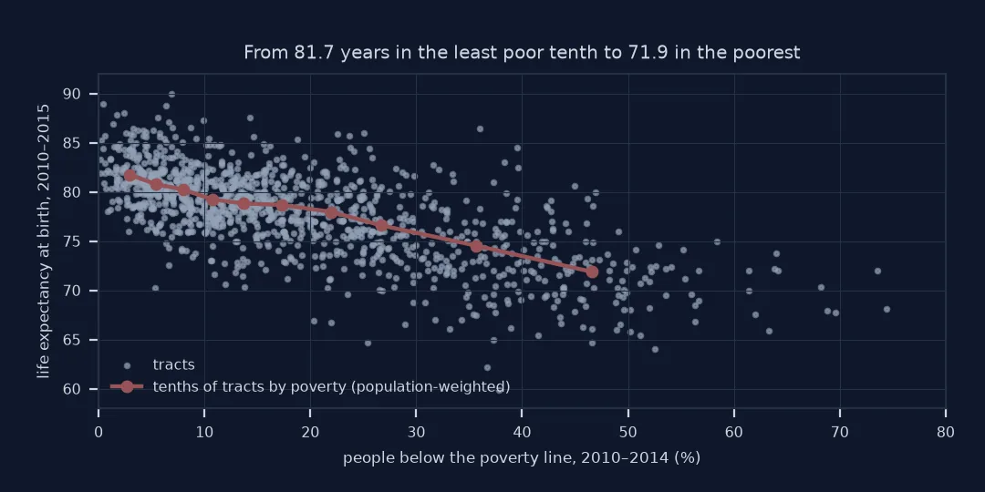
The bivariate map shows the relationship; a number summarises it:
dec = M.groupby(pd.qcut(M.EP_POV, 10, labels=False)).apply(
    lambda d: pd.Series({"median poverty %": d.EP_POV.median(), "life expectancy": np.average(d["e(0)"], weights=d.E_TOTPOP)}),
    include_groups=False)
print(dec.round(1).to_string())
print(f"gap between the lowest- and highest-poverty tenths: {dec['life expectancy'].iloc[0] - dec['life expectancy'].iloc[-1]:.1f} years; "
      f"r across tracts = {M['e(0)'].corr(M.EP_POV):.2f}")
median poverty % life expectancy
EP_POV
0 2.9 81.7
1 5.4 80.8
2 8.0 80.2
3 10.8 79.2
4 13.7 78.8
5 17.4 78.7
6 22.0 78.0
7 26.7 76.6
8 35.7 74.5
9 46.6 71.9
gap between the lowest- and highest-poverty tenths: 9.9 years; r across tracts = -0.68
3. Find the tracts off the diagonal
off = {"high poverty, longest lives": (2, 0), "low poverty, shortest lives": (0, 2)}
for label, (p, l) in off.items():
    sel = M[(M.pov_class == p) & (M.le_class == l)]
    print(f"{label}: {len(sel)} tracts; median poverty {sel.EP_POV.median():.1f}%, median life expectancy {sel['e(0)'].median():.1f}")
high poverty, longest lives: 33 tracts; median poverty 26.5%, median life expectancy 82.0
low poverty, shortest lives: 31 tracts; median poverty 7.5%, median life expectancy 75.9
Sixty-four tracts, about one in twenty, sit in the two opposite corners, against 718 on the diagonal. A median life expectancy of 82.0 years in the high-poverty corner is higher than the county's best tercile starts.
The bivariate colour scheme
The data used on this page
USALEEP life expectancy at birth, 2010–2015, by 2010 census tract; the CDC/ATSDR Social Vulnerability Index 2014 for Illinois, whose EP_POV is the percentage of people below the poverty line (ACS 2010–2014) and E_TOTPOP the population; and the Census 2019 cartographic boundary file of Illinois tracts, which uses 2010 tract boundaries.
from pathlib import Path

import geopandas as gpd
import numpy as np
import pandas as pd
import requests

Path("data").mkdir(exist_ok=True)
SRC = {"US_A.CSV": "https://ftp.cdc.gov/pub/Health_Statistics/NCHS/Datasets/NVSS/USALEEP/CSV/US_A.CSV",
       "svi_2014_illinois.csv": "https://svi.cdc.gov/Documents/Data/2014/csv/states/Illinois.csv",
       "cb_2019_17_tract_500k.zip": "https://www2.census.gov/geo/tiger/GENZ2019/shp/cb_2019_17_tract_500k.zip"}
for name, url in SRC.items():
    if not Path("data", name).exists():
        Path("data", name).write_bytes(requests.get(url, timeout=300).content)
LE = pd.read_csv("data/US_A.CSV", dtype={"Tract ID": str})
LE["GEOID"] = LE["Tract ID"].str.zfill(11)
LE = LE[LE.GEOID.str.startswith("17031")]
SVI = pd.read_csv("data/svi_2014_illinois.csv", dtype={"FIPS": str}).query("FIPS.str.startswith('17031')", engine="python")
M = LE.merge(SVI[["FIPS", "EP_POV", "E_TOTPOP"]], left_on="GEOID", right_on="FIPS").query("EP_POV >= 0").copy()
TRACTS = gpd.read_file("data/cb_2019_17_tract_500k.zip").query("COUNTYFP == '031'").to_crs(3435)
print(f"{len(M)} Cook County tracts with both life expectancy and poverty")
1200 Cook County tracts with both life expectancy and poverty
Example 1: the colours
A three-by-three palette needs colours that read as two separate scales. This one mixes a blue scale for poverty with a pink scale for short lives, so the dark corner is where both are bad:
PALETTE = ["#e8e8e8", "#e4acac", "#c85a5a",     # low poverty: long, middle, short lives
           "#b0d5df", "#ad9ea5", "#985356",     # middle poverty
           "#64acbe", "#627f8c", "#574249"]     # high poverty
gdf = TRACTS.merge(M[["GEOID", "code"]], on="GEOID", how="left")
gdf["colour"] = gdf.code.map(lambda c: PALETTE[int(c)] if pd.notna(c) else "#ffffff")
print(gdf.colour.value_counts().head(3).to_string())
colour
#574249 285
#e8e8e8 242
#ad9ea5 191
When a bivariate choropleth works
A bivariate choropleth works when the two variables are related but not identical, and when the reader needs to see where they part. Three classes on each axis is the practical limit: nine colours can be learned from a legend, sixteen cannot. Terciles keep every class populated, at the cost of breaks that depend on this county's distribution; a map meant for comparison with other places should use fixed breaks instead.
The off-diagonal tracts are where a map like this earns its keep, and the explanations have to come from elsewhere. A large immigrant population, whose life expectancy is often higher than income predicts, or a care home whose deaths fall in a small tract, can each move a tract away from the diagonal; neither can be read from the map, which says only where to look. The relationship itself is ecological, between tract averages, and says nothing directly about the life expectancy of poor or non-poor individuals.
Vintages, uncertainty and colour vision
- Same vintage: join 2010-tract health data with 2010-tract demographics; mixing vintages needs a crosswalk.
- Uncertainty: USALEEP standard errors are one to two years, so tracts near a tercile break could fall either side.
- Colour vision: test the palette with a colour-blindness simulator; blue-pink palettes survive the common forms better than red-green ones.
- Legend: draw the legend as a 3×3 square with axis labels and arrows; a list of nine colours is unreadable.
- Missing data: tracts without a life expectancy estimate are left white, not given a class.
Internal links
- How to map life expectancy by census tract — the USALEEP data
- The ecological fallacy explained — what tract-level relationships do not say
FAQ
What is a bivariate choropleth map?
A map that colours areas by the combination of two variables, each cut into a few classes, with a square legend showing every combination.
How many classes should a bivariate map have?
Three per variable, nine in total, is the usual maximum that readers can decode from a legend.
How do I make a bivariate map in Python?
Classify each variable with pd.qcut or fixed breaks, combine the class numbers into one code, map each code to a colour from a 3×3 palette, and draw a square legend.
How much does life expectancy differ by poverty in Cook County?
In 2010–2015, by about ten years between the tenth of tracts with the least poverty and the tenth with the most.