
How to Make a Kernel Density Map of Disease Cases in Python
On this page
Problem statement
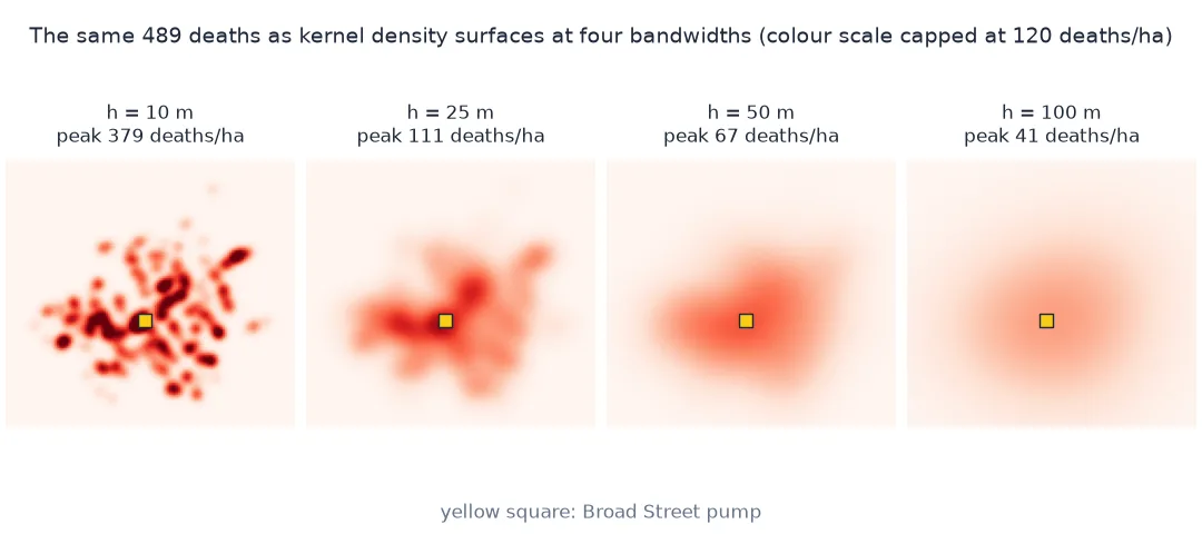
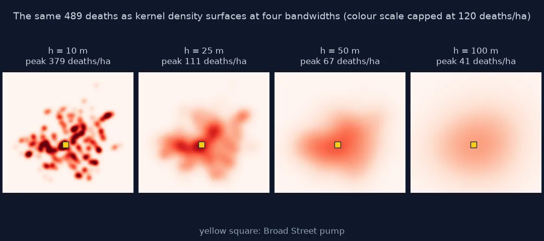
A map of individual cases shows where each one was; a kernel density map shows where they concentrate. Each case is spread into a smooth bump, and the bumps add up to a surface of cases per unit area. The surface is only as good as its one free parameter: the bandwidth, the width of each bump. Too narrow and the surface is a bed of nails, one spike per address; too wide and every cluster melts into one blob. The peak height, the area of the "hot spot" and, sometimes, its location all depend on that choice.
This page builds kernel density surfaces of the 489 deaths of John Snow's 1854 cholera outbreak, at four bandwidths and with a rule-of-thumb bandwidth, and measures what changes and what does not.
Quick answer
Place a Gaussian kernel of bandwidth h metres on every address, weighted by its deaths, and sum on a grid:
def kde(h, weights=W):
    z = np.zeros_like(GX)
    for xi, yi, wi in zip(X, Y, weights):
        z += wi * np.exp(-((GX - xi) ** 2 + (GY - yi) ** 2) / (2 * h * h))
    return z / (2 * np.pi * h * h)                     # deaths per m²

Z = kde(25)
j, i = np.unravel_index(Z.argmax(), Z.shape)
print(f"h = 25 m: peak {Z.max() * 1e4:.0f} deaths per hectare, {np.hypot(GRID_X[i] - BS.x, GRID_Y[j] - BS.y):.0f} m from the Broad Street pump")
print(f"mass on the grid: {Z.sum() * RES * RES:.1f} of {W.sum():.0f} deaths")
h = 25 m: peak 111 deaths per hectare, 13 m from the Broad Street pump
mass on the grid: 489.0 of 489 deaths
Compare bandwidths, start from a rule of thumb, weight by cases
1. Compare bandwidths
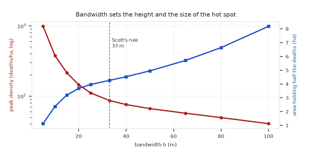
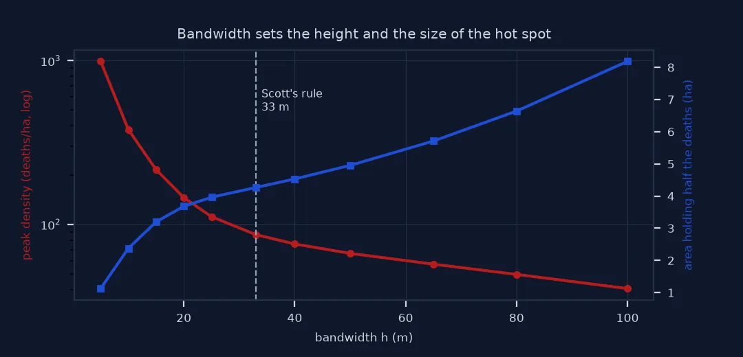
Run the same data through several bandwidths and measure the peak, its position and the size of the core, the smallest area holding half of the deaths:
def core_area(z):
    zs = np.sort(z.ravel())[::-1]
    thr = zs[np.searchsorted(np.cumsum(zs) * RES * RES, 0.5 * W.sum())]
    return (z >= thr).sum() * RES * RES / 1e4

rows = []
for h in (10, 25, 50, 100):
    z = kde(h); j, i = np.unravel_index(z.argmax(), z.shape)
    rows.append({"bandwidth (m)": h, "peak (deaths/ha)": z.max() * 1e4,
                 "peak to pump (m)": np.hypot(GRID_X[i] - BS.x, GRID_Y[j] - BS.y), "50% core (ha)": core_area(z)})
print(pd.DataFrame(rows).round(1).to_string(index=False))
bandwidth (m) peak (deaths/ha) peak to pump (m) 50% core (ha)
10 378.9 13.3 2.4
25 111.4 13.3 4.0
50 66.5 7.2 5.0
100 40.6 14.1 8.2
The location of the peak barely moves; its height changes ninefold, and the core more than triples in area. Report a density map's bandwidth with its numbers.
2. Use a rule of thumb as a starting point
Scott's rule sets the bandwidth from the spread of the data and the number of points:
n = W.sum()
sd = np.sqrt(0.5 * (np.cov(X, aweights=W) + np.cov(Y, aweights=W)))
h_scott = sd * n ** (-1 / 6)
print(f"weighted standard distance {sd:.0f} m; Scott's rule bandwidth for {n:.0f} deaths: {h_scott:.0f} m")
weighted standard distance 93 m; Scott's rule bandwidth for 489 deaths: 33 m
Rules like this assume one bump-shaped cluster; for several clusters they over-smooth. Treat the result as a starting point and look at maps at neighbouring bandwidths.
3. Weight by cases
Each point is an address with up to 15 deaths. Without weights, a house with 15 deaths counts as one:
zw, zu = kde(25), kde(25, weights=np.ones_like(W))
jw, iw = np.unravel_index(zw.argmax(), zw.shape); ju, iu = np.unravel_index(zu.argmax(), zu.shape)
print(f"weighted peak {np.hypot(GRID_X[iw] - BS.x, GRID_Y[jw] - BS.y):.0f} m from the pump; unweighted {np.hypot(GRID_X[iu] - BS.x, GRID_Y[ju] - BS.y):.0f} m; "
      f"share of weighted mass within 100 m of the pump: {zw[np.hypot(GX - BS.x, GY - BS.y) <= 100].sum() * RES * RES / W.sum():.0%}")
weighted peak 13 m from the pump; unweighted 67 m; share of weighted mass within 100 m of the pump: 38%
Ignoring the counts moves the peak 67 m from the pump: addresses with one death each, spread along streets further away, outweigh the houses where many died.
Contouring the cholera surface
The data used on this page
Robin Wilson's SnowGIS deaths and pumps (British National Grid, EPSG:27700); the Broad Street pump is the one at the memorial's position, as on the cholera map page. Densities are computed on a 5 m grid extending 300 m beyond the deaths, three times the widest bandwidth.
from pathlib import Path

import geopandas as gpd
import numpy as np
import pandas as pd
import requests
from shapely.geometry import Point

Path("data").mkdir(exist_ok=True)
Z_ = Path("data/SnowGIS_v2.zip")
if not Z_.exists():
    Z_.write_bytes(requests.get("https://www.rtwilson.com/downloads/SnowGIS_v2.zip", timeout=300).content)
deaths = gpd.read_file(f"zip://{Z_}!SnowGIS/Cholera_Deaths.shp")
pumps = gpd.read_file(f"zip://{Z_}!SnowGIS/Pumps.shp")
memorial = gpd.GeoSeries([Point(-0.136682, 51.5133184)], crs=4326).to_crs(27700).iloc[0]    # Wikidata Q139765546
BS = pumps.geometry.iloc[int(pumps.distance(memorial).idxmin())]
X, Y, W = deaths.geometry.x.to_numpy(), deaths.geometry.y.to_numpy(), deaths.Count.to_numpy().astype(float)
RES, PAD = 5, 300
x0, y0, x1, y1 = deaths.total_bounds
GRID_X, GRID_Y = np.arange(x0 - PAD, x1 + PAD, RES), np.arange(y0 - PAD, y1 + PAD, RES)
GX, GY = np.meshgrid(GRID_X, GRID_Y)
print(f"{len(deaths)} addresses, {W.sum():.0f} deaths; grid {GX.shape[1]} x {GX.shape[0]} cells of {RES} m")
250 addresses, 489 deaths; grid 220 x 210 cells of 5 m
Example 1: contour the surface
import matplotlib
matplotlib.use("Agg")
import matplotlib.pyplot as plt
fig, ax = plt.subplots(figsize=(5, 5))
cs = ax.contourf(GX, GY, kde(25) * 1e4, levels=[5, 20, 40, 60, 80, 100, 120], cmap="Reds")
ax.scatter(pumps.geometry.x, pumps.geometry.y, marker="s", color="navy")
ax.set_aspect("equal"); fig.colorbar(cs, label="deaths per hectare"); fig.savefig("data/snow_kde.png", dpi=120)
print(f"contour levels drawn: {len(cs.levels)}; highest band starts at {cs.levels[-2]:.0f} deaths per hectare")
contour levels drawn: 7; highest band starts at 100 deaths per hectare
A kernel density estimate sums small surfaces
A kernel density estimate replaces each point with a small probability surface, a Gaussian bump here, and adds them up. Dividing by the area under each bump keeps the total equal to the number of cases, so the surface is a density: cases per square metre, or per hectare. Wider kernels spread each case further, which lowers peaks, merges nearby clusters and enlarges every zone above a threshold; narrower kernels do the opposite.
What the surface does not show is risk. Without a population at risk, a density of deaths is high both where the disease was intense and where many people lived. Snow's argument rested on the pattern relative to the pumps and on the exceptions, not on density alone. For rates, the same kernel can be applied to a population surface and the two divided, with the same bandwidth for both.
Grid extent, edges and kernel shape
- Grid extent: pad the grid by at least three bandwidths beyond the points, or mass falls off the edge.
- Edge effects: densities near the study area's boundary are underestimated, because the kernel extends where no data were collected.
- Kernel shape (Gaussian, quartic, Epanechnikov) matters far less than bandwidth.
- Libraries:
scipy.stats.gaussian_kdeandsklearn.neighbors.KernelDensityaccept weights; set the bandwidth in map units deliberately. - Projected CRS: bandwidths are distances; never compute densities on longitude and latitude.
Internal links
- How to recreate John Snow's cholera map — the points and pumps
- Kernel density explained — the method in general
- How to make a point density heatmap — density for general point data
FAQ
What bandwidth should I use for a kernel density map?
There is no single right value; start from a rule such as Scott's, show maps at neighbouring bandwidths, and report the one used.
Does a kernel density map show disease risk?
No. It shows the density of cases, which also reflects where people live. Risk needs a population denominator.
How do I weight a kernel density estimate in Python?
Multiply each point's kernel by its weight, or pass weights to scipy.stats.gaussian_kde or sample_weight to scikit-learn's KernelDensity.fit.
Why does the peak value change so much with bandwidth?
The total number of cases is fixed; a narrower kernel packs it into less area, so peaks rise.