
How to Map Crime Hotspots with Kernel Density in Python
On this page
Problem statement
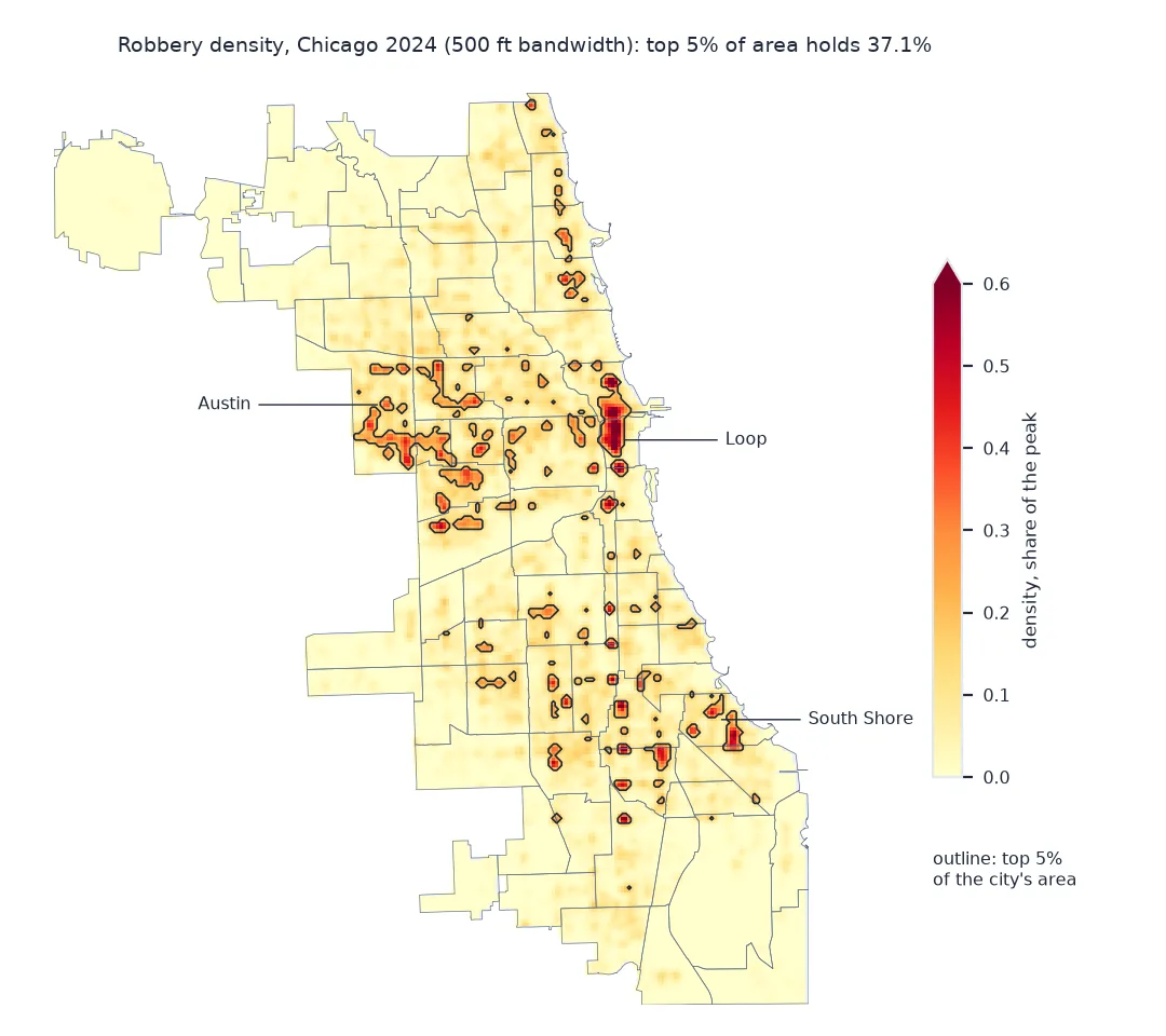
A dot map of a year's robberies in a large city is a smear: thousands of points overlapping on every busy street. A kernel density surface turns the points into a continuous map of concentration, and its highest cells are what most crime maps call hotspots. The surface depends on two choices, the grid and the bandwidth, and a hotspot map is only useful if it says something about where crime will happen next, which can be measured.
This page builds a kernel density surface of Chicago's 2024 robberies with scikit-learn, marks the top 5% of the city's area as hotspots, and tests how well hotspots drawn from 2023 robberies, at three bandwidths, predict where 2024's happened.
Quick answer
Project the points to a metric CRS, fit KernelDensity, evaluate it on a grid clipped to the city, and take a top percentile as hotspots:
xy = np.column_stack([R24.geometry.x, R24.geometry.y])
kde = KernelDensity(bandwidth=500).fit(xy)                        # feet: EPSG:3435 is in US survey feet
Z = surface(kde)
hot = Z >= np.nanpercentile(Z, 95)
print(f"{len(xy):,} robberies; grid {Z.shape[1]} x {Z.shape[0]} cells of {CELL} ft, {INSIDE.sum():,} inside the city")
print(f"top 5% of the city's area holds {share_in(hot, R24):.1%} of 2024 robberies")
9,085 robberies; grid 229 x 276 cells of 500 ft, 25,767 inside the city
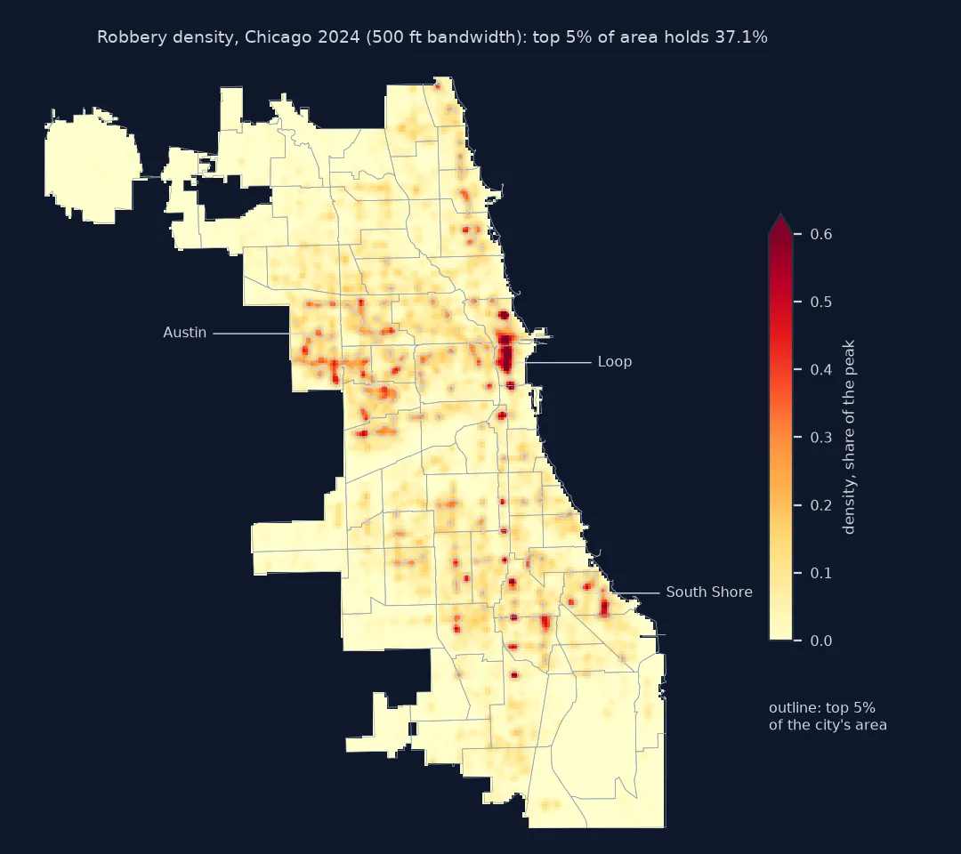
top 5% of the city's area holds 37.1% of 2024 robberies
Linear units, compared bandwidths, a test on the next year
1. Project to a CRS in linear units
Bandwidth is a distance, so the points must be in a projected CRS. For Chicago, the Illinois East State Plane zone (EPSG:3435) is in US survey feet; a bandwidth of 500 is about 150 metres, and the city's street grid runs eight blocks to the mile, 660 feet apart:
print(R24.crs.name, "| units:", R24.crs.axis_info[0].unit_name)
print(f"city extent: {(XMAX - XMIN) / 5280:.1f} by {(YMAX - YMIN) / 5280:.1f} miles")
NAD83 / Illinois East (ftUS) | units: US survey foot
city extent: 21.6 by 26.1 miles
2. Compare bandwidths
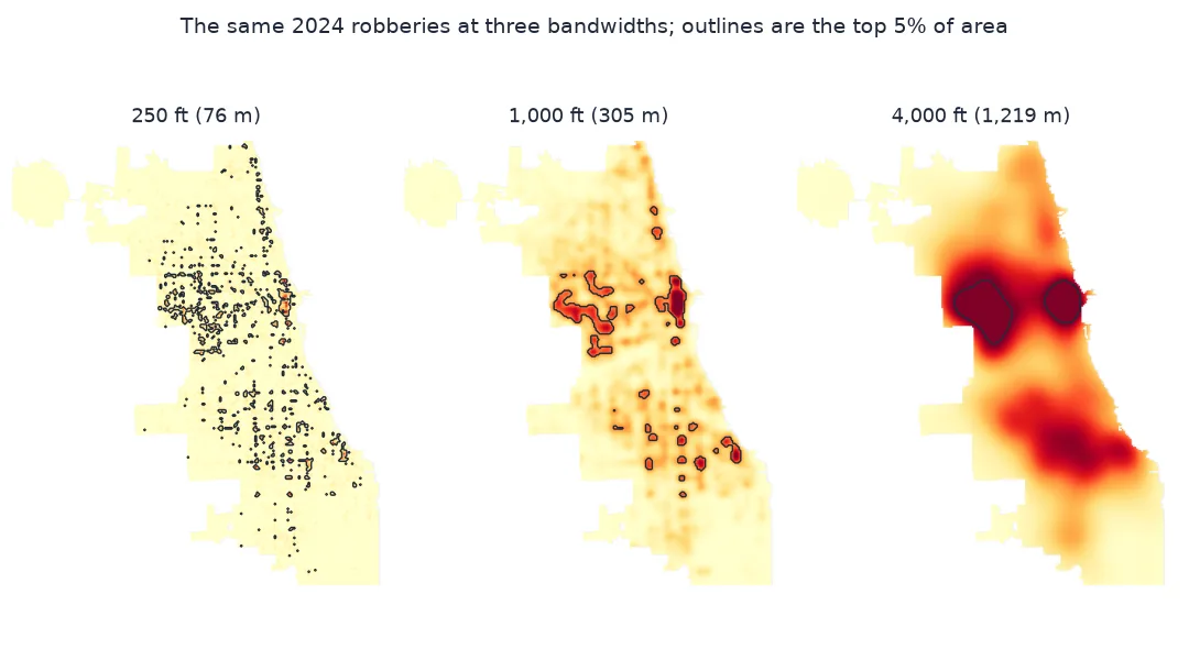
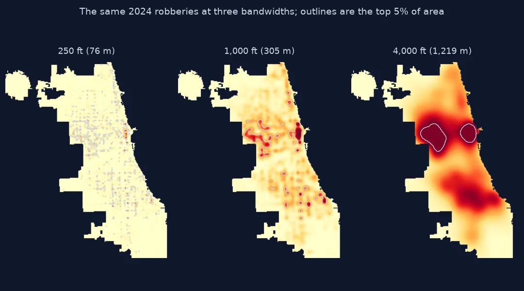
A small bandwidth draws tight peaks around individual corners; a large one blurs them into districts. Measure how concentrated each surface's hotspots are on the same year's data:
for bw in (250, 500, 1000, 2000, 4000):
    Zb = surface(KernelDensity(bandwidth=bw).fit(xy))
    print(f"bandwidth {bw:>5,} ft: top 5% of area holds {share_in(Zb >= np.nanpercentile(Zb, 95), R24):.1%} of robberies")
bandwidth 250 ft: top 5% of area holds 47.5% of robberies
bandwidth 500 ft: top 5% of area holds 37.1% of robberies
bandwidth 1,000 ft: top 5% of area holds 29.1% of robberies
bandwidth 2,000 ft: top 5% of area holds 22.8% of robberies
bandwidth 4,000 ft: top 5% of area holds 17.2% of robberies
The narrowest surface always looks best on the data it was fitted to, because it can wrap itself around every cluster of points: at 250 feet the top 5% of the city holds 47.5% of the year's robberies. Part of that is fitting noise, so the score on the fitting year cannot choose the bandwidth.
3. Test hotspots on the next year
Fit on 2023 and count how many 2024 robberies fall in the 2023 hotspots. The predictive accuracy index (PAI) divides the share of crime captured by the share of area flagged; a PAI of 1 is no better than chance:
xy23 = np.column_stack([R23.geometry.x, R23.geometry.y])
for bw in (250, 500, 1000, 2000, 4000):
    Z23 = surface(KernelDensity(bandwidth=bw).fit(xy23))
    hit = share_in(Z23 >= np.nanpercentile(Z23, 95), R24)
    print(f"bandwidth {bw:>5,} ft: 2023 hotspots hold {hit:.1%} of 2024 robberies, PAI {hit / 0.05:.2f}")
bandwidth 250 ft: 2023 hotspots hold 30.8% of 2024 robberies, PAI 6.16
bandwidth 500 ft: 2023 hotspots hold 28.5% of 2024 robberies, PAI 5.71
bandwidth 1,000 ft: 2023 hotspots hold 23.4% of 2024 robberies, PAI 4.69
bandwidth 2,000 ft: 2023 hotspots hold 17.9% of 2024 robberies, PAI 3.59
bandwidth 4,000 ft: 2023 hotspots hold 14.3% of 2024 robberies, PAI 2.86
On the next year every surface does worse than on its own year, and the drop is largest for the narrowest, from 47.5% to 30.8% at 250 feet. Narrow still wins: 2023's 250-foot hotspots captured 30.8% of 2024's robberies, a PAI of 6.16, against 14.3% for the 4,000-foot surface. Robbery in Chicago keeps returning to the same few blocks, and wide kernels spread that over neighbourhoods where it does not happen.
Kernel density against plain cell counts
The data used on this page
The City of Chicago's Crimes - 2001 to Present dataset (ijzp-q8t2), robberies dated 2023 and 2024 with coordinates, and the city's community area boundaries, dissolved into one city outline. Surfaces are evaluated on a 500-foot grid.
from pathlib import Path

import geopandas as gpd
import numpy as np
import pandas as pd
import requests
import shapely
from sklearn.neighbors import KernelDensity

Path("data").mkdir(exist_ok=True)
URL = "https://data.cityofchicago.org/resource/ijzp-q8t2.json"


def socrata(where, select, page=50_000):
    rows, offset = [], 0
    while True:
        part = requests.get(URL, timeout=300, params={"$where": where, "$select": select,
                                                     "$limit": page, "$offset": offset, "$order": "id"}).json()
        rows += part; offset += len(part)
        if len(part) < page:
            return pd.DataFrame(rows)


for year in (2023, 2024):
    f = Path(f"data/robbery_{year}.parquet")
    if not f.exists():
        socrata(f"year={year} AND primary_type='ROBBERY'", "id,date,latitude,longitude").to_parquet(f)
G = Path("data/chicago_community_areas.geojson")
if not G.exists():
    G.write_bytes(requests.get("https://data.cityofchicago.org/resource/igwz-8jzy.geojson?$limit=100", timeout=120).content)


def load(year):
    d = pd.read_parquet(f"data/robbery_{year}.parquet").dropna(subset=["latitude", "longitude"])
    d = d.astype({"latitude": float, "longitude": float})
    return gpd.GeoDataFrame(d, geometry=gpd.points_from_xy(d.longitude, d.latitude), crs=4326).to_crs(3435)


R23, R24 = load(2023), load(2024)
CITY = gpd.read_file(G).to_crs(3435).union_all()
CELL = 500                                                              # feet
XMIN, YMIN, XMAX, YMAX = CITY.bounds
GX, GY = np.meshgrid(np.arange(XMIN, XMAX, CELL) + CELL / 2, np.arange(YMIN, YMAX, CELL) + CELL / 2)
INSIDE = shapely.contains_xy(CITY, GX, GY)


def surface(kde):
    """Density at the centre of every grid cell inside the city, NaN outside."""
    Z = np.full(GX.shape, np.nan)
    Z[INSIDE] = np.exp(kde.score_samples(np.column_stack([GX[INSIDE], GY[INSIDE]])))
    return Z


def share_in(mask, pts):
    """Share of points whose grid cell is in the mask."""
    ix = ((pts.geometry.x - XMIN) // CELL).astype(int).to_numpy()
    iy = ((pts.geometry.y - YMIN) // CELL).astype(int).to_numpy()
    ok = (ix >= 0) & (ix < GX.shape[1]) & (iy >= 0) & (iy < GX.shape[0])
    return mask[iy[ok], ix[ok]].sum() / len(pts)


print(f"robberies with coordinates: {len(R23):,} in 2023, {len(R24):,} in 2024")
robberies with coordinates: 11,027 in 2023, 9,085 in 2024
Example 1: kernel density against plain cell counts
Is smoothing worth it? Flag the 5% of cells with the most 2023 robberies directly, with ties at the threshold broken by the KDE, and test them on 2024 the same way:
def counts(pts):
    ix = ((pts.geometry.x - XMIN) // CELL).astype(int).to_numpy()
    iy = ((pts.geometry.y - YMIN) // CELL).astype(int).to_numpy()
    C = np.zeros(GX.shape); np.add.at(C, (iy, ix), 1)
    return np.where(INSIDE, C, np.nan)

C23 = counts(R23)
Z23 = surface(KernelDensity(bandwidth=500).fit(xy23))
k = int(0.05 * INSIDE.sum())
order = np.lexsort((np.nan_to_num(Z23[INSIDE]), np.nan_to_num(C23[INSIDE])))[::-1][:k]
top_cells = np.zeros(INSIDE.sum(), bool); top_cells[order] = True
mask = np.zeros(GX.shape, bool); mask[INSIDE] = top_cells
print(f"cells with any 2023 robbery: {(C23 > 0).sum():,} of {INSIDE.sum():,}")
print(f"top 5% of cells by raw 2023 count: {share_in(mask, R24):.1%} of 2024 robberies, PAI {share_in(mask, R24) / 0.05:.2f}")
cells with any 2023 robbery: 5,911 of 25,767
top 5% of cells by raw 2023 count: 32.7% of 2024 robberies, PAI 6.54
In the hotspot methods comparison, only 5,911 of the 25,767 cells had any robbery in 2023, and the 1,288 with the most captured 32.7% of 2024's robberies: slightly more than any kernel surface. At a 500-foot cell, smoothing adds no predictive power for this offence; what it adds is a readable map, and a way to rank the many cells with one or two robberies.
What a kernel and its bandwidth do
A kernel density estimate puts a small bump, the kernel, on every point and adds them up. scikit-learn's default kernel is Gaussian, so a bandwidth of 500 feet means each robbery spreads its weight with a standard deviation of 500 feet in each direction. The surface is a probability density: the values are tiny numbers per square foot that integrate to one, so the scale is relative and the useful output is the ranking of cells, not the numbers themselves.
A hotspot is then a choice: the cells above a percentile, or above some multiple of the mean. Fixing the share of area, 5% here, makes different bandwidths, years and methods comparable, and it matches how hotspot policing is planned, with a fixed amount of attention to spread. The predictive accuracy index turns that into one number: share of crime captured divided by share of area flagged.
The test on the following year is the part most hotspot maps skip. Every surface fits its own year better than the next, because some of what it fits is noise, a single busy weekend at one address, and the gap is widest for narrow kernels. Here the persistent pattern was so tightly concentrated that narrow kernels still predicted best, and raw counts in 500-foot cells did as well. That is a finding about Chicago robbery in 2023 and 2024, not a rule: a rarer offence, such as homicide, has too few points for raw counts, and the held-out test is how to tell.
Edges, counts versus rates and block points
- Edges: cells near the city boundary lose part of their kernel outside it, so the surface is biased low there; at O'Hare and on the lakefront the effect is visible.
- Counts versus rates: a density of robberies is not a risk per person; busy downtown blocks have more people to rob.
- Block-level points: Chicago moves points to the block, so bandwidths much below the length of a block describe the geocoding, not the crime.
- Weights:
fit(xy, sample_weight=...)weights points, for example by seriousness. - Speed:
KernelDensityuses a tree and handles tens of thousands of points on a city grid in seconds; for millions, bin first and smooth the grid with a Gaussian filter.
Internal links
- Kernel density explained — kernels and bandwidth in general
- Your heatmap looks wrong: KDE bandwidth and cell size — choosing bandwidth
- How to download and map city crime data in Python — the data on this page
FAQ
How do I make a crime hotspot map in Python?
Project the incidents to a metric CRS, fit sklearn.neighbors.KernelDensity with a bandwidth in map units, evaluate it on a grid clipped to the city, and flag the top few percent of cells.
What bandwidth should I use for crime kernel density?
Test it: fit on one period and measure how much of the next period's crime falls in the hotspots. For Chicago robberies, hotspots from 2023 predicted 2024 best at 250 feet, about 75 metres, and worst at 4,000 feet.
What is the predictive accuracy index?
The share of crime falling in the flagged hotspots divided by the share of the area they cover; 1 means no better than chance.
Is a kernel density map a crime rate?
No; it is a density of recorded incidents per area, with no account of how many people are there.