
How to Draw a Land Cover Transition (Sankey) Diagram in Python
On this page
Problem statement
A change matrix holds every transition between two land cover maps, but a table of 64 numbers is hard to read. A Sankey diagram draws the same matrix as bands: the classes of the first year on the left, the second year on the right, and a band for each transition whose width is its area. The obvious version is dominated by persistence. In most landscapes nearly everything stays the same, so the bands that matter come out as hairlines between thick slabs of "no change".
This page draws the 2001 to 2021 transitions of Williamson County, Texas, with matplotlib alone, first with persistence and then showing only the change, and checks that band widths add up to the matrix.
Quick answer
Stack each year's classes as bars, then join every pair with a band whose width is the transition's area, drawn as a filled Bézier shape:
def band(ax, y0_top, y0_bot, y1_top, y1_bot, x0=0.1, x1=0.9, **kw):
    """A filled band from (x0, y0_bot..y0_top) to (x1, y1_bot..y1_top) with S-shaped edges."""
    xm = (x0 + x1) / 2
    verts = [(x0, y0_top), (xm, y0_top), (xm, y1_top), (x1, y1_top),
             (x1, y1_bot), (xm, y1_bot), (xm, y0_bot), (x0, y0_bot), (x0, y0_top)]
    codes = [MPath.MOVETO, MPath.CURVE4, MPath.CURVE4, MPath.CURVE4, MPath.LINETO, MPath.CURVE4, MPath.CURVE4, MPath.CURVE4, MPath.CLOSEPOLY]
    ax.add_patch(PathPatch(MPath(verts, codes), lw=0, **kw))

def sankey(ax, m, gap=0.01):
    total = m.to_numpy().sum()
    left, right = {}, {}
    y = 0
    for c in m.index:                                # left bars, top to bottom
        h = m.loc[c].sum() / total; left[c] = [y, y + h]; y += h + gap
    y = 0
    for c in m.columns:
        h = m[c].sum() / total; right[c] = [y, y + h]; y += h + gap
    lpos = {c: v[0] for c, v in left.items()}; rpos = {c: v[0] for c, v in right.items()}
    for a in m.index:
        for b in m.columns:
            w = m.loc[a, b] / total
            if w > 0:
                band(ax, lpos[a], lpos[a] + w, rpos[b], rpos[b] + w, color=COLORS[a], alpha=0.55)
                lpos[a] += w; rpos[b] += w
    for side, bars, x in (("L", left, 0.07), ("R", right, 0.9)):
        for c, (y0, y1) in bars.items():
            ax.add_patch(plt.Rectangle((x, y0), 0.03, y1 - y0, color=COLORS[c]))
    ax.set_xlim(0, 1); ax.set_ylim(y + gap, -gap); ax.set_axis_off()
    return left, right

fig, ax = plt.subplots(figsize=(6, 5))
left, right = sankey(ax, MATRIX)
fig.savefig("data/sankey_all.png", dpi=150)
print(f"{(MATRIX > 0).to_numpy().sum()} bands; persistence is {np.trace(MATRIX.to_numpy()) / MATRIX.to_numpy().sum():.1%} of the width")
59 bands; persistence is 89.7% of the width
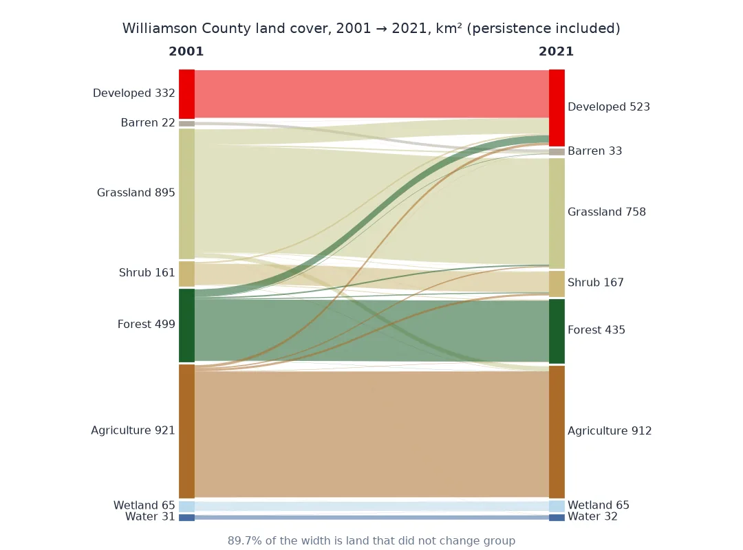
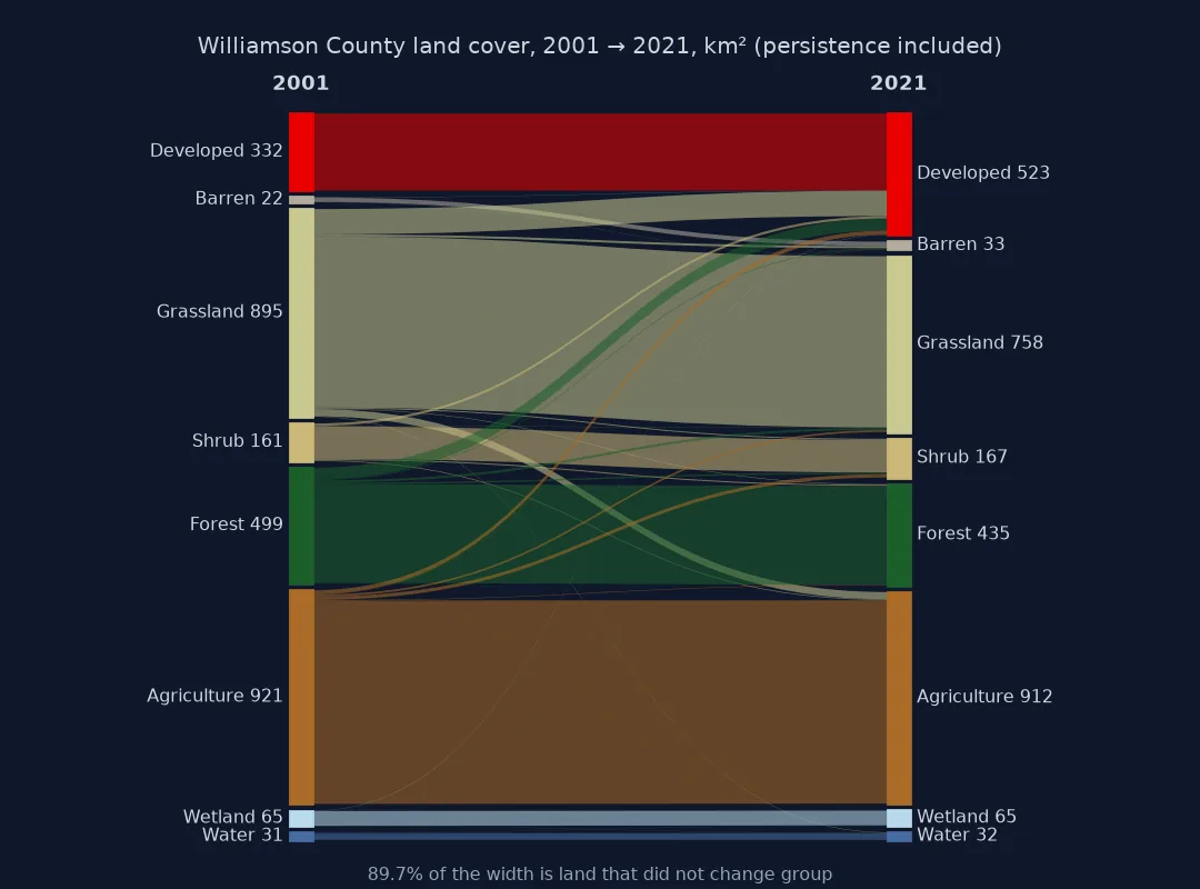
Bands that add up, persistence dropped, classes ordered
1. Check the bands add up
Each bar's height must equal its row or column total, and the bands leaving a bar must fill it exactly:
total = MATRIX.to_numpy().sum()
err_left = max(abs((left[c][1] - left[c][0]) - MATRIX.loc[c].sum() / total) for c in MATRIX.index)
err_right = max(abs((right[c][1] - right[c][0]) - MATRIX[c].sum() / total) for c in MATRIX.columns)
print(f"largest bar error: {max(err_left, err_right):.1e} of the total; total area {total:,.1f} km²")
largest bar error: 9.7e-17 of the total; total area 2,926.2 km²
2. Drop persistence to show the change
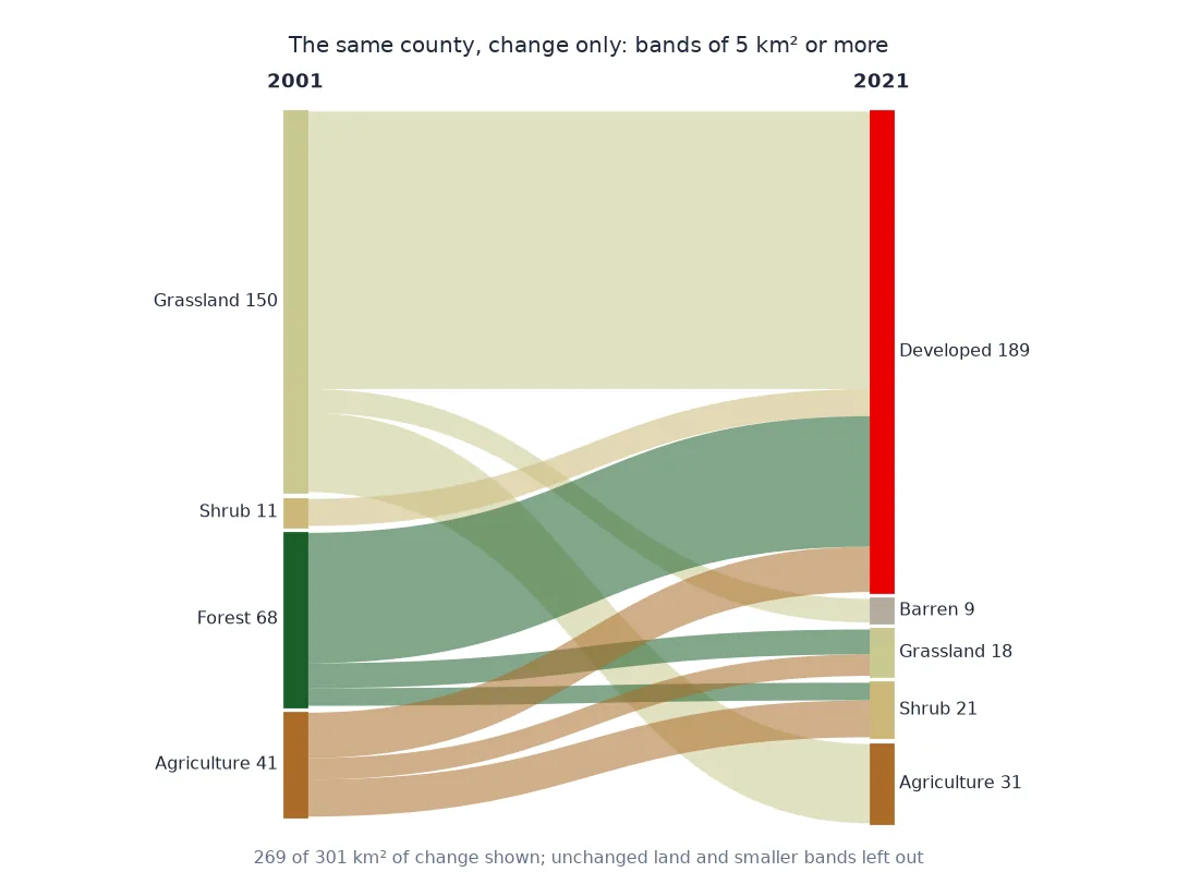
Set the diagonal to zero and draw again. Every band is now a change, and the widths compare changes with each other:
arr = MATRIX.to_numpy(copy=True)
np.fill_diagonal(arr, 0)
change = pd.DataFrame(arr, index=MATRIX.index, columns=MATRIX.columns)
fig, ax = plt.subplots(figsize=(6, 5))
sankey(ax, change.loc[change.sum(axis=1) > 0, change.sum(axis=0) > 0])
fig.savefig("data/sankey_change.png", dpi=150)
top = change.stack().sort_values(ascending=False)
print(f"{change.to_numpy().sum():,.1f} km² of change; widest band: {top.index[0][0]} → {top.index[0][1]}, {top.iloc[0]:.1f} km² ({top.iloc[0] / change.to_numpy().sum():.0%})")
301.5 km² of change; widest band: Grassland → Developed, 109.1 km² (36%)
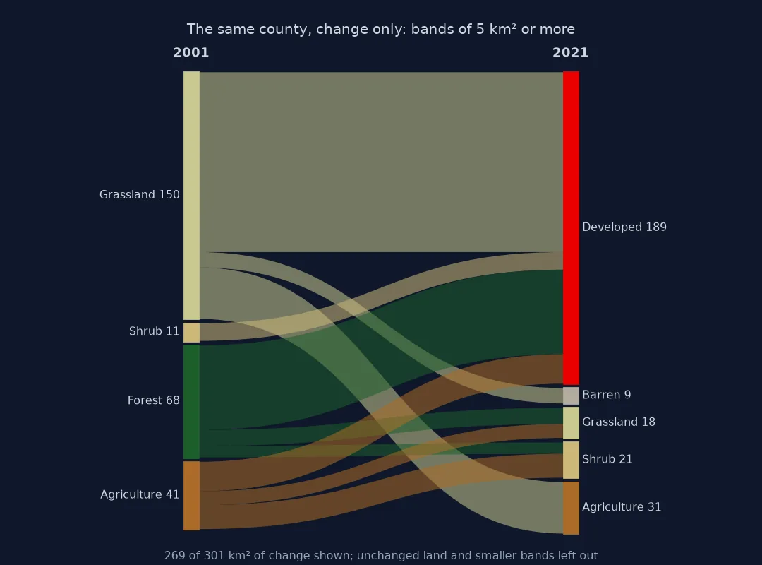
3. Order the classes to reduce crossings
Bands cross when a class's neighbours on the left lead to classes far apart on the right. Keep each class in the same position on both sides and try orders, but count the crossings rather than assume:
def crossings(order, m):
    pos = {c: k for k, c in enumerate(order)}
    bands = [(a, b) for a in m.index for b in m.columns if m.loc[a, b] > 0]
    return len(bands), sum(1 for i, (a1, b1) in enumerate(bands) for a2, b2 in bands[i + 1:]
                           if (pos[a1] - pos[a2]) * (pos[b1] - pos[b2]) < 0)

for name, order in (("alphabetical", sorted(ORDER)), ("grouped by kind", ORDER)):
    n, x = crossings(order, change)
    print(f"{name:16s}: {n} change bands, {x} crossing pairs")
big = change.where(change >= 5, 0)
n, x = crossings(ORDER, big)
print(f"bands of 5 km² or more only: {n} bands, {x} crossing pairs, {big.to_numpy().sum() / change.to_numpy().sum():.0%} of the change")
alphabetical : 51 change bands, 545 crossing pairs
grouped by kind : 51 change bands, 541 crossing pairs
bands of 5 km² or more only: 10 bands, 13 crossing pairs, 89% of the change
The order hardly matters here, because change flows into developed land from nearly every class. Dropping bands under 5 km² keeps 89% of the change in 10 bands with 13 crossings: the threshold, not the order, makes this diagram readable.
Labelling the change bands
The data used on this page
NLCD 2001 and 2021 (30 m) for Williamson County, Texas, from MRLC's WCS, masked to the 2023 Census county outline and grouped into eight classes; the matrix is the one built on the change matrix page, in km².
import time
from pathlib import Path

import geopandas as gpd
import matplotlib
matplotlib.use("Agg")
import matplotlib.pyplot as plt
import numpy as np
import pandas as pd
import rasterio
import rasterio.mask
import requests
from matplotlib.patches import PathPatch
from matplotlib.path import Path as MPath

Path("data").mkdir(exist_ok=True)
if not Path("data/cb_2023_us_county_20m.zip").exists():
    Path("data/cb_2023_us_county_20m.zip").write_bytes(requests.get("https://www2.census.gov/geo/tiger/GENZ2023/shp/cb_2023_us_county_20m.zip", timeout=300).content)
COUNTY = gpd.read_file("data/cb_2023_us_county_20m.zip").query("GEOID == '48491'").to_crs(5070)
LC = {}
for year in (2001, 2021):
    p = Path(f"data/nlcd_{year}.tif")
    if not p.exists():
        x0, y0, x1, y1 = COUNTY.total_bounds
        for attempt in range(4):
            r = requests.get("https://www.mrlc.gov/geoserver/mrlc_download/wcs", params={"service": "WCS", "version": "2.0.1", "request": "GetCoverage",
                             "coverageId": f"mrlc_download__NLCD_{year}_Land_Cover_L48", "subset": [f"X({x0},{x1})", f"Y({y0},{y1})"], "format": "image/geotiff"}, timeout=300)
            if r.status_code < 500:
                break
            time.sleep(15 * (attempt + 1))
        r.raise_for_status()
        p.write_bytes(r.content)
    with rasterio.open(p) as src:
        LC[year] = rasterio.mask.mask(src, COUNTY.geometry, crop=True, nodata=0)[0][0]
GROUP = {11: "Water", 21: "Developed", 22: "Developed", 23: "Developed", 24: "Developed", 31: "Barren", 41: "Forest", 42: "Forest", 43: "Forest",
         52: "Shrub", 71: "Grassland", 81: "Agriculture", 82: "Agriculture", 90: "Wetland", 95: "Wetland"}
ORDER = ["Developed", "Barren", "Grassland", "Shrub", "Forest", "Agriculture", "Wetland", "Water"]
COLORS = {"Developed": "#eb0000", "Barren": "#b3ac9f", "Grassland": "#c9c98f", "Shrub": "#ccb879", "Forest": "#1c5f2c",
          "Agriculture": "#ab6c28", "Wetland": "#b8d9eb", "Water": "#466b9f"}
valid = (LC[2001] > 0) & (LC[2021] > 0)
MATRIX = (pd.crosstab(pd.Series(LC[2001][valid]).map(GROUP), pd.Series(LC[2021][valid]).map(GROUP)) * 900 / 1e6).reindex(index=ORDER, columns=ORDER, fill_value=0)
print(f"{MATRIX.shape[0]} x {MATRIX.shape[1]} matrix, {MATRIX.to_numpy().sum():,.1f} km²")
8 x 8 matrix, 2,926.2 km²
Example 1: label the change bands
for (a, b), v in top.head(4).items():
    print(f"{a:>11} → {b:<11} {v:6.1f} km²")
Grassland → Developed 109.1 km²
Forest → Developed 51.3 km²
Grassland → Agriculture 31.2 km²
Agriculture → Developed 17.9 km²
A change matrix drawn with lengths
A Sankey diagram is a change matrix drawn with lengths instead of numbers: bar heights are the row and column totals, and each band's width is one cell. The construction is bookkeeping. Each bar keeps a cursor that moves down as bands leave or arrive, so bands stack in order and fill their bars exactly. The S-shaped edges are cubic Bézier curves with control points at the middle, which is what makes the bands look like flows rather than straight wedges.
The design question is what to show. With persistence included, the diagram answers "how much stayed the same", and here the answer, nearly nine tenths, swamps everything else. Dropping the diagonal answers "what did the change consist of", which is usually the reason to draw a Sankey at all; say in the caption that persistence is left out, and give its size.
Many classes, thin bands and more years
- Many classes: with all 16 NLCD classes, a Sankey has up to 256 bands; group first.
- Thin bands: hide bands below a threshold and report the total hidden, or the diagram fills with hairlines.
- Colour by source or by destination: colouring by the source class shows where land came from; by destination, where it went.
- Interactive versions: Plotly's
go.Sankeydraws the same thing with hover labels, at the cost of a large dependency. - More than two years: chain several columns, one per year, with the same bookkeeping between each pair.
Internal links
- How to build a land cover change matrix — the numbers behind the bands
- How to make a flow map in Python — flows between places rather than classes
FAQ
How do I make a Sankey diagram of land cover change in Python?
Cross-tabulate the two maps into a change matrix, then draw a bar for each class in each year and a band for each transition with width proportional to its area; matplotlib's matplotlib.path.Path and PathPatch are enough.
Should a land cover Sankey include unchanged land?
Only if persistence is the point. Usually drop the diagonal so the change is visible, and state how much land was unchanged.
Can I draw a Sankey without Plotly?
Yes. Each band is a closed path with two cubic Bézier edges; matplotlib draws it as a filled patch.
Why do the bands in my Sankey overlap their bars?
The band positions are not being tracked. Keep a cursor per bar and advance it by each band's width.