
How to Make a Weather Map in Python
On this page
Problem statement
A weather map shows the state of the atmosphere at one moment over a region: temperature as colour, isotherms as lines, wind as arrows, rain as shading. Making one in Python takes three things: gridded data for a single time, a map projection suited to the region, and a careful choice of colours and contour levels so the map reads at a glance. ERA5 provides the data for any hour since 1940, and Cartopy and matplotlib draw it.
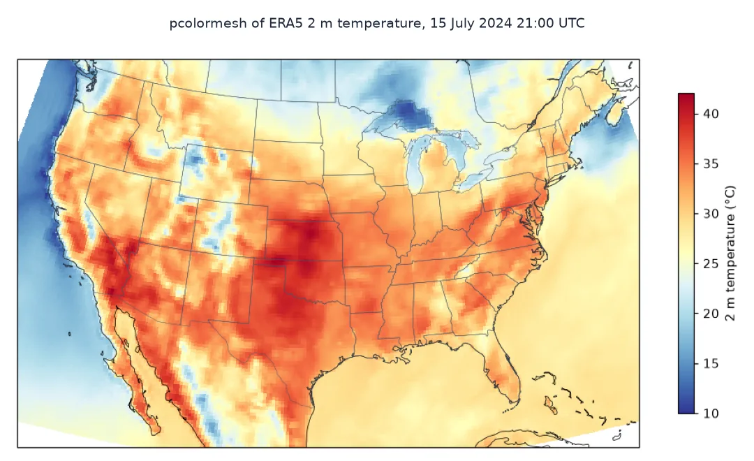
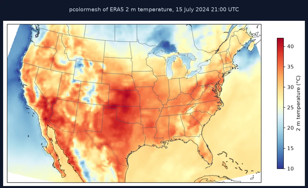
This page draws the weather over the contiguous United States at 21:00 UTC on 15 July 2024, during a heat wave in the East. It shows 2 m temperature, labelled isotherms, 10 m wind vectors and hourly precipitation, all from the ERA5 reanalysis, in a Lambert conformal projection.
Quick answer
Read one hour of temperature for a box and plot it with Cartopy:
T = (ds["2m_temperature"].sel(time=WHEN, latitude=slice(52, 22), longitude=slice(360 - 128, 360 - 64)) - 273.15).load()
fig = plt.figure(figsize=(11, 6.5)); ax = plt.axes(projection=PROJ)
ax.set_extent([-121, -71, 23, 50], crs=ccrs.PlateCarree())
mesh = ax.pcolormesh(T.longitude, T.latitude, T, cmap="RdYlBu_r", vmin=10, vmax=42, transform=ccrs.PlateCarree(), shading="auto")
ax.coastlines("50m", linewidth=0.5); ax.add_feature(cfeature.STATES.with_scale("50m"), linewidth=0.3, edgecolor="#475569")
fig.colorbar(mesh, ax=ax, shrink=0.7, label="2 m temperature (°C)")
fig.savefig("data/temperature_map.png", dpi=110, bbox_inches="tight"); plt.close(fig)
print(f"{T.sizes['latitude']} x {T.sizes['longitude']} cells; {float(T.min()):.1f} to {float(T.max()):.1f} °C over the box")
121 x 257 cells; 10.0 to 42.5 °C over the box
The box has 121 by 257 cells, ranging from 10.0 to 42.5 °C.
Isotherms, wind and rain, a station check
1. Isotherms
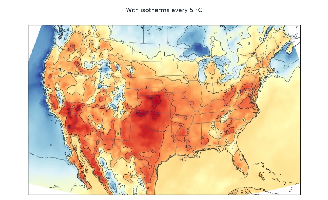
Contour lines at round values make temperatures readable without the colour bar:
fig = plt.figure(figsize=(11, 6.5)); ax = plt.axes(projection=PROJ)
ax.set_extent([-121, -71, 23, 50], crs=ccrs.PlateCarree())
ax.pcolormesh(T.longitude, T.latitude, T, cmap="RdYlBu_r", vmin=10, vmax=42, transform=ccrs.PlateCarree(), shading="auto")
cs = ax.contour(T.longitude, T.latitude, T, levels=[20, 25, 30, 35, 40], colors="#1e293b", linewidths=0.6, transform=ccrs.PlateCarree())
ax.clabel(cs, fmt="%d°", fontsize=7)
ax.coastlines("50m", linewidth=0.5); ax.add_feature(cfeature.STATES.with_scale("50m"), linewidth=0.3, edgecolor="#475569")
fig.savefig("data/isotherms_map.png", dpi=110, bbox_inches="tight"); plt.close(fig)
land = T.where(T > -100)
print(f"share of the box at or above 35 °C: {(land >= 35).mean().item():.1%}; at or above 40 °C: {(land >= 40).mean().item():.2%}")
share of the box at or above 35 °C: 9.4%; at or above 40 °C: 0.43%
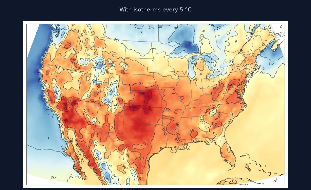
9.4% of the box was at 35 °C or above, and 0.43% at 40 °C or above.
2. Wind and rain
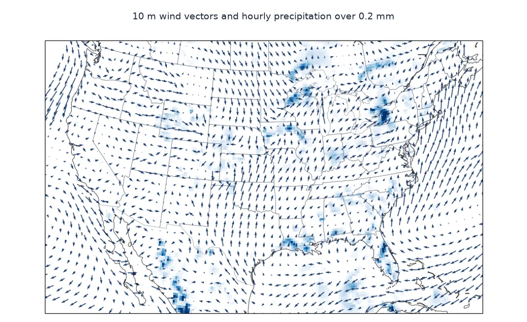
Add 10 m wind from its u and v components, thinned to every fourth cell, and hourly precipitation in mm:
U = ds["10m_u_component_of_wind"].sel(time=WHEN, latitude=slice(52, 22), longitude=slice(360 - 128, 360 - 64)).load()
V = ds["10m_v_component_of_wind"].sel(time=WHEN, latitude=slice(52, 22), longitude=slice(360 - 128, 360 - 64)).load()
P = (ds["total_precipitation"].sel(time=WHEN, latitude=slice(52, 22), longitude=slice(360 - 128, 360 - 64)) * 1000).load()
speed = np.hypot(U, V)
fig = plt.figure(figsize=(11, 6.5)); ax = plt.axes(projection=PROJ)
ax.set_extent([-121, -71, 23, 50], crs=ccrs.PlateCarree())
ax.pcolormesh(P.longitude, P.latitude, P.where(P >= 0.2), cmap="Blues", vmin=0, vmax=8, transform=ccrs.PlateCarree(), shading="auto")
s = slice(None, None, 4)
ax.quiver(U.longitude[s].values, U.latitude[s].values, U[s, s].values, V[s, s].values, transform=ccrs.PlateCarree(), scale=300, width=0.0018, color="#1a3a6b")
ax.coastlines("50m", linewidth=0.5); ax.add_feature(cfeature.STATES.with_scale("50m"), linewidth=0.3, edgecolor="#475569")
fig.savefig("data/wind_rain_map.png", dpi=110, bbox_inches="tight"); plt.close(fig)
print(f"wind speed: median {float(speed.median()):.1f} m/s, max {float(speed.max()):.1f} m/s; cells with at least 0.2 mm in the hour: {(P >= 0.2).mean().item():.1%}; heaviest {float(P.max()):.1f} mm")
wind speed: median 3.7 m/s, max 11.3 m/s; cells with at least 0.2 mm in the hour: 10.8%; heaviest 13.6 mm
Winds were light, with a median of 3.7 m/s and a maximum of 11.3 m/s. 10.8% of the cells had at least 0.2 mm of rain in that hour, and the heaviest had 13.6 mm, from afternoon thunderstorms.
3. Check the map against a station
The map is only as good as the data. Compare the cell over Washington with the hourly observation at Reagan National:
obs = ms.hourly("72405", datetime(2024, 7, 15, 21), datetime(2024, 7, 15, 21)).fetch().temp.iloc[0]
cell = float(T.sel(latitude=38.85, longitude=283.0, method="nearest"))
print(f"21:00 UTC 15 July 2024, Washington: station {obs:.1f} °C, ERA5 cell {cell:.1f} °C")
21:00 UTC 15 July 2024, Washington: station 36.7 °C, ERA5 cell 35.0 °C
At that hour the station read 36.7 °C and the ERA5 cell 35.0 °C: the map catches the pattern but runs a little cool against an urban station.
The same hour in Fahrenheit
The data used on this page
ERA5 hourly single-level fields (Copernicus Climate Change Service) from Google's public ARCO-ERA5 Zarr store, Natural Earth coastlines and state borders through Cartopy, and the hourly observation at Washington National from Meteostat.
from datetime import datetime
from pathlib import Path

import cartopy.crs as ccrs
import cartopy.feature as cfeature
import matplotlib
matplotlib.use("Agg")
import matplotlib.pyplot as plt
import meteostat as ms
import numpy as np
import xarray as xr

Path("data").mkdir(exist_ok=True)
ds = xr.open_zarr("gs://gcp-public-data-arco-era5/ar/full_37-1h-0p25deg-chunk-1.zarr-v3", chunks=None, storage_options={"token": "anon"})
WHEN = "2024-07-15T21:00"
PROJ = ccrs.LambertConformal(central_longitude=-96, central_latitude=39, standard_parallels=(33, 45))
print(f"ERA5 store opened; mapping {WHEN} UTC")
ERA5 store opened; mapping 2024-07-15T21:00 UTC
The map shows 21:00 UTC on 15 July 2024, 5 pm in Washington.
Example 1: the same hour in °F
US audiences read °F. Convert and find the cells above 100 °F:
F = T * 9 / 5 + 32
print(f"range {float(F.min()):.0f} to {float(F.max()):.0f} °F; cells at or above 100 °F: {int((F >= 100).sum())}")
hot = F.where(F >= 100, drop=True)
print(f"those cells span longitudes {float(hot.longitude.min()) - 360:.1f} to {float(hot.longitude.max()) - 360:.1f}")
range 50 to 108 °F; cells at or above 100 °F: 841
those cells span longitudes -117.8 to -78.0
In °F the map runs from 50 to 108, and 841 cells were at 100 °F or more, spread from 117.8° W in the West to 78.0° W in the East.
A grid at one chosen time
A weather map shows fields on a grid at one time, so the data has to be gridded and the time has to be chosen. ERA5 offers both for every hour since 1940, at 0.25°. The projection should preserve shapes over the region: Lambert conformal conic, with standard parallels across the middle latitudes of the area, is what the US National Weather Service and many others use for North America. Plotting gridded data in Cartopy follows one rule: the coordinates are longitude and latitude, so every plotting call takes transform=ccrs.PlateCarree().
Readability comes from restraint. A diverging colour map fixed to a sensible range, such as 10 to 42 °C for a summer map, keeps colours comparable between maps. Contours at round values carry the numbers. Wind arrows need thinning or they become noise. Precipitation is best shown only above a threshold, so dry areas stay clear. ERA5 values are cell averages from a model constrained by observations: good for the large-scale pattern, and smoother than station extremes, which is why a station check is worth doing.
Time zones, precipitation and wind direction
- Time zones: ERA5 times are UTC; 21:00 UTC is 5 pm EDT, near the day's peak in the East.
- Precipitation: ERA5's hourly
total_precipitationis the accumulation over the hour ending at the time, in metres. - Wind direction: compute it from u and v as the direction the wind blows from; see wind direction off by 180°.
- Animation: loop over hours and save frames for an animated map.
Internal links
- How to get ERA5 reanalysis data in Python — the data source
- How to make a map with Cartopy in Python — projections and features
- How to draw wind arrows on a map in Python — wind in detail
FAQ
How do I make a weather map in Python?
Load one time step of a gridded field such as ERA5 temperature, plot it with Cartopy's pcolormesh and contour using transform=ccrs.PlateCarree(), and add coastlines and borders.
What projection should a weather map use?
A conformal projection suited to the region, such as Lambert conformal conic for mid-latitude countries.
Where can I get gridded weather data for a map?
ERA5 for any past hour (via the Copernicus CDS or the public ARCO-ERA5 Zarr store), or a forecast model such as GFS or HRRR for current and future weather.
How do I add wind arrows to a weather map?
Use ax.quiver with the u and v wind components, thinned to every few grid cells.